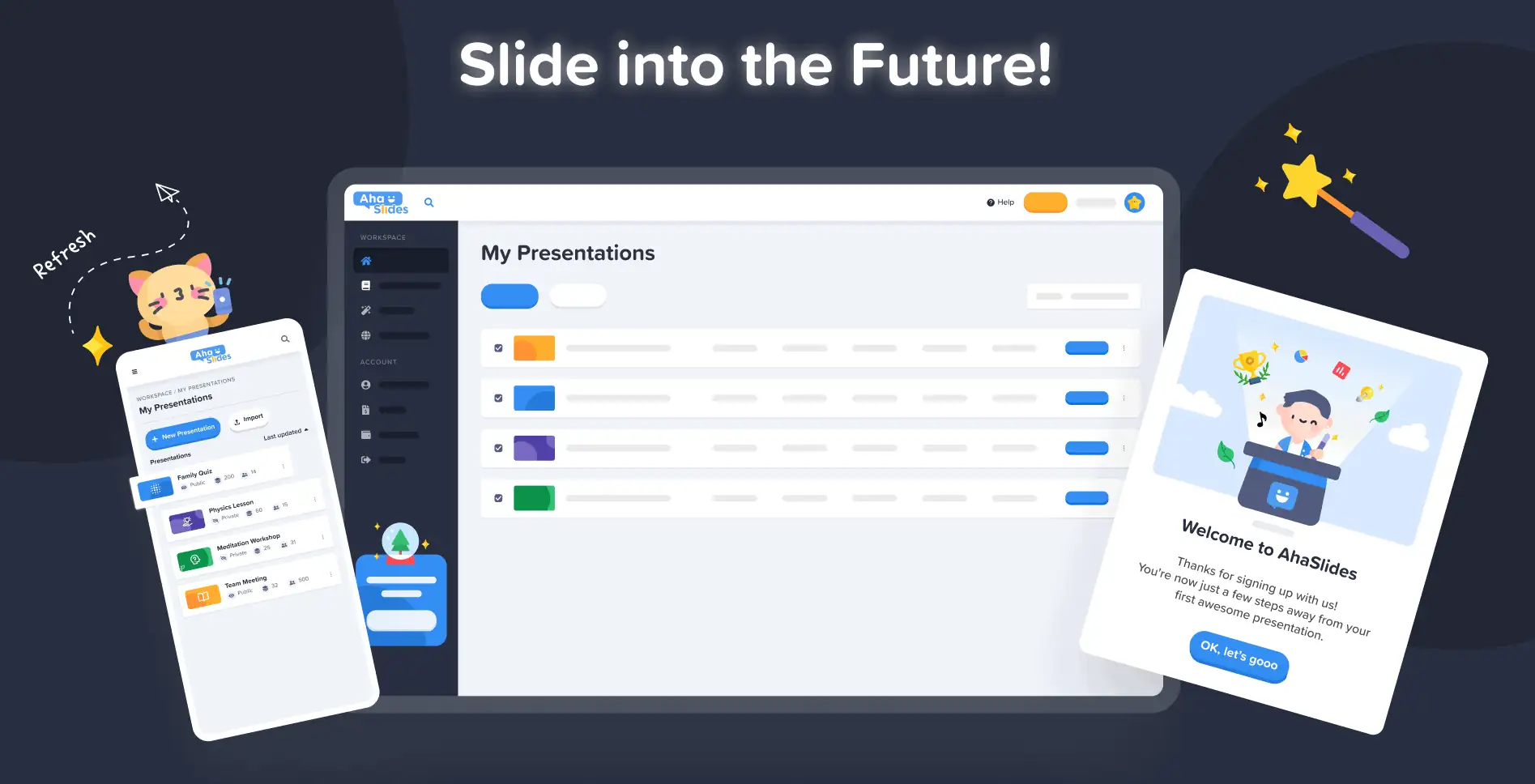
في AhaSlides، هدفنا هو جعل العروض التقديمية أكثر متعةً وتفاعلاً وفائدةً لك ولجمهورك. واليوم، نخطو خطوةً كبيرةً نحو ذلك من خلال تصميم جديد!
برنامج AhaSlides الجديد هو جديد بعدة طرق. لقد جعلنا الأمور أكثر تنظيمًا ومرونة وفعالية. us أكثر مما سبق.
العقل والأيدي وراء ذلك كله كان مصممنا ، ترانج:
أخذتُ رؤية AhaSlides المتراكمة وأضفتُ عليها بعضًا من أفكاري الخاصة. وانتهى بنا الأمر بشيء رائع للمستخدمين الجدد، ولكنه في الوقت نفسه شكرٌ مُخلصٌ وصادقٌ لمن كانوا معنا منذ البداية.
ترانج تران - مصمم
دعونا نلقي نظرة على التغييرات التي أجريناها وكيف يمكنها مساعدتك في إنشاء عروض تقديمية أكثر ذكاءً وأفضل لجمهورك.
الحكة للتحقق من ذلك؟ اذهب واكتشف ما هو جديد بالضغط على الزر أدناه:
ما الجديد؟
تحسين الشكل والمظهر
هذه المرة، قررنا أن نذهب مع شيء أكثر قليلاً... نحن.
هوية العلامة التجارية كان هذا محورًا رئيسيًا في التصميم الجديد. في حين أننا كنا متحفظين بعض الشيء في الماضي، فنحن الآن مستعدون الخطّ الغامق.
ينقسم نهج هويتنا الجديدة إلى 3 أجزاء:
#1 – الرسم التوضيحي
عندما بدأنا عام ٢٠١٩، لم تكن الصور الجميلة والملونة من أولوياتنا. اخترنا الجانب العملي على الجانب الجمالي.
الآن، مع وجود فريق تطوير قوي يعمل بجد على إنشاء الميزات وتحسينها، يمكن لمصممنا الرئيسي ترانج التركيز على صنع AhaSlides أكثر جاذبية. لقد كانت مهمة ضخمة لتشكيل هوية جديدة للعلامة التجارية حول الرسوم التوضيحية والرسوم المتحركة ، ولكنها أدت إلى مكتبة رائعة من التصاميم اللطيفة:

تحقق من هذه الأمثلة الأخرى من الرسوم التوضيحية الجديدة على لوحة معلومات عروضي التقديمية و مبادئ السلوك صفحة الاشتراك:
لكل رسم توضيحي مكانه ودوره الخاص. نعتقد أنه ترحيبٌ أرحب لمستخدمينا الجدد والحاليين، الذين يمكنهم رؤية روح AhaSlides المرحة بمجرد تسجيل دخولهم.
بعد التحدث مع ديف [الرئيس التنفيذي لشركة AhaSlides]، قررنا أن نجعل الأمور أكثر حيويةً ومرحًا. كما ترون، أصبحت الصور الآن أكثر تكاملًا وجاذبية، لكننا لم نرد أن تكون طفولية للغاية. أعتقد أن ما لدينا الآن هو توازن جيد بين المرح والوظيفة.
ترانج تران - مصمم
#2 – اللون
حيوية كانت هذه هي الكلمة المفتاحية للتصميم الجديد. أردنا شيئًا لا يخجل من حيويته، شيئًا يعكس متعة إعداد عرض تقديمي شيق لمشاركته مع جمهور حي.
لهذا السبب قمنا بمضاعفة الجهود ألوان قوية وجريئة.
تفرّعنا من اللونين الأزرق والأصفر المميزين لشعارنا ووسّعنا لوحة الألوان لتشمل درجات الأحمر والبرتقالي والأخضر والأرجواني:
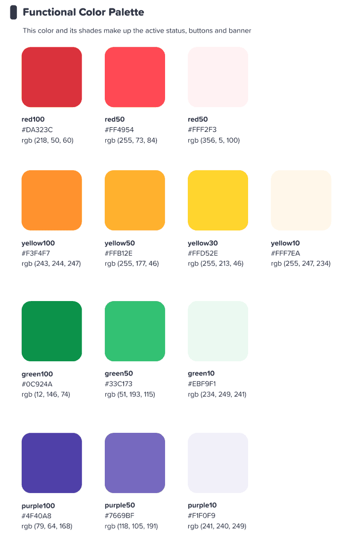
كنا نأمل أن تلهم هذه الواجهة الملونة المستخدمين لدينا ابدأ شيئًا ما الملونة.
ترانج تران - مصمم
⭐ قريبا! ⭐ بالطبع، أردنا أن نوسع نطاق تركيزنا الجديد على الألوان ليشمل مستخدمينا أيضًا. ولذلك، سيتمكن مقدمو العروض قريبًا من اختيار أي لون متاح. لنصهم:

#3 – هندسة المعلومات
وغني عن القول أن الشكل والمظهر الجديد يجب أن يكون لهما وظيفة.
لهذا السبب أجرينا تغييرًا كبيرًا على IA (المعلومات الهندسة المعمارية) من AhaSlides. هذا يعني أننا أعدنا ترتيب وتصور أجزاء من برنامجنا لمساعدة المستخدمين على فهم ما يفعلونه بشكل أفضل.
فيما يلي مثال واحد لما نعنيه - الأزرار القديمة والجديدة الحالية:

اعجاب الكل الأزرار الموجودة في التصميم الجديد ، تحتوي الأزرار أعلاه على ما لا يمكننا وصفه إلا كملف الأكثر من ذلك يشعر زر صلقد أضفنا ظلًا وتوهجًا مشابهين للعديد من خيارات التحديد ليس فقط لمنحها إحساسًا حقيقيًا، ولكن أيضًا لتحسين الذكاء الاصطناعي، حتى يتمكن المستخدمون من فهم ما تم تحديده بشكل أفضل والمكان الذي يجب أن يتركز فيه تركيزهم.
ماذا بعد؟ حسنًا ، يمكنك رؤية بعض تغييرات IA في هذه الصورة:
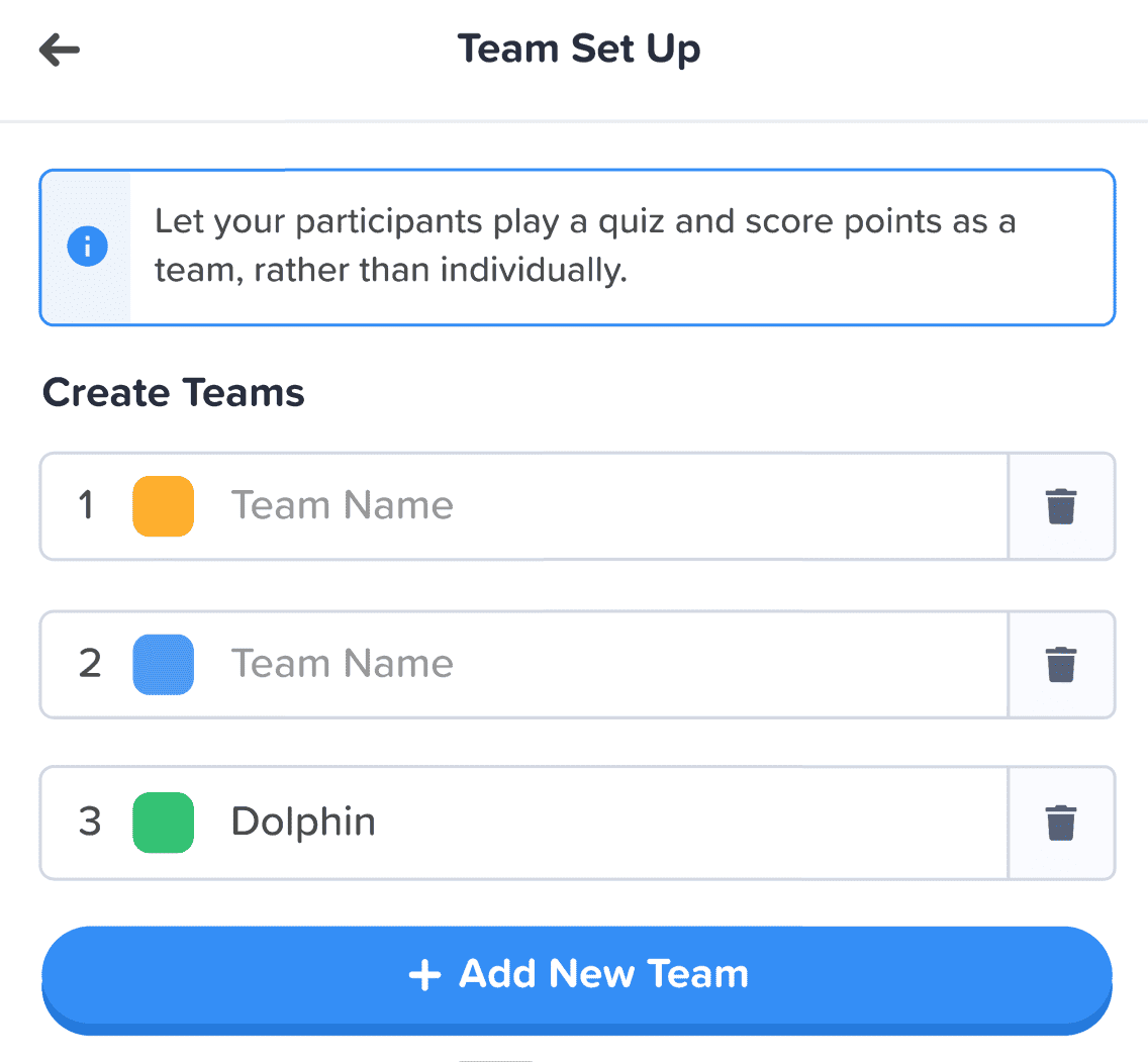
بالإضافة إلى الزر، قمنا بإجراء المزيد من التحسينات بالطرق التالية:
- مربعات فردية للمساعدة في فصل كل عنصر.
- نص غامق يميز المعلومات المدخلة عن النص الباهت لمربع فارغ.
- الرموز والألوان السماح لصناديق المعلومات بالتميز.
قد تكون التغييرات في بنية المعلومات طفيفة، لكن هذا كان قصدي. لم أُرِد أن يضطر مستخدمونا للانتقال إلى منزل جديد، بل أردتُ ببساطة تزيين منازلهم الحالية، ولو بلمسات بسيطة.
ترانج تران - مصمم
تنظيم أفضل ، تنقل أكثر سلاسة 📁
كما قلنا - ما الهدف من جعل الأشياء أكثر جمالاً إذا لم تتحسن الوظيفة جنبًا إلى جنب معها؟
وهنا يأتي التغيير الكبير الثاني لدينا. لقد اشترينا الكثير من الأثاث الرقمي وقمنا بفرز الفوضى.
دعونا نلقي نظرة على 4 مجالات قمنا فيها بإجراء تحسينات:
- لوحة معلومات العروض التقديمية الخاصة بي
- الشريط العلوي للمحرر
- العمود الأيسر للمحرر
- العمود الأيمن للمحرر (قريبا!)
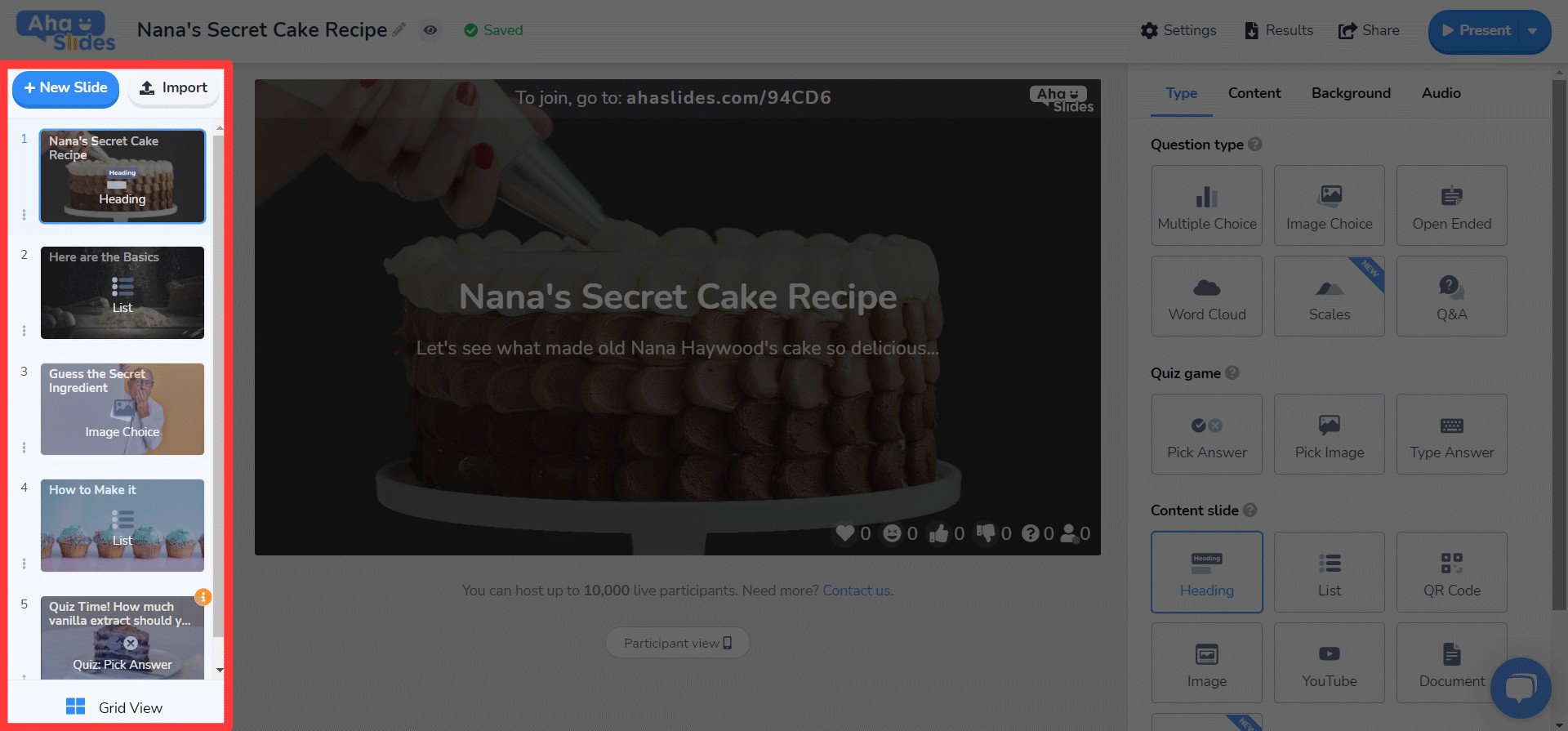
#1 – لوحة معلومات العروض التقديمية الخاصة بي
حسنًا، نعترف بذلك - لم يكن من السهل دائمًا العثور على عروضك التقديمية وترتيبها على التصميم القديم للوحة المعلومات.
لحسن الحظ، لقد قمنا بتغيير الأمور بشكل كبير في لوحة المعلومات الجديدة…
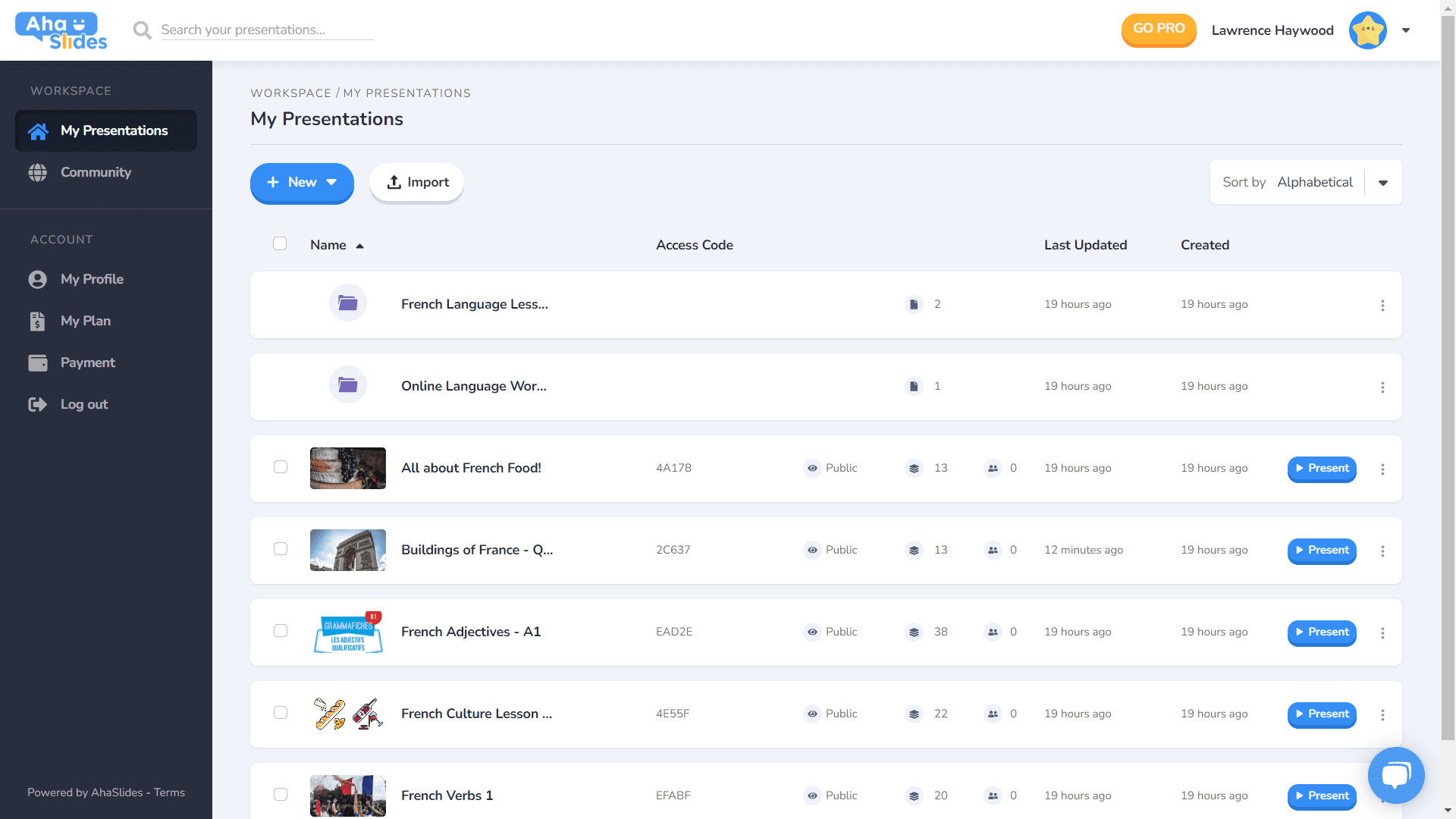
- كل عرض تقديمي له حاويته الخاصة.
- تحتوي الحاويات الآن على صور مصغرة (ستكون الصورة المصغرة هي الصورة الأولى لعرضك التقديمي).
- خيارات العرض (تكرار ، محو البيانات ، حذف ، إلخ) موجودة الآن في قائمة كباب مرتبة.
- هناك المزيد من الطرق لفرز عروضك التقديمية والبحث عنها.
- تم الآن فصل "مساحة العمل" و"الحساب" الخاص بك في العمود الأيسر.
⭐قريبا!⭐ سيكون هناك خيار عرض لوحة معلومات جديد تمامًا في المستقبل القريب - شبكة عرض! تتيح لك طريقة العرض هذه مشاهدة عروضك التقديمية بتنسيق شبكة تتمحور حول الصورة. يمكنك التبديل بين عرض الشبكة وعرض القائمة الافتراضي في أي وقت.
#2 – شريط المحرر العلوي
لقد قمنا بإعادة ترتيب بعض الأشياء باستخدام الشريط العلوي على شاشة المحرر…

- تم تقليص عدد الخيارات في الشريط العلوي من 4 إلى 3.
- تقدم القوائم المنسدلة لكل خيار تنظيمًا أفضل.
- تم تغيير عرض القوائم المنسدلة لضمان احتواء القائمة في العمود الأيمن.
#3 – العمود الأيسر للمحرر
تصميم أبسط وأكثر سلاسة لعمود محتويات العرض التقديمي. كما يتميز عرض الشبكة بمظهر جديد كليًا...
- يتم الآن إلغاء تشويش خيارات الشرائح في قائمة الكباب.
- تمت إضافة زر جديد لعرض الشبكة في الجزء السفلي.
- تم تحسين تخطيط وتشغيل عرض الشبكة بشكل كبير.
⭐ قريبا! ⭐ العمود الأيمن لم ينتهِ بعد تمامًا، ولكن إليك ما يمكنك أن تتوقع رؤيته هناك قريبًا!
#4 – العمود الأيمن للمحرر
تغييرات صغيرة على الأيقونات، وتغييرات كبيرة على لون النص…
- إعادة تصميم الرموز لكل نوع شريحة.
- مجموعة كبيرة ومتنوعة من خيارات ألوان النص.
- تمت إعادة ترتيب العناصر في علامة التبويب "المحتوى".
تحرير في أي مكان وعلى أي جهاز 📱
بالنسبة لـ 28% من مستخدمينا الذين يقومون بتحرير عروضهم التقديمية على الهاتف المحمول، فإننا نأسف لإهمالكم لفترة طويلة ؟؟؟؟
مع التصميم الجديد، أردنا أن نقدم لمستخدمي الهواتف المحمولة والأجهزة اللوحية منصة مجرد استجابة مثل سطح المكتب. وهذا يعني إعادة التفكير في كل عنصر للتأكد من أن مستخدمينا يمكنهم التعديل أثناء التنقل.
بالطبع ، كل شيء يبدأ بـ لوحة القيادةلقد أجرينا بعض التغييرات هنا…

أهم المعلومات المتعلقة بعروضك التقديمية ومجلداتك معروضة هنا. كما توجد قائمة الكباب على اليمين، والتي تُنظّم جميع إعدادات العرض التقديمي.
On القادم رئيس التحرير، سيتم الترحيب بك بواجهة أخرى أكثر ودية.
مرة أخرى ، كل شيء مخبأ في قوائم الكباب. يؤدي القيام بذلك إلى تنقية عوامل التشتيت ويترك لك مساحة أكبر بكثير لمشاهدة العرض التقديمي العام.

هل أصبح واضحًا أننا نحب الكباب؟ لقد استبدلنا البار العلوي المزدحم بقائمة كباب جديدة! هذا يجعل... واجهة أقل إرهاقًا ويتيح لك التركيز على جودة العرض التقديمي.

أردت حقًا إزالة بعض القيود التي تمنع مستخدمي الهواتف المحمولة من إنشاء العروض التقديمية التي يريدونها. اخترنا شيئًا أكثر أناقة وبساطة من ذي قبل، ولكن لا يزال لدينا خطط كبيرة للتعرف على إمكانيات AhaSlides المحمولة في المستقبل!
ترانج تران - مصمم