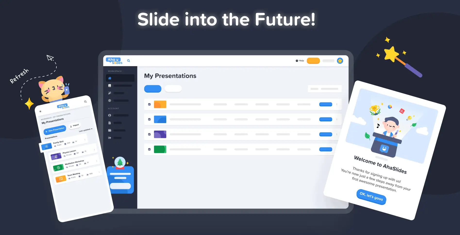
Наша мэта ў AhaSlides - зрабіць прэзентацыі больш вясёлымі, прывабнымі і больш карыснымі для вас і вашай аўдыторыі. Сёння мы робім вялікі крок да гэтага з нашым зусім новы дызайн!
Новы AhaSlides ёсць новы у многіх адносінах. Мы зрабілі рэчы больш арганізаванымі, больш гнуткімі і больш us чым калі-небудзь раней.
Мазгі і рукі за ўсім гэтым быў нашым дызайнерам, Trang:
Я ўзяў назапашанае бачанне AhaSlides і дадаў свае ўласныя. У нас атрымалася нешта выдатнае для новых карыстальнікаў, але таксама годнае і шчырае «дзякуй» тым, хто быў з намі з першага дня.
Транг Тран – Дызайнер
Давайце паглядзім, якія змены мы ўнеслі і як менавіта яны могуць дапамагчы вам рабіць прэзентацыі больш разумнымі і лепшымі для вашай аўдыторыі.
Сверб праверыць? Даведайцеся пра навінкі, націснуўшы кнопку ніжэй:
Што новага?
- Палепшаны знешні выгляд
- Лепшая арганізацыя, больш плыўная навігацыя
- Рэдагуйце ў любым месцы на любой прыладзе
Палепшаны знешні выгляд and
На гэты раз мы вырашылі зрабіць нешта больш… сваё.
Фірмовы стыль быў галоўным пунктам увагі новага дызайну. Хоць у мінулым мы маглі быць крыху стрыманымі, цяпер мы гатовыя быць смелы.
Падыход да нашай новай ідэнтычнасці падзелены на 3 часткі:
#1 – Ілюстрацыя
Калі мы пачыналі ў 2019 годзе, мілыя, маляўнічыя выявы не былі ў цэнтры ўвагі ў спісе спраў. Мы аддалі перавагу функцыянальнасці, а не знешнасці.
Цяпер, калі салідная каманда распрацоўшчыкаў старанна працуе над стварэннем і паляпшэннем функцый, наш галоўны дызайнер Транг можа засяродзіцца на стварэнні AhaSlides больш прывабным. Стварыць новую ідэнтычнасць брэнда вакол ілюстрацый і анімацыі было мамантавай задачай, але ў выніку атрымалася выдатная бібліятэка мілых дызайнаў:

Праверце гэтыя іншыя прыклады новых ілюстрацый на сайце Інфармацыйная панэль "Мае прэзентацыі" і падпісацца на старонку:
Кожная ілюстрацыя мае сваё месца і ролю. Мы лічым, што гэта больш цёплы прыём для нашых новых і цяперашніх карыстальнікаў, якія могуць убачыць гуллівы дух AhaSlides, як толькі ўвойдуць у сістэму.
Пасля размовы з Дэйвам [генеральным дырэктарам AhaSlides] мы вырашылі, што хочам зрабіць усё больш яркім і больш гуллівым. Як бачыце, выявы цяпер больш круглявыя, больш мілыя, але мы не хацелі рабіць іх занадта дзіцячымі. Я думаю, што тое, што ў нас ёсць зараз, — гэта добры баланс задавальнення і функцый.
Транг Тран – Дызайнер
#2 – Колер
Жыццё сапраўды было ключавым словам новага дызайну. Мы хацелі чагосьці, што не саромелася б сваёй жывасці і адлюстроўвала б радасць ад стварэння захапляльнай прэзентацыі для жывой аўдыторыі.
Вось чаму мы падвоілі намаганні моцныя, смелыя колеры.
Мы аддзяліліся ад сіняга і жоўтага фірмовага лагатыпа і пашырылі палітру колераў да адценняў чырвонага, аранжавага, зялёнага і фіялетавага:
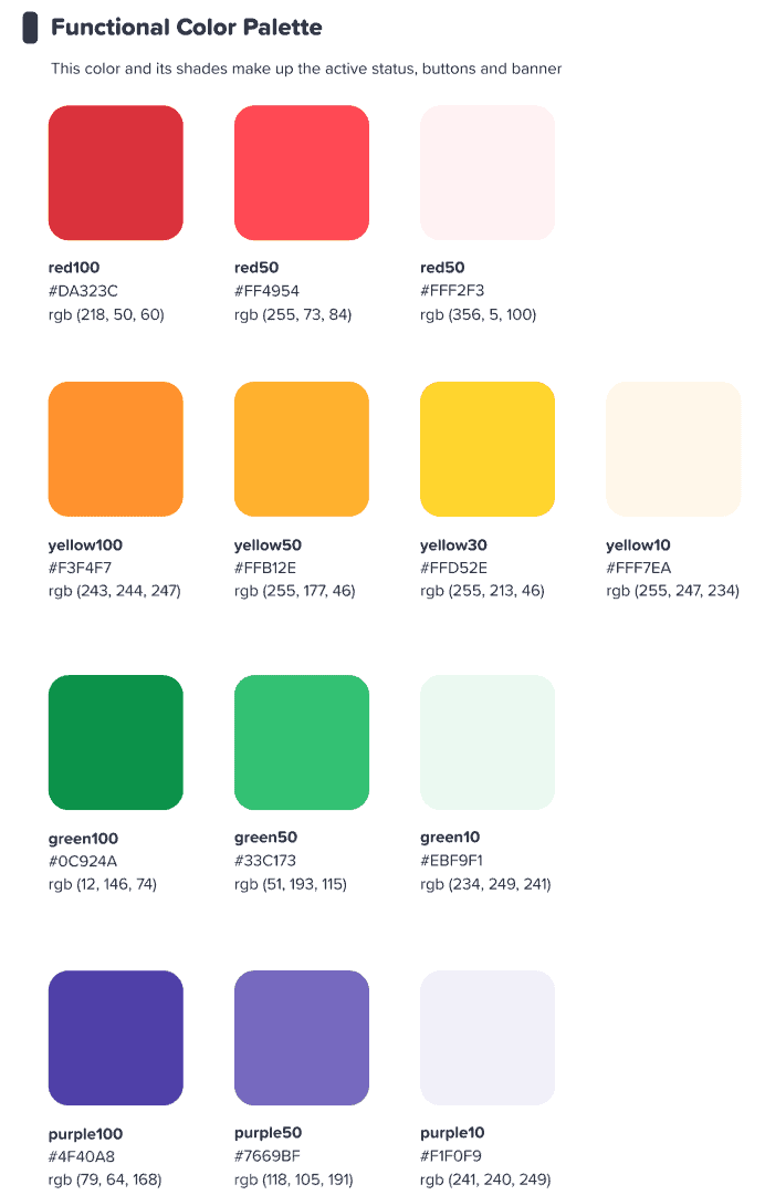
Мы спадзяваліся, што гэты маляўнічы інтэрфейс натхніць нашых карыстальнікаў пачаць нешта маляўнічы.
Транг Тран – Дызайнер
⭐ Хутка ў продажы! ⭐ Вядома, мы хацелі распаўсюдзіць нашу новую ўвагу на колер і на нашых карыстальнікаў. Вось чаму вядучыя хутка змогуць выбраць любы колер пад сонцам. для іх тэксту:

#3 – Інфармацыйная архітэктура
Само сабой зразумела, што новы выгляд і стыль павінны быць функцыя.
Вось чаму мы ўнеслі вялікія змены ў IA (Інфармацыйная архітэктура) AhaSlides. Гэта ў асноўным азначае, што мы пераарганізавалі і пераасэнсавалі часткі нашага праграмнага забеспячэння, каб лепш дапамагчы карыстальнікам зразумець, што яны робяць.
Вось адзін прыклад таго, што мы маем на ўвазе — старыя і новыя кнопкі падарункаў:

як усё кнопкі ў новым дызайне, на прыведзеных вышэй ёсць тое, што мы можам апісаць толькі як больш кнопка-у адчуваюМы дадалі падобны цень і свячэнне да многіх варыянтаў выбару не толькі для таго, каб надаць ім рэальнае адчуванне, але і для паляпшэння ўзаемадзеяння, каб карыстальнікі лепш разумелі, што выбрана і на чым ім трэба засяродзіцца.
Што яшчэ? Ну, вы можаце ўбачыць некалькі змен у ІА на гэтым малюнку:
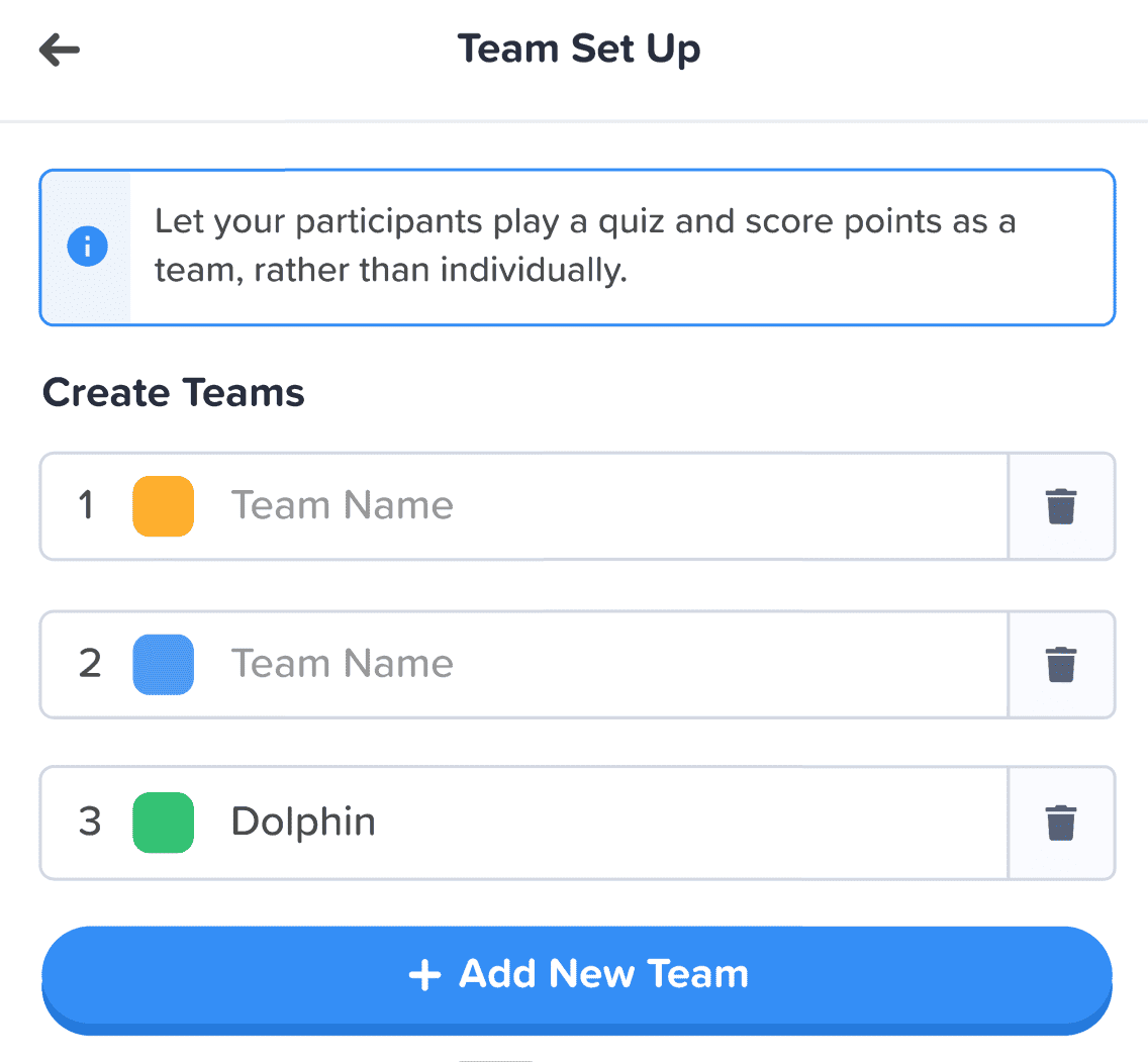
Акрамя кнопкі, мы зрабілі наступныя паляпшэнні:
- Асобныя скрынкі каб дапамагчы раздзяліць кожны элемент.
- тоўсты адрознівае уведзеную інфармацыю ад выцвілага тэксту пустога поля.
- Абразкі і колеры дазваляюць вылучаць інфармацыйныя скрыні.
Змены ў інфармацыйнай архітэктуры могуць быць нязначнымі, але менавіта ў гэтым і заключалася мая мэта. Я не хацеў, каб нашым карыстальнікам давялося перасяляцца ў новы дом, я проста хацеў крыху ўпрыгожыць дом, у якім яны ўжо жывуць.
Транг Тран – Дызайнер
Лепшая арганізацыя, больш плыўная навігацыя 📁
Як мы ўжо казалі — які сэнс рабіць рэчы прыгажэйшымі, калі функцыянальнасць не паляпшаецца разам з гэтым?
Вось тут і пачалася наша другая вялікая змена. Мы купілі кучу лічбавай мэблі і разабраліся з беспарадкам.
Давайце разгледзім 4 вобласці, дзе мы зрабілі паляпшэнні:
- Інфармацыйная панэль "Мае прэзентацыі"
- Верхняя панэль рэдактара
- Левая калона рэдактара
- Правая калонка рэдактара (хутка)
#1 – Мая панэль прэзентацый
Добра, прызнаем — не заўсёды было лёгка знайсці і размясціць прэзентацыі на старой панэлі кіравання.
На шчасце, мы кардынальна змянілі новую панэль кіравання…
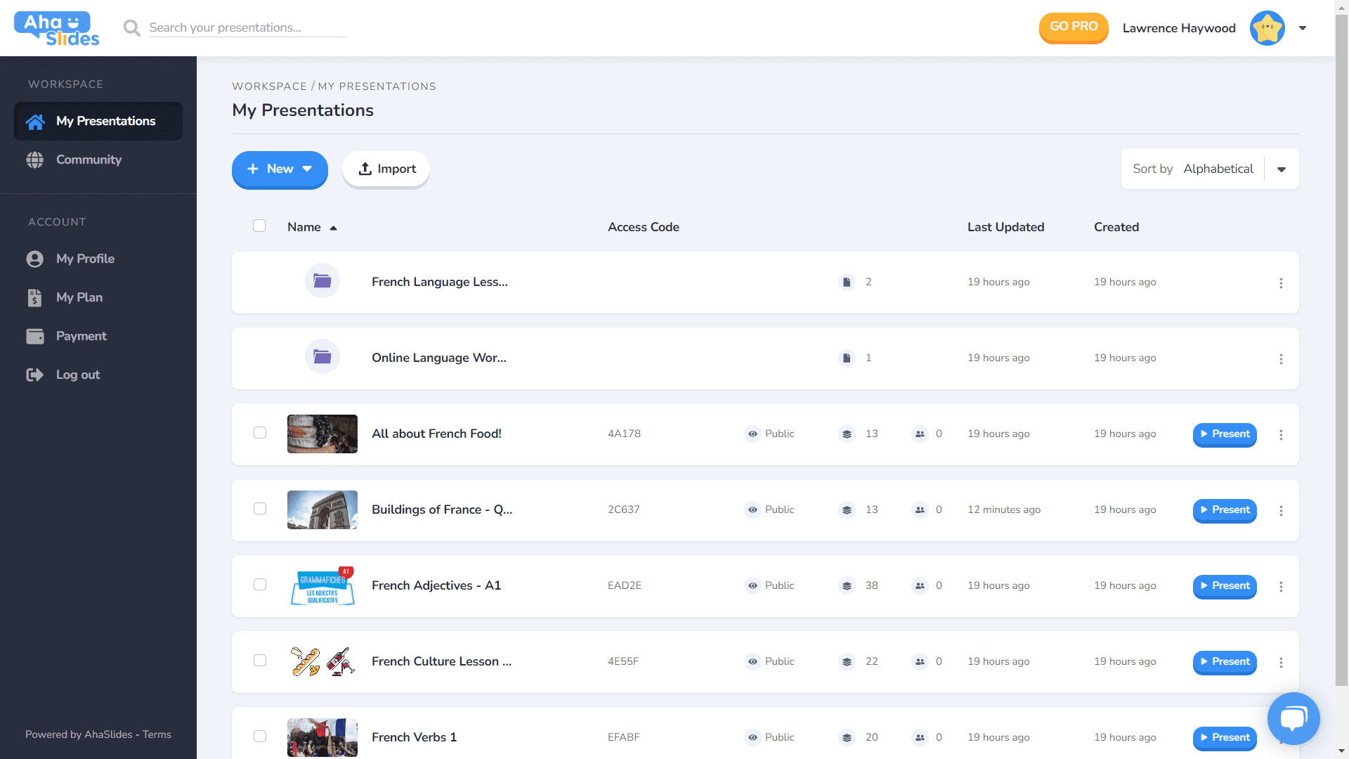
- Кожная прэзентацыя мае свой кантэйнер.
- Цяпер у кантэйнерах ёсць выявы мініяцюр (мініяцюра стане першай выявай вашай прэзентацыі).
- Параметры прэзентацыі (дублікаты, выдаленне дадзеных, выдаленне і г.д.) зараз знаходзяцца ў прыбраным меню шашлыка.
- Ёсць больш спосабаў сартавання і пошуку вашых прэзентацый.
- Ваша «Працоўная прастора» і ваш «Уліковы запіс» цяпер падзеленыя ў левай калонцы.
⭐Хутка ў продажы!⭐ У бліжэйшай будучыні з'явіцца зусім новы варыянт прагляду панэлі кіравання – Grid View! Гэты выгляд дазваляе вам бачыць свае прэзентацыі ў фармаце сеткі, арыентаванай на выявы. Вы можаце ў любы час пераключацца паміж выглядам сеткі і выглядам спіса па змаўчанні.
#2 – Верхняя панэль рэдактара
Мы пераставілі некалькі элементаў у верхняй панэлі рэдактара…

- Колькасць варыянтаў у верхняй панэлі зменшылася з 4 да 3.
- Выпадальнае меню для кожнага варыянту прапануе лепшую арганізацыю.
- Шырыня выпадальных меню змянілася, каб гарантаваць, што меню будзе ўпісвацца ў правы слупок.
#3 – Левая калонка рэдактара
Больш просты і элегантны дызайн слупка зместу прэзентацыі. Таксама зусім новы выгляд сеткі…
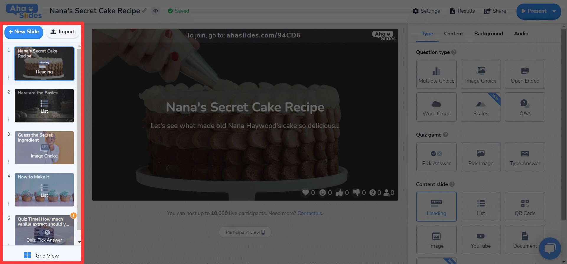
- У меню шашлыка цяпер няма варыянтаў слайдаў.
- Унізе дададзена новая кнопка "Сеткавы выгляд".
- Структура і функцыянаванне Grid View значна палепшана.
⭐ Хутка ў продажы! ⭐ Правая калонка яшчэ не зусім завершана, але вось што вы можаце чакаць там неўзабаве!
#4 – Рэдактар правай калонкі
Невялікія змены ў значках, вялікія змены ў колеры тэксту…
- Перапрацаваны абразкі для кожнага тыпу слайда.
- Вялікая разнастайнасць варыянтаў колеру тэксту.
- Зменены парадак элементаў на ўкладцы «Змест».
Рэдагаваць дзе заўгодна, на любой прыладзе 📱
Тыя 28% нашых карыстальнікаў, якія рэдагуюць свае прэзентацыі на мабільных прыладах, просяць прабачэння за тое, што так доўга вас не ўлічвалі. 😞
З новым дызайнам мы хацелі прапанаваць нашым карыстальнікам мабільных тэлефонаў і планшэтаў платформу, якая... гэтак жа спагадны, як настольны. Гэта азначала перагледзець кожны элемент, каб нашы карыстальнікі маглі рэдагаваць у руху.
Зразумела, усё пачынаецца з прыборная панэльМы ўнеслі тут некалькі змяненняў…

Тут адлюстроўваецца найважнейшая інфармацыя пра вашы прэзентацыі і папкі. Таксама справа ёсць меню кебабаў, дзе ўсе налады прэзентацыі сабраны ў парадку.
On la рэдактар, вас сустрэне яшчэ адзін, больш зручны інтэрфейс.
Зноў жа, усё схавана ў меню шашлыка. Гэта ачышчае адцягваючыя факты і пакідае вам значна больш месца для прагляду агульнай прэзентацыі.

Ці становіцца відавочным, што мы любім кебабы? Мы замянілі перапоўненую верхнюю барную стойку старой, так, яшчэ адным меню кебабаў! Гэта робіць яго... значна менш пераважны інтэрфейс і дазваляе засяродзіць увагу на якасці вашай прэзентацыі.

Я вельмі хацеў зняць некаторыя абмежаванні якія перашкаджаюць нашым мабільным карыстальнікам ствараць патрэбныя ім прэзентацыі. Мы выбралі нешта больш элегантнае і простае, чым раней, але ў нас усё яшчэ ёсць вялікія планы для мабільных магчымасцей AhaSlides у будучыні!
Транг Тран – Дызайнер