

उस आखिरी प्रेजेंटेशन के बारे में सोचिए जिसने शुरू से अंत तक आपका ध्यान सचमुच खींचे रखा। संभवतः वह अधिकांश प्रेजेंटेशन से छोटी थी, उसमें आपकी अपेक्षा से कम स्लाइड थीं, और स्क्रीन पर टेक्स्ट इतना बड़ा था कि आप बिना आंखें सिकोड़े उसे पढ़ सकें। यह संयोगवश नहीं होता। यह जानबूझकर की गई पाबंदी का परिणाम है।
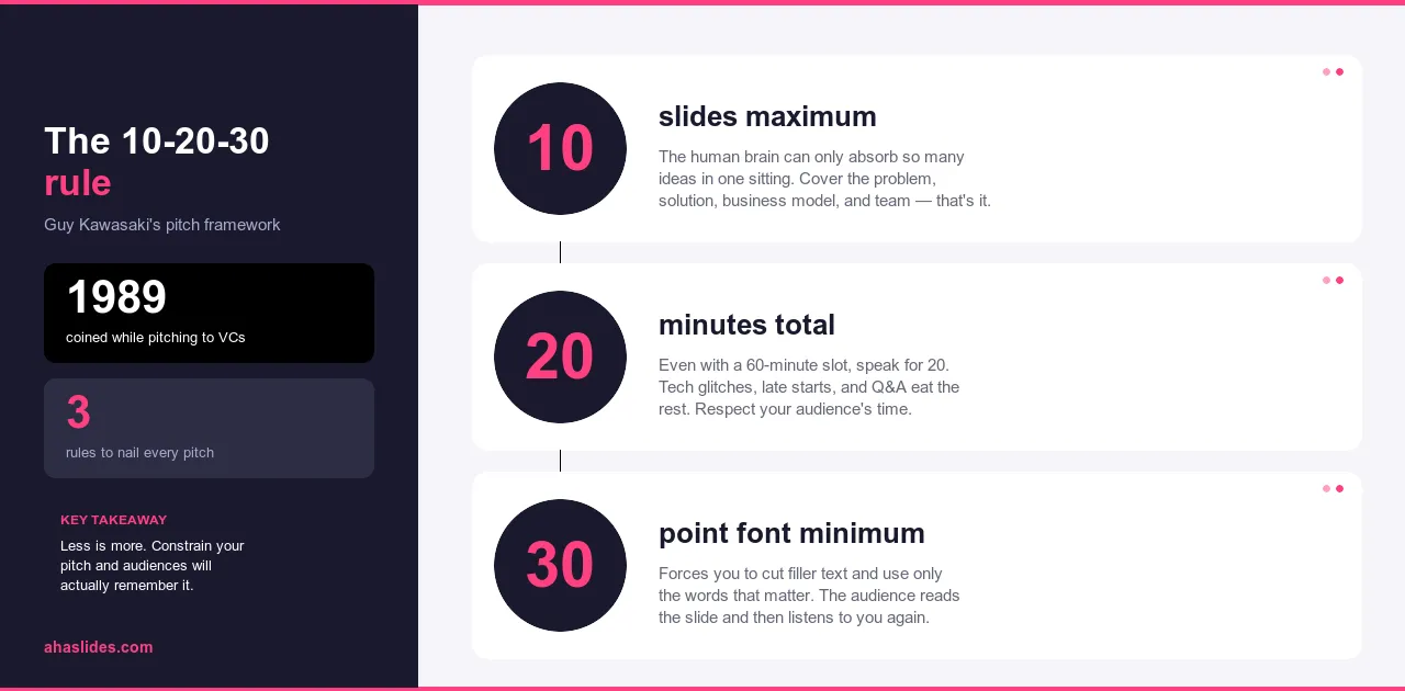
निवेशकों के सामने प्रस्तुति देने के लिए गाइ कावासाकी ने 10-20-30 का नियम विकसित किया था, जहाँ श्रोताओं को खोने का जोखिम तुरंत और स्पष्ट रूप से दिखाई देता है। यह तर्क इतना कारगर साबित हुआ कि पेशेवर प्रस्तुति में यह सबसे व्यापक रूप से उपयोग किए जाने वाले ढाँचों में से एक बन गया। दस स्लाइड। बीस मिनट। कम से कम तीस पॉइंट का फ़ॉन्ट। तीन ऐसे बिंदु जो प्रस्तुतियों को भुला देने वाली अधिकांश समस्याओं का समाधान करते हैं।
यह मार्गदर्शिका बताती है कि प्रत्येक बाधा कैसे काम करती है, वे कैसे परस्पर क्रिया करती हैं, और आप इस ढांचे को अपनी किसी भी प्रस्तुति पर कैसे लागू कर सकते हैं, चाहे आप निवेशकों को पिच कर रहे हों, कर्मचारियों को प्रशिक्षण दे रहे हों, या संशयी निर्णय लेने वालों के समूह के सामने किसी बात का समर्थन कर रहे हों।
यह नियम जिस समस्या को हल करने के लिए बनाया गया था
अधिकांश लोग ऐसी प्रस्तुति में बैठे होंगे जो किसी दंड की तरह लगी हो। साठ के दशक की स्लाइडें। आठ-पॉइंट फ़ॉन्ट में लिखे घने पैराग्राफ़। वक्ता स्क्रीन से शब्दशः पढ़ता है जबकि श्रोता उससे भी तेज़ी से पढ़ते हैं, उससे पहले ही समाप्त कर लेते हैं और शेष समय अगली स्लाइड के इंतज़ार में बिताते हैं। कुछ भी समझ में नहीं आता। कुछ भी याद नहीं रहता। हर कोई एक अच्छी तरह से लिखे गए ईमेल से भी कम सीखकर चला जाता है।
यह कोई दुर्लभ विफलता नहीं है। यह तो आम बात है। अधिकांश प्रेजेंटेशन सॉफ्टवेयर में स्लाइड और टेक्स्ट जोड़ना आसान होता है, जिसका मतलब है कि ज्यादातर प्रेजेंटेशन में टेक्स्ट और टेक्स्ट दोनों ही ज़रूरत से ज़्यादा हो जाते हैं। प्रेजेंटेशन व्यापकता की ओर झुकता है क्योंकि व्यापकता सुरक्षित महसूस होती है। कुछ कम करने से ऐसा लगता है जैसे कुछ खो गया हो। लेकिन ऐसा नहीं है। संपादन ही असली चुनौती है, और संपादन ही प्रेजेंटेशन को प्रभावी बनाता है।
10-20-30 का नियम इसी भटकाव को सुधारने का एक उपाय है। यह कोई बाहरी रूप से थोपी गई रचनात्मक बाधा नहीं है, बल्कि सीमाओं का एक ऐसा समूह है जो हर निर्णय को एक ही दिशा में ले जाता है: एक ऐसी प्रस्तुति की ओर जहाँ वक्ता तर्क प्रस्तुत करता है और स्लाइड उसका समर्थन करती हैं, न कि इसके विपरीत।
10-20-30 नियम क्या है?
इस नियम के तीन भाग हैं, जिनमें से प्रत्येक में उन विभिन्न तरीकों पर चर्चा की गई है जिनसे प्रस्तुतियाँ आमतौर पर गलत हो जाती हैं।
अधिकतम दस स्लाइड। दस स्लाइड लक्ष्य नहीं, बल्कि अधिकतम सीमा। यह सीमा एक प्रकार का संपादकीय अनुशासन लागू करती है जो अधिकांश प्रस्तुतियों में कभी विकसित नहीं होता: आपको यह तय करना होता है कि क्या आवश्यक है, न कि हर उस चीज़ को शामिल करना जो प्रासंगिक हो सकती है। जब आप सब कुछ शामिल नहीं कर पाते, तो आपको प्राथमिकता तय करनी पड़ती है। इस प्रक्रिया के बाद जो बचता है, वह लगभग हमेशा शुरुआत से बेहतर होता है।
अधिकतम बीस मिनट। यह लगभग वह समय सीमा है जिसमें श्रोता बिना किसी रुकावट के लगातार ध्यान केंद्रित कर सकते हैं। बीस मिनट के बाद, ध्यान धीरे-धीरे कम नहीं होता, बल्कि तेज़ी से घटता है। बीस मिनट की प्रस्तुति समय सारिणी में आसानी से फिट हो जाती है और श्रोताओं के समय के प्रति सम्मान दर्शाती है, जबकि साठ मिनट का सत्र ऐसा नहीं कर पाता।
कम से कम तीस पॉइंट का फ़ॉन्ट साइज़ होना चाहिए। छोटा टेक्स्ट एक समस्या है, डिज़ाइन की पसंद नहीं। प्रस्तुतकर्ता इसका इस्तेमाल स्लाइड पर ज़्यादा सामग्री फिट करने के लिए करते हैं, जिसका मतलब है कि ज़्यादा सामग्री ज़ोर से पढ़ी जाती है, और इसका मतलब है कि श्रोता किसी को बोलते हुए सुनने के बजाय उसे पढ़ते हुए देखते हैं। तीस पॉइंट का न्यूनतम फ़ॉन्ट साइज़ स्लाइड को प्रस्तुति बनने से रोकता है। इतने छोटे साइज़ में पैराग्राफ़ फिट नहीं हो सकते। आपको विवरण वहीं रखना पड़ता है जहाँ उसे होना चाहिए: अपनी आवाज़ में।
ये तीनों सीमाएँ एक दूसरे को पुष्ट करती हैं। कम स्लाइड का मतलब है कम सामग्री। कम सामग्री का मतलब है छोटी प्रस्तुतियाँ। बड़े फ़ॉन्ट का मतलब है प्रति स्लाइड कम पाठ। ये तीनों मिलकर एक ही दिशा में आगे बढ़ते हैं: एक ऐसी प्रस्तुति की ओर जहाँ वक्ता मुख्य आकर्षण होता है और स्लाइडें सहायक सामग्री होती हैं।
10 स्लाइड क्यों?
अधिकांश प्रस्तुतियों में बहुत अधिक स्लाइड होती हैं क्योंकि प्रस्तुतकर्ता ने यह तय नहीं किया होता कि वास्तव में क्या महत्वपूर्ण है। एक स्लाइड जोड़ना मूल्यवर्धन जैसा लगता है। लेकिन ऐसा अक्सर नहीं होता। यह अक्सर दो विचारों के बीच चुनाव को टालने जैसा होता है, जबकि वास्तव में दो विचार एक ही होने चाहिए थे।
दस स्लाइड होने पर आपको यह चुनाव करना पड़ता है। जब आप सीमा तक पहुँच जाते हैं और फिर भी सामग्री बची रहती है, तो आपको तय करना होता है: क्या यह विचार इतना महत्वपूर्ण है कि पहले से मौजूद किसी चीज़ की जगह ले ले, या इसे हैंडआउट, फॉलो-अप ईमेल या मौखिक स्पष्टीकरण में शामिल किया जाना चाहिए? यही निर्णय लेना असली काम है। यही सीमा आपको काम करने के लिए प्रेरित करती है।
इसका नतीजा यह है कि आपकी प्रस्तुति आपके संपूर्ण कंटेंट के बजाय आपके सबसे मजबूत पहलुओं पर केंद्रित होती है। हर स्लाइड का अपना महत्व है। कोई भी स्लाइड सिर्फ इसलिए शामिल नहीं की गई है क्योंकि उसे हटाने का कोई कारण नहीं बचा था।
अधिकांश प्रकार की प्रस्तुतियों में कारगर संरचना इस तर्क पर आधारित है: समस्या से शुरुआत करें, यह बताएं कि यह क्यों महत्वपूर्ण है, अपना समाधान प्रस्तुत करें, यह कैसे काम करता है समझाएं, प्रमाण प्रस्तुत करें, यह बताएं कि यह किसके लिए है, प्रतिस्पर्धी या वैकल्पिक परिदृश्य पर चर्चा करें, क्रियान्वयन की क्षमता स्थापित करें, आवश्यक संसाधनों का विवरण दें और अंत में एक विशिष्ट अनुरोध के साथ समाप्त करें। दस स्लाइड। प्रत्येक स्लाइड में एक विचार। समस्या से लेकर समाधान तक का संपूर्ण तर्क।
संदर्भ के अनुसार अनुपात बदल जाते हैं। प्रशिक्षण प्रस्तुति में प्रतिस्पर्धी परिदृश्य के स्थान पर कार्यान्वयन योजना प्रस्तुत की जाती है। बिक्री प्रस्तुति में टीम स्लाइड के स्थान पर ग्राहक साक्ष्य प्रस्तुत किए जाते हैं। मूल सिद्धांत वही रहता है: समस्या, समाधान, प्रमाण, प्रश्न।
20 मिनट क्यों?
लगभग बीस मिनट तक लगातार सुनने के बाद अधिकांश लोग अपना ध्यान खो देते हैं। यह कोई व्यक्तिगत कमी या आधुनिक ध्यान अवधि की समस्या नहीं है। यह मानव ध्यान के काम करने के तरीके में एक सामान्य प्रवृत्ति है। उस समय सीमा के बाद, आप केवल अधिक समय नहीं मांग रहे हैं, बल्कि आप ऐसी चीज मांग रहे हैं जो लोग आसानी से नहीं दे सकते।
बीस मिनट का समय भी व्यावहारिक है। यह तीस मिनट की बैठक में सवालों के लिए पर्याप्त समय के साथ समाहित हो जाता है। एक घंटे की तुलना में इसे निर्धारित करना आसान है। लोगों के उपस्थित होने, पूरी बैठक में ध्यान केंद्रित रखने और कही गई बातों को स्पष्ट रूप से याद रखने की संभावना अधिक होती है।
समय स्वाभाविक रूप से तीन भागों में बँट जाता है। शुरुआत में, जहाँ आप दर्शकों का ध्यान आकर्षित करते हैं और यह बताते हैं कि यह विशेष श्रोताओं के लिए क्यों महत्वपूर्ण है, दो से तीन मिनट लगते हैं। मुख्य विषयवस्तु, जिसमें तीन से चार मुख्य बिंदु शामिल हैं, बारह से चौदह मिनट तक चलती है, यानी लगभग तीन से चार मिनट प्रति बिंदु। निष्कर्ष और कार्रवाई का आह्वान दो से तीन मिनट में समाप्त होता है। इसके बाद एक या दो मिनट का अतिरिक्त समय बचता है, जिसकी प्रस्तुतियों को लगभग हमेशा आवश्यकता होती है क्योंकि वे अक्सर छोटी की तुलना में लंबी होती हैं।
यदि आपकी सामग्री को वास्तव में अधिक समय की आवश्यकता है, तो प्रस्तुति को लंबा करना सही तरीका नहीं है। बल्कि, विवरण को सहायक दस्तावेजों में शामिल करना और उन बीस मिनटों का उपयोग उस तर्क को प्रस्तुत करने के लिए करना चाहिए जो लोगों को उन्हें पढ़ने के लिए प्रेरित करे।

30-पॉइंट फ़ॉन्ट क्यों?
स्लाइड में बहुत सारी जानकारी एक साथ दिखाने की कोशिश करने पर फ़ॉन्ट छोटा हो जाता है। प्रस्तुतकर्ता स्क्रीन पर पूरी व्याख्या दिखाना चाहता है, इसलिए फ़ॉन्ट छोटा हो जाता है। फिर, क्योंकि व्याख्या स्क्रीन पर ही होती है, वे उसे ज़ोर से पढ़ते हैं। श्रोता प्रस्तुतकर्ता के बोलने की गति से ज़्यादा तेज़ी से पढ़ते हैं, प्रस्तुतकर्ता से पहले स्लाइड खत्म कर लेते हैं, और बाकी समय सुनने के बजाय इंतज़ार करने में बिताते हैं।
तीस पॉइंट का न्यूनतम आकार इस पैटर्न को तोड़ता है। इस आकार में, एक मानक स्लाइड में तीन से चार छोटी पंक्तियाँ ही समाहित होती हैं। एक शीर्षक और दो सहायक वाक्यांश। एक लेबल के साथ एक ही आँकड़ा। बस इतना ही। जो विवरण पहले स्लाइड पर होता था, उसे कहीं और रखना पड़ता है, और वह केवल मौखिक प्रस्तुति में ही समाहित हो सकता है, जहाँ वह होना चाहिए।
यह प्रतिबंध एक ऐसी समस्या का भी समाधान करता है जिसके बारे में प्रस्तुतकर्ता अक्सर नहीं सोचते। कमरे के पीछे बैठे लोग भी तीस पॉइंट के टेक्स्ट को पढ़ सकते हैं। दृष्टिबाधित लोग भी तीस पॉइंट के टेक्स्ट को पढ़ सकते हैं। छोटे अक्षर आपके दर्शकों के कुछ हिस्सों को चुपचाप और बिना किसी संकेत के अलग कर देते हैं।
कुछ प्रस्तुतकर्ता इससे भी अधिक सख्त सीमाएँ लागू करते हैं, स्लाइड को एक ही चित्र या कुछ शब्दों तक सीमित कर देते हैं। इन तरीकों के पीछे का सिद्धांत 10-20-30 नियम के समान है: स्लाइड में जितना कम लिखा होगा, प्रस्तुतकर्ता को उतना ही अधिक बोलना पड़ेगा। और वास्तविक समझ के साथ बोलने वाला प्रस्तुतकर्ता, स्लाइड को पढ़कर सुनाने की तुलना में लगभग हमेशा अधिक आकर्षक होता है।

व्यवहार में यह कैसा दिखता है
इस फ्रेमवर्क के साथ तैयार की गई प्रस्तुति और इसके बिना तैयार की गई प्रस्तुति के बीच का अंतर, अमूर्त रूप से वर्णन करने की तुलना में एक विशिष्ट उदाहरण में देखना आसान है।
कल्पना कीजिए कि आप अपनी लीडरशिप टीम के सामने एक नए कर्मचारी प्रशिक्षण कार्यक्रम का प्रेजेंटेशन दे रहे हैं। लंबाई या संरचना पर कोई पाबंदी न होते हुए, आप 35 स्लाइड तैयार करते हैं: कार्यक्रम का इतिहास, बाज़ार अनुसंधान, प्रतिस्पर्धी विश्लेषण, पाठ्यक्रम का विस्तृत विवरण, विभागवार लागत का ब्यौरा, प्रत्येक स्थान के लिए कार्यान्वयन समयसीमा, परिशिष्ट। प्रेजेंटेशन 75 मिनट का होता है। लगभग 20वीं स्लाइड पर अधिकारी अपना ध्यान खो बैठते हैं। आप प्रेजेंटेशन खत्म करते हैं, सभी को धन्यवाद देते हैं, और हफ्तों तक जवाब का इंतज़ार करते हैं जो शायद कभी न आए। सारी जानकारी मौजूद थी, लेकिन तर्क नहीं था।
10-20-30 के ढांचे के साथ, वही प्रस्ताव दस स्लाइडों में बदल जाता है:
- समस्या यह है कि वर्तमान में भर्ती प्रक्रिया में तीन महीने लगते हैं और विभिन्न स्थानों पर इसके परिणाम एक जैसे नहीं होते।
- इसके परिणाम: उत्पादकता में देरी, शुरुआती दौर में कर्मचारियों के नौकरी छोड़ने की उच्च दर और असंगत ग्राहक अनुभव।
- इसका समाधान: मानकीकृत सामग्री और प्रबंधकीय जाँच बिंदुओं के साथ एक संरचित आठ-सप्ताह का कार्यक्रम।
- यह कैसे काम करता है: इसमें तीन चरण शामिल हैं, जिनमें ओरिएंटेशन, भूमिका-विशिष्ट प्रशिक्षण और फीडबैक लूप के साथ पर्यवेक्षित अभ्यास शामिल हैं।
- प्रायोगिक परिणाम: यह कार्यक्रम छह महीने की अवधि में दो स्थानों पर चलाया गया, जिससे कर्मचारियों को बनाए रखने और उत्पादकता प्राप्त करने में लगने वाले समय में उल्लेखनीय सुधार हुआ।
- कार्यान्वयन योजना: एक समर्पित परियोजना प्रमुख के नेतृत्व में बारह महीनों में सभी स्थानों पर इसे लागू करना।
- आवश्यक संसाधन: बजट, कर्मचारियों की संख्या और प्रौद्योगिकी संबंधी आवश्यकताएं, चरणवार विवरण के साथ।
- समयरेखा: अनुमोदन से लेकर पूर्ण कार्यान्वयन तक के प्रमुख पड़ाव।
- जोखिम और उससे बचाव: तीन सबसे संभावित बाधाएं और योजना इनमें से प्रत्येक का समाधान कैसे करती है।
- उनकी मांग है: बारह महीने के पायलट बजट की मंजूरी और एक परियोजना प्रमुख की नियुक्ति।
आप अठारह मिनट में अपनी बात रखते हैं। तर्क स्पष्ट है: यह कार्यक्रम कारगर है, योजना व्यावहारिक है, और बजट उचित है। अधिकारी समझ जाते हैं कि उन्हें क्या मंज़ूर करना है। आप पूरी दस्तावेज़ी प्रस्तुत करते हैं, लेकिन लाइव प्रस्तुति ने अपना काम कर दिया।
35 स्लाइड वाले संस्करण और 10 स्लाइड वाले संस्करण में लगभग एक ही जानकारी है। अंतर केवल इतना है कि एक में तर्क प्रस्तुत किया जाता है और दूसरे में एक फ़ाइल प्रस्तुत की जाती है।
10-20-30 प्रेजेंटेशन कैसे बनाएं
स्लाइड डेक खोलने से पहले ही शुरुआत करें। अपने मुख्य संदेश को एक वाक्य में लिखें: आप अपने दर्शकों को कौन सी एक बात याद दिलाना या करवाना चाहते हैं? यदि आप वह वाक्य नहीं लिख सकते, तो आपके पास अभी तक पर्याप्त स्पष्ट तर्क नहीं है। तीस स्लाइड बनाने से पहले यह जानना उपयोगी होगा।
फिर उन सभी चीजों की सूची बनाएं जो आपको लगता है कि प्रस्तुति में होनी चाहिए। इस चरण में संपादन न करें। सब कुछ लिख लें, फिर देखें कि आपके पास क्या है। क्या आवश्यक है? क्या सहायक है? क्या अनावश्यक है जिसे आपने इसलिए शामिल किया क्योंकि उसे हटाना सुरक्षित लगा?
बची हुई जानकारी को एक कथा के रूप में व्यवस्थित करें: समस्या, समाधान, प्रमाण, प्रश्न। अपनी दस स्लाइडों में से प्रत्येक के लिए एक विचार निर्धारित करें। यदि आपको दस से अधिक ऐसे विचार लगते हैं जो आवश्यक प्रतीत होते हैं, तो या तो आप बहुत व्यापक विषय को कवर कर रहे हैं या आपने अभी तक महत्वपूर्ण निर्णय नहीं लिए हैं। उन्हें अभी लें, न कि अपने दर्शकों के सामने।
प्रत्येक स्लाइड के लिए, यह पूछें कि क्या आप विचार को वर्णन करने के बजाय उसे दिखा सकते हैं। एक चार्ट जो बात को दृश्य रूप से स्पष्ट करता है, मौखिक व्याख्या से कहीं अधिक प्रभावी होता है। तीस-पॉइंट फ़ॉन्ट में फिट न होने वाली किसी भी चीज़ को अपने मौखिक प्रस्तुति में शामिल करें, जहाँ वह उपयुक्त है।
बोलकर अभ्यास करें और समय का ध्यान रखें। जानें कि आप कहाँ ज़्यादा समय ले रहे हैं और गति बढ़ाने के बजाय वहीं रुक जाएँ। सामान्य गति से बीस मिनट में समाप्त होने वाली प्रस्तुति और जल्दबाज़ी में बीस मिनट में समाप्त होने वाली प्रस्तुति में बहुत अंतर होता है। पहली प्रस्तुति श्रोताओं का सम्मान करती है, जबकि दूसरी प्रस्तुति यह संकेत देती है कि आपने पर्याप्त संपादन नहीं किया है।

सामान्य चिंताएं
सबसे आम आपत्ति यह है कि जटिल विषयों के लिए बीस मिनट का समय पर्याप्त नहीं होता। आमतौर पर ऐसा ही होता है। गलती व्यापक कवरेज को प्रभावी संचार समझने की है। एक बीस मिनट की प्रस्तुति जो तीन स्पष्ट बिंदु प्रस्तुत करती है और श्रोताओं का विश्वास जीतती है, वह साठ मिनट की उस प्रस्तुति से कहीं अधिक प्रभावी होती है जो सब कुछ कवर कर लेती है लेकिन श्रोताओं को कुछ भी याद नहीं रहता। विस्तृत जानकारी सहायक दस्तावेजों में होनी चाहिए जिन्हें लोग तब पढ़ते हैं जब वे विषय को गहराई से समझने के लिए तैयार होते हैं, न कि लाइव सत्र में जहां ध्यान सीमित होता है।
दूसरी आपत्ति यह है कि क्या दस वाकई सही संख्या है या ग्यारह या बारह भी ठीक रहेंगे। महत्वपूर्ण बात संख्या है। यह एक सीमा है, सुझाव नहीं। जैसे ही आप अपवादों की अनुमति देते हैं, आप फिर से उन अनावश्यक प्रस्तुतियों की ओर बढ़ जाते हैं जिन्हें एक-एक स्लाइड के आधार पर सही ठहराया जाता है। दस स्लाइड तक सीमित रहने का अनुशासन अक्सर सबसे अच्छे संपादकीय निर्णयों का आधार होता है। जिस स्लाइड को आप हटाने से हिचकिचाते हैं, उसमें आमतौर पर कुछ ऐसा होता है जिसे स्क्रीन पर दिखाने के बजाय मौखिक रूप से कहना बेहतर होता है।
डेटा से भरपूर प्रस्तुतियों में एक वाजिब सवाल उठता है: जो आंकड़े मेल नहीं खाते उनका क्या होता है? इसका जवाब यह है कि महत्वपूर्ण आंकड़े स्पष्ट रूप से व्याख्या के साथ स्लाइड पर रखे जाते हैं। सहायक डेटा को एक हैंडआउट या परिशिष्ट में रखा जाता है जिसका आप संदर्भ देते हैं लेकिन प्रस्तुत नहीं करते। आपका काम मुख्य निष्कर्षों को स्पष्ट और विश्वसनीय तरीके से प्रस्तुत करना है। दर्शक बाद में पूरे डेटासेट की जांच कर सकते हैं।
फ़ॉन्ट संबंधी आपत्ति का समाधान स्वयं ही हो जाता है। न्यूनतम तीस-पॉइंट का मतलब है बड़ा टेक्स्ट, जिसका अर्थ है कि कमरे के पीछे बैठे लोग भी आपकी स्लाइड पढ़ सकते हैं। यदि आपके वर्तमान फ़ॉन्ट आकार के कारण दर्शकों को आँखें छोटी करनी पड़ रही हैं या आगे झुकना पड़ रहा है, तो यह डिज़ाइन संबंधी समस्या नहीं है। यह एक ऐसी समस्या है जिसका समाधान यह नियम करता है।
AhaSlides के साथ इसे और आगे ले जाना
10-20-30 का नियम आपकी स्लाइड्स पर क्या दिखाया जाएगा और आप कितनी देर बोलेंगे, इस बारे में बताता है। यह इस बारे में नहीं बताता कि प्रस्तुति के दौरान आपके श्रोता क्या करते हैं, जो कि अधिकांश प्रस्तुतियों में कुछ भी नहीं होता है।
इंटरैक्टिव एलिमेंट्स इसे बदल देते हैं। जब आपके श्रोताओं को समस्या को अपनी स्थिति से जोड़ने की ज़रूरत होती है, उस समय एक पोल रखने से, आपके तर्क प्रस्तुत करने से पहले ही समस्या व्यक्तिगत लगने लगती है। प्रस्तुति के बीच में एक वर्ड क्लाउड आपको वास्तविक समय में दिखाता है कि कौन से विचार प्रभावी हैं और कौन से नहीं, इससे पहले कि आप अपने तर्क के बाकी हिस्से पर आगे बढ़ें। एक सहज बदलाव में शामिल एक गुमनाम प्रश्नोत्तर सत्र आपके श्रोताओं की उन आपत्तियों को पकड़ लेता है जिन्हें वे खुलकर नहीं उठाते।
ये क्षण प्रस्तुति की लंबाई या जटिलता नहीं बढ़ाते। 10-20-30 मिनट की प्रस्तुति में अंतर्निहित होने के कारण, ये बीस मिनट की समय सीमा के भीतर समाहित हो जाते हैं और निष्क्रिय रूप से स्लाइड देखने के बजाय सक्रिय भागीदारी को बढ़ावा देते हैं। AhaSlides इसे सरल बनाने के लिए डिज़ाइन किया गया है: सर्वेक्षण, प्रश्नोत्तरी, वर्ड क्लाउड और प्रश्नोत्तर सत्र आपकी प्रस्तुति के प्रवाह में इस तरह से समाहित होते हैं कि विषयवस्तु से अंतःक्रिया की ओर बदलाव सहज और सहज लगता है, न कि व्यवधानकारी।
10-20-30 का नियम आपकी प्रस्तुति को संक्षिप्त और केंद्रित बनाता है। इंटरैक्टिव तत्व इसे दोतरफा बनाते हैं। दोनों ही उपयोगी हैं।
ऊपर लपेटकर
10-20-30 का नियम इसलिए कारगर है क्योंकि यह जिन समस्याओं का समाधान करता है वे वास्तविक और सुसंगत हैं। बहुत अधिक स्लाइडें। बहुत अधिक पाठ। तर्क पर बहुत कम समय व्यतीत करना। ये तीन प्रतिबंध इन तीनों समस्याओं का एक साथ समाधान करते हैं, और ऐसा करके वे उन निर्णयों को लेने के लिए बाध्य करते हैं जिन्हें अधिकांश प्रस्तुतकर्ता तब तक टालते रहते हैं जब तक कि उनके पास कोई अच्छा विकल्प नहीं बचता।
दस स्लाइड। बीस मिनट। तीस पॉइंट का फ़ॉन्ट। अपनी अगली प्रस्तुति में इन तीनों को लागू करें और देखें कि इन सीमाओं के कारण आपको क्या करना पड़ता है। आप जो कटौती करते हैं, वह लगभग हमेशा सही होती है। समय की बचत लगभग हमेशा सराहनीय होती है। और अंत में जो प्रस्तुति बनकर तैयार होती है, वह लगभग हमेशा शुरुआती प्रस्तुति से कहीं अधिक प्रभावशाली होती है।