एक समय ऐसा भी आता है जब पिन और रंगful.
करो या मरो की प्रस्तुति देने वालों के लिए, एक इंटरैक्टिव टीम मीटिंग चलाने वाले, या अपने दोस्तों के लिए एक प्रश्नोत्तरी रात की मेजबानी करने वालों के लिए, वह समय वर्तमान है।
क्योंकि वर्तमान प्रस्तुतकर्ताओं का है.
AhaSlides भी बोल्ड और रंगीन की ओर कदम बढ़ा रहा है। हमारी नई ब्रांडिंग बेहतरीन प्रस्तुति की ताकत, भावना और अंतर्संबंध को दर्शाती है। चाहे आप हमें काम, स्कूल, समुदाय या किसी और काम के लिए इस्तेमाल कर रहे हों, हमें यकीन है कि आपको नए AhaSlides में अपना एक हिस्सा मिलेगा।
AhaSlides की नई ब्रांडिंग को देखने के लिए नीचे क्लिक करें 👇
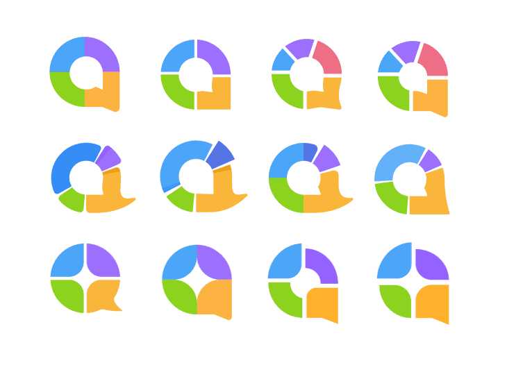
# 1: लोगो मार्क

नया, गोलाकार लोगो चिह्न कुछ अलग विचारों से पैदा हुआ था:
- एक भाषण बुलबुले का प्रतीक, दो तरफा का प्रतिनिधित्व करता है बातचीत.
- एक वृत्त की गोलाई, जो एक साथ आने का प्रतिनिधित्व करती है संघ.
- एक डोनट चार्ट के जुड़े हुए खंड, प्रतिनिधित्व करते हैं दृश्य और रेखांकन.
यह सब मिलकर 'ए' अक्षर बनाते हैं - जो AhaSlides का पहला अक्षर है। यह इस बात का सार है कि हम साझा विचारों पर कैसे जुड़ते हैं।
लोगो चिह्न की यह ग्रिड प्रणाली बताती है कि वृत्त का विचार चिह्न के लिए कितना महत्वपूर्ण है।
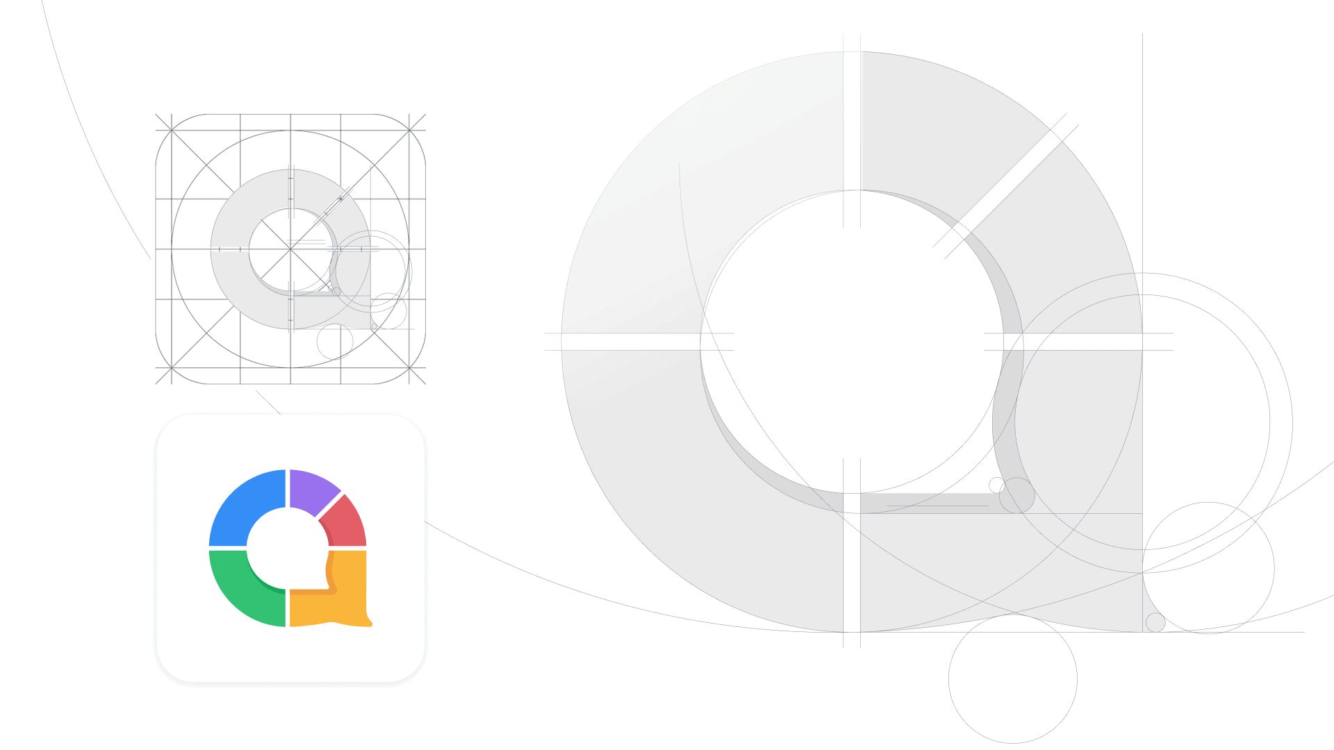
इस तरह से आकार को तोड़ने से पता चलता है कि आईओएस और एंड्रॉइड ऐप आइकन के मानक दिशानिर्देशों के साथ चिह्न कैसे फिट होगा।
#2: रंग
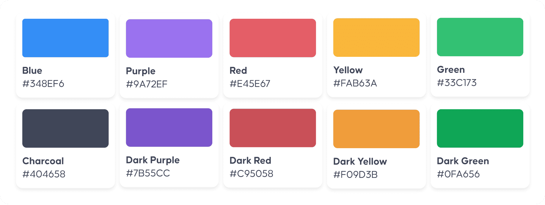
जैसे-जैसे हम बड़े होते गए, हमने इसकी व्यापकता सीखी अन्तरक्रियाशीलता में निहित भावना, तो हमारा रंग पैलेट भी है।
पारंपरिक नीले और पीले रंग से, नया लोगो रंग के 5 बोल्ड सेगमेंट में अपनी सीमा का विस्तार करता है, प्रत्येक भावनाओं और गुणों का प्रतिनिधित्व करता है:
- नीला खुफिया और सुरक्षा के लिए
- लाल जुनून और उत्साह के लिए
- हरा विकास और बहुमुखी प्रतिभा के लिए
- बैंगनी विश्वास और विलासिता के लिए
- पीला मित्रता और पहुंच के लिए
साथ में, रंगों की श्रेणी दर्शाती है विविधता सॉफ्टवेयर और उसके भीतर होने वाली प्रस्तुतियों के बारे में। हाई स्कूल में पाठ और बोर्ड रूम में बैठकों से लेकर क्विज़ नाइट्स, चर्च के उपदेश और गोद भराई तक, कनेक्टिविटी के रंग शक्तिशाली और प्रमुख रहते हैं।
#3: टाइपोग्राफी
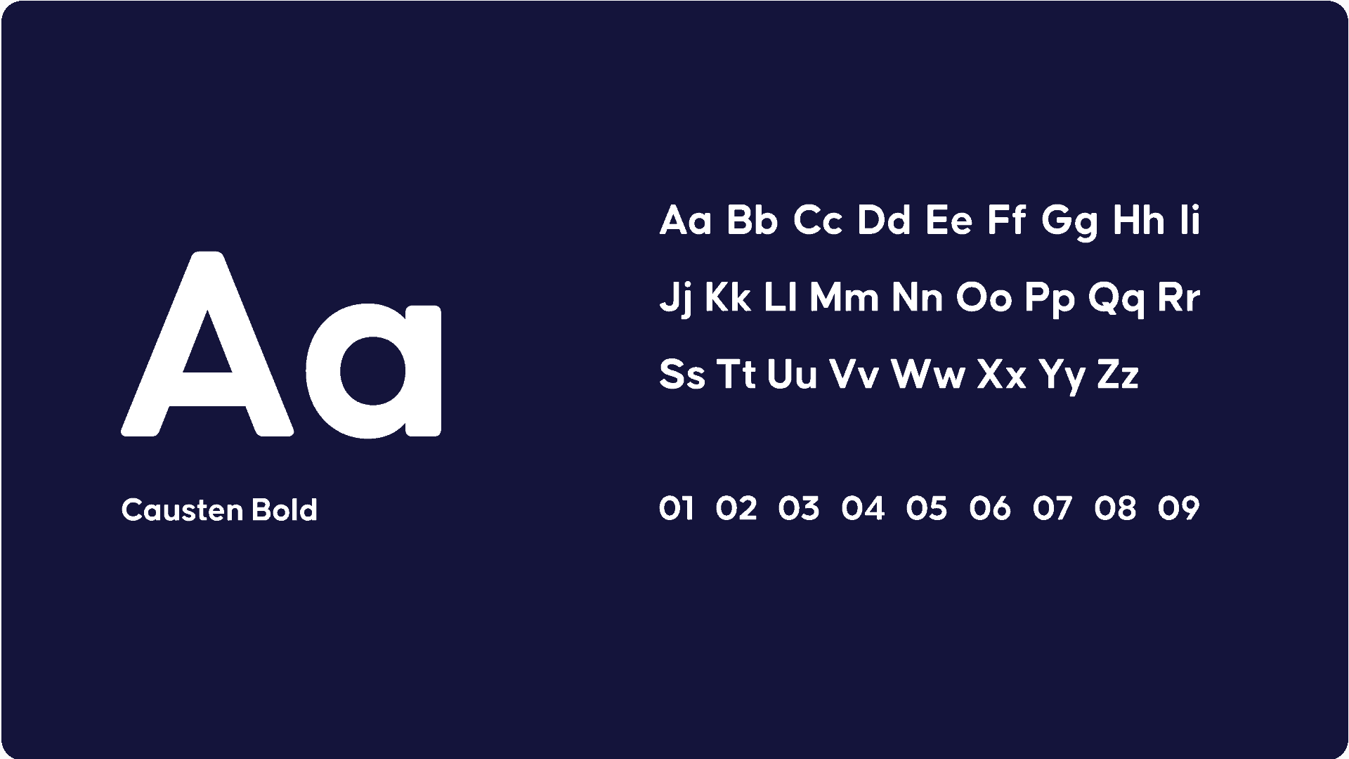
कॉस्टन फ़ॉन्ट लोगो में लालित्य, संरचना और आधुनिकता लाता है। यह एक ज्यामितीय सैंस सेरिफ़ फ़ॉन्ट है जिसमें एक साफ-सुथरी उपस्थिति और स्पष्ट दृश्यता है, जो इसे वेबसाइट, प्रस्तुतकर्ता ऐप और दर्शकों के ऐप पर अलग दिखने में मदद करती है।
ये तीनों तत्व मिलकर हमारा नया लोगो बनाते हैं...

लोगो की कहानी
हमारी ब्रांड पहचान को फिर से बनाना एक बड़ा उपक्रम था।
यह नवंबर 2020 में शुरू हुआ, जब हमारे प्रमुख डिजाइनर त्रंग त्रान कुछ शुरुआती विचारों को स्केच करना शुरू किया।
उन विचारों में मूल लोगो के चमकीले नीले और पीले तत्वों को लिया गया, लेकिन 'आनंद' की अवधारणा को अलग-अलग तरीकों से अभिव्यक्त किया गया:
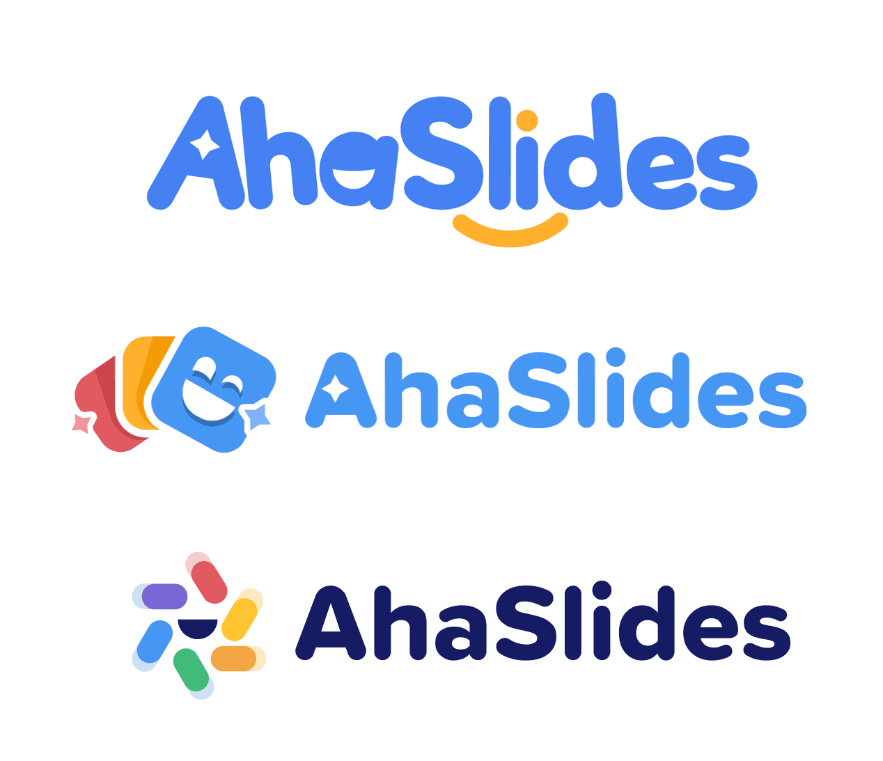
हमने यहां अंतिम संस्करण के साथ आगे बढ़ने का फैसला किया। हम जो खोज रहे थे, उसके लिए स्लीक फॉन्ट, डार्क टेक्स्ट और रंग की प्रचुरता एक बेहतरीन संयोजन साबित हुई।
ट्रांग ने पाया कि उसकी सबसे कठिन चुनौती थी लोगो चिह्नउन्होंने एक ऐसा सर्वव्यापी चिह्न बनाने के लिए अथक परिश्रम किया, जिसका उपयोग उन विचारों को प्रतिबिंबित करने के लिए किया जा सके जिनके लिए AhaSlides खड़ा है:
लोगो मार्क बनाना निश्चित रूप से इस प्रोजेक्ट का वह हिस्सा था जिस पर मैंने सबसे ज़्यादा समय लगाया। इसमें बहुत सारे अलग-अलग विचार समाहित होने चाहिए थे, लेकिन साथ ही यह सरल और आकर्षक भी होना चाहिए। मैं इस बात से बेहद खुश हूँ कि यह कैसे निकला!
त्रंग त्रान – मुख्य डिजाइनर
अगले कुछ हफ़्तों में, आप हमारी वेबसाइट, प्रेजेंटर ऐप और ऑडियंस ऐप पर नया लोगो अपडेट होते देखेंगे। अपडेट करते समय हम यथासंभव शांत रहेंगे ताकि आपके महत्वपूर्ण काम के दौरान हम आपको परेशान न करें।
AhaSlides को लगातार समर्थन देने के लिए धन्यवाद। हमें उम्मीद है कि आपको नया लोगो उतना ही पसंद आएगा जितना हमें!