AhaSlides में, हमारा लक्ष्य आपके और आपके दर्शकों के लिए प्रस्तुतियों को अधिक मज़ेदार, अधिक आकर्षक और अधिक फायदेमंद बनाना है। आज, हम अपने इस लक्ष्य की ओर एक बड़ा कदम उठा रहे हैं ब्रांड नई डिजाइन!
नया AhaSlides है नई कई मायनों में। हमने चीजों को अधिक व्यवस्थित, अधिक लचीला और अधिक सुविधाजनक बना दिया है us से पहले कभी।
दिमाग और इसके पीछे के हाथ हमारे डिजाइनर थे, ट्रांग:
मैंने AhaSlides के संचित दृष्टिकोण को लिया और उसमें अपने कुछ अंश जोड़े। हमने कुछ ऐसा बनाया है जो नए उपयोगकर्ताओं के लिए बहुत बढ़िया है, लेकिन साथ ही उन लोगों के लिए एक उचित और हार्दिक 'धन्यवाद' भी है जो पहले दिन से हमारे साथ हैं।
त्रंग त्रान - डिजाइनर
आइए देखें कि हमने क्या परिवर्तन किए हैं और वे किस प्रकार आपके दर्शकों के लिए बेहतर और स्मार्ट प्रस्तुतियाँ बनाने में आपकी मदद कर सकते हैं।
इसे जांचने के लिए खुजली? नीचे दिए गए बटन पर क्लिक करके जानें कि नया क्या है:
नया क्या है?
बेहतर लुक और फील 🤩
इस बार हमने कुछ और करने का निर्णय लिया... अपने बारे में।
ब्रांड की पहचान नए डिज़ाइन का एक बड़ा फ़ोकस पॉइंट था। जबकि अतीत में हम थोड़े आरक्षित रहे होंगे, अब हम इसके लिए तैयार हैं पिन.
हमारी नई पहचान के दृष्टिकोण को 3 भागों में विभाजित किया गया है:
#1 – चित्रण
जब हमने 2019 में शुरुआत की थी, तो सुंदर, रंगीन इमेजरी वास्तव में 'टू-डू लिस्ट' में सबसे ऊपर नहीं थी। हमने दिखावट के बजाय कार्यक्षमता को चुना।
अब, एक ठोस विकास टीम के साथ सुविधाओं को बनाने और सुधारने पर कड़ी मेहनत करने के साथ, हमारे प्रमुख डिजाइनर ट्रांग AhaSlides बनाने पर ध्यान केंद्रित कर सकते हैं अधिक आकर्षक। यह चित्रण और एनिमेशन के आसपास एक नई ब्रांड पहचान बनाने के लिए एक विशाल कार्य था, लेकिन एक यह कि प्यारा प्यारा का एक बड़ा पुस्तकालय हुआ:

पर नए चित्र के इन अन्य उदाहरणों की जाँच करें मेरी प्रस्तुतियाँ डैशबोर्ड और पेज साइन अप करें:
प्रत्येक चित्रण का अपना स्थान और भूमिका है। हमें लगता है कि यह हमारे नए और मौजूदा उपयोगकर्ताओं के लिए एक गर्मजोशी भरा स्वागत है, जो लॉग इन करते ही AhaSlides की चंचल भावना को देख सकते हैं।
डेव [एहास्लाइड्स के सीईओ] से बात करने के बाद, हमने फैसला किया कि हम चीजों को और अधिक जीवंत और अधिक चंचल बनाना चाहते हैं। जैसा कि आप देख सकते हैं, अब छवि अधिक गोल, अधिक प्यारी है, लेकिन हम इसे बहुत बचकाना नहीं बनाना चाहते थे। मुझे लगता है कि अब हमारे पास जो है वह एक है मज़ा और समारोह का अच्छा संतुलन.
त्रंग त्रान - डिजाइनर
#2 – रंग
कंपन नए डिज़ाइन के साथ वास्तव में यही कीवर्ड था। हम कुछ ऐसा चाहते थे जो अपनी जीवंतता से न शर्माए, और ऐसा कुछ जो लाइव दर्शकों के साथ साझा करने के लिए एक रोमांचक प्रस्तुति बनाने की खुशी को दर्शाता हो।
इसीलिए हमने दोगुना प्रयास किया मजबूत, बोल्ड रंग.
हमने अपने लोगो के हस्ताक्षर नीले और पीले रंग से लिए और अपने रंग पैलेट को लाल, नारंगी, हरे और बैंगनी रंगों में विस्तारित किया:
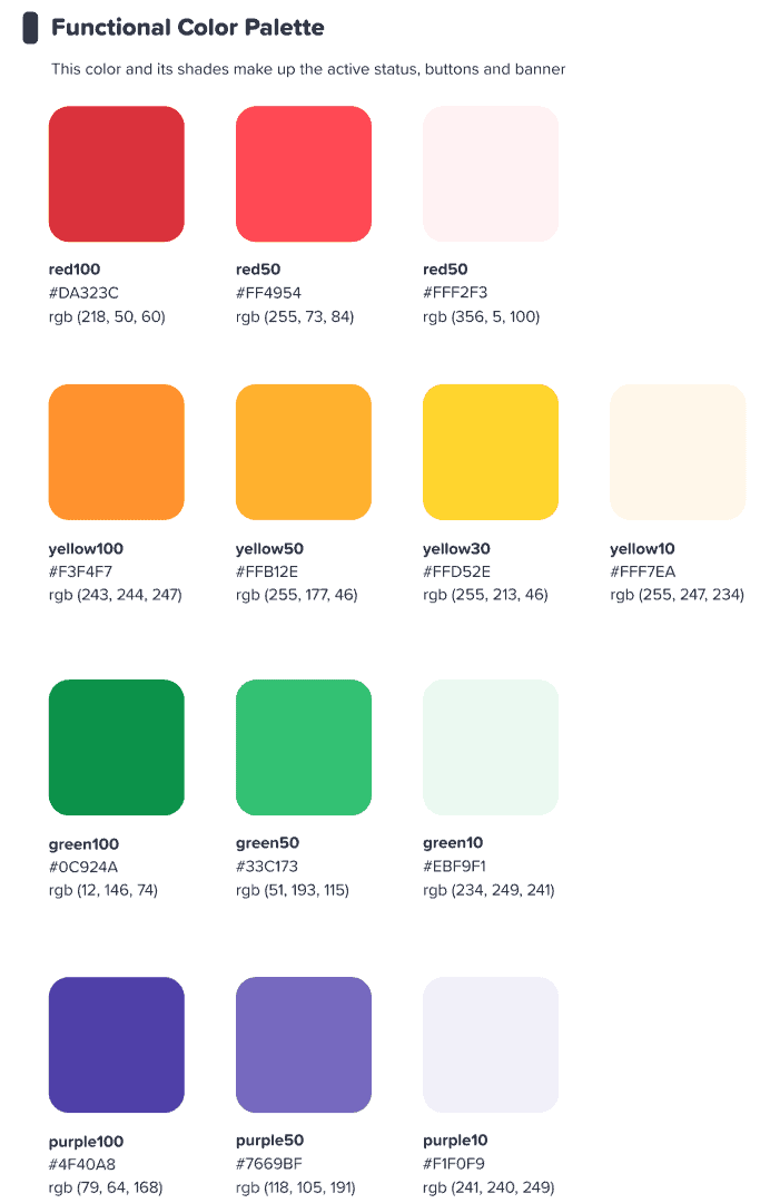
हम उम्मीद कर रहे थे कि यह रंगीन इंटरफ़ेस हमारे उपयोगकर्ताओं को प्रेरित करेगा कुछ शुरू करो रंग बिरंगा.
त्रंग त्रान - डिजाइनर
⭐ जल्द आ रहा है! ⭐ बेशक, हम अपने उपयोगकर्ताओं के लिए भी रंग पर अपना नया ध्यान केंद्रित करना चाहते थे। यही कारण है कि प्रस्तुतकर्ताओं के पास जल्द ही सूरज के नीचे किसी भी रंग का चयन करने का विकल्प होगा उनके पाठ के लिए:

#3 – सूचना वास्तुकला
यह बिना कहे चला जाता है कि एक नया रूप और एहसास होना चाहिए समारोह.
इसीलिए हमने इसमें बड़ा बदलाव किया है। IA (सूचना वास्तुकला) AhaSlides का। इसका मूल रूप से मतलब है कि हमने अपने सॉफ़्टवेयर के कुछ हिस्सों को फिर से व्यवस्थित और पुनः कल्पना की है ताकि उपयोगकर्ताओं को यह समझने में बेहतर मदद मिल सके कि वे क्या कर रहे हैं।
हम जो कहना चाहते हैं उसका एक उदाहरण यहां दिया गया है - पुराने और नए वर्तमान बटन:

पसंद सब नए डिजाइन में बटन, ऊपर वाले के पास केवल एक के रूप में वर्णित किया जा सकता है अधिक बटन-वाई महसूसहमने कई चयन विकल्पों में एक समान छाया और चमक जोड़ी है, न केवल उन्हें वास्तविक अनुभव देने के लिए, बल्कि IA में सुधार करने के लिए भी, ताकि उपयोगकर्ता बेहतर ढंग से समझ सकें कि क्या चुना गया है और उनका ध्यान कहाँ होना चाहिए।
और क्या? ठीक है, आप इस छवि में कुछ IA परिवर्तन देख सकते हैं:
बटन के अलावा, हमने निम्नलिखित तरीकों से और भी सुधार किए हैं:
- व्यक्तिगत बक्से प्रत्येक तत्व को अलग करने में मदद करने के लिए।
- बोल्ड अक्षर खाली बॉक्स के फीके पाठ से इनपुट की गई जानकारी को अलग करता है।
- प्रतीक और रंग सूचना बक्से को बाहर खड़े होने की अनुमति दें।
सूचना वास्तुकला में परिवर्तन सूक्ष्म हो सकते हैं, लेकिन यही मेरा इरादा था। मैं नहीं चाहता था कि हमारे उपयोगकर्ताओं को एक नए घर में जाना पड़े, मैं बस छोटे-छोटे तरीकों से उस घर को सजाना चाहता था जिसमें वे पहले से ही रह रहे हैं।
त्रंग त्रान - डिजाइनर
बेहतर संगठन, चिकनी नेविगेशन other
जैसा कि हमने कहा - चीजों को सुंदर बनाने का क्या मतलब है, अगर इसके साथ-साथ कार्यक्षमता में सुधार न हो?
यहीं पर हमारा दूसरा बड़ा परिवर्तन आता है। हमने ढेर सारा डिजिटल फर्नीचर खरीदा है और अस्त-व्यस्त सामान को व्यवस्थित किया है।
आइए उन 4 क्षेत्रों पर नज़र डालें जहां हमने सुधार किए हैं:
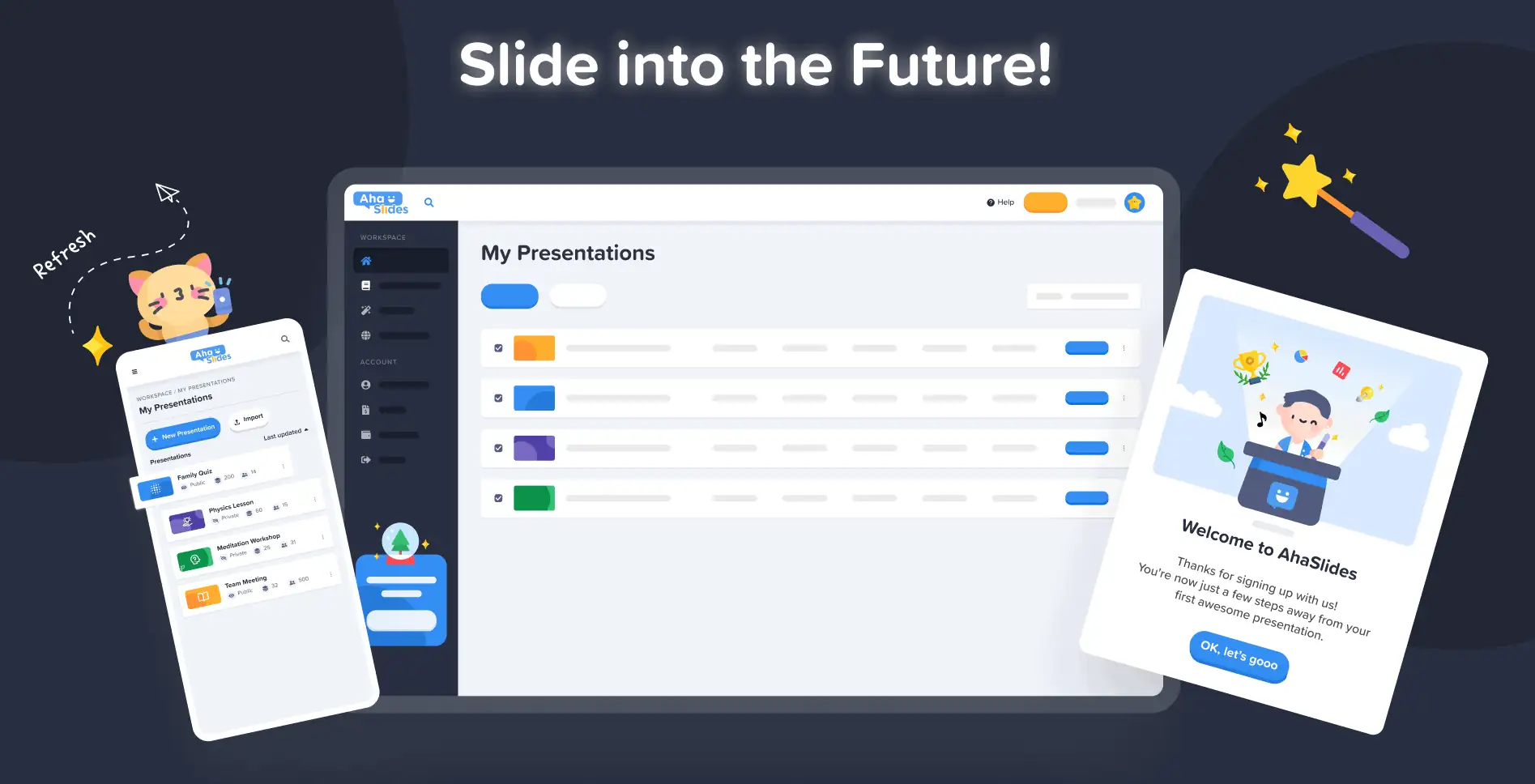
#1 – मेरा प्रेजेंटेशन डैशबोर्ड
ठीक है, हम मानते हैं - डैशबोर्ड के पुराने डिज़ाइन पर अपनी प्रस्तुतियों को ढूंढना और व्यवस्थित करना हमेशा आसान काम नहीं था।
सौभाग्य से, हमने नए डैशबोर्ड पर बहुत कुछ बदल दिया है...
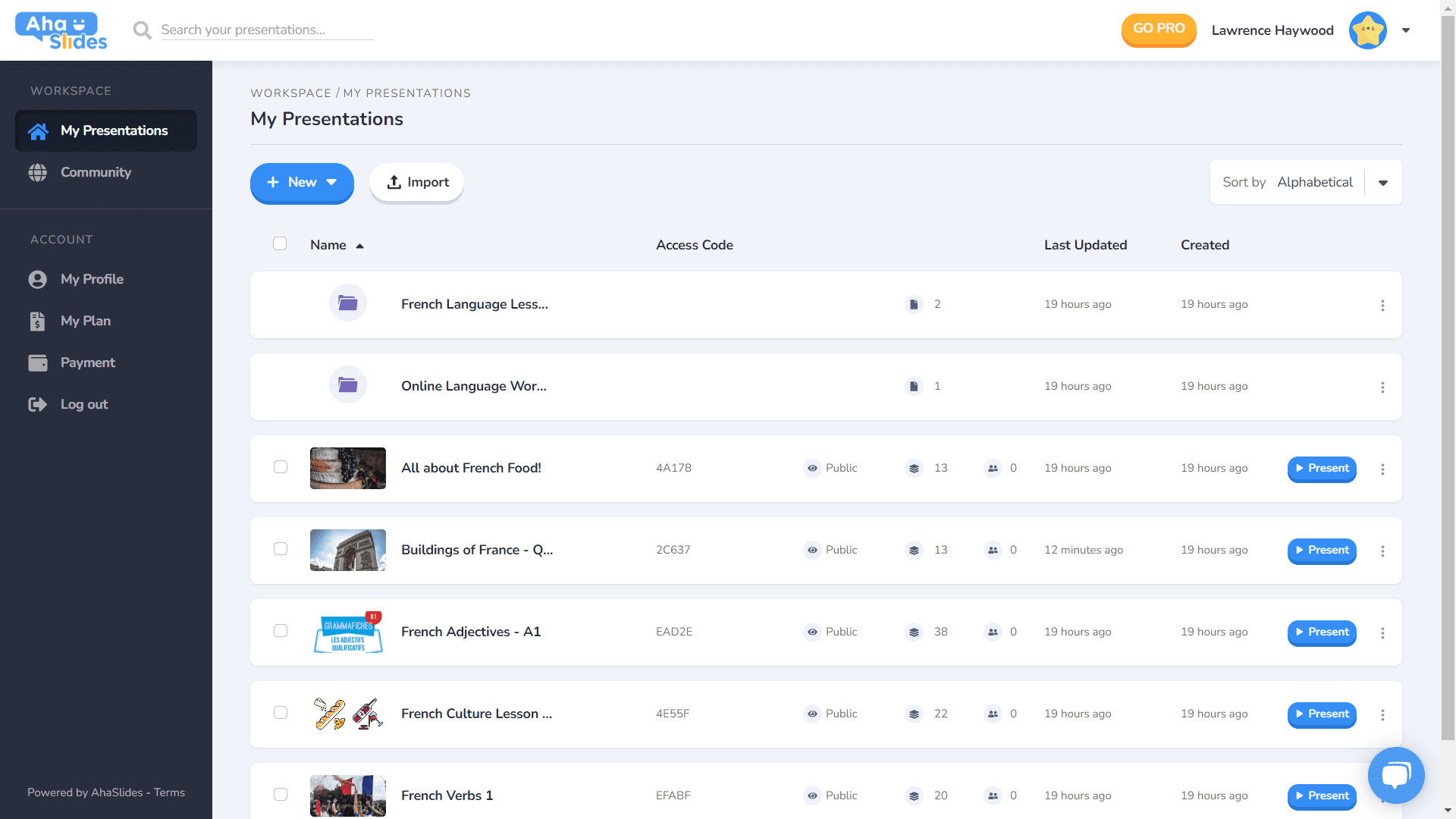
- प्रत्येक प्रस्तुति का अपना कंटेनर होता है।
- कंटेनरों में अब थंबनेल चित्र हैं (थंबनेल आपकी प्रस्तुति की पहली छवि होगी)।
- प्रस्तुति विकल्प (डुप्लिकेट, इरेज़ डेटा, डिलीट आदि) अब एक साफ कबाब मेनू में हैं।
- आपकी प्रस्तुतियों के लिए सॉर्ट करने और खोजने के और भी तरीके हैं।
- आपका 'कार्यक्षेत्र' और आपका 'खाता' अब बाएं कॉलम में अलग हो गए हैं।
⭐जल्द आ रहा है!⭐ निकट भविष्य में एक नया डैशबोर्ड दृश्य विकल्प होगा – जाली देखना! यह दृश्य आपको छवि-केंद्रित ग्रिड प्रारूप में अपनी प्रस्तुतियाँ देखने देता है। आप किसी भी समय ग्रिड दृश्य और डिफ़ॉल्ट सूची दृश्य के बीच स्वैप कर सकते हैं।
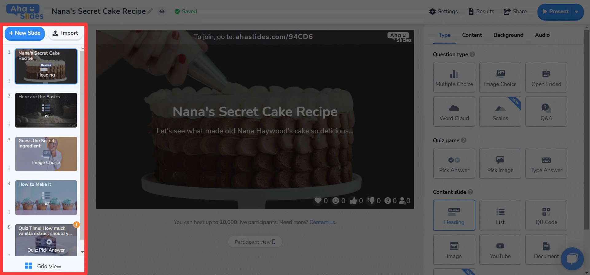
#2 – संपादक शीर्ष बार
हमने संपादक स्क्रीन पर शीर्ष पट्टी के साथ कुछ चीजों में फेरबदल किया है...

- शीर्ष बार में विकल्पों की संख्या 4 से घटकर 3 हो गई है।
- प्रत्येक विकल्प के लिए ड्रॉपडाउन मेनू बेहतर संगठन प्रदान करता है।
- ड्रॉपडाउन की चौड़ाई यह सुनिश्चित करने के लिए बदल गई है कि मेनू सही कॉलम में फिट होगा।
#3 – संपादक बायां कॉलम
आपके प्रेजेंटेशन कंटेंट कॉलम में सरल, आकर्षक डिज़ाइन। ग्रिड व्यू का भी बिल्कुल नया रूप है...
- स्लाइड विकल्पों को अब एक कबाब मेनू में घोषित किया गया है।
- नीचे एक नया ग्रिड व्यू बटन बटन जोड़ा गया है।
- ग्रिड व्यू के लेआउट और संचालन में बहुत सुधार हुआ है।
⭐ जल्द आ रहा है! ⭐ दायां कॉलम अभी तक पूरा नहीं हुआ है, लेकिन आप शीघ्र ही वहां क्या देखने की उम्मीद कर सकते हैं, वह यहां दिया गया है!
#4 – संपादक दायाँ कॉलम
आइकन में छोटे परिवर्तन, टेक्स्ट के रंग में बड़े परिवर्तन...
- प्रत्येक स्लाइड प्रकार के लिए पुन: डिज़ाइन किए गए आइकन।
- पाठ रंग विकल्पों की एक विशाल विविधता।
- 'सामग्री' टैब में तत्वों को पुनः क्रमित किया गया।
कहीं भी, किसी भी डिवाइस पर संपादित करें Any
हमारे उन 28% उपयोगकर्ताओं के लिए जो मोबाइल पर अपनी प्रस्तुतियाँ संपादित करते हैं, हमें खेद है कि हमने इतने लंबे समय तक आपकी उपेक्षा की ????
नए डिजाइन के साथ, हम अपने मोबाइल और टैबलेट उपयोगकर्ताओं को एक ऐसा मंच प्रदान करना चाहते थे जो बस डेस्कटॉप के रूप में उत्तरदायी। इसका मतलब यह था कि हमारे उपयोगकर्ताओं को यह सुनिश्चित करने के लिए हर तत्व को पुनर्विचार करना चाहिए।
बेशक, यह सब के साथ शुरू होता है डैशबोर्डहमने यहां कुछ बदलाव किए हैं...

आपकी प्रस्तुतियों और फ़ोल्डरों के बारे में सबसे महत्वपूर्ण जानकारी यहाँ प्रदर्शित होती है। दाईं ओर कबाब मेनू भी है जो सभी प्रस्तुति सेटिंग्स को व्यवस्थित रखता है।
On la संपादक, आपका स्वागत एक और अधिक मैत्रीपूर्ण इंटरफ़ेस के साथ किया जाता है।
फिर से, कबाब मेनू में सब कुछ दूर tucked है। ऐसा करने से ध्यान भंग होता है और आपकी समग्र प्रस्तुति को देखने के लिए आपको बहुत अधिक जगह मिलती है।

क्या यह स्पष्ट हो रहा है कि हमें कबाब बहुत पसंद है? हमने पुराने भीड़भाड़ वाले टॉप बार की जगह, हाँ, एक और कबाब मेनू ला दिया है! यह एक बेहतरीन कबाब मेनू है! बहुत कम भारी इंटरफ़ेस और आपको अपनी प्रस्तुति की गुणवत्ता पर ध्यान केंद्रित करने देता है।

मैं वास्तव में कुछ सीमाओं को दूर करना चाहता था जो हमारे मोबाइल उपयोगकर्ताओं को अपनी मनचाही प्रस्तुतियाँ बनाने से रोकते हैं। हमने पहले से ज़्यादा आकर्षक और सरल कुछ चुना, लेकिन फिर भी हमारे पास कुछ कमी है बड़ी योजना भविष्य में AhaSlides की मोबाइल क्षमताओं के लिए!
त्रंग त्रान - डिजाइनर

अभी तक कोशिश की?
बस देखने के लिए नीचे दिए गए बटन पर क्लिक करें
AhaSlides का नया डिज़ाइन!