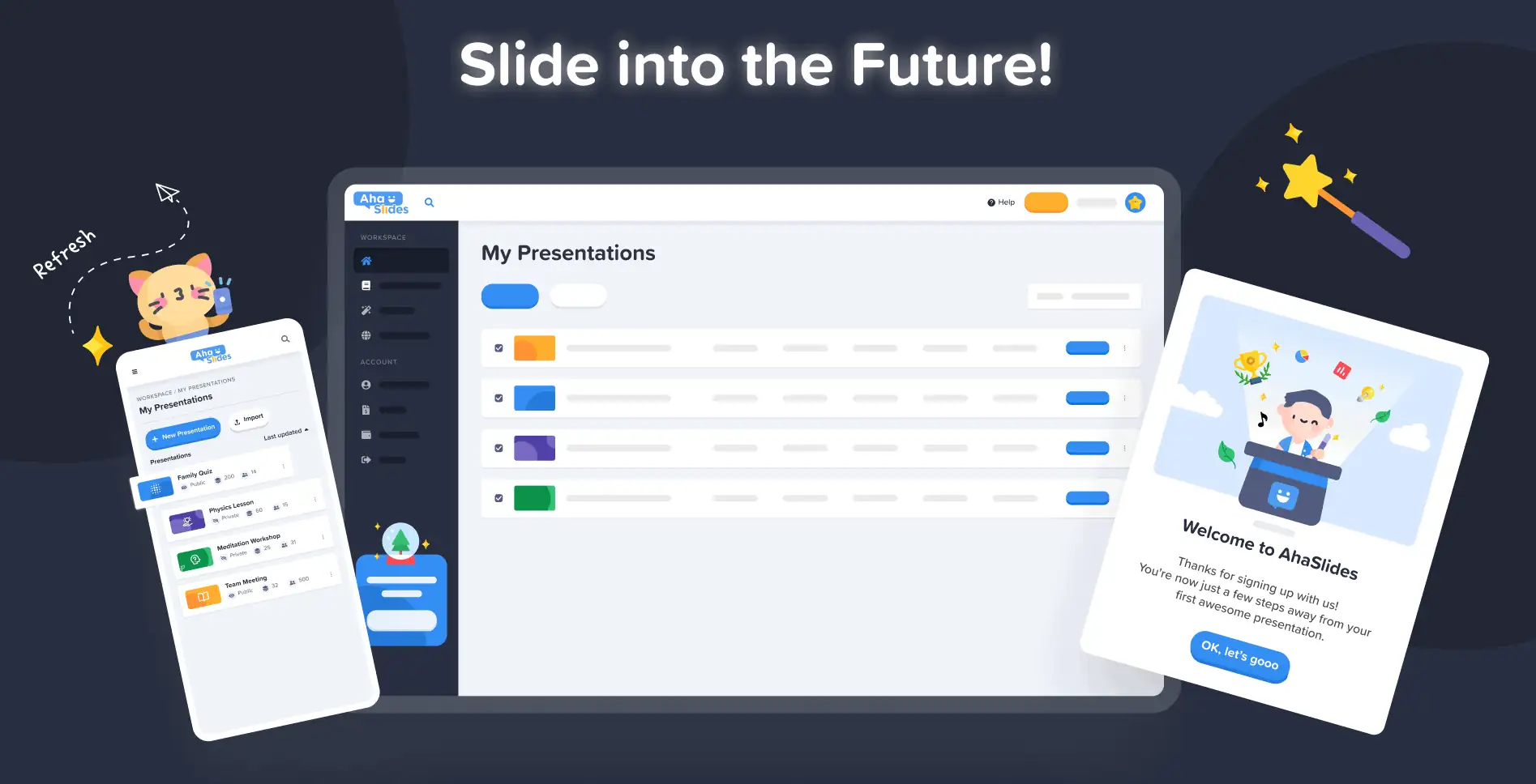
AhaSlides-ում մեր նպատակն է պրեզենտացիաները դարձնել ավելի զվարճալի, ավելի գրավիչ և ավելի պարգևատրելի ձեր և ձեր լսարանի համար: Այսօր մենք հսկայական քայլ ենք անում դեպի դա մեր կողմից բոլորովին նոր դիզայն!
Նոր AhaSlides-ն է նոր այնքան շատ առումներով։ Մենք ամեն ինչ դարձրել ենք ավելի կազմակերպված, ավելի ճկուն և ավելի us քան երբեւէ նախկինում:
Ուղեղն ու ձեռքերը դրա ամեն ինչի ետևում մեր դիզայներն էին, Trang:
Ես վերցրեցի AhaSlides-ի կուտակած տեսլականը և ավելացրի իմ սեփականը։ Մենք ստացանք մի բան, որը հիանալի է նոր օգտատերերի համար, բայց նաև տեղին և սրտանց «շնորհակալություն» նրանց, ովքեր մեզ հետ են եղել առաջին օրվանից։
Տրանգ Տրան – Դիզայներ
Եկեք նայենք, թե ինչ փոփոխություններ ենք կատարել և թե ինչպես դրանք կարող են օգնել ձեզ ստեղծել ավելի խելացի և ավելի լավ ներկայացումներ ձեր լսարանի համար։
Քոր է՞ ստուգել: Բացահայտեք նորույթները՝ սեղմելով ստորև նշված կոճակը։
Ինչ նորություն կա?
- Բարելավված տեսք և զգացում
- Ավելի լավ կազմակերպում, ավելի սահուն նավիգացիա
- Խմբագրել ցանկացած վայրում, ցանկացած սարքում
Բարելավված տեսք և զգացում
Այս անգամ մենք որոշեցինք ընտրել մի բան, որը մի փոքր ավելի… մեզ է բնորոշ։
Ապրանքանիշի ինքնությունը նոր դիզայնի մեծ ուշադրության կենտրոնում էր։ Մինչդեռ անցյալում մենք մի փոքր զուսպ էինք, հիմա մենք պատրաստ ենք լինել համարձակ.
Մեր նոր ինքնության մոտեցումը բաժանված է 3 մասի.
#1 – Նկարազարդում
Երբ մենք սկսեցինք 2019 թվականին, գեղեցիկ, գունագեղ պատկերները այդքան էլ բարձր տեղ չէին զբաղեցնում «անելիքների ցանկում»։ Մենք նախընտրեցինք ֆունկցիոնալությունը՝ արտաքին տեսքի փոխարեն։
Այժմ, երբ զարգացող թիմը քրտնաջան աշխատում է հնարավորությունների ստեղծման և բարելավման վրա, մեր գլխավոր դիզայներ Թրանգը կարող է կենտրոնանալ AhaSlides-ի ստեղծման վրա: ավելի գրավիչ, Նկարազարդումների և անիմացիաների շուրջ նոր բրենդային ինքնություն ձևավորելը մամոնտի խնդիր էր, բայց արդյունքում ստացվեց գեղեցիկ դիզայնի հիանալի գրադարան.

Տեսեք նոր նկարազարդումների այս այլ օրինակները Իմ շնորհանդեսների վահանակ եւ Գրանցվել էջը:
Յուրաքանչյուր նկարազարդում ունի իր տեղն ու դերը: Մենք կարծում ենք, որ սա ավելի ջերմ ողջույն է մեր նոր և ներկա օգտատերերի համար, ովքեր կարող են տեսնել AhaSlides-ի խաղային ոգին մուտք գործելուն պես:
Դեյվի [AhaSlides-ի գործադիր տնօրեն] հետ խոսելուց հետո մենք որոշեցինք, որ ուզում ենք ամեն ինչ ավելի վառ և խաղային դարձնել։ Ինչպես տեսնում եք, պատկերները հիմա ավելի կլորավուն են, ավելի խելոք, բայց մենք չէինք ուզում այն չափազանց մանկական դարձնել։ Կարծում եմ՝ այն, ինչ մենք հիմա ունենք, զվարճանքի և գործառույթի լավ հավասարակշռություն.
Տրանգ Տրան – Դիզայներ
#2 – Գույն
Կենսունակություն իսկապես սա էր նոր դիզայնի գլխավոր բանալի բառը։ Մենք ուզում էինք մի բան, որը չէր խուսափում իր կենսունակությունից և որը կարտացոլեր հետաքրքիր ներկայացում ստեղծելու ուրախությունը՝ ուղիղ լսարանի հետ կիսվելու համար։
Ահա թե ինչու մենք կրկնապատկեցինք ուժեղ, համարձակ գույներ.
Մենք բաժանվեցինք մեր լոգոյի կապույտ և դեղին ստորագրություններից և մեր գունապնակը տարածեցինք կարմիր, նարնջագույն, կանաչ և մանուշակագույն երանգների վրա.
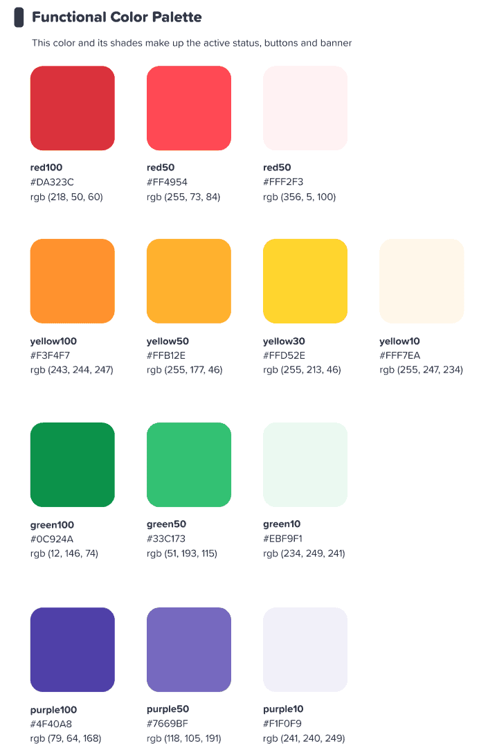
Մենք հույս ունեինք, որ այս գունագեղ ինտերֆեյսը ոգեշնչի մեր օգտվողներին ինչ-որ բան սկսել գունագեղ.
Տրանգ Տրան – Դիզայներ
⭐ Շուտով! ⭐ Իհարկե, մենք ցանկանում էինք մեր նոր ուշադրությունը գույնի վրա տարածել նաև մեր օգտատերերի վրա։ Ահա թե ինչու հաղորդավարները շուտով կունենան ցանկացած գույն ընտրելու հնարավորություն։ իրենց տեքստի համար:

#3 – Տեղեկատվական ճարտարապետություն
Անշուշտ ասվում է, որ նոր տեսքն ու զգացողությունը պետք է ունենան ա ֆունկցիա.
Ահա թե ինչու մենք մեծ փոփոխություն կատարեցինք IA (Տեղեկատվություն Ճարտարապետություն) AhaSlides-ի։ Սա հիմնականում նշանակում է, որ մենք վերադասավորել և վերաիմաստավորել ենք մեր ծրագրաշարի որոշ մասեր՝ օգտատերերին ավելի լավ օգնելու հասկանալ, թե ինչ են անում։
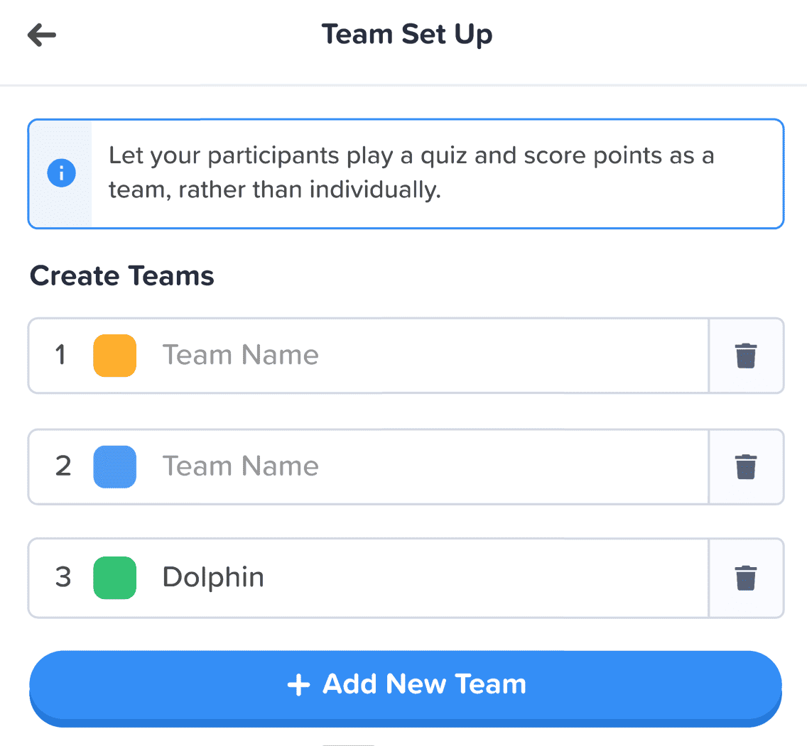
Ահա մեկ օրինակ, թե ինչ ենք նկատի ունենում՝ հին և նոր նվերների կոճակները։

նման բոլորը Նոր դիզայնի կոճակները, վերը նշվածները ունեն այն, ինչը մենք կարող ենք միայն նկարագրել որպես a ավելին կոճակով զգացողությունՄենք նմանատիպ ստվեր և փայլ ենք ավելացրել բազմաթիվ ընտրության տարբերակների վրա՝ ոչ միայն դրանց իրական տեսք հաղորդելու, այլև IA-ն բարելավելու համար, որպեսզի օգտատերերն ավելի լավ հասկանան, թե ինչ է ընտրված և որտեղ պետք է կենտրոնանան։
Էլ ինչ? Դե, այս պատկերում կարող եք տեսնել մի քանի IA փոփոխություններ.
Կոճակից բացի, մենք ավելի շատ բարելավումներ ենք կատարել հետևյալ առումներով.
- Անհատական տուփեր օգնելու առանձնացնել յուրաքանչյուր տարր:
- Bold տեքստը տարբերակում է մուտքագրված տեղեկատվությունը դատարկ տուփի խունացած տեքստից:
- Սրբապատկերներ և գույները թույլ տալ, որ տեղեկատվական տուփերն առանձնանան:
Տեղեկատվական ճարտարապետության փոփոխությունները կարող են աննշան լինել, բայց դա իմ մտադրությունն էր։ Ես չէի ուզում, որ մեր օգտատերերը ստիպված լինեին տեղափոխվել նոր տուն, ես պարզապես ուզում էի փոքր-ինչ զարդարել այն տունը, որտեղ նրանք արդեն ապրում են։
Տրանգ Տրան – Դիզայներ
Ավելի լավ կազմակերպում, ավելի սահուն նավիգացիա
Ինչպես ասացինք՝ ի՞նչ իմաստ ունի իրերն ավելի գեղեցիկ դարձնելը, եթե ֆունկցիոնալությունը դրան զուգահեռ չի բարելավվում։
Ահա թե որտեղ է մեր երկրորդ մեծ փոփոխությունը։ Մենք գնել ենք թվային կահույքի մի կույտ և դասավորել ենք անկարգությունը։
Եկեք նայենք 4 ոլորտների, որտեղ մենք բարելավումներ ենք կատարել:
- Իմ շնորհանդեսների կառավարման վահանակ
- Խմբագրի վերին շարքը
- Խմբագիր ձախ սյունակ
- Խմբագիր աջ սյունակ (շուտով!)
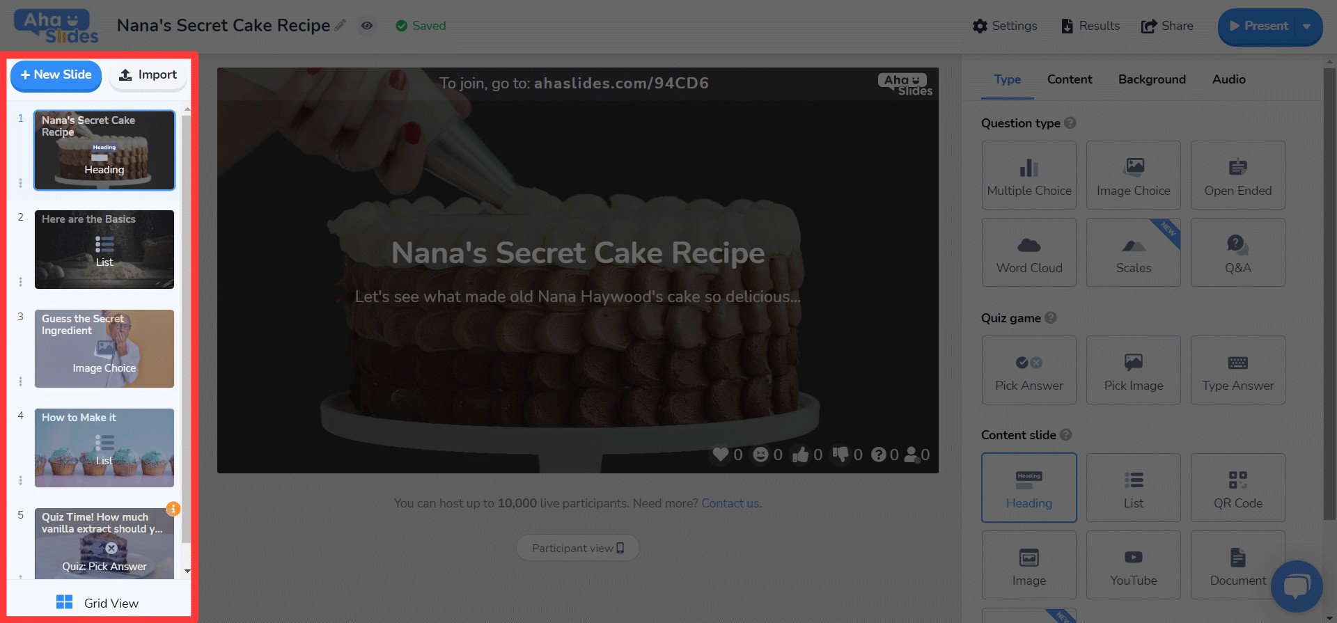
#1 – Իմ ներկայացումների վահանակ
Լավ, խոստովանում ենք՝ միշտ չէ, որ ամենահեշտ բանը եղել է վահանակի հին դիզայնի վրա ներկայացումներ գտնելն ու դասավորելը։
Բարեբախտաբար, մենք մեծ փոփոխություններ ենք կատարել նոր վահանակում…
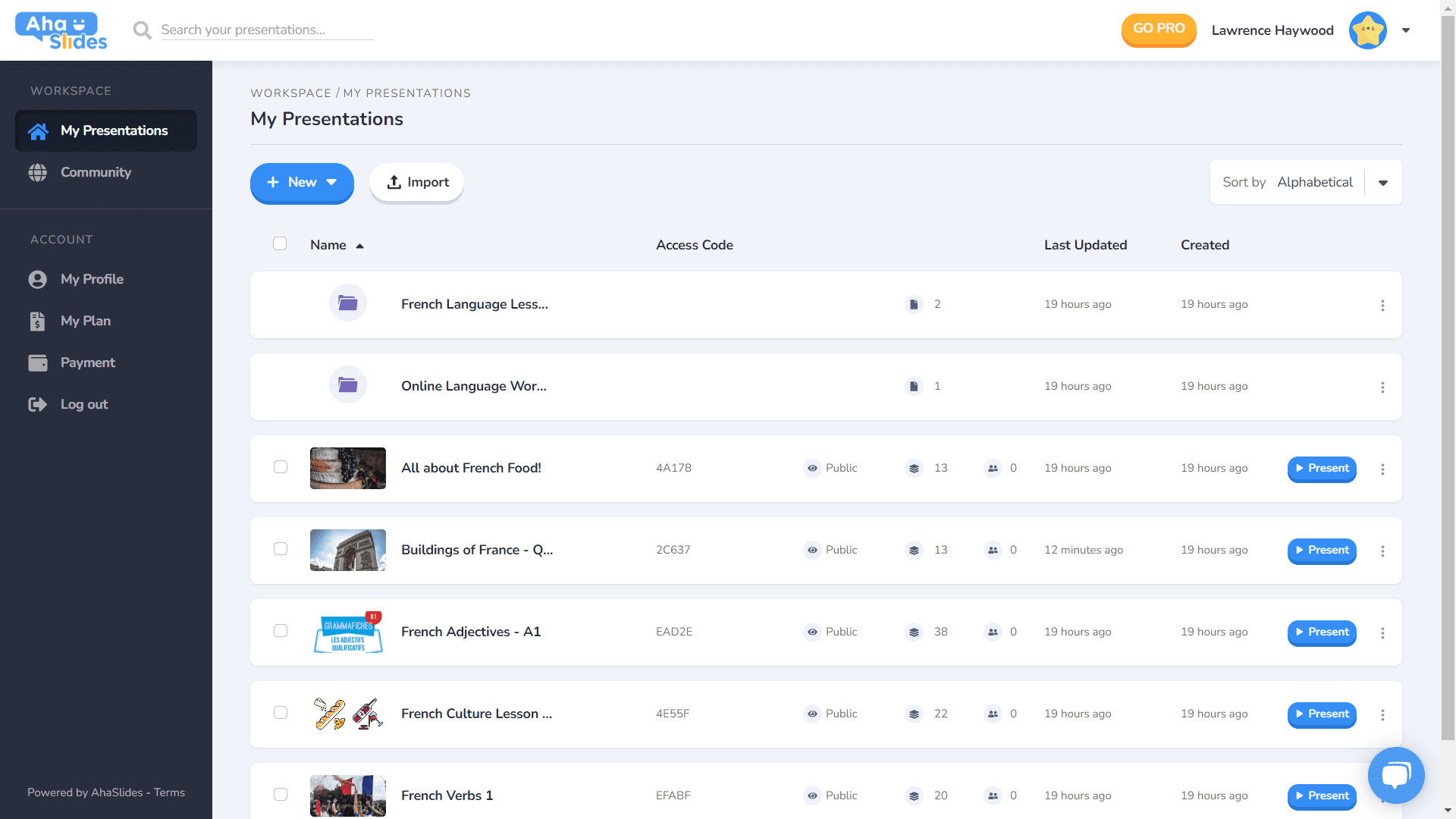
- Յուրաքանչյուր ներկայացում ունի իր սեփական տարան:
- Բեռնարկղերն այժմ ունեն մանրապատկերների պատկերներ (մանրապատկերը կլինի ձեր ներկայացման առաջին պատկերը):
- Ներկայացման ընտրանքները (կրկնօրինակեք, ջնջեք տվյալները, ջնջեք և այլն) այժմ գտնվում են կոկիկ կոկիկ ընտրացանկում:
- Ձեր ներկայացումները դասավորելու և որոնելու ավելի շատ եղանակներ կան:
- Ձեր «Աշխատանքային տարածքը» և ձեր «Հաշիվը» այժմ առանձնացված են ձախ սյունակում։
⭐Շուտով!⭐ Մոտ ապագայում կլինի նոր վահանակի դիտման տարբերակ՝ Ցանց Դիտել! Այս տեսքը հնարավորություն է տալիս տեսնել ձեր ներկայացումները պատկերակենտրոն ցանցի ձևաչափով: Gանկացած պահի կարող եք փոխել Grid View- ի և լռելյայն List View- ի միջև:
#2 – Խմբագրի վերին վահանակ
Մենք խմբագրիչի էկրանի վերին գոտու հետ կապված մի քանի բան վերադասավորել ենք…

- Վերին տողի ընտրանքների քանակը կրճատվել է 4-ից 3-ի:
- Յուրաքանչյուր տարբերակի բացվող ընտրացանկերն առաջարկում են ավելի լավ կազմակերպում:
- Theանկի բացման լայնությունը փոխվել է `ապահովելու համար, որ ընտրացանկը տեղավորվի աջ սյունակում:
#3 – Խմբագրի ձախ սյունակ
Ավելի պարզ, ավելի նրբագեղ դիզայն ձեր ներկայացման բովանդակության սյունակում: Ցանցային տեսքը նույնպես ունի բոլորովին նոր տեսք…
- Սլայդի ընտրանքները այժմ խառնաշփոթ են քյաբաբի ընտրացանկում:
- Ներքևում ավելացվել է Grid View կոճակի նոր կոճակ:
- Grid View- ի դասավորությունը և աշխատանքը զգալիորեն բարելավվել է:
⭐ Շուտով! ⭐ Աջ սյունակը դեռ լիովին պատրաստ չէ, բայց ահա թե ինչ կարող եք ակնկալել այնտեղ շուտով տեսնել։
#4 – Խմբագրի աջ սյունակ
Փոքր փոփոխություններ պատկերակներում, մեծ փոփոխություններ տեքստի գույնի մեջ…
- Յուրաքանչյուր սլայդի տեսակի համար նորովի մշակված պատկերակներ:
- Տեքստի գույնի ընտրանքների զանգվածային բազմազանություն:
- «Բովանդակություն» ներդիրում տարրերը վերադասավորվել են։
Խմբագրել ցանկացած վայրում, ցանկացած սարքի վրա
Մեր օգտատերերի այն 28%-ի համար, ովքեր իրենց շնորհանդեսները խմբագրում են բջջային հեռախոսով, մենք ներողություն ենք խնդրում ձեզ այդքան երկար անտեսելու համար։ 😞
Նոր դիզայնով մենք ցանկանում էինք մեր բջջային և պլանշետային օգտատերերին տրամադրել մի հարթակ, որը նույնքան պատասխանատու, որքան աշխատասեղանը, Դա նշանակում էր վերանայել յուրաքանչյուր տարր ՝ համոզվելու համար, որ մեր օգտվողները կարող են խմբագրել ճանապարհորդության ընթացքում:
Իհարկե, ամեն ինչ սկսվում է դրանից վահանակՄենք այստեղ մի քանի փոփոխություն ենք կատարել…

Այստեղ ցուցադրվում են ձեր շնորհանդեսների և թղթապանակների վերաբերյալ ամենակարևոր տեղեկությունները: Աջ կողմում կա նաև քյաբաբի ցանկ, որը կազմակերպված է պահում շնորհանդեսի բոլոր կարգավորումները:
On որ խմբագիր, ձեզ կդիմավորի մեկ այլ, ավելի բարեկամական ինտերֆեյս։
Կրկին ամեն ինչ խրված է քյաբաբի ընտրացանկերի մեջ: Դա անելով ՝ մաքրվում են շեղումները և ձեզ շատ ավելի շատ տեղ է մնում ՝ ձեր ընդհանուր ներկայացումը դիտելու համար:

Ակնհայտ է դառնում, որ մենք սիրում ենք քյաբաբներ։ Մենք փոխարինել ենք հին, գերբնակեցված վերևի բարը, այո, մեկ այլ քյաբաբի ճաշացանկով։ Դա ստեղծում է... շատ ավելի քիչ ճնշող ինտերֆեյս և թույլ է տալիս կենտրոնանալ ձեր ներկայացման որակի վրա:

Ես իսկապես ուզում էի վերացնել որոշ սահմանափակումներ որոնք խանգարում են մեր բջջային օգտատերերին ստեղծել իրենց ուզած շնորհանդեսները: Մենք ընտրեցինք ավելի նրբագեղ և պարզ մի բան, քան նախկինում, բայց մենք դեռ ունենք մեծ ծրագրեր AhaSlides-ի բջջային հնարավորությունների համար ապագայում:
Տրանգ Տրան – Դիզայներ

Փորձեցի՞ք դեռ
Պարզապես կտտացրեք ներքևի կոճակին ՝ տեսնելու համար
AhaSlides-ի վերափոխված դիզայնը!