

最初から最後まで本当にあなたの注意を引きつけた最後のプレゼンテーションを思い出してみてください。おそらくそれは、ほとんどのプレゼンテーションよりも短く、予想よりもスライドの枚数が少なく、画面上の文字は目を凝らさなくても読めるほど大きかったでしょう。この組み合わせは偶然ではありません。それは意図的な制約の結果なのです。
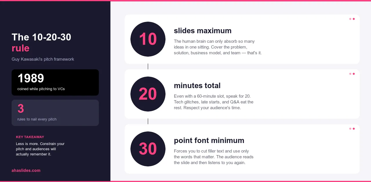
10-20-30ルールは、聴衆を失うことの代償が即座に目に見える投資家向けプレゼンテーションのために、ガイ・カワサキによって考案されました。この論理は非常に汎用性が高く、プロのプレゼンテーションにおいて最も広く用いられているフレームワークの一つとなりました。スライド10枚、20分、フォントサイズは最低30ポイント。この3つの数字が、プレゼンテーションが記憶に残らない原因となる問題のほとんどを解決します。
このガイドでは、それぞれの制約がなぜ機能するのか、それらがどのように相互作用するのか、そして投資家へのプレゼンテーション、従業員研修、懐疑的な意思決定者を前にした説明など、作成するあらゆるプレゼンテーションにこのフレームワークをどのように適用するかを解説します。
このルールが解決するために作られた問題
ほとんどの人が、まるで罰を受けているかのようなプレゼンテーションを経験したことがあるだろう。60ページにも及ぶスライド。8ポイントのフォントでびっしりと書かれた段落。発表者は画面をそのまま読み上げるが、聴衆は発表者よりも速く読み終え、残りの時間を次のスライドを待つことに費やす。何も心に響かず、何も記憶に残らない。結局、誰もが、きちんと書かれたメールから得られる情報よりも少ないものしか得られずに会場を後にするのだ。
これは稀な失敗例ではなく、むしろデフォルトの状態です。ほとんどのプレゼンテーションソフトウェアはスライドの追加やテキストの追加を容易にするため、結果としてプレゼンテーションはどちらも過剰になりがちです。プレゼンテーションという媒体は、包括性が安全だと感じられるため、包括性へと傾倒していきます。削ることは何かを失うように感じられますが、そうではありません。それは編集であり、編集こそがプレゼンテーションを機能させる鍵なのです。
10-20-30ルールは、こうした方向性のずれを是正するためのものです。外部から課せられる創造的な制約ではなく、あらゆる決定を同じ方向へ導くための一連の制限です。つまり、話し手が主張を展開し、スライドがそれを裏付けるという、逆の構図ではなく、話し手が主張を展開し、スライドがそれを裏付けるというプレゼンテーションを目指すためのものです。
10-20-30 ルールとは何ですか?
このルールは3つの部分から構成されており、それぞれがプレゼンテーションでよくある失敗の異なるパターンに対処している。
スライドは最大10枚まで。10枚が目標ではなく、上限です。この制約によって、ほとんどのプレゼンテーションでは身につかないような編集規律が身につきます。つまり、関連する可能性のあるものをすべて含めるのではなく、何が重要かを判断しなければならないのです。すべてを収めることができない場合は、優先順位をつけざるを得ません。その過程を経て残るものは、ほぼ間違いなく、最初に用意したものよりも優れたものになります。
最大でも20分。聴衆が休憩なしで集中力を維持できるおおよその時間です。20分を超えると、集中力は徐々に低下するのではなく、より急激に低下します。また、20分のプレゼンテーションはスケジュールに組み込みやすく、60分のセッションでは伝わらない、聴衆の時間を尊重しているという印象を与えます。
フォントサイズは最低30ポイントにしましょう。文字が小さいのは、デザイン上の選択ではなく、問題の原因です。プレゼンターはスライドに多くの内容を詰め込むために文字を小さくしますが、これは読み上げられる内容が増えることを意味し、結果として聴衆は誰かが話しているのを聞くのではなく、誰かが読んでいるのを見ることになります。30ポイントという最小サイズは、スライドがプレゼンテーションそのものになるのを防ぎます。このサイズでは段落を収めることができません。そのため、詳細情報は本来あるべき場所、つまりあなたの声で伝えることを余儀なくされます。
これら3つの制約は互いに影響し合います。スライドの枚数が少なくなれば、内容も少なくなります。内容が少なくなれば、プレゼンテーションの時間は短くなります。フォントサイズを大きくすれば、スライドあたりのテキスト量が少なくなります。これら3つの制約は、いずれも同じ方向、つまり、講演者が主役で、スライドは補足資料となるようなプレゼンテーションへと向かう方向に作用します。
なぜ10枚のスライドなのか
プレゼンテーションのスライドが多すぎるのは、発表者が本当に重要なことをきちんと決めていないからだ。スライドを追加すれば価値が増すように感じるが、実際はそうではない。たいていは、本来一つにまとめるべき二つのアイデアのどちらかを選ぶという決断を先延ばしにしているだけだ。
スライドが10枚に制限されると、選択を迫られます。制限に達してもまだ内容が残っている場合、そのアイデアは既存の内容を置き換えるほど重要なのか、それとも配布資料、フォローアップメール、あるいは口頭での説明に含めるべきなのか、判断しなければなりません。その判断こそが作業であり、制約があるからこそ、その作業に取り組めるのです。
その結果、すべての資料を詰め込むのではなく、最も効果的な資料を中心に構成されたプレゼンテーションが完成します。すべてのスライドは、そこに掲載されるに値するものであり、削除する理由がなくなったからという理由で掲載されているものはありません。
ほとんどのプレゼンテーション形式に共通する構成は、次の論理に従います。まず問題提起を行い、なぜそれが重要なのかを明確にし、解決策を紹介し、その仕組みを説明し、実証を示し、対象者を示し、競合状況や代替案について触れ、実行能力を確立し、必要なリソースを提示し、最後に具体的な要望で締めくくります。スライドは10枚。各スライドには1つのアイデアのみ。問題提起から行動へと至る、完全な論理展開です。
状況に応じて、その比率は変化します。研修プレゼンテーションでは、競合状況の説明の代わりに導入計画が提示されます。営業プレゼンテーションでは、チーム紹介のスライドの代わりに顧客事例が提示されます。しかし、根底にある論理は変わりません。問題提起、解決策、証拠提示、そして質問という流れです。
なぜ20分なのか
ほとんどの人は、約20分間連続して聞いていると、集中力が持続しなくなります。これは個人の能力不足でも、現代人の集中力低下の問題でもありません。人間の注意力の働き方全体を通して、これは一貫したパターンです。その時間を超えると、単に時間を増やしてほしいというだけでなく、人々がもはや容易に与えることができないものを求めていることになるのです。
20分という時間は、現実的な長さでもあります。30分の会議枠に収まり、質疑応答の時間も確保できます。1時間よりもスケジュール調整が容易です。参加者の出席率も高く、最後まで集中して参加してくれる可能性も高く、話し合われた内容をより鮮明に記憶に残してくれる可能性も高くなります。
時間は自然に3つのセクションに分けられます。冒頭では、聴衆の注意を引きつけ、なぜこの内容が特定の聴衆にとって重要なのかを明確にするため、2~3分かかります。3~4つの主要なポイントからなる本文は12~14分、1ポイントあたり約3~4分です。結論と行動喚起は2~3分です。これで1~2分の余裕ができますが、プレゼンテーションは短いものよりも長いものが多いので、この余裕はほぼ必ず必要になります。
もし資料の内容が本当に時間を要するものであれば、プレゼンテーションを延長するのが正しい対応策ではありません。詳細な説明は補足資料にまとめ、残りの20分は、聴衆が資料を読みたくなるような論点を述べるために使うべきです。

なぜ30ポイントのフォントなのか
スライドに詰め込みすぎた結果、フォントサイズが小さくなってしまうことがあります。プレゼンターは画面上に詳細な説明を表示しようとするため、フォントサイズが小さくなってしまいます。そして、説明が画面に表示されているため、プレゼンターはそれを読み上げます。すると、聴衆はプレゼンターの話すスピードよりも速くスライドを読み上げ、プレゼンターよりも先にスライドを見終えてしまい、残りの時間は話を聞くのではなく、待つことに費やしてしまうのです。
30ポイントという最小サイズは、その常識を覆します。このサイズでは、標準的なスライドには3~4行の短いテキストしか収まりません。見出しと2つの補足フレーズ、ラベル付きの統計データが1つ。それだけです。これまでスライドに表示されていた詳細情報は別の場所に配置せざるを得ず、その唯一の場所は、本来あるべき口頭での発表なのです。
この制約は、プレゼンターがあまり意識しないアクセシビリティの問題も解決します。部屋の後方にいる人も30ポイントの文字を読むことができます。視覚に障害のある人も30ポイントの文字を読むことができます。小さな文字は、気づかれないうちに、そして何の兆候もなく、聴衆の一部を排除してしまうのです。
プレゼンターの中には、これよりもさらに厳しい制限を設け、スライドを一枚の画像や数語にまで減らす人もいます。こうした手法の根底にあるのは、10-20-30ルールと同じ原理です。つまり、スライドの内容が少なければ少ないほど、プレゼンターが説明しなければならないことが増えるということです。そして、真に理解した上で話すプレゼンターの姿は、スライドを読み上げるよりも、ほぼ間違いなく聴衆を引きつけます。

実際にはどのように見えるか
このフレームワークを用いて作成されたプレゼンテーションと、そうでないプレゼンテーションの違いは、抽象的な説明よりも具体的な例を見た方が分かりやすい。
経営陣に新しい従業員研修プログラムを発表すると想像してみてください。長さや構成に制約はなく、プログラムの歴史、市場調査、競合分析、詳細なカリキュラム内訳、部門別のコスト内訳、各拠点の導入スケジュール、付録など、35枚のスライドを用意します。プレゼンテーションは75分。経営陣は20枚目あたりで集中力を失います。プレゼンテーションを終え、全員に感謝を述べ、何週間も返事を待ちますが、返事が来ないかもしれません。情報はすべて揃っていました。問題は、説得力のある説明がなかったことです。
10-20-30のフレームワークを用いると、同じ提案が10枚のスライドに分割されます。
- 問題点:現在のオンボーディングプロセスには3ヶ月かかり、拠点によって結果にばらつきが生じる。
- その代償:生産性の低下、高い初期離職率、一貫性のない顧客体験。
- 解決策は、標準化された内容と管理者によるチェックポイントを備えた、体系的な8週間のプログラムである。
- 仕組み:オリエンテーション、役割別トレーニング、フィードバックループを伴う監督付き実践という3つの段階から構成されます。
- 試験運用結果:このプログラムは2つの拠点で6ヶ月間実施され、従業員の定着率と生産性向上までの時間において、測定可能な改善が見られた。
- 実施計画:専任のプロジェクトリーダーを配置し、12ヶ月かけて全拠点に展開する。
- 必要なリソース:予算、人員、および技術ニーズを段階別に内訳したもの。
- タイムライン:承認から本格展開までの主要なマイルストーン。
- リスクと軽減策:最も起こりうる3つの障害と、計画がそれぞれにどのように対処するか。
- 要望内容:12ヶ月間の試験運用予算の承認とプロジェクトリーダーの任命。
あなたは18分間でプレゼンテーションを行いました。主張は明確です。このプログラムは効果的であり、計画は現実的で、予算は正当化される、と。経営陣は承認を求められている内容を理解しました。その後、詳細な資料を提出しましたが、ライブプレゼンテーションは十分に役割を果たしました。
35枚のスライド版と10枚のスライド版は、ほぼ同じ情報を含んでいます。違いは、一方が議論を展開し、もう一方がファイルを提示している点です。
10-20-30プレゼンテーションの作成方法
スライドデッキを開く前に、まず核となるメッセージを1つの文で書き出してみましょう。聴衆に覚えておいてほしいこと、あるいは行動してほしいことは何ですか?もしその1文が書けないなら、まだ十分な主張ができていないということです。30枚ものスライドを作成する前に、このことを知っておくことは非常に重要です。
次に、プレゼンテーションに含めるべきだと思うものをすべてリストアップしてください。この段階では編集しないでください。すべて書き出して、それから内容を見直してください。何が必須ですか?何が補足的なものですか?省略するよりは安全だと感じたから含めた、いわば付け足しのようなものは何ですか?
残りの内容を、問題、解決策、証拠、質問という構成で整理しましょう。10枚のスライドそれぞれに、1つのアイデアを割り当ててください。もし、重要だと感じるアイデアが10個以上ある場合は、テーマが広すぎるか、まだ難しい選択をしていないかのどちらかです。聴衆の前で決めるのではなく、今すぐに決めておきましょう。
各スライドについて、アイデアを説明するよりも視覚的に示すことができるかどうかを自問自答してください。要点を視覚的に伝える図表は、言葉で説明するテキストよりも効果的です。30ポイントのフォントサイズに収まらないものは、本来あるべき場所である口頭発表の中に配置してください。
声に出して練習し、時間を計ってみましょう。どこが長引いているかを把握し、スピードを上げるのではなく、そこをカットしましょう。通常のペースで20分に収まるプレゼンテーションと、急いで20分に収まるプレゼンテーションは全く別物です。前者は聴衆への配慮を示していますが、後者は編集が不十分だったことを示しています。

共通の懸念
最もよくある反論は、複雑なテーマを扱うには20分では足りないというものです。しかし、実際にはたいていは十分です。問題は、包括的な内容と効果的なコミュニケーションを混同していることです。3つの明確なポイントを提示し、聴衆の信頼を得られる20分のプレゼンテーションは、すべてを網羅しながらも何も記憶に残らない60分のプレゼンテーションよりもはるかに効果的です。詳細な情報は、聴衆の注意力が限られているライブセッションではなく、より深く理解したいときに読むための補足資料に記載すべきです。
2つ目の反論は、10枚が本当に適切な枚数なのか、それとも11枚や12枚でも問題ないのか、という点です。重要なのは枚数です。それは目安ではなく、境界線なのです。例外を認めた途端、1枚ずつスライドを追加していくことで正当化される、冗長なプレゼンテーションへと逆戻りしてしまいます。10枚という枚数を守るという規律こそ、最良の編集判断が下される場なのです。削除をためらうスライドには、画面に表示するよりも口頭で説明する価値のある内容が含まれていることが多いのです。
データ量の多いプレゼンテーションでは、当然ながら「スライドに収まらない数値はどうなるのか?」という疑問が生じます。答えは、重要な数値は明確な注釈を付けてスライドに掲載し、補足データは配布資料や付録に記載して参照するものの、プレゼンテーションでは提示しないということです。聴衆の役割は、重要な発見を明確かつ説得力のある形で伝えることです。聴衆は後でデータセット全体を詳しく調べることができます。
フォントに関する異議は、それ自体で解決できます。最低30ポイントとは、文字サイズを大きくすることを意味し、部屋の後方にいる人でもスライドを読めるようになります。現在のフォントサイズでは、聴衆が目を細めたり、体を前に傾けたりする必要があるとしたら、それはデザインの好みの問題ではなく、このルールが解決する問題です。
AhaSlidesでさらに進化
10-20-30ルールは、スライドの内容と話す時間について定めたものですが、プレゼンテーション中に聴衆が何をするかについては触れていません。ほとんどのプレゼンテーションでは、聴衆は何もしていないでしょう。
インタラクティブな要素を取り入れることで、状況は一変します。聴衆が問題を自分自身の状況と結びつける必要があるタイミングでアンケートを実施すれば、主張を述べる前に問題が個人的なものに感じられます。プレゼンテーションの途中でワードクラウドを表示すれば、どのアイデアが聴衆に受け入れられているか、どのアイデアが受け入れられていないかをリアルタイムで把握でき、議論の続きに入る前に理解を深めることができます。自然な流れで組み込まれた匿名Q&Aは、聴衆が抱えているものの、声に出しては言わないような反論を捉えるのに役立ちます。
これらの要素は、プレゼンテーションの長さや複雑さを増すものではありません。10-20-30のプレゼンテーションに組み込まれているため、20分という時間枠内に収まり、受動的なスライド閲覧を能動的な参加へと変えます。AhaSlidesは、このプロセスをシンプルに実現するように設計されています。アンケート、クイズ、ワードクラウド、質疑応答セッションはプレゼンテーションの流れの中に自然に溶け込むため、コンテンツからインタラクションへの移行は、中断ではなく意図的なものとして感じられます。
10-20-30ルールは、プレゼンテーションを簡潔かつ的確なものにします。インタラクティブな要素は、プレゼンテーションを双方向的なものにします。どちらも取り入れる価値があります。
包み込む
10-20-30ルールが有効なのは、それが解決する問題が現実的かつ一貫しているからです。スライドが多すぎる。テキストが多すぎる。議論そのものに費やす時間が少なすぎる。この3つの制約は、これら3つの問題すべてに同時に対処します。そして、ほとんどのプレゼンターが、他に良い選択肢が残されていない聴衆の前に立つまで先延ばしにする決断を、強制的に迫ることでそれを実現するのです。
スライド10枚。時間20分。フォントサイズ30ポイント。この3つの条件を次のプレゼンテーションに適用して、制約によって何が変わるかを観察してみてください。削った部分はほぼ間違いなく正しい選択です。節約できた時間はほぼ間違いなく感謝されます。そして、出来上がったプレゼンテーションは、ほぼ間違いなく元のものよりも優れたものになるでしょう。