その時が来る 大胆な の三脚と カラーFUL.
やる気を起こさせるプレゼンテーションをしたり、インタラクティブなチームミーティングを実行したり、友達のためにクイズナイトを主催したりする人にとっては、その時が現在です。
プレゼントはプレゼンターのものだから.
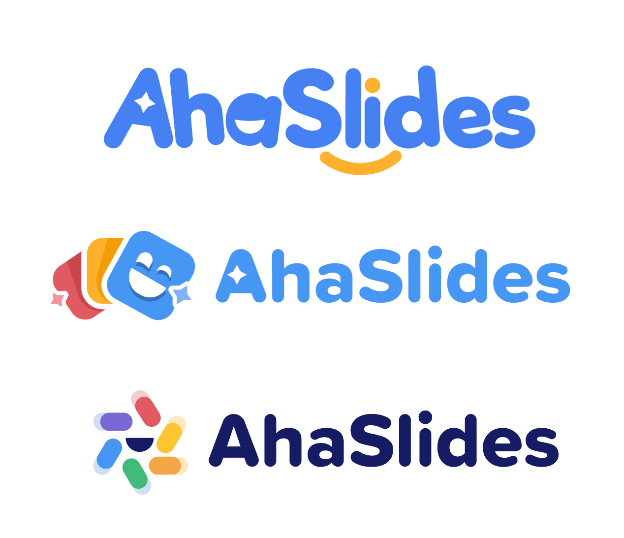
AhaSlidesは、大胆でカラフルな世界へと一歩踏み出します。新しいブランディングは、完璧なプレゼンテーションの力強さ、感動、そして相互の繋がりを表現しています。仕事、学校、コミュニティなど、どんな場面でも、新しいAhaSlidesできっとご自身の個性を発見していただけるはずです。
AhaSlidesの新しいブランディングの実際の様子を見るには、以下をクリックしてください👇
#1:ロゴマーク

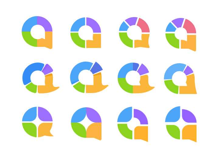
新しい円形のロゴマークは、いくつかの異なるアイデアから生まれました。
- 両面を表す吹き出しのシンボル 会話.
- 円の丸み、一緒に来ることを表す 組合.
- ドーナツチャートの結合されたセグメント。 ビジュアルとグラフ.
これらすべてが組み合わさって、AhaSlidesの頭文字である「a」を形成します。これは、私たちが共通のアイデアでつながるための、統合のエッセンスです。
ロゴマークのこのグリッドシステムは、円のアイデアがマークにとってどれほど重要であるかを明らかにします。
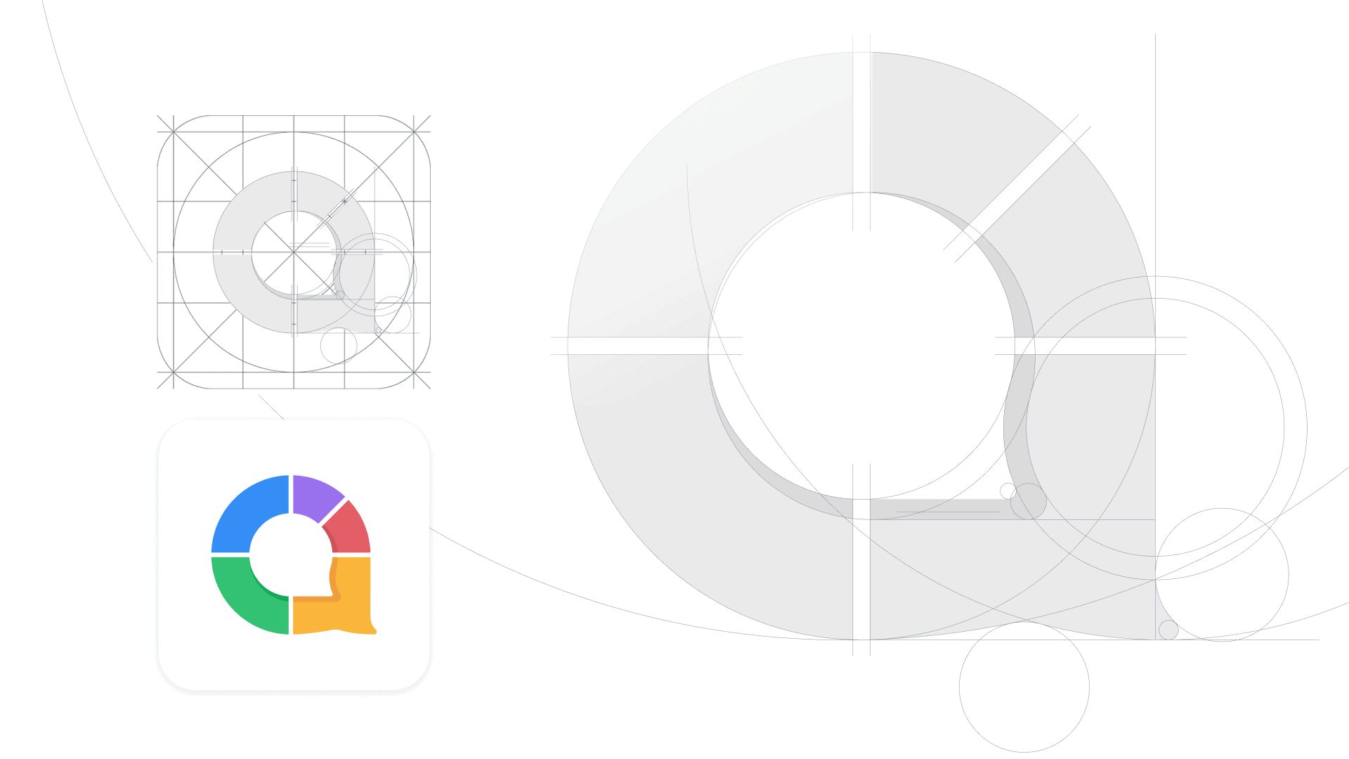
このように形状を分解すると、マークがiOSおよびAndroidアプリアイコンの標準ガイドラインにどのように適合するかがわかります。
#2:色
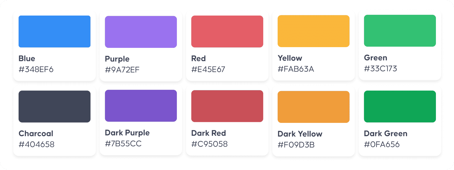
私たちは成長して、 双方向性に固有の感情、カラーパレットもあります。
新しいロゴは、従来の青と黄色から、それぞれが感情と美徳を表す5つの大胆な色のセグメント全体にその範囲を拡大します。
- 青 インテリジェンスとセキュリティのために
- レッド 情熱と興奮のために
- グリーン 成長と多様性のために
- パープル 信頼と贅沢のために
- イエロー 親しみやすさとアクセシビリティのために
一緒に、色の範囲は 多様性 ソフトウェアとその中で発生するプレゼンテーションの。 高校でのレッスンや会議室での会議から、クイズナイト、教会の説教、ベビーシャワーまで、接続性の色は引き続き強力で際立っています。
#3:タイポグラフィ
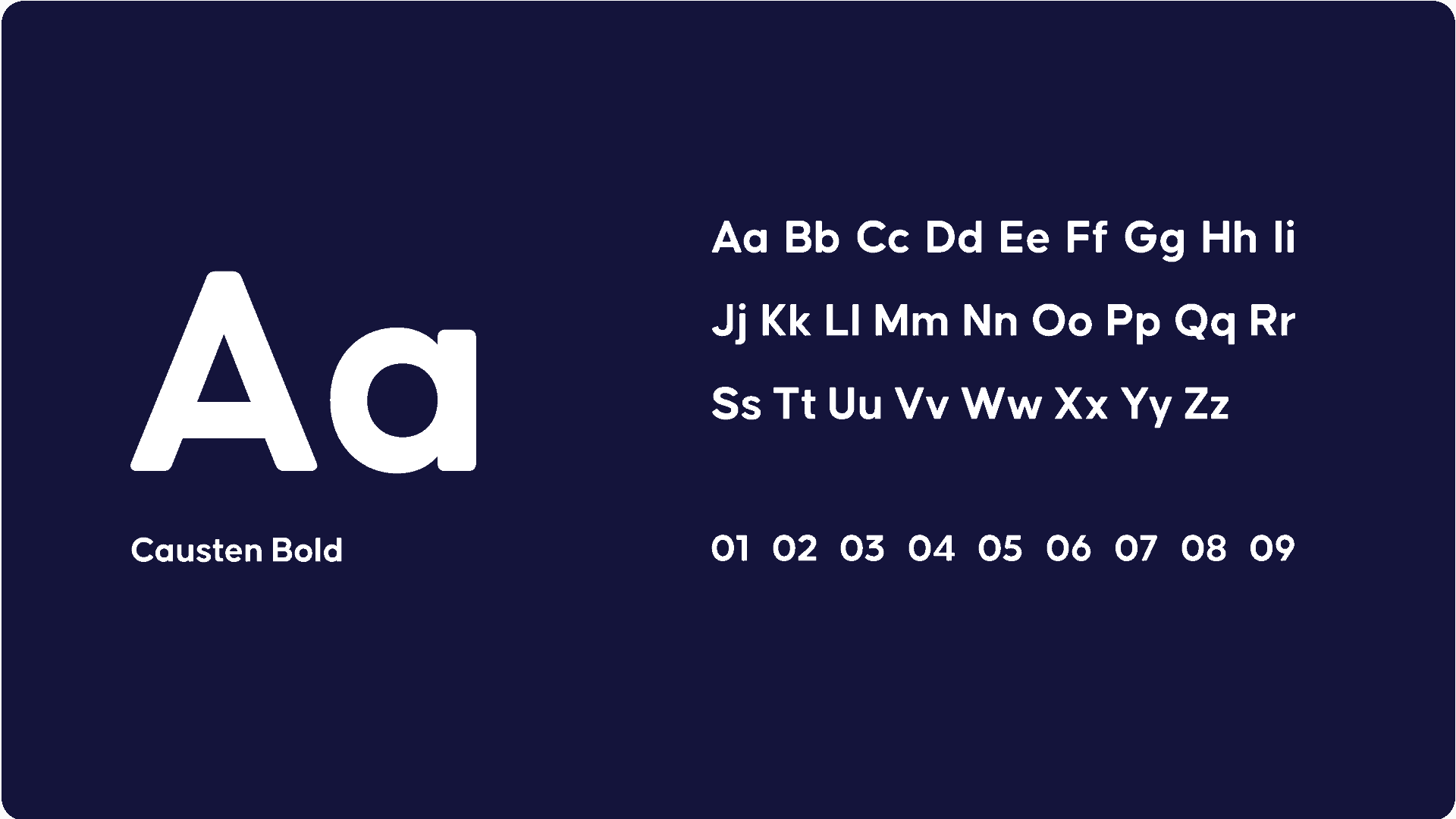
Caustenフォントは、ロゴにエレガントさ、構造、そしてモダンさをもたらします。すっきりとした外観と明瞭な視認性を備えた幾何学的なサンセリフフォントで、ウェブサイト、プレゼンターアプリ、オーディエンスアプリで目立つように役立ちます。
これら 3 つの要素が組み合わさって新しいロゴが形成されます。

ロゴの物語
ブランドアイデンティティの再発明は大きな仕事でした。
それは私たちのヘッドデザイナーが2020年XNUMX月にさかのぼって始まりました トラントラン いくつかの初期のアイデアをスケッチし始めました。
これらのアイデアは、元のロゴの明るい青と黄色の要素を取り入れながら、「喜び」というコンセプトをさまざまな方法で表現しました。
ここで最終バージョンを進めることにしました。 滑らかなフォント、暗いテキスト、豊富な色は、私たちが探していたものに最適な組み合わせであることがわかりました。
トランは、彼女の最も困難な課題は ロゴマーク彼女は、AhaSlidesが掲げる理念を反映するために、それ自体で使用できる包括的なマークを作成するために精力的に取り組みました。
ロゴマークの作成は、このプロジェクトの中で最も時間を費やした部分でした。様々なアイデアを凝縮しつつ、シンプルで魅力的なものにする必要がありました。出来上がりには本当に満足しています!
トラントラン – ヘッドデザイナー
今後数週間で、ウェブサイト、プレゼンターアプリ、オーディエンスアプリ全体で新しいロゴが更新されます。皆様の重要な業務に支障をきたさないよう、更新作業は可能な限り静かに行います。
引き続きAhaSlidesをご愛顧いただきありがとうございます。新しいロゴも気に入っていただければ幸いです。