AhaSlidesの目標は、プレゼンテーションをより楽しく、より魅力的に、そしてよりやりがいのあるものにすることです。本日、私たちはその目標に向けて大きな一歩を踏み出します。 真新しいデザイン!
新しいAhaSlidesは NEW 色々な意味で。私たちは物事をより整理し、より柔軟に、そしてより us 過去最高の。
その背後にある頭脳と手はすべて私たちのデザイナーでした、 ページ:
AhaSlidesの蓄積されたビジョンに、私自身のアイディアを少し加えました。その結果、新規ユーザーにとって素晴らしいだけでなく、創業当初から私たちを支えてくれている皆さんへの心からの「感謝」の気持ちを込めた、素晴らしいサービスが完成しました。
トラントラン - デザイナー
私たちが行った変更点と、それが視聴者にとってよりスマートで優れたプレゼンテーションの作成にどのように役立つのかを見てみましょう。
それをチェックするかゆみ? 下のボタンをクリックして、新機能をご覧ください。
新着情報?
ルックアンドフィールの改善🤩
今回は、もう少し…私たちらしいことをやろうと決めました。
ブランドアイデンティティ 新しいデザインの大きな焦点でした。以前は少し控えめだったかもしれませんが、今は準備万端です。 大胆な.
私たちの新しいアイデンティティへのアプローチは、3つの部分に分かれています。
#1 – イラスト
2019年に事業を始めた頃は、可愛くてカラフルな画像は「やるべきことリスト」の上位には入っていませんでした。見た目よりも機能性を重視したのです。
現在、堅実な開発チームが機能の作成と改善に熱心に取り組んでいるため、ヘッドデザイナーのTrangはAhaSlidesの開発に集中できます。 より魅力的な。 イラストやアニメーションを中心に新しいブランドアイデンティティを形成することは大変な作業でしたが、かわいいデザインの素晴らしいライブラリを生み出しました。

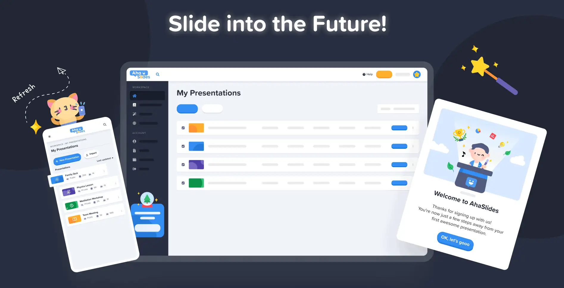
上の新しいイラストの他の例をチェックしてください マイプレゼンテーションダッシュボード と サインアップページ:
それぞれのイラストには、それぞれの役割と役割があります。新規ユーザーの皆様、そして既存のユーザーの皆様も、ログインした瞬間からAhaSlidesの遊び心を感じていただける、温かいおもてなしになると思います。
デイブ(AhaSlidesのCEO)と話し合った結果、もっと生き生きとして遊び心のあるものにしたいと考えました。ご覧の通り、イメージはより丸みを帯び、より可愛らしくなりましたが、子供っぽくなりすぎないようにしたかったのです。今のものは、 楽しさと機能のバランスが良い.
トラントラン - デザイナー
#2 – 色
活気 新しいデザインのキーワードはまさにこれでした。私たちは、生き生きとした活気を隠さず、ライブの観客と共有できるエキサイティングなプレゼンテーションを創り出す喜びを反映するものを求めていました。
だから私たちは 強くて大胆な色.
ロゴの署名の青と黄色から分岐し、カラーパレットを赤、オレンジ、緑、紫の色合いに拡張しました。
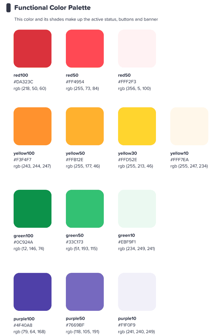
このカラフルなインターフェースがユーザーに刺激を与えることを望んでいました 何かを始める カラフル.
トラントラン - デザイナー
⭐ (近日開始予定) ⭐ もちろん、色彩への新たな取り組みをユーザーの皆様にも広めたいと考えました。そのため、プレゼンターはまもなく、あらゆる色を選択できるようになります。 彼らのテキストのために:

#3 – 情報アーキテクチャ
言うまでもなく、新しいルックアンドフィールには function.
そこで私たちは、 IA (情報アーキテクチャ)です。これは基本的に、ユーザーが自分の操作をよりよく理解できるように、ソフトウェアの一部を再編成し、再構築したことを意味します。
ここで、古いプレゼントボタンと新しいプレゼントボタンの例を示します。

いいね を 新しいデザインのボタン、上記のボタンには、私たちが説明できるのは よ ボタンっぽい感じ多くの選択オプションに同様の影と輝きを追加しました。これは、リアルな感触を与えるためだけでなく、IA を改善して、ユーザーが何が選択され、どこに焦点を合わせるべきかをよりよく理解できるようにするためです。
ほかに何か? さて、あなたはこの画像でいくつかのIAの変更を見ることができます:
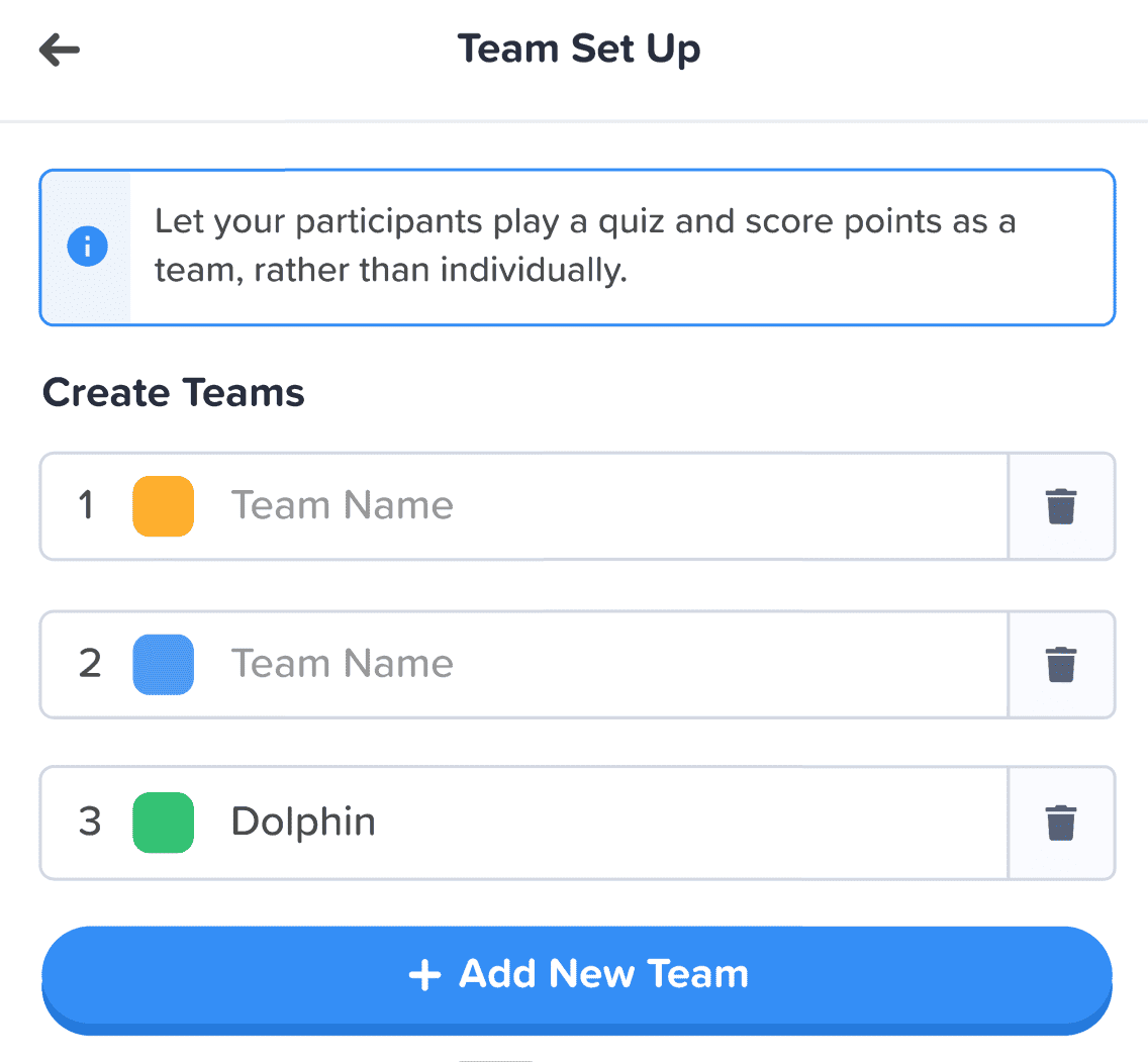
ボタン以外にも、次のような点が改善されました。
- 個別のボックス 各要素を分離するのに役立ちます。
- 太字テキスト 入力された情報を、空のボックスの色あせたテキストと区別します。
- アイコン と色 情報ボックスを目立たせる。
情報アーキテクチャの変更は些細なものかもしれませんが、それが私の意図でした。ユーザーに新しい家に引っ越してもらうのではなく、ただ、今住んでいる家を少しだけ飾ってあげたいと思ったのです。
トラントラン - デザイナー
より良い組織、よりスムーズなナビゲーション📁
先ほども言ったように、機能性が向上しないのなら、見た目を良くしても意味がありません。
ここで、2 つ目の大きな変化が起こります。デジタル家具を大量に購入し、散らかったものを整理しました。
改善した4つの分野を見てみましょう:
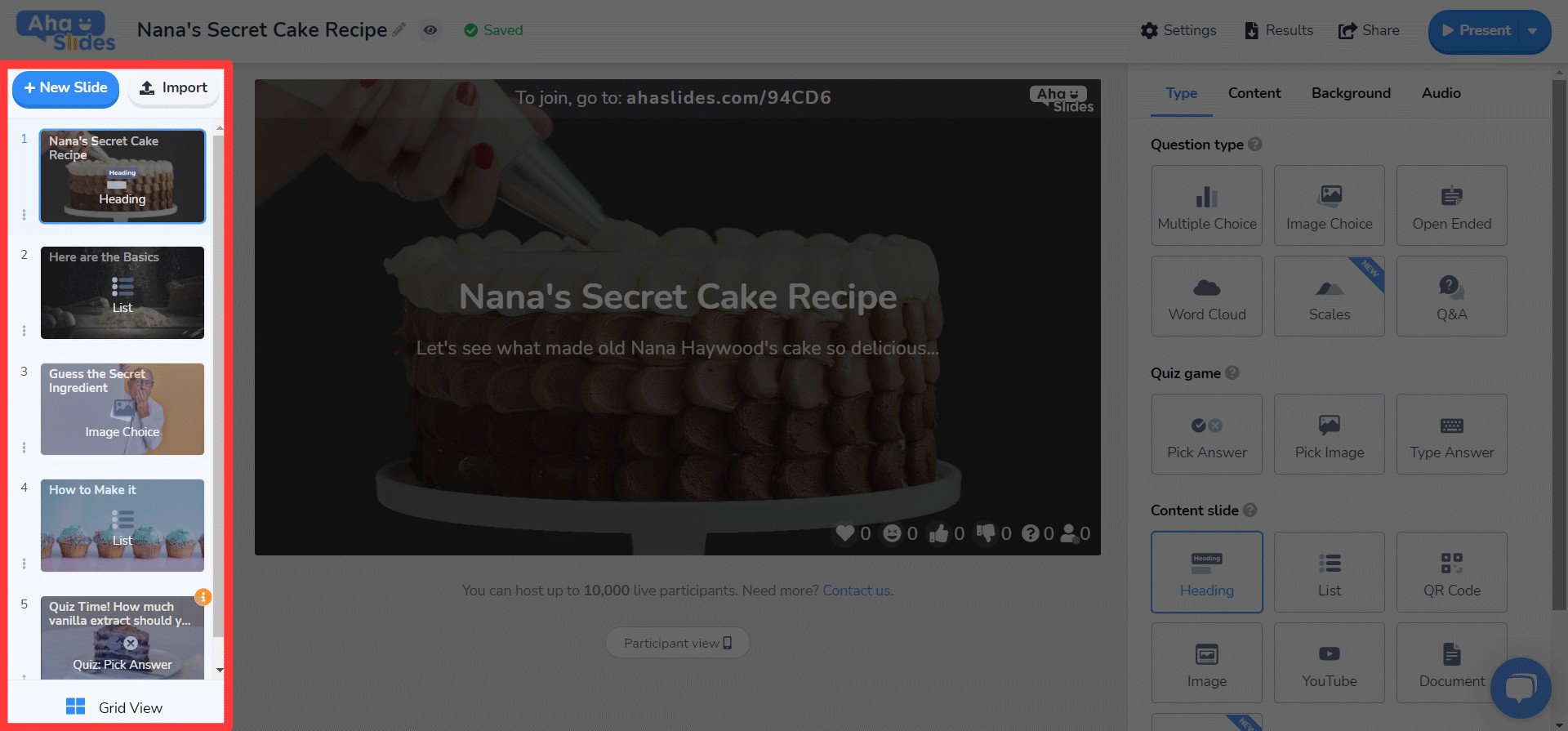
#1 – プレゼンテーションダッシュボード
はい、認めます。ダッシュボードの古いデザインでは、プレゼンテーションを見つけて整理するのは必ずしも簡単ではありませんでした。
幸いなことに、新しいダッシュボードでは大きな変更が行われました...
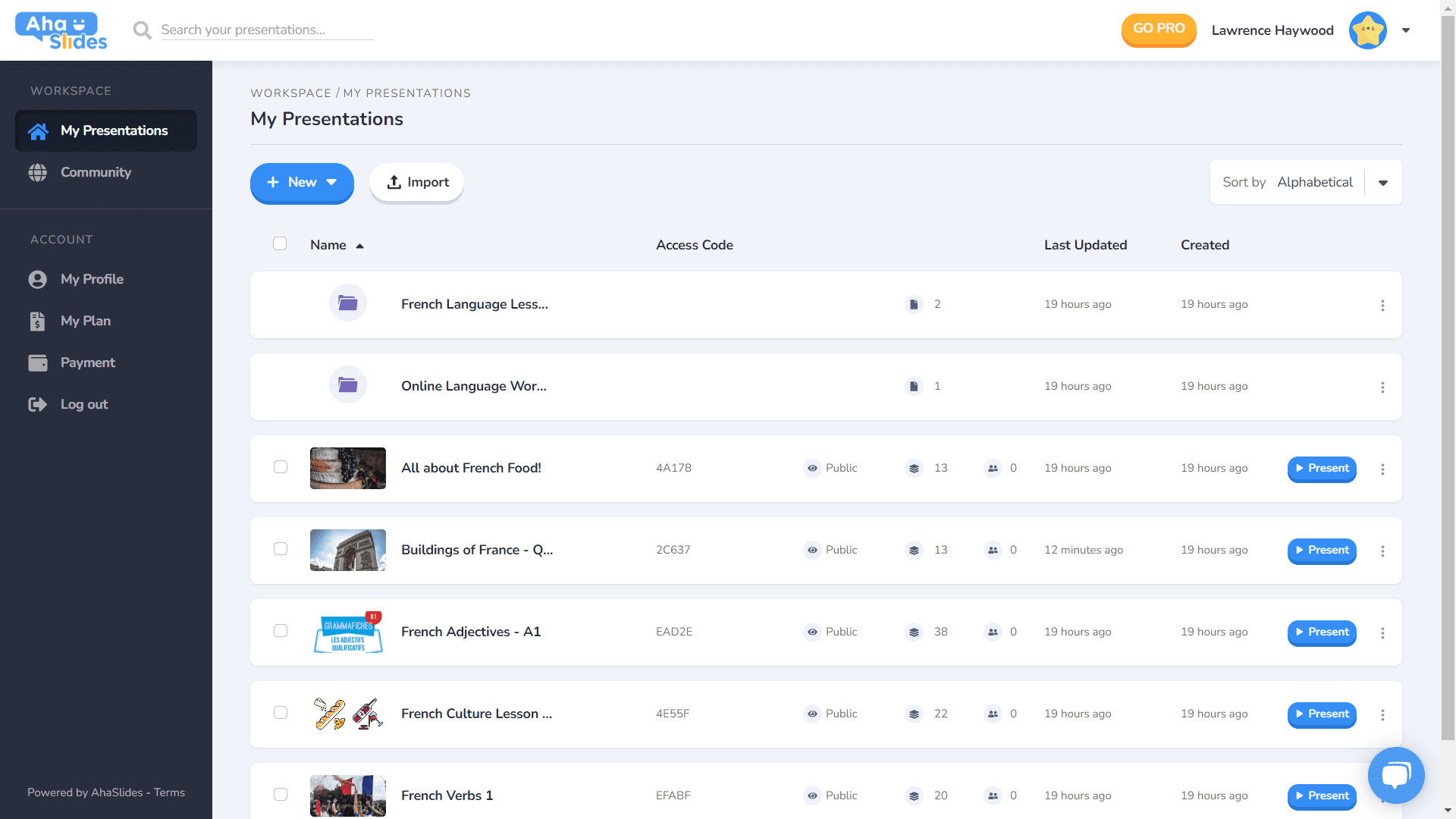
- 各プレゼンテーションには独自のコンテナがあります。
- コンテナにサムネイル画像が追加されました(サムネイルがプレゼンテーションの最初の画像になります)。
- プレゼンテーションオプション(複製、データの消去、削除など)が整然としたケバブメニューに追加されました。
- プレゼンテーションを並べ替えて検索する方法は他にもあります。
- 「ワークスペース」と「アカウント」が左側の列に分離されました。
⭐(近日開始予定)⭐ 近い将来、新しいダッシュボード表示オプションが追加されます – グリッドビュー! このビューでは、プレゼンテーションを画像中心のグリッド形式で表示できます。 グリッドビューとデフォルトのリストビューはいつでも切り替えることができます。
#2 – エディタートップバー
エディター画面のトップバーを少し変更しました。

- トップバーのオプションの数が4から3に縮小されました。
- 各オプションのドロップダウンメニューは、より良い構成を提供します。
- ドロップダウンの幅が変更され、メニューが正しい列に収まるようになりました。
#3 – エディターの左列
プレゼンテーションのコンテンツ列のデザインがよりシンプルで洗練されたものになりました。グリッドビューも刷新されました。
- スライドオプションがケバブメニューで整理されました。
- 新しいグリッドビューボタンボタンが下部に追加されました。
- グリッドビューのレイアウトと操作が大幅に改善されました。
⭐ (近日開始予定) ⭐ 右側の列はまだ完成していませんが、まもなく次の内容が表示される予定です。
#4 – エディターの右列
アイコンの小さな変更、テキストの色の大きな変更…
- スライドタイプごとに再設計されたアイコン。
- 多種多様なテキストの色のオプション。
- 「コンテンツ」タブ内の要素を並べ替えました。
どこでも、どのデバイスでも編集📱
モバイルでプレゼンテーションを編集しているユーザーの28%の方々には、長い間無視して申し訳ありませんでした。 😞
新しいデザインでは、モバイルやタブレットのユーザーに、 デスクトップと同じように応答性。 つまり、ユーザーが外出先で編集できるように、すべての要素を再考する必要がありました。
もちろん、それはすべて ダッシュボードいくつか変更を加えました…

プレゼンテーションとフォルダに関する最も重要な情報がここに表示されます。また、右側にはプレゼンテーションの設定を整理できるケバブメニューもあります。
On エディタ、さらに使いやすいインターフェースが表示されます。
繰り返しになりますが、すべてがケバブメニューに隠れています。 これを行うと、気が散る部分がクリーンアップされ、プレゼンテーション全体を表示するためのスペースが大幅に増えます。

ケバブ好きが明らかになってきたでしょうか?以前の混雑したトップバーの代わりに、またケバブメニューをご用意しました! はるかに少ない圧倒的なインターフェース プレゼンテーションの品質に集中できます。

私は本当にいくつかの制限を取り除きたかった モバイルユーザーが望むプレゼンテーションを作成するのを妨げているものがありました。私たちは以前よりも洗練されたシンプルなものを採用しましたが、それでも 大きな計画 将来のAhaSlidesのモバイル機能のために!
トラントラン - デザイナー