AhaSlides의 목표는 여러분과 청중 모두에게 더욱 재미있고, 매력적이며, 보람 있는 프레젠테이션을 제공하는 것입니다. 오늘 저희는 이를 위해 큰 발걸음을 내딛습니다. 새로운 디자인!
새로운 AhaSlides는 여러 면에서 말이죠. 우리는 모든 것을 더 체계적이고 유연하게 만들었습니다. us 이전보다.
그 뒤에있는 두뇌와 손은 모두 우리 디자이너 였고 트랑:
AhaSlides의 축적된 비전에 제 생각을 더했습니다. 그 결과, 신규 사용자들에게는 훌륭한 기능일 뿐만 아니라, 처음부터 함께해 주신 분들께도 감사의 마음을 전할 수 있는, 적절하고 진심 어린 감사 인사를 전할 수 있는 기능을 갖추게 되었습니다.
트랑 트란 – 디자이너
우리가 어떤 변화를 만들었는지, 그리고 그것이 청중에게 더 똑똑하고 나은 프레젠테이션을 만드는 데 어떻게 도움이 될 수 있는지 살펴보겠습니다.
확인하고 싶습니까? 아래 버튼을 클릭하여 새로운 소식을 알아보세요.
새로운 기능
향상된 모양과 느낌 🤩
이번에는 좀 더 우리다운 것을 선택했습니다.
브랜드 정체성 새로운 디자인의 큰 초점이었습니다. 과거에는 다소 소극적이었을지 모르지만, 이제는 일시: XNUMX년 XNUMX월 XNUMX일 화요일 XNUMX:XNUMXpm - XNUMX:XNUMXpm 장소: 여의도 페어몬트 앰배서더 서울 호텔 XNUMXF 아잘레아스 룸 [약도] 행사 문의: info.korea@rescale.com.
우리의 새로운 정체성에 대한 접근 방식은 세 부분으로 나뉩니다.
#1 – 일러스트레이션
2019년에 시작했을 때는 귀엽고 화려한 이미지가 '해야 할 일 목록'에서 그다지 높은 순위를 차지하지 않았습니다. 겉모습보다는 기능성을 중시했죠.
이제 기능 생성 및 개선에 열심히 노력하는 견고한 개발 팀이 있으므로 수석 디자이너 Trang은 AhaSlides 제작에 집중할 수 있습니다. 더욱 매력적인. 일러스트레이션과 애니메이션을 중심으로 새로운 브랜드 아이덴티티를 형성하는 것은 엄청난 작업 이었지만, 그 결과 귀여운 디자인의 훌륭한 라이브러리가 탄생했습니다.

새로운 삽화의 다른 예를 확인하십시오. 내 프레젠테이션 대시 보드 그리고 가입 페이지:
각 일러스트는 고유한 위치와 역할을 가지고 있습니다. AhaSlides에 로그인하는 순간부터 AhaSlides의 유쾌한 분위기를 느낄 수 있기 때문에, 신규 사용자와 기존 사용자 모두에게 따뜻한 환영의 의미를 담고 있다고 생각합니다.
Dave[AhaSlides CEO]와 이야기를 나눈 후, 저희는 더욱 생동감 넘치고 재미있는 콘텐츠를 만들기로 결정했습니다. 보시다시피, 이미지가 더욱 입체적이고 귀엽게 바뀌었지만, 너무 유치하게 만들고 싶지는 않았습니다. 지금 저희가 가진 이미지는 재미와 기능의 좋은 균형.
트랑 트란 – 디자이너
#2 – 색상
활기 새로운 디자인의 핵심 키워드는 바로 '정말'이었습니다. 생동감 넘치는 모습에 쑥스러워하지 않으면서도, 현장의 청중과 공유할 수 있는 흥미로운 프레젠테이션을 만드는 즐거움을 반영하는 무언가를 원했습니다.
그래서 우리는 두 배로 노력했습니다. 강하고 대담한 색상.
로고의 시그니처 파란색과 노란색에서 분기하여 색상 팔레트를 빨간색, 주황색, 녹색 및 자주색 음영으로 확장했습니다.
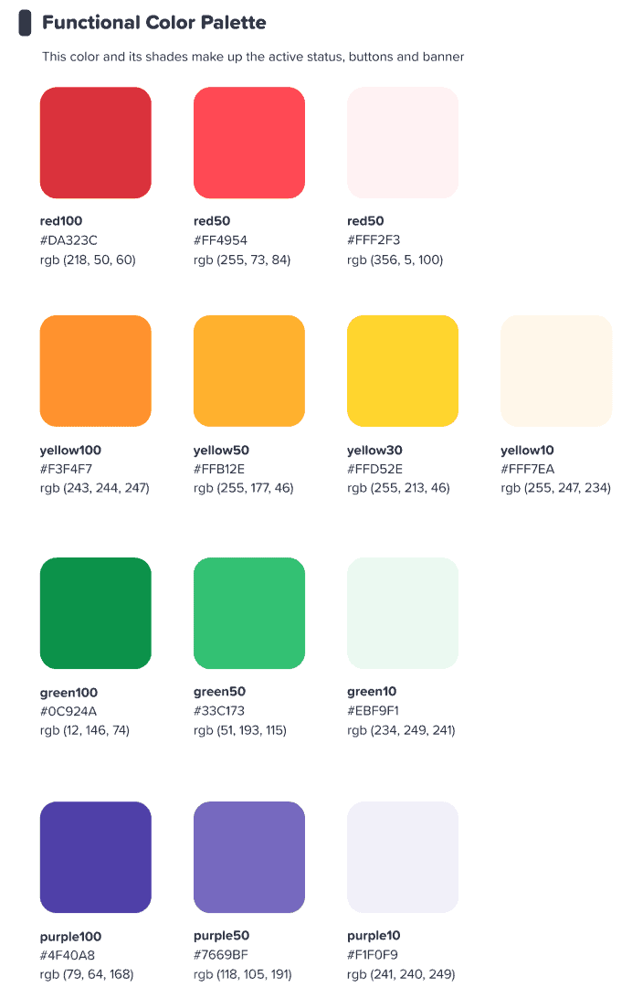
이 화려한 인터페이스가 사용자에게 영감을 주길 바랬습니다. 뭔가 시작 화려한.
트랑 트란 – 디자이너
⭐ 곧 출시 될 예정입니다. ⭐ 물론, 저희는 색상에 대한 새로운 집중을 사용자들에게도 확장하고 싶었습니다. 그래서 발표자들은 곧 세상 모든 색상을 선택할 수 있게 될 것입니다. 그들의 텍스트:

#3 – 정보 아키텍처
새로운 모양과 느낌이 있어야한다는 것은 말할 필요도 없습니다. 기능.
그래서 우리는 큰 변화를 만들었습니다. IA (정보 아키텍처) AhaSlides의. 이는 기본적으로 사용자가 무엇을 하는지 더 잘 이해할 수 있도록 소프트웨어의 여러 부분을 재구성하고 재구성했다는 것을 의미합니다.
다음은 우리가 의미하는 바를 보여주는 한 가지 예입니다. 즉, 기존 버튼과 새로운 현재 버튼입니다.

처럼 모든 새로운 디자인의 버튼, 위의 버튼은 더 보기 버튼 같은 느낌. 우리는 실제적인 느낌을 줄 뿐만 아니라 IA(Information Assurance)를 개선하여 사용자가 무엇을 선택했는지, 어디에 초점을 맞춰야 하는지 더 잘 이해할 수 있도록 많은 선택 옵션에 비슷한 그림자와 빛을 추가했습니다.
그 밖의 무엇? 이 이미지에서 몇 가지 IA 변경 사항을 볼 수 있습니다.
버튼 외에도 다음과 같은 면에서 많은 개선이 이루어졌습니다.
- 개별 상자 각 요소를 분리하는 데 도움이됩니다.
- 굵은 글씨체 입력 된 정보를 빈 상자의 희미한 텍스트와 구별합니다.
- 아이콘 및 색상 정보 상자를 돋보이게합니다.
정보 구조의 변화는 미묘할 수 있지만, 제 의도는 바로 이것이었습니다. 사용자들이 새 집으로 이사하는 것을 원하지 않았습니다. 그저 기존에 살고 있는 집을 소소하게나마 꾸며주고 싶었을 뿐입니다.
트랑 트란 – 디자이너
더 나은 구성, 원활한 탐색 📁
앞서 말했듯이, 기능성이 향상되지 않는다면 아무리 예쁘게 만들어도 무슨 의미가 있겠습니까?
여기서 두 번째 큰 변화가 시작됩니다. 디지털 가구를 많이 구입하고 잡동사니를 정리했습니다.
우리가 개선한 4가지 영역을 살펴보겠습니다.:
- 내 프레젠테이션 대시 보드
- 에디터 상단 바
- 편집기 왼쪽 열
- 편집기 오른쪽 열 (곧 출시됩니다!)
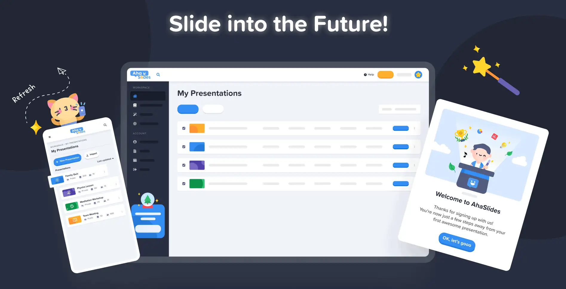
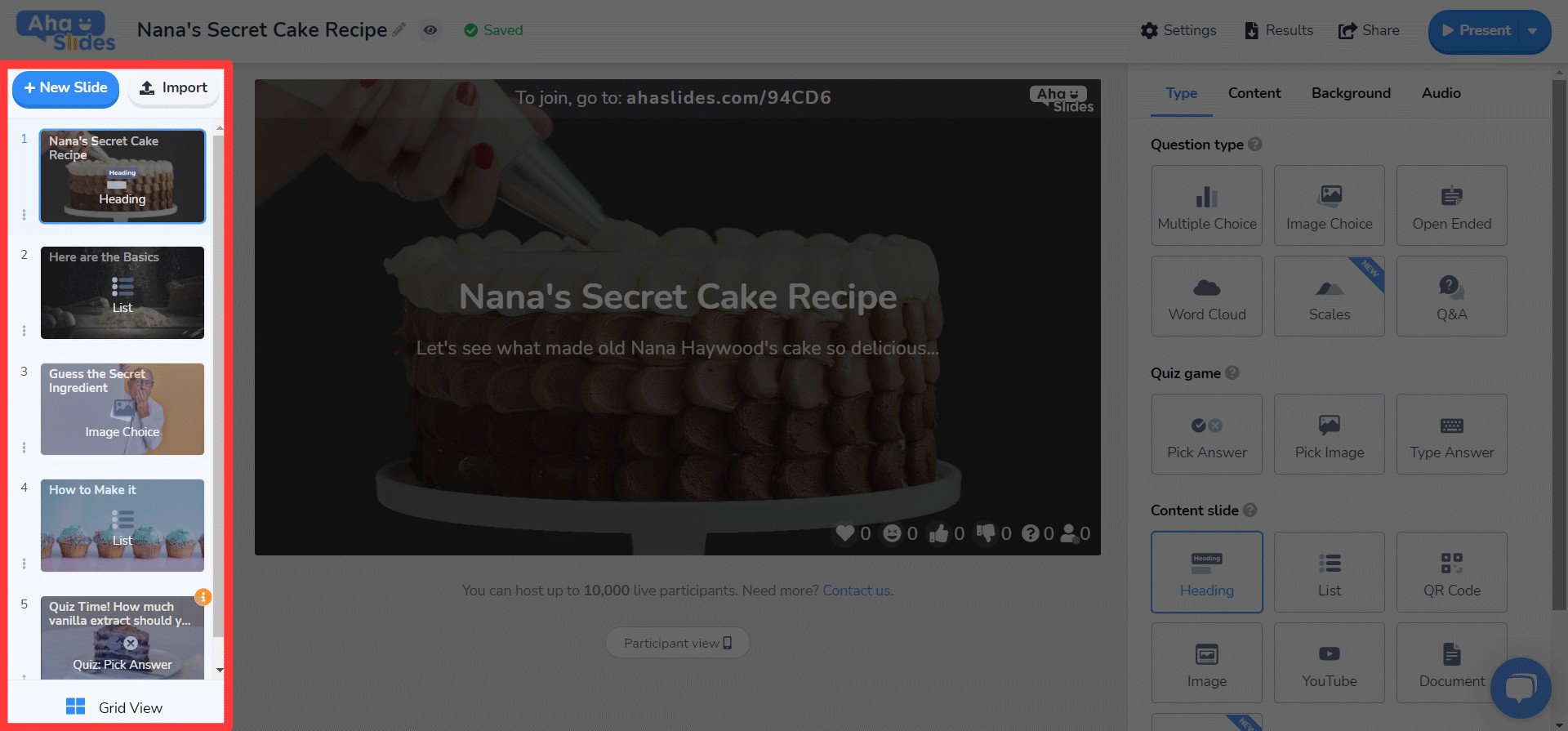
#1 – 내 프레젠테이션 대시보드
네, 인정합니다. 대시보드의 이전 디자인에서 프레젠테이션을 찾고 정리하는 게 항상 쉬운 일은 아니었습니다.
다행히도, 새로운 대시보드에서는 많은 것이 바뀌었습니다.
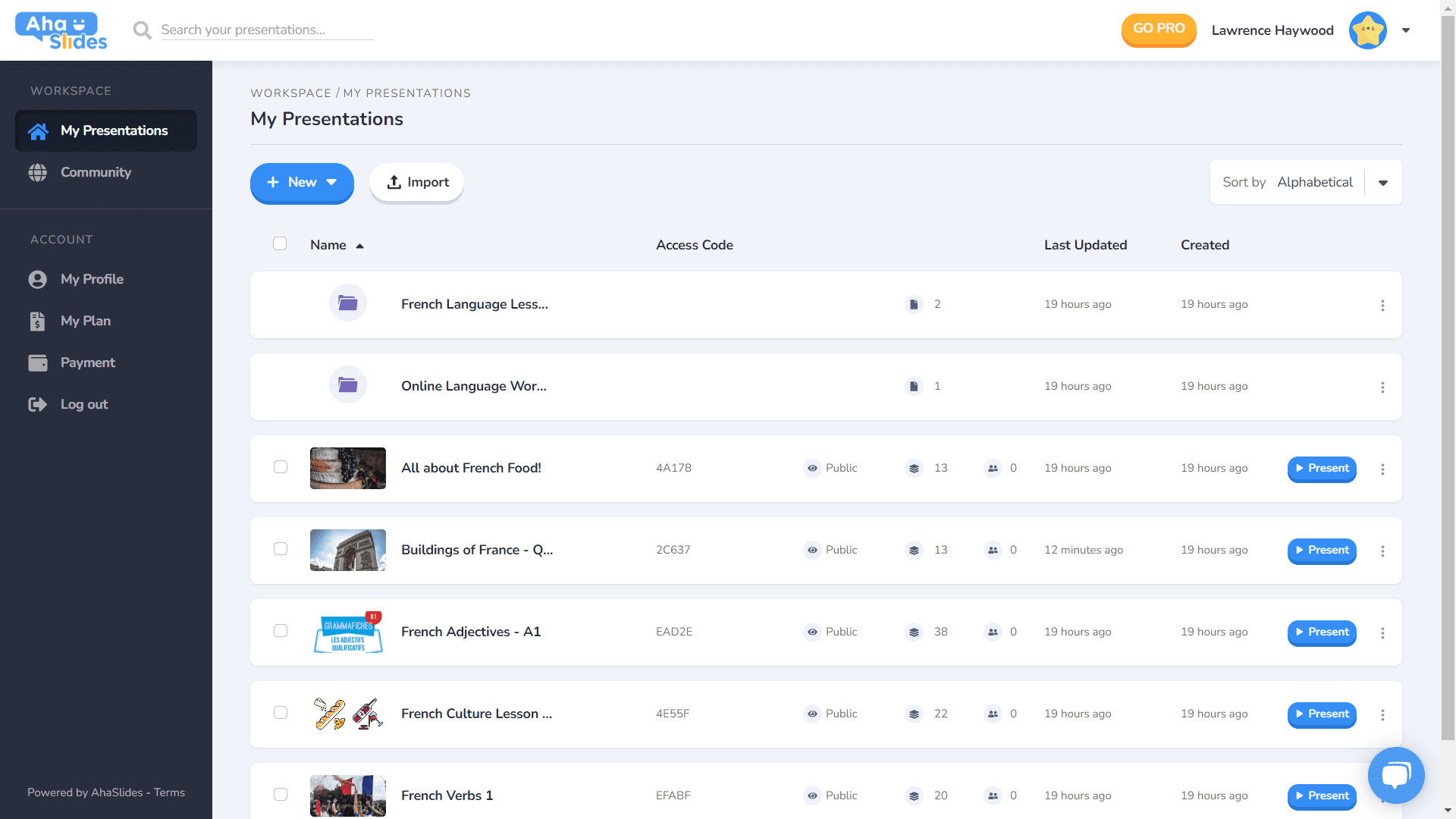
- 각 프레젠테이션에는 자체 컨테이너가 있습니다.
- 이제 컨테이너에 썸네일 이미지가 있습니다 (썸네일이 프레젠테이션의 첫 번째 이미지가 됨).
- 프레젠테이션 옵션 (복제, 데이터 지우기, 삭제 등)이 이제 깔끔한 케밥 메뉴에 있습니다.
- 프레젠테이션을 정렬하고 검색하는 더 많은 방법이 있습니다.
- 이제 '작업 공간'과 '계정'이 왼쪽 열에서 구분되었습니다.
⭐곧 출시 될 예정입니다.⭐ 가까운 미래에 완전히 새로운 대시보드 보기 옵션이 제공될 예정입니다. 그리드보기! 이보기를 사용하면 프레젠테이션을 이미지 중심의 격자 형식으로 볼 수 있습니다. 언제든지 격자보기와 기본 목록보기간에 전환 할 수 있습니다.
#2 – 편집기 상단 바
편집기 화면의 상단 표시줄에 몇 가지 변경 사항이 있습니다.

- 상단 표시 줄의 옵션 수가 4 개에서 3 개로 축소되었습니다.
- 각 옵션의 드롭 다운 메뉴는 더 나은 구성을 제공합니다.
- 메뉴가 오른쪽 열에 맞도록 드롭 다운의 너비가 변경되었습니다.
#3 – 편집자 왼쪽 열
프레젠테이션 콘텐츠 열이 더욱 간결하고 매끈하게 디자인되었습니다. 그리드 보기도 완전히 새로워졌습니다.
- 슬라이드 옵션은 이제 케밥 메뉴에서 깔끔하게 정리되었습니다.
- 새로운 그리드보기 버튼 버튼이 하단에 추가되었습니다.
- Grid View의 레이아웃 및 작동이 크게 향상되었습니다.
⭐ 곧 출시 될 예정입니다. ⭐ 오른쪽 기둥은 아직 완성되지 않았지만, 곧 그곳에서 볼 수 있는 내용은 다음과 같습니다!
#4 – 편집자 오른쪽 열
아이콘은 약간 변경하고, 텍스트 색상은 크게 변경했습니다.
- 각 슬라이드 유형에 대한 아이콘이 다시 디자인되었습니다.
- 다양한 텍스트 색상 옵션.
- '콘텐츠' 탭에서 요소를 다시 정렬했습니다.
어디서나, 모든 장치에서 편집 📱
모바일에서 프레젠테이션을 편집하는 사용자의 28%에게 오랫동안 방치해 드려 죄송합니다. 😞
새로운 디자인을 통해 우리는 모바일 및 태블릿 사용자에게 다음과 같은 플랫폼을 제공하고자 했습니다. 데스크탑과 같은 반응. 즉, 사용자가 이동 중에 편집 할 수 있도록 모든 요소를 재고해야했습니다.
물론 모든 것은 대시 보드. 여기에 몇 가지 변경 사항이 있습니다…

프레젠테이션과 폴더에 대한 가장 중요한 정보가 여기에 표시됩니다. 오른쪽에는 모든 프레젠테이션 설정을 정리하는 케밥 메뉴도 있습니다.
On 전에, 편집자, 또 다른 사용자 친화적인 인터페이스가 나타납니다.
다시 말하지만 모든 것이 케밥 메뉴에 숨겨져 있습니다. 이렇게하면 산만 함이 정리되고 전체 프레젠테이션을 볼 수있는 훨씬 더 많은 공간이 남습니다.

케밥을 좋아한다는 게 점점 확실해지나요? 예전처럼 사람이 북적이던 윗쪽 바를, 네, 또 다른 케밥 메뉴로 바꿨어요! 훨씬 덜 압도적 인 인터페이스 프레젠테이션의 품질에 집중할 수 있습니다.

몇 가지 제한 사항을 제거하고 싶었습니다. 모바일 사용자가 원하는 프레젠테이션을 만드는 데 방해가 되는 요소들이 있습니다. 이전보다 더 세련되고 심플한 디자인을 선택했지만, 여전히 큰 계획 앞으로 AhaSlides의 모바일 기능에 대해 알아보세요!
트랑 트란 – 디자이너