
슬라이드를 보셨을 겁니다. 어쩌면 직접 만드셨을지도 모르죠. 8개의 항목에 걸쳐 40개의 단어가 적혀 있는데, 모두 필수적인 내용이지만 세 번째 줄에서는 하나도 읽기 어렵습니다. 발표자는 각 항목을 큰 소리로 읽고, 청중은 그 앞에 적힌 내용을 먼저 읽은 후, 다음 슬라이드를 기다리며 30초를 보냅니다.
저건 프레젠테이션이 아니에요. 그냥 누군가가 옆에 서 있는 문서일 뿐이에요.
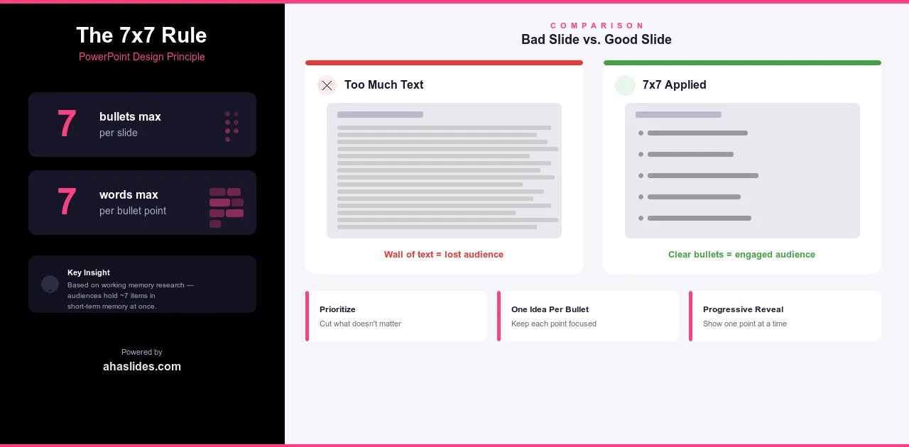
7x7 규칙은 바로 이런 문제를 방지하기 위해 만들어졌습니다. 아이디어는 간단합니다. 슬라이드당 글머리 기호는 7개 이하, 각 글머리 기호는 7단어 이하로 사용하는 것입니다. 두 가지 제약 조건, 하나의 원칙. 이 규칙을 일관되게 적용하면 슬라이드가 발표자의 메시지와 충돌하는 것이 아니라 오히려 메시지를 뒷받침하게 됩니다.
7x7 규칙이란 무엇인가
이 규칙은 두 부분으로 구성됩니다.
슬라이드당 글머리 기호는 7개 이하, 각 글머리 기호는 7단어 이하로 작성하십시오.
이 규칙은 작업 기억에 대한 연구에서 비롯되었습니다. 우리 뇌는 단기 기억에 대략 7개의 항목을 동시에 저장할 수 있습니다. 그 이상을 저장하려고 하면 정보가 누락되기 시작하는데, 이는 청중이 주의를 기울이지 않아서가 아니라 인간의 인지 능력이 한 번에 처리할 수 있는 한계를 넘어섰기 때문입니다.
항목 7개, 각 항목당 단어 7개. 바로 이 지점에서 슬라이드와 발표가 서로 상충하지 않고 조화를 이루기 시작합니다.
7x7 규칙이 효과적인 이유
규칙을 적용하면 실제로 중요한 것이 무엇인지 결정해야 합니다. 7개의 단어로 구성된 7개의 항목에 모든 것을 담을 수는 없습니다. 무언가를 빼야 합니다. 바로 그 제약이 핵심입니다. 항목을 삭제할 때마다 청중에게 실제로 필요한 정보와 단순히 포함시키는 것이 안전하다고 생각한 정보 사이에서 판단을 내려야 합니다. 이 규칙은 편집 과정을 통해 프레젠테이션을 더욱 탄탄하게 만들어 줍니다.
또한 주의 집중이 실제로 어떻게 작용하는지를 고려한 전략입니다. 읽기와 듣기는 모두 언어 처리 작업입니다. 청중에게 두 가지를 동시에 하도록 요청하면, 보통 읽기에 집중하고 슬라이드를 넘기는 동안에는 당신의 말을 듣지 않게 됩니다. 따라서 핵심 내용을 한눈에 파악할 수 있을 만큼 간결하게 구성하면, 사람들은 고개를 들어 슬라이드를 볼 이유가 생깁니다. 슬라이드는 대본이 아니라 하나의 지시사항이 되는 것입니다.
간과하기 쉬운 또 다른 이점이 있습니다. 슬라이드가 간결할수록 발표할 공간이 생깁니다. 일곱 단어 안에 다 담을 수 없는 모든 맥락, 이야기, 예시를 입을 통해 전달할 수 있죠. 이건 제약이 아닙니다. 발표자가 필요한 이유가 바로 그거죠. 알아야 할 모든 내용이 슬라이드에 이미 담겨 있다면, 발표자는 굳이 필요하지 않겠죠.
규칙 해석
7x7 규칙은 지침일 뿐 법이 아닙니다. 언제 엄격하게 따라야 하고 언제 유연하게 적용해야 하는지 아는 것이 이 규칙을 잘 활용하는 비결입니다.
대부분의 프레젠테이션에서는 7x7 크기를 엄격한 기준으로 삼으세요. 비즈니스 미팅, 영업 프레젠테이션, 교육 세션, 컨퍼런스 발표 등은 청중이 깔끔한 슬라이드를 기대하는 상황이며, 그렇지 않을 경우 바로 알아차립니다. 이러한 상황에서 7x7 크기를 어기면 슬라이드를 읽기 어려울 뿐만 아니라, 발표자가 생각을 다듬지 않았다는 인상을 줄 수 있습니다.
전문가를 대상으로 하는 기술 프레젠테이션의 경우, 계산 방식이 약간 달라집니다. 사양을 검토하는 엔지니어, 방법론을 설명하는 연구원, 상세한 모델을 제시하는 분석가와 같은 청중은 논리를 따라가기 위해 화면에 더 많은 정보를 필요로 하는 경우가 있습니다. 하지만 그렇더라도 7:7 비율이 기본이 되어야 합니다. 콘텐츠가 정말로 필요로 하는 경우에만 그 이상을 사용하고, 단순히 화면 크기를 줄이는 작업이 너무 번거롭다는 이유로 더 크게 만들 필요는 없습니다.
해당 규칙이 실제로 적용되는 범위에 대해 몇 가지 사항을 명확히 할 필요가 있습니다.
글머리 기호가 두 번째 줄로 넘어가는 것은 이미 규칙을 어긴 것입니다. 일곱 단어는 한 줄에 일곱 단어여야 합니다. 편집 중에 글머리 기호가 계속 길어진다면, 일반적으로 해당 항목을 합치는 것보다는 나누거나 삭제해야 한다는 신호입니다.
형식과 관계없이 이 규칙이 적용됩니다. 번호 매기기 목록, 화살표, 레이블이 있는 아이콘 등 항목 목록을 표시하는 경우 동일한 제한 사항이 적용됩니다. 핵심은 글머리 기호 문자의 개수가 아니라 인지 부하에 관한 것입니다.
7x7에서 흔히 저지르는 실수
가장 흔한 실수는 규칙을 제한이 아닌 시작점으로 여기는 것입니다. 사람들은 먼저 자세한 항목들을 작성한 다음, 그것들을 줄이려고 합니다. 하지만 그렇게 되면 슬라이드에 너무 많은 정보가 담겨버려서, 줄이는 것이 마치 손해를 보는 것처럼 느껴집니다. 해결책은 간단합니다. 처음부터 간결하게 작성하세요. 7단어가 목표가 아니라 최대치입니다.
두 번째 실수는 구두점을 이용해 규칙을 교묘하게 이용하는 것입니다. 하나의 긴 항목을 두 개의 짧은 항목으로 나누어 함께 있을 때만 의미가 통하도록 하는 것은 허용되지 않습니다. 두 항목이 독립적으로 사용될 수 없다면, 세미콜론으로 구분해야 하는 두 개의 항목이 아니라 하나의 항목으로 수정해야 합니다.
세 번째는 글머리 기호에는 규칙을 적용하면서 제목은 무시하는 것입니다. 슬라이드 제목이 12단어에 달하면 다른 모든 곳에서 적용하려는 원칙 자체가 무너집니다. 제목은 슬라이드의 다른 모든 내용처럼 한눈에 훑어볼 수 있을 만큼 짧아야 합니다.
마지막 요점은 좀 더 미묘합니다. 어떤 발표자들은 모든 슬라이드에서 7x7 비율을 충실히 지키면서도 텍스트가 많은 슬라이드 10개를 쉬는 없이 연달아 내놓습니다. 7개의 글머리 기호가 7번 연속으로 나오는 것은 여전히 인지적 과부하를 초래합니다. 이 규칙은 전체적인 흐름의 일부로 사용될 때 가장 효과적입니다. 예를 들어 텍스트 슬라이드, 시각 자료, 인터랙티브 요소, 그리고 다시 텍스트 슬라이드 순으로 구성해야 합니다. 내용이 빽빽한 부분 사이에는 청중이 숨 쉴 공간을 주세요.

점진적 공개: 대안적 접근 방식
점진적 공개는 말 그대로 모든 항목을 한 번에 보여주는 대신, 각 항목을 설명할 때마다 클릭할 때마다 하나씩 보여주는 방식입니다. 따라서 청중은 현재 설명하고 있는 내용만 볼 수 있습니다.
유용한 기법이지만, 실제로 어떤 문제를 해결하고 어떤 문제를 해결하지 못하는지 이해하는 것이 중요합니다.
이 기능은 주의 집중 관리 문제를 해결합니다. 화면에 모든 내용이 이미 표시되어 있으면 사람들은 미리 내용을 읽고, 당신보다 먼저 끝내고, 다음 30초 동안 기다리는 데 시간을 허비합니다. 점진적 표시 방식은 이러한 문제를 방지합니다. 클릭할 때마다 작은 재설정이 이루어져 다음 단계로 넘어가기 전에 현재 위치로 주의가 다시 집중됩니다.
하지만 콘텐츠가 너무 많은 문제를 해결해주지는 못합니다. 한 슬라이드에 15개의 항목이 모두 들어가야 한다면, 하나씩 순차적으로 보여주는 방식은 근본적인 문제를 해결해주지 못합니다. 단지 너무 많은 정보를 접하는 속도를 늦출 뿐입니다. 7x7 규칙과 점진적 공개 방식은 서로 대체할 수 없습니다. 전자는 슬라이드에 얼마나 많은 내용을 담을 것인가에 관한 것이고, 후자는 그 순서를 정하는 방식에 관한 것입니다.
점진적 공개 방식은 각 요점이 이전 요점을 바탕으로 구축되는 순차적 논증, 모든 것을 한꺼번에 보여주면 혼란을 야기할 수 있는 단계별 과정, 그리고 속도를 신중하게 조절해야 하는 세부적인 부분에 가장 효과적입니다.
한 가지 확실한 한계는, 발표자 없이도 다른 사람들이 볼 슬라이드 자료에는 점진적 공개 방식이 적합하지 않다는 점입니다. 누군가 나중에 프레젠테이션을 열어본다면 숨겨진 항목이 있다는 사실을 알지 못하고, 슬라이드가 미완성이라고 생각할 것입니다. 따라서 발표자 없이도 내용을 이해할 수 있는 자료라면 7x7 형식이 유일하게 효과적인 방법입니다.
대부분의 발표자는 두 가지 방식을 모두 사용합니다. 대부분의 슬라이드는 7x7 레이아웃을 사용하고, 순서가 정말 중요한 몇몇 부분에만 점진적 공개 방식을 적용합니다.
7x7을 실전에 적용하기
다음 프레젠테이션을 만들 때, 간단한 제약 조건부터 시작해 보세요. 화면에 꼭 필요한 것 외에는 아무것도 표시하지 마세요.
즉, 핵심 요점을 맨 처음에 쓰는 것이 아니라 맨 마지막에 작성하라는 뜻입니다. 발표자 노트에 핵심 요점을 적어두세요. 실제로 무엇을 말할지 정한 다음, 슬라이드에 무엇을 보여주면 그 내용을 요약하거나 반복하는 것이 아니라 뒷받침할 수 있을지 생각해 보세요. 이렇게 하면 슬라이드부터 시작하는 것보다 훨씬 더 7x7 형식의 발표 자료가 나올 가능성이 높습니다.
이는 또한 과감하게 편집해야 한다는 것을 의미합니다. 항목이 너무 길면 잘라내고, 두 항목이 함께 있을 때만 의미가 통한다면 병합하세요. 슬라이드에 아홉 개의 요점이 있고 모두 필수적이라고 느껴진다면, 너무 많은 내용을 다루려고 한다는 신호입니다. 슬라이드를 분할하거나 아예 다른 형식을 찾아보세요.
유용한 테스트 방법 하나를 알려드리겠습니다. 발표자 노트를 가리고 슬라이드만 보세요. 만약 누군가가 슬라이드를 읽고도 발표를 완전히 건너뛸 수 있다면, 너무 많은 정보를 담고 있는 것입니다. 반대로 답변보다 질문이 더 많이 생긴다면, 제대로 된 방향으로 가고 있는 것입니다.
AhaSlides로 한 단계 더 나아가세요
7x7 법칙은 근본적으로 인지 부하를 줄이는 것에 관한 것입니다. 인터랙티브 요소는 다른 관점에서 동일한 역할을 합니다. 화면 내용을 단순화하는 대신, 사용자에게 무언가를 할 수 있도록 함으로써 정보를 수동적으로 수용하는 사용자에서 능동적으로 참여하는 사용자로 전환시킵니다.
단순히 12개의 핵심 요점만 나열하는 대신, 실시간 설문조사를 통해 청중이 답변을 공개하기 전에 직접 질문에 참여할 수 있도록 합니다. 내용이 너무 많은 요약 슬라이드는 청중의 집중력을 떨어뜨릴 수 있지만, 워드 클라우드나 퀴즈는 참여를 유도하는 동시에 동일한 정보를 더욱 효과적으로 전달합니다.
두 가지 접근 방식은 서로 시너지 효과를 냅니다. 7x7은 슬라이드를 간결하게 유지하고, AhaSlides는 청중의 집중도를 높여줍니다. 어느 쪽도 훌륭한 콘텐츠를 대체할 수는 없지만, 콘텐츠의 전달력을 향상시켜 줍니다.
최대 포장
숫자 7이 꼭 신성한 숫자는 아닙니다. 5단어로 된 항목 5개가 7개나 되는 것보다 훨씬 낫습니다. 규칙 자체보다 그 이면에 숨겨진 원칙이 더 중요합니다. 슬라이드를 충분히 단순하게 만들어 여러분의 목소리가 중심이 되도록 하고, 텍스트로 가득 찬 벽 옆에 해설이 덧붙여지는 것이 되지 않도록 하세요.
그 원칙을 꾸준히 적용하면 변화가 일어납니다. 슬라이드가 깔끔해지고, 발표는 더욱 자신감 있어지며, 청중은 읽는 것을 멈추고 듣기 시작합니다.
그게 요점입니다.