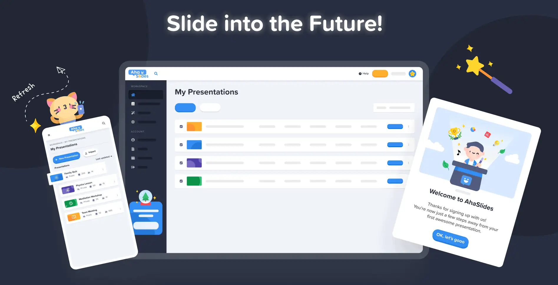
Bij AhaSlides is het ons doel om presentaties leuker, boeiender en waardevoller te maken voor jou en je publiek. Vandaag zetten we een grote stap in die richting met onze gloednieuw ontwerp!
De nieuwe AhaSlides is nieuwe op zoveel manieren. We hebben de zaken beter georganiseerd, flexibeler en overzichtelijker gemaakt. us dan ooit tevoren.
Het brein en de handen erachter waren onze ontwerper, Trang:
Ik heb de opgebouwde visie van de AhaSlides overgenomen en er mijn eigen stukjes aan toegevoegd. Het resultaat is iets dat geweldig is voor nieuwe gebruikers, maar ook een passend en oprecht bedankje is voor degenen die ons vanaf dag één hebben gevolgd.
Trang Tran - Ontwerper
Laten we eens kijken naar de wijzigingen die we hebben doorgevoerd en hoe deze u kunnen helpen om slimmere en betere presentaties te maken voor uw publiek.
Jeuk om het uit te zoeken? Ontdek wat er nieuw is door op onderstaande knop te klikken:
Wat is er nieuw?
Verbeterde look en feel 🤩
Deze keer hebben we gekozen voor iets meer… onszelf.
Merkidentiteit was een belangrijk aandachtspunt in het nieuwe ontwerp. Waar we in het verleden misschien wat terughoudend waren, zijn we nu klaar om pin.
De benadering van onze nieuwe identiteit is opgesplitst in 3 delen:
#1 – Illustratie
Toen we in 2019 begonnen, stonden schattige, kleurrijke beelden niet echt hoog op de to-dolijst. We kozen voor functionaliteit in plaats van uiterlijk.
Nu, met een solide ontwikkelingsteam dat hard werkt aan het creëren en verbeteren van functies, kon onze hoofdontwerper Trang zich concentreren op het maken van AhaSlides aantrekkelijker Het was een gigantische taak om een nieuwe merkidentiteit te vormen rond illustraties en animaties, maar een die resulteerde in een geweldige bibliotheek met schattige ontwerpen:

Bekijk deze andere voorbeelden van nieuwe illustraties op de Mijn presentaties-dashboard en Aanmelden pagina:
Elke illustratie heeft zijn eigen plek en rol. We denken dat dit een warm welkom is voor onze nieuwe en huidige gebruikers, die de speelse geest van AhaSlides al kunnen ervaren zodra ze inloggen.
Na een gesprek met Dave [CEO van AhaSlides] besloten we dat we het levendiger en speelser wilden maken. Zoals je kunt zien, is de beeldtaal nu ronder en schattiger, maar we wilden het niet te kinderachtig maken. Ik denk dat we nu een goede balans tussen plezier en functie.
Trang Tran - Ontwerper
#2 – Kleur
Levendigheid was echt het sleutelwoord bij het nieuwe ontwerp. We wilden iets dat zijn eigen levendigheid niet schuwde en iets dat de vreugde uitstraalde van het creëren van een spannende presentatie om te delen met een live publiek.
Daarom hebben we de inzet verdubbeld sterke, gedurfde kleuren.
We vertrokken van het kenmerkende blauw en geel van ons logo en breidden ons kleurenpalet uit naar de tinten rood, oranje, groen en paars:
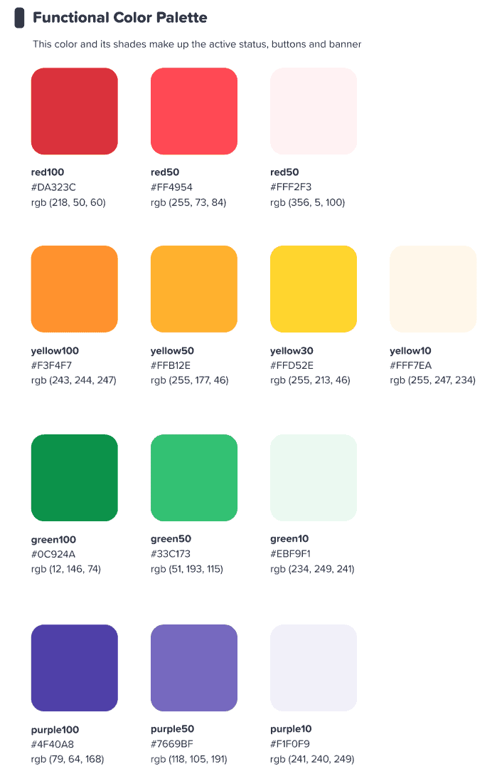
We hoopten dat deze kleurrijke interface onze gebruikers zou inspireren iets beginnen kleurrijk.
Trang Tran - Ontwerper
⭐ Binnenkort verkrijgbaar! ⭐ Natuurlijk wilden we onze nieuwe focus op kleur ook naar onze gebruikers uitbreiden. Daarom kunnen presentatoren binnenkort elke gewenste kleur kiezen. voor hun tekst:

#3 – Informatiearchitectuur
Het behoeft geen betoog dat een nieuwe look en feel een functie.
Daarom hebben we een grote verandering doorgevoerd in de IA (Informatie Architectuur) van AhaSlides. Dit betekent in feite dat we onderdelen van onze software opnieuw hebben ingedeeld en vormgegeven om gebruikers beter te helpen begrijpen wat ze doen.
Hier is een voorbeeld van wat we bedoelen: de oude en nieuwe presentatieknoppen:

Like allen knoppen in het nieuwe ontwerp, de bovenstaande hebben wat we alleen kunnen omschrijven als een meer knoop-y gevoelWe hebben een vergelijkbare schaduw en gloed toegevoegd aan veel selectieopties, niet alleen om ze een realistisch gevoel te geven, maar ook om de IA te verbeteren, zodat gebruikers beter begrijpen wat er is geselecteerd en waar hun focus moet liggen.
Wat anders? Welnu, je kunt een paar IA-wijzigingen in deze afbeelding zien:
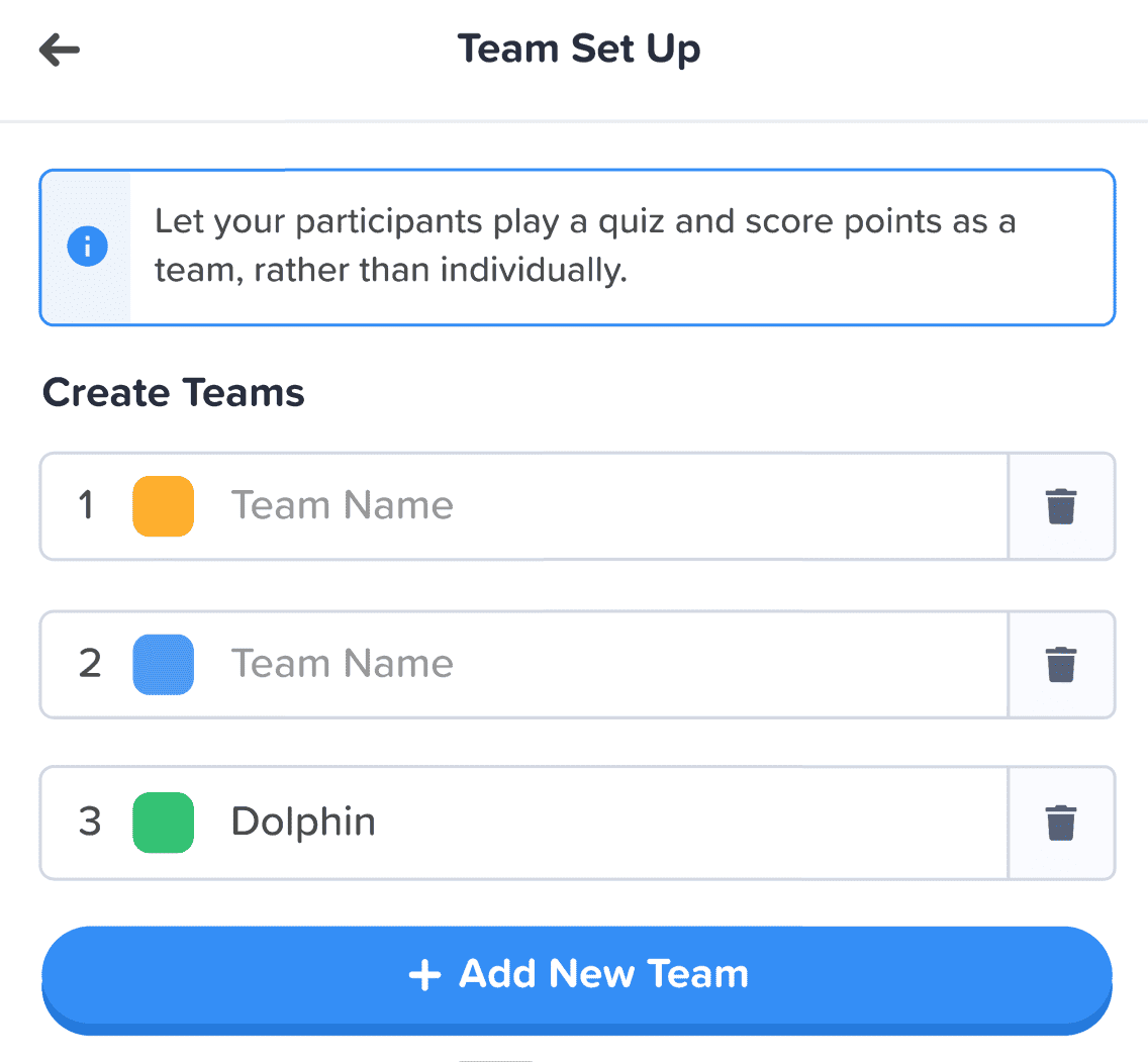
Naast de knop hebben we nog meer verbeteringen doorgevoerd op de volgende manieren:
- Individuele dozen om elk element te helpen scheiden.
- Vette tekst onderscheidt ingevoerde informatie van de vervaagde tekst van een leeg vak.
- Pictogrammen en kleuren laat informatieboxen opvallen.
De veranderingen in de informatiearchitectuur zijn misschien subtiel, maar dat was mijn bedoeling. Ik wilde niet dat onze gebruikers naar een nieuw huis zouden moeten verhuizen, ik wilde gewoon, op kleine manieren, het huis waar ze al wonen, wat opfleuren.
Trang Tran - Ontwerper
Betere organisatie, vlottere navigatie 📁
Zoals we al zeiden: wat is het nut van het mooier maken van dingen als de functionaliteit er niet mee verbetert?
Daar komt onze tweede grote verandering om de hoek kijken. We hebben een heleboel digitale meubels gekocht en de rommel opgeruimd.
Laten we eens kijken naar vier gebieden waar we verbeteringen hebben doorgevoerd:
- Mijn presentatiedashboard
- Editor bovenste balk
- Editor linkerkolom
- Editor rechterkolom (binnenkort beschikbaar!)
#1 – Mijn presentatiedashboard
Oké, we geven het toe: het was niet altijd even makkelijk om je presentaties te vinden en in te delen in het oude ontwerp van het dashboard.
Gelukkig hebben we een aantal grote veranderingen doorgevoerd op het nieuwe dashboard…
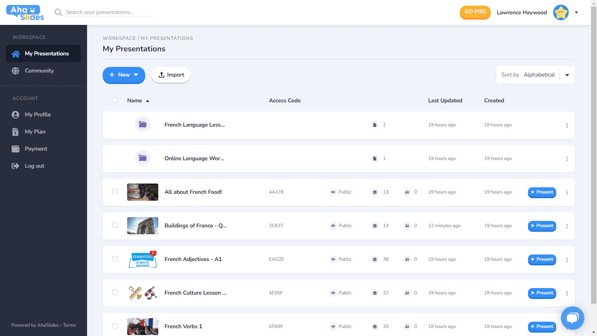
- Elke presentatie heeft zijn eigen container.
- Containers hebben nu miniatuurafbeeldingen (de miniatuur is de eerste afbeelding van uw presentatie).
- Presentatie-opties (dupliceren, gegevens wissen, verwijderen, etc.) bevinden zich nu in een opgeruimd kebabmenu.
- Er zijn meer manieren om uw presentaties te sorteren en te zoeken.
- Uw 'Werkruimte' en uw 'Account' zijn nu in de linkerkolom gescheiden.
⭐Binnenkort verkrijgbaar!⭐ Binnenkort komt er een gloednieuwe optie voor het weergeven van het dashboard – Grid View In deze weergave kunt u uw presentaties bekijken in een beeldcentrisch rasterformaat. U kunt op elk moment wisselen tussen de rasterweergave en de standaardlijstweergave.
#2 – Editor-bovenbalk
We hebben een paar dingen gewijzigd in de bovenste balk van het editorscherm…

- Het aantal opties in de bovenste balk is verkleind van 4 naar 3.
- Vervolgkeuzemenu's voor elke optie bieden een betere organisatie.
- De breedte van de vervolgkeuzelijsten is gewijzigd om ervoor te zorgen dat het menu in de rechterkolom past.
#3 – Linkerkolom van de redacteur
Eenvoudiger en strakker ontwerp in de inhoudskolom van uw presentatie. De rasterweergave heeft ook een geheel nieuwe look...
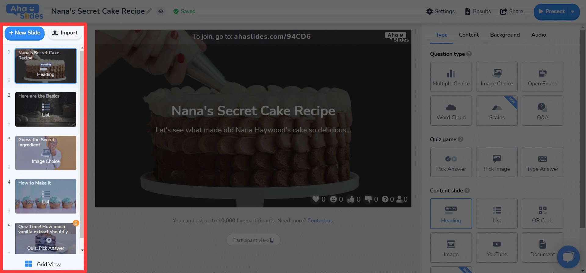
- Dia-opties zijn nu opgeruimd in een kebabmenu.
- Onderaan is een nieuwe knop voor de rasterweergave toegevoegd.
- De lay-out en werking van Grid View is sterk verbeterd.
⭐ Binnenkort verkrijgbaar! ⭐ De rechterkolom is nog niet helemaal af, maar dit is wat je er binnenkort kunt verwachten!
#4 – Redacteur rechterkolom
Kleine wijzigingen aan pictogrammen, grote wijzigingen aan tekstkleur…
- Opnieuw ontworpen pictogrammen voor elk type dia.
- Een enorme verscheidenheid aan tekstkleuropties.
- Elementen op het tabblad 'Inhoud' opnieuw geordend.
Bewerk overal, op elk apparaat 📱
Voor de 28% van onze gebruikers die hun presentaties op mobiele apparaten bewerken: het spijt ons dat we jullie zo lang hebben verwaarloosd. 😞
Met het nieuwe ontwerp wilden we onze mobiele en tabletgebruikers een platform bieden dat net zo responsief als desktop Dat betekende dat we elk element moesten heroverwegen om ervoor te zorgen dat onze gebruikers onderweg konden bewerken.
Het begint natuurlijk allemaal met het dashboardWe hebben hier een paar wijzigingen aangebracht...

De belangrijkste informatie over je presentaties en mappen vind je hier. Rechts vind je ook het kebabmenu waarmee je al je presentatie-instellingen overzichtelijk houdt.
On the editor, wordt u begroet door een andere, gebruiksvriendelijkere interface.
Nogmaals, alles is weggestopt in kebabmenu's. Door dit te doen, worden de afleidingen opgeruimd en heb je zoveel meer ruimte om je algehele presentatie te bekijken.

Wordt het steeds duidelijker dat we dol zijn op kebab? We hebben de overvolle bar van vroeger vervangen door, jawel, wéér een kebabmenu! Het zorgt voor een veel minder overweldigende interface en laat u zich concentreren op de kwaliteit van uw presentatie.

Ik wilde echt enkele van de beperkingen verwijderen die onze mobiele gebruikers ervan weerhouden de presentaties te maken die ze willen. We hebben gekozen voor iets dat strakker en eenvoudiger is dan voorheen, maar we hebben nog steeds grote plannen voor de mobiele mogelijkheden van AhaSlides in de toekomst!
Trang Tran - Ontwerper

Heb je het al geprobeerd?
Klik gewoon op de onderstaande knop om te zien
Het vernieuwde ontwerp van AhaSlides!