.webp)
Każdego dnia powstaje około 30 milionów prezentacji w programie PowerPoint. Badania sugerują, że zdecydowana większość z nich usypia ludzi, a zwrot „śmierć przez PowerPointa” tak mocno zakorzenił się w kulturze, że właściwie nie wymaga wyjaśnienia.
Oto paradoks: od dziesięcioleci wiemy, jak unikać nudnych prezentacji. Wykład Davida JP Phillipsa na TED na ten temat Obejrzano ponad 5 milionów razy. Książki o projektowaniu prezentacji zapełniają całe półki. Każdy profesjonalista obejrzał wystarczająco dużo fatalnych prezentacji, żeby wiedzieć, czego NIE robić. A jednak śmierć przez PowerPointa wciąż trwa.
Problemem nie jest brak wskazówek. To niezrozumienie przyczyn niepowodzeń prezentacji. Ten artykuł wykracza poza standardową radę „używaj mniej punktów” i zagłębia się w kognitywistykę, wyjaśniając, co tak naprawdę idzie nie tak, gdy prezentacje nudzą ludzi, i co można z tym zrobić.
Dlaczego mózg przestaje działać podczas złych prezentacji
Śmierć przez PowerPointa to nie problem projektowy. To problem poznawczy. Kiedy zrozumiemy, jak mózg przetwarza prezentacje, rozwiązania staną się oczywiste.
I to nie tylko teoria. W niedawnym badaniu AhaSlides, obejmującym 1,048 amerykańskich specjalistów regularnie prowadzących prezentacje, 82.4% z nich zgłasza regularne rozpraszanie uwagi publiczności. Najczęstsze przyczyny? Wielozadaniowość (48.3%), korzystanie z urządzeń cyfrowych (43.9%), zmęczenie ekranem (41.9%) i brak interaktywności (41.7%). To nie są przypadkowe skargi – mają one bezpośrednie odniesienie do poniższych zagadnień z zakresu nauk kognitywnych.

Efekt redundancji
Psycholog poznawczy Richard Mayer zidentyfikował zjawisko, które nazwał efektem redundancji: gdy prezenter czyta tekst, który publiczność również czyta na ekranie, poziom zrozumienia w rzeczywistości maleje w porównaniu z sytuacją, gdy prezenter czyta wyłącznie słowo mówione lub sam tekst.
Wydaje się to sprzeczne z intuicją. Więcej informacji powinno pomóc, prawda? Ale system przetwarzania języka w mózgu nie potrafi jednocześnie czytać i słuchać. Kiedy wyświetlasz akapit na ekranie, a następnie czytasz go na głos, odbiorcy są zmuszeni wybrać, które dane wejściowe przetworzyć. Większość ludzi zaczyna czytać (ponieważ dane wizualne są bardziej bezpośrednie), co oznacza, że przestają cię słuchać. W rezultacie ani wersja mówiona, ani pisana nie zostaje prawidłowo przetworzona.
Jest to najczęstsza przyczyna zgonów związanych z programem PowerPoint i wyjaśnia, dlaczego nawet prezenterzy z dobrymi intencjami i dobrą treścią tracą publiczność.
Przeciążenie poznawcze
Pamięć robocza ma ograniczoną pojemność, około czterech do siedmiu bloków informacji w dowolnym momencie, według badań kognitywisty George'a Millera i późniejszych aktualizacji Nelsona Cowana. Slajd z ośmioma punktami, wykresem, podtytułem i obrazkiem przekracza tę pojemność.
Kiedy slajd prezentuje więcej informacji, niż pamięć robocza jest w stanie przetworzyć, mózg nie przetwarza ich wszystkich wolniej. Zaczyna całkowicie pomijać informacje. Publiczność dosłownie nie jest w stanie przyswoić tego, co jej pokazujesz, bez względu na to, jak ważne to jest.
Krzywa zaniku uwagi
Badania przeprowadzone na Uniwersytecie w Melbourne wykazały, że uwaga publiczności podczas tradycyjnych wykładów przebiega według przewidywalnego schematu: stosunkowo wysoka przez pierwsze kilka minut, po czym następuje gwałtowny spadek. W środowiskach wirtualnych spadek ten jest jeszcze szybszy, a w niektórych badaniach koncentracja uwagi spada poniżej minuty.
To nie lenistwo. To biologia. Mózg jest zaprogramowany do reagowania na nowości i zmiany. Ciągły strumień slajdów o podobnym formacie, podobnej gęstości informacji i podobnym przekazie tworzy monotonny sygnał, który mózg uczy się ignorować.
Prezenterzy też to czują. W tym samym Ankieta AhaSlides88% respondentów uważa, że czas koncentracji uwagi ulega skróceniu — 43.2% odpowiedziało „znacznie”. Zapytani o przyczynę, 61.5% wskazało na media społecznościowe i ciągłe powiadomienia, a 64% na nadmiar informacji. Tylko 3.4% stwierdziło, że czas koncentracji uwagi faktycznie się poprawia.
Sześć objawów śmierci według programu PowerPoint
Zanim naprawisz problem, warto go zdiagnozować. Oto jak wygląda śmierć przez PowerPointa w praktyce.
Slajdy, które pełnią funkcję dokumentów. Jeśli ktoś może przeczytać Twoją prezentację i zrozumieć wszystko, nie słysząc Twojej prezentacji, Twoje slajdy nie spełniają swojej funkcji. Slajdy powinny uzupełniać narrację, a nie ją zastępować.
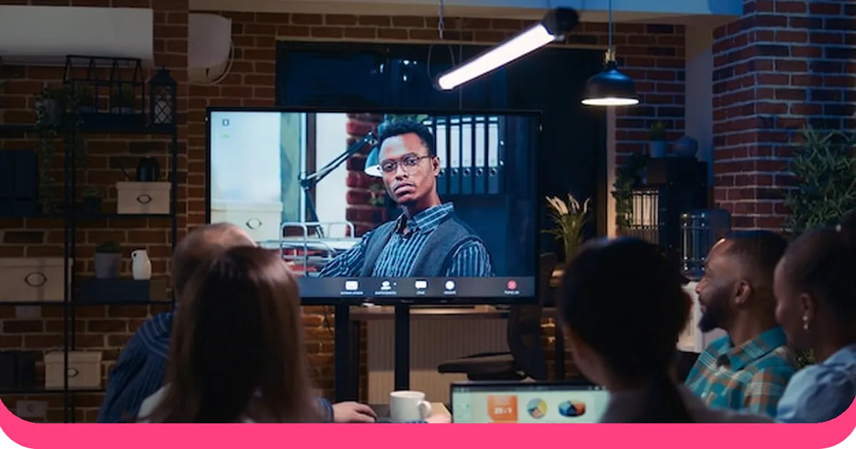
Prezenter czyta z ekranu. Kiedy prezenter odwraca się do ekranu i zaczyna czytać, publiczność otrzymuje jasny sygnał: „Nie jestem tu potrzebny. Moglibyście sami to przeczytać”. To moment, w którym zaangażowanie znika.
Nadmiar informacji na slajdzie. Więcej niż jeden kluczowy pomysł na slajdzie, więcej niż sześć elementów wizualnych lub więcej niż 20 słów tekstu. Badania Davida JP Phillipsa sugerują, że przekroczenie tych progów wywołuje reakcję przeciążenia poznawczego.
Brak zmian w formacie. Slajd za slajdem o tej samej strukturze (tytuł, punkty wypunktowane, może obrazek w rogu) tworzy schemat, który mózg uczy się ignorować. Nowość i różnorodność podtrzymują uwagę.
Brak udziału publiczności. Publiczność siedzi biernie przez cały czas trwania, nie wnosząc nic, nie odpowiadając na nic, nie analizując niczego aktywnie. To sposób prezentacji w formie wykładu, a badania Narodowej Akademii Nauk pokazują, że daje on najgorsze rezultaty w zapamiętywaniu ze wszystkich formatów prezentacji. Rzeczywisty koszt jest wysoki: w badaniu AhaSlides 69.8% prezenterów stwierdziło, że skrócenie czasu koncentracji uwagi negatywnie wpływa na produktywność, 66.1% zgłosiło słabsze zapamiętywanie informacji, a 63.3% odnotowało słabsze rezultaty w nauce. Jest też mniejszy koszt — 33.3% stwierdziło, że wpływa to na ich odczucia dotyczące własnej pracy.
Niejasny cel. Prezentacja nie odpowiada na fundamentalne pytanie publiczności: „Dlaczego to jest dla mnie ważne?”. Bez wyraźnego odniesienia do zainteresowań, obaw lub obowiązków publiczności, nawet dobrze zaprojektowane slajdy nie są w stanie zainteresować odbiorców.
Jak uniknąć tych błędów prezentacyjnych
Zacznij od przesłania, nie slajdów
Trener prezentacji Benjamin Ball nazywa to podejściem „prezentacji opartej na przesłaniu”: zanim otworzysz program PowerPoint, zapisz jedno zdanie, które chcesz, aby odbiorcy zapamiętali. Wszystko w prezentacji powinno być zgodne z tym zdaniem. Wszystko, co nie jest z nim powiązane, niezależnie od tego, jak interesujące, zostaje pominięte.
To trudniejsze, niż się wydaje, ponieważ wymaga podjęcia decyzji, co pominąć. Ale ograniczenia to wróg śmierci PowerPointa. Skoncentrowana prezentacja z 10 przejrzystymi slajdami zawsze będzie lepsza od kompleksowej, składającej się z 40 slajdów.

Zastosuj zasadę jednej wiadomości na slajd
Najważniejsza zasada Phillipsa jest jednocześnie najprostsza: jeden przekaz na slajd. Nie jeden temat. Nie jedna sekcja. Jeden przekaz.
Jeśli Twój slajd komunikuje „Przychody w trzecim kwartale wzrosły o 12% rok do roku”, to jest to jedyna informacja na tym slajdzie (być może z prostym wykresem pokazującym trend). Następny slajd może dodać kontekst. Kolejny może wyjaśnić czynniki napędzające ten wzrost. Ale każdy slajd niesie ze sobą dokładnie jedną myśl.
To podejście radykalnie zmniejsza obciążenie poznawcze i wymusza jasność myślenia. Jeśli nie potrafisz wyrazić przesłania slajdu w jednym zdaniu, slajd próbuje przekazać zbyt wiele.

Projekt dla ucha, nie dla oka
Oto zasada, która przeczy większości porad projektowych: Twoje slajdy powinny być nieco mylące bez narracji. Jeśli ktoś czyta Twoją prezentację, nie słysząc Twojej prezentacji, powinien zrozumieć sedno, ale nie dostrzec pełnego obrazu.
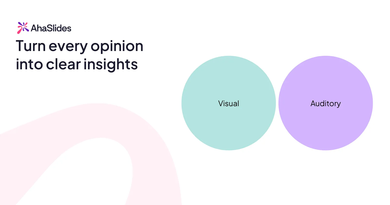
Oznacza to, że slajdy zawierają wskazówki wizualne (wykres, obraz, słowo kluczowe), a nie pełne wyjaśnienia. Wyjaśnienie pochodzi od Ciebie. To podejście prawidłowo wykorzystuje zasadę multimediów: kanały wizualne i słuchowe przekazują uzupełniające się, a nie redundantne informacje.
Przerwij schemat co 8-10 minut
Uwaga odbiorców podlega pewnemu cyklowi. Osiąga szczyt, gdy dzieje się coś nowego (inny format slajdu, pytanie, film, zmiana sposobu przekazu), i spada, gdy schemat staje się przewidywalny.
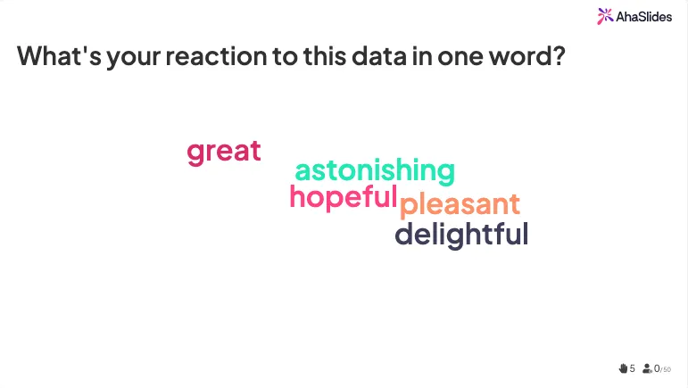
Wprowadź do swojej prezentacji przemyślane, schematyczne przejścia. Po dwóch lub trzech slajdach z treścią wstaw punkt interakcji. Może to być ankieta na żywo („Biorąc pod uwagę to, co właśnie omówiliśmy, gdzie Twoim zdaniem leży największe ryzyko?”), chmura słów („Jaka jest Twoja reakcja na te dane jednym słowem?”) lub proste pytanie z podniesieniem rąk.
Te punkty interakcji pełnią wiele funkcji: resetują cykl uwagi, dają informację zwrotną w czasie rzeczywistym na temat zrozumienia przekazu przez odbiorców i przesuwają ich od biernej konsumpcji do aktywnego przetwarzania.
Narzędzia takie jak AhaSlides pozwalają płynnie przełamywać schematy. Możesz wstawiać ankiety na żywo, quizy, chmury słów i sesje pytań i odpowiedzi bezpośrednio do prezentacji PowerPoint lub Google Slides. Publiczność odpowiada za pomocą telefonów, wyniki pojawiają się na ekranie w czasie rzeczywistym, a energia w sali zmienia się ze „słuchania” na „uczestniczenie”.
Zastąp punkty wypunktowane rozmową
Najbardziej radykalnym lekarstwem na śmierć PowerPointa nie są lepsze slajdy. To mniej slajdów i więcej interakcji.
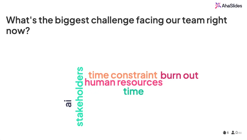
Pomyśl o tym: zamiast slajdu z listą „Pięć wyzwań stojących przed naszym działem”, możesz wyświetlić chmurę słów z pytaniem „Jakie jest największe wyzwanie, przed którym stoi obecnie nasz zespół?”. Publiczność wpisuje odpowiedzi, chmura słów pojawia się na ekranie i nagle otrzymujesz prawdziwe dane od prawdziwych ludzi, zamiast z góry ustalonej listy, która może, ale nie musi, odzwierciedlać to, co faktycznie myślą zgromadzeni.
Takie podejście nie tylko zapobiega nudzie. Generuje lepsze rezultaty. Publiczność wnosi swoją perspektywę, czuje się wysłuchana i angażuje się w treść na głębszym poziomie niż jakikolwiek slajd z wypunktowaniami.
Śmierć przez audyt PowerPoint
Przed wygłoszeniem kolejnej prezentacji zadaj sobie pięć poniższych pytań.
- Czy ktoś jest w stanie zrozumieć całą prezentację, czytając jedynie slajdy? Jeśli tak, Twoje slajdy spełniają swoją rolę. Wytnij tekst i pozwól narracji przekazać przesłanie.
- Czy któryś ze slajdów zawiera więcej niż jedną główną myśl? Jeśli tak, podziel to na dwa slajdy. Slajdy są bezpłatne. Przeciążenie poznawcze jest kosztowne.
- Czy przerwa w działaniu schematu następuje co najmniej co 8–10 minut? Jeśli nie, dodaj punkt interakcji, inny format wizualny, wideo lub pytanie.
- Czy mógłbyś przedstawić to bez slajdów, gdyby technologia zawiodła? Jeśli nie, to jesteś zbyt zależny od talii. Ćwicz przekazywanie głównego przesłania bez żadnego wsparcia wizualnego.
- Czy publiczność robi coś więcej niż tylko słucha? Jeśli odpowiedź brzmi „nie”, masz do czynienia z wykładem, a nie prezentacją. Dodaj co najmniej dwa lub trzy momenty, w których publiczność aktywnie uczestniczy w dyskusji.
PYTANIA I ODPOWIEDZI
Co właściwie oznacza „śmierć przez PowerPointa”?
Termin ten, prawdopodobnie ukuty przez Angelę R. Garber w 2001 roku, opisuje prezentacje tak przeładowane tekstem, wypunktowaniami i monotonnym przekazem, że publiczność mentalnie się wyłącza. Nie chodzi tu konkretnie o PowerPointa. Chodzi o każdy format prezentacji, w którym gęstość informacji jest priorytetem nad zaangażowaniem odbiorców.
Jakie są główne przyczyny zgonów z powodu programu PowerPoint?
Trzy główne przyczyny to przeciążenie poznawcze (zbyt dużo informacji na slajdzie), efekt redundancji (czytanie tekstu, który jest jednocześnie mówiony) oraz brak zróżnicowania (powtarzanie tego samego formatu slajdów przez całą prezentację). Wszystkie trzy mają swoje źródło w sposobie przetwarzania informacji przez mózg, a nie w lenistwie czy ograniczonej koncentracji uwagi.
Ile slajdów powinna mieć prezentacja?
Nie ma uniwersalnej reguły, ale model Guya Kawasakiego 10/20/30 (10 slajdów, 20 minut, czcionka minimum 30 punktów) to dobry punkt wyjścia. Ważniejsza od liczby slajdów jest zasada jednego przekazu na slajd. Dwadzieścia slajdów z jedną myślą na każdym z nich zaangażuje lepiej niż dziesięć slajdów z trzema myślami na każdym.
Czy oprogramowanie do interaktywnych prezentacji naprawdę pomaga?
Tak, a dowody są mocne. Badania konsekwentnie pokazują, że aktywne uczestnictwo poprawia zapamiętywanie, zaangażowanie i satysfakcję w porównaniu z pasywnymi formatami wykładów. Interaktywne narzędzia, takie jak AhaSlides, pozwalają osadzać ankiety, quizy i sesje pytań i odpowiedzi bezpośrednio w istniejących slajdach, przekształcając jednostronną prezentację w dwustronną rozmowę bez konieczności przebudowywania całej prezentacji.
Aukcje internetowe dla Twojej strony!