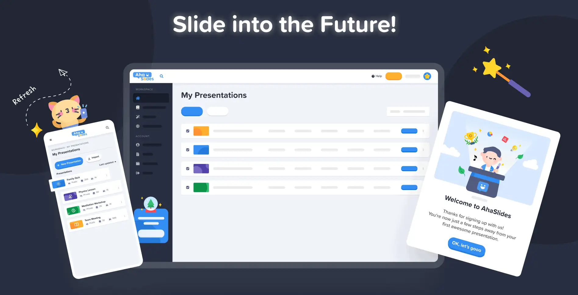
W AhaSlides naszym celem jest uczynienie prezentacji przyjemniejszymi, bardziej angażującymi i bardziej satysfakcjonującymi dla Ciebie i Twojej publiczności. Dzisiaj robimy ogromny krok w tym kierunku dzięki naszym zupełnie nowy projekt!
Nowy AhaSlides to nowych na wiele sposobów. Sprawiliśmy, że rzeczy stały się bardziej zorganizowane, bardziej elastyczne i bardziej us niż kiedykolwiek wcześniej.
Mózgiem i rękami stojącymi za tym wszystkim był nasz projektant, Trang:
Wziąłem nagromadzoną wizję AhaSlides i dodałem własne fragmenty. Skończyliśmy z czymś, co jest świetne dla nowych użytkowników, ale także stosownym i szczerym „dziękuję” dla tych, którzy byli z nami od pierwszego dnia.
Trang Tran – Projektant
Przyjrzyjmy się bliżej wprowadzonym zmianom i temu, jak mogą one pomóc Ci tworzyć prezentacje, które będą mądrzejsze i lepsze dla Twoich odbiorców.
Masz ochotę to sprawdzić? Kliknij poniższy przycisk, aby dowiedzieć się, co nowego:
Co nowego?
- Ulepszony wygląd i styl
- Lepsza organizacja, płynniejsza nawigacja
- Edytuj w dowolnym miejscu, na dowolnym urządzeniu
Ulepszony wygląd i styl 🤩
Tym razem zdecydowaliśmy się na coś bardziej… naszego.
Tożsamość marki był głównym punktem nowego projektu. Podczas gdy w przeszłości mogliśmy być nieco powściągliwi, teraz jesteśmy gotowi, aby być .
Podejście do naszej nowej tożsamości jest podzielone na 3 części:
#1 – Ilustracja
Kiedy zaczynaliśmy w 2019 r., ładne, kolorowe obrazy nie były wysoko na liście „rzeczy do zrobienia”. Postawiliśmy na funkcjonalność, a nie na wygląd.
Teraz, gdy solidny zespół programistów ciężko pracuje nad tworzeniem i ulepszaniem funkcji, nasz główny projektant Trang może skupić się na udoskonalaniu AhaSlides bardziej atrakcyjny. Stworzenie nowej tożsamości marki wokół ilustracji i animacji było gigantycznym zadaniem, ale zaowocowało to ogromną biblioteką uroczych projektów:

Zapoznaj się z innymi przykładami nowych ilustracji w witrynie Panel moich prezentacji i strona rejestracji:
Każda ilustracja ma swoje miejsce i rolę. Uważamy, że jest to cieplejsze powitanie dla naszych nowych i obecnych użytkowników, którzy mogą dostrzec zabawnego ducha AhaSlides, gdy tylko się zalogują.
Po rozmowie z Dave’em [CEO AhaSlides] zdecydowaliśmy, że chcemy, aby wszystko było bardziej żywe i zabawne. Jak widać, obrazowanie jest teraz bardziej zaokrąglone, bardziej słodkie, ale nie chcieliśmy, aby było zbyt dziecinne. Myślę, że to, co mamy teraz, to dobra równowaga zabawy i funkcjonalności.
Trang Tran – Projektant
#2 – Kolor
Żywość naprawdę było słowem kluczowym w nowym projekcie. Chcieliśmy czegoś, co nie będzie krępowało się własnej żywotności i czegoś, co odzwierciedli radość tworzenia ekscytującej prezentacji do udostępnienia publiczności na żywo.
Dlatego podwoiliśmy nasze wysiłki mocne, odważne kolory.
Odchodziliśmy od charakterystycznego niebieskiego i żółtego naszego logo i rozszerzyliśmy paletę kolorów o odcienie czerwieni, pomarańczy, zieleni i fioletu:
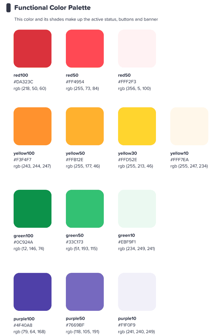
Liczyliśmy, że ten kolorowy interfejs zainspiruje naszych użytkowników zacząć coś kolorowy.
Trang Tran – Projektant
⭐ Wkrótce! ⭐ Oczywiście chcieliśmy rozszerzyć nasze nowe skupienie na kolorze również na naszych użytkowników. Dlatego prezenterzy wkrótce będą mieli możliwość wyboru dowolnego koloru pod słońcem za ich tekst:

#3 – Architektura informacji
Nie trzeba dodawać, że nowy wygląd i styl muszą mieć rozszerzenie funkcjonować.
Dlatego wprowadziliśmy dużą zmianę w IA (Architektura informacji) AhaSlides. Zasadniczo oznacza to, że przearanżowaliśmy i przeprojektowaliśmy części naszego oprogramowania, aby lepiej pomóc użytkownikom zrozumieć, co robią.
Oto jeden przykład tego, co mamy na myśli – stare i nowe przyciski teraźniejszości:

Jak cała kolekcja przyciski w nowym projekcie, te powyżej mają to, co możemy opisać tylko jako jeszcze czucie guzikaDodaliśmy podobny cień i blask do wielu opcji wyboru nie tylko po to, aby nadać im realistyczny charakter, ale także po to, aby ulepszyć IA, dzięki czemu użytkownicy lepiej rozumieją, co jest zaznaczone i na czym powinni się skupić.
Co jeszcze? Na tym obrazku widać kilka zmian w IA:
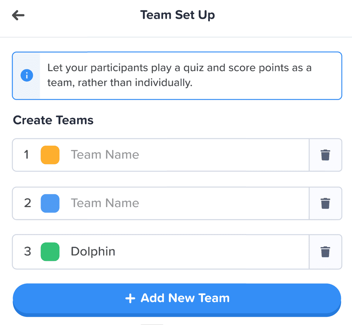
Oprócz przycisku wprowadziliśmy również następujące udoskonalenia:
- Pojedyncze pudełka aby pomóc w segregacji każdego elementu.
- Pogrubiony tekst odróżnia wprowadzone informacje od wyblakłego tekstu pustego pola.
- Ikony i kolory sprawić, by pola informacyjne się wyróżniały.
Zmiany w architekturze informacji mogą być subtelne, ale taki był mój zamiar. Nie chciałem, aby nasi użytkownicy musieli przeprowadzać się do nowego domu, chciałem po prostu ozdobić, w małych krokach, dom, w którym już są.
Trang Tran – Projektant
Lepsza organizacja, płynniejsza nawigacja 📁
Jak już powiedzieliśmy – jaki jest sens w upiększaniu rzeczy, jeśli wraz z tym nie poprawia się ich funkcjonalność?
To właśnie tutaj pojawia się nasza druga duża zmiana. Kupiliśmy mnóstwo cyfrowych mebli i uporządkowaliśmy bałagan.
Przyjrzyjmy się 4 obszarom, w których wprowadziliśmy ulepszenia:
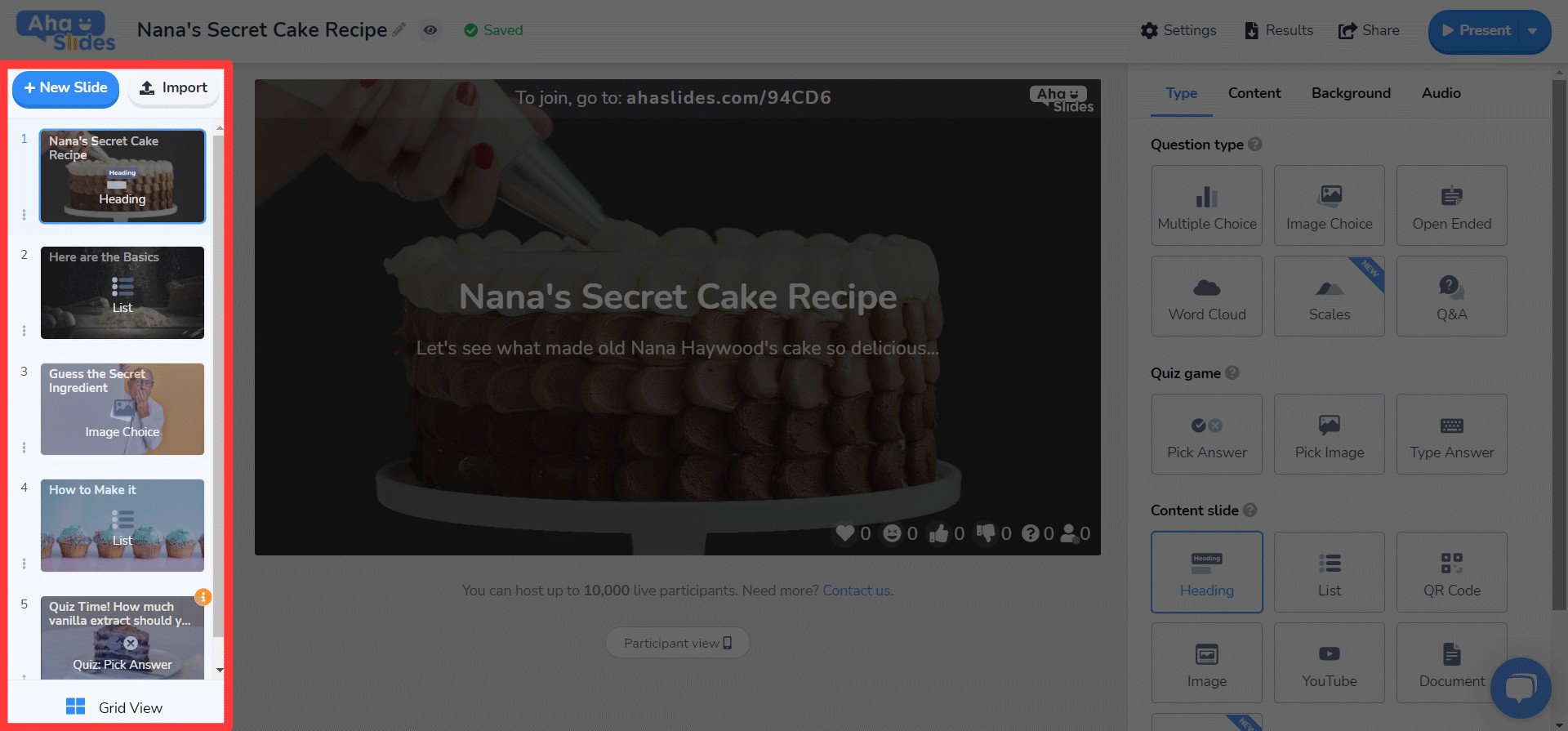
#1 – Mój panel prezentacji
No dobrze, przyznajemy – znalezienie i uporządkowanie prezentacji w starym wyglądzie pulpitu nie zawsze było najłatwiejszą rzeczą.
Na szczęście wprowadziliśmy spore zmiany w nowym panelu…
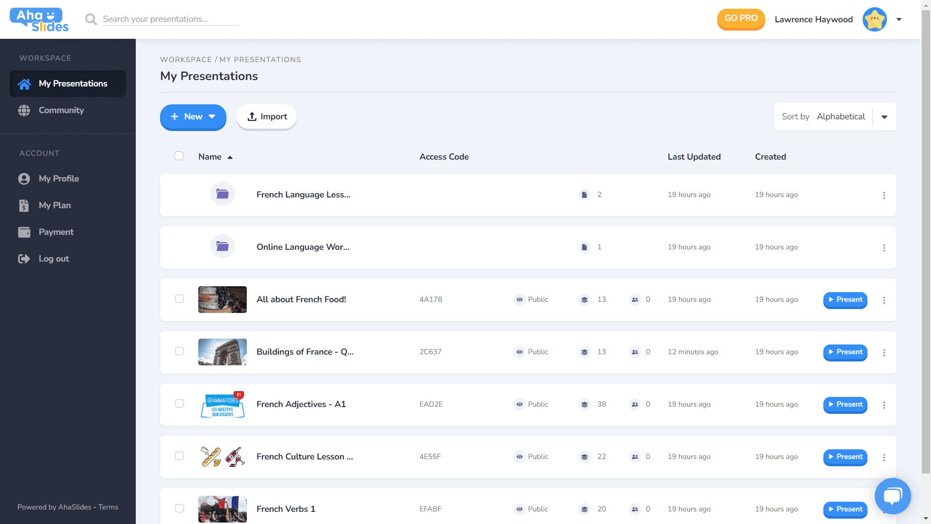
- Każda prezentacja ma swój własny kontener.
- Kontenery mają teraz obrazy miniatur (miniatura będzie pierwszym obrazem Twojej prezentacji).
- Opcje prezentacji (duplikowanie, usuwanie danych, usuwanie itp.) Znajdują się teraz w uporządkowanym menu z kebabem.
- Istnieje więcej sposobów sortowania i wyszukiwania prezentacji.
- Twój „Obszar roboczy” i Twoje „Konto” są teraz rozdzielone w lewej kolumnie.
⭐Wkrótce!⭐ W niedalekiej przyszłości pojawi się zupełnie nowa opcja widoku pulpitu nawigacyjnego – grid View! Ten widok umożliwia wyświetlanie prezentacji w siatkowym formacie skoncentrowanym na obrazie. W dowolnym momencie możesz przełączać się między widokiem siatki a domyślnym widokiem listy.
#2 – Górny pasek edytora
Przeorganizowaliśmy kilka rzeczy w górnym pasku na ekranie edytora…

- Liczba opcji na górnym pasku została zmniejszona z 4 do 3.
- Menu rozwijane dla każdej opcji zapewniają lepszą organizację.
- Szerokość list rozwijanych została zmieniona, aby zapewnić dopasowanie menu do prawej kolumny.
#3 – Lewa kolumna redaktora
Prostszy, bardziej elegancki projekt w kolumnie zawartości prezentacji. Widok siatki ma również zupełnie nowy wygląd…
- Opcje slajdów są teraz uporządkowane w menu kebaba.
- Na dole dodano nowy przycisk widoku siatki.
- Układ i działanie widoku siatki zostały znacznie ulepszone.
⭐ Wkrótce! ⭐ Prawa kolumna nie jest jeszcze całkowicie ukończona, ale oto, czego możecie się tam wkrótce spodziewać!
#4 – Kolumna prawa redaktora
Małe zmiany w ikonach, duże zmiany w kolorze tekstu…
- Przeprojektowane ikony dla każdego typu slajdu.
- Ogromna różnorodność opcji kolorów tekstu.
- Zmieniono kolejność elementów na karcie „Zawartość”.
Edytuj w dowolnym miejscu, na dowolnym urządzeniu 📱
Przepraszamy 28% naszych użytkowników, którzy edytują swoje prezentacje na urządzeniach mobilnych, za tak długie zaniedbanie ????
Dzięki nowemu projektowi chcieliśmy zapewnić użytkownikom urządzeń mobilnych i tabletów platformę, która jest tak samo responsywny jak komputer. Oznaczało to przemyślenie każdego elementu, aby upewnić się, że nasi użytkownicy mogą edytować w dowolnym miejscu.
Oczywiście wszystko zaczyna się od deska rozdzielcza. Wprowadziliśmy tutaj kilka zmian…

Najważniejsze informacje o prezentacjach i folderach są tutaj wyświetlane. Po prawej stronie znajduje się również menu kebab, które utrzymuje wszystkie ustawienia prezentacji w porządku.
On dotychczasowy redaktor, zostaniesz powitany przez inny, bardziej przyjazny interfejs.
Znowu wszystko jest schowane w menu kebabów. Takie postępowanie usuwa czynniki rozpraszające i pozostawia o wiele więcej miejsca na przeglądanie całej prezentacji.

Czy staje się oczywiste, że kochamy kebaby? Zastąpiliśmy przepełniony górny bar starym, tak, kolejnym menu kebabów! To sprawia, że znacznie mniej przytłaczający interfejs i pozwala skupić się na jakości prezentacji.

Naprawdę chciałem usunąć niektóre ograniczenia które uniemożliwiają naszym użytkownikom urządzeń mobilnych tworzenie prezentacji, których chcą. Poszliśmy w stronę czegoś bardziej eleganckiego i prostego niż wcześniej, ale nadal mamy wielkie plany dla przyszłych możliwości mobilnych AhaSlides!
Trang Tran – Projektant

Próbowałeś już?
Po prostu kliknij przycisk poniżej, aby zobaczyć
Odświeżony wygląd AhaSlides!