

Większość danych z ankiet nie przynosi żadnych rezultatów. Zespoły przeprowadzić ankietę, zestawić liczby, a następnie stworzyć prezentację wyników ankiety, która będzie zawierać listę wszystkich pytań i ich procentowe rozbicie. Interesariusze kiwają głowami podczas spotkania, prezentacja trafia do archiwum, a nic się nie zmienia. Brzmi znajomo?
Problemem rzadko są dane. Problemem jest prezentacja. Ten przewodnik omawia, jak strukturować, wizualizować i prezentować wyniki ankiet, aby to one napędzały decyzje, a nie wypełniały teczkę archiwum. Raport McKinsey Global Institute wykazał, że organizacje oparte na danych mają 23 razy większe szanse na pozyskanie klientów i 19 razy większe szanse na rentowność, jednak większość wyników ankiet nigdy nie przekłada się na decyzje, ponieważ są prezentowane bez jasnej narracji [5].
Co właściwie powinna zawierać prezentacja wyników ankiety
Zanim wybierzesz typ wykresu lub napiszesz slajd tytułowy, jasno określ cel prezentacji. Prezentacja wyników ankiety musi spełniać trzy rzeczy:
- Powiedz publiczności, co znalazłeś
- Wyjaśnij, dlaczego jest to dla nich szczególnie ważne
- Wskaż, co powinno się wydarzyć dalej
Wszystko inne to dekoracja. Dyrektorzy siedzą i słuchają prezentacji na temat zaangażowanie pracowników Brak danych do oceny metodologii. Chcą wiedzieć, co liczby mówią o stanie organizacji i co należy zmienić. Specjaliści HR analizujący wyniki ewaluacji szkoleń chcą wiedzieć, które programy działają, a które wymagają przeprojektowania. Rama ma znaczenie przed pierwszym slajdem.
Krok 1: Zanim cokolwiek stworzysz, poznaj swoją publiczność
Te same dane z ankiety muszą być prezentowane w różny sposób, w zależności od tego, kto znajduje się w pomieszczeniu. Szczegółowe zestawienie Skala Likerta Dystrybucja w ramach dziesięciu pytań jest odpowiednia dla zespołu analityków HR. Te same informacje przedstawione dyrektorowi finansowemu należy skondensować do dwóch lub trzech głównych ustaleń bezpośrednio powiązanych z wynikami biznesowymi.
Zanim zaczniesz tworzyć prezentację lub raport, odpowiedz sobie na poniższe pytania:
- Jaką decyzję musi podjąć ta publiczność?
- Ile informacji kontekstowych mają już na temat ankiety i jej celów?
- Ile czasu będą mieli na przejrzenie i obejrzenie prezentacji?
- Jaki poziom szczegółowości danych statystycznych uznają za przydatny, a jaki za przytłaczający?
W przypadku grup liderów zacznij od najważniejszego odkrycia. W przypadku grup praktyków możesz dodać więcej szczegółów. W przypadku grup mieszanych, ustrukturyzuj prezentację tak, aby najważniejsze wnioski pojawiły się na początku, a dane je potwierdzające – później. Dzięki temu interesariusze będą mogli wyjść po omówieniu najważniejszych wniosków, a zespół analityczny zostanie na resztę.
Krok 2: Przefiltruj dane przed ich wizualizacją
Ankieta składająca się z 30 pytań generuje 30 punktów danych, ale to nie oznacza, że należy przedstawić wszystkie 30. Większość ankiet zawiera od trzech do pięciu ustaleń, które rzeczywiście mają znaczenie dla podejmowanych decyzji. Reszta to w najlepszym razie kontekst, w najgorszym – szum informacyjny.
Przeanalizuj swoje wyniki i zadaj sobie pytanie: które wnioski są zaskakujące, istotne lub wykonalne? Pytanie, na które 94% respondentów odpowiedziało tak samo, nie mówi prawie nic: prawdopodobnie można je skrócić. Pytanie, na które odpowiedzi są mocno podzielone między działami lub w którym trend znacząco się zmienił od ostatniego cyklu ankiet, zazwyczaj powinno znaleźć się w prezentacji.
Ten etap filtrowania to obszar, w którym większość prezenterów nie inwestuje zbyt wiele. Pokazanie wszystkiego wydaje się dokładne, ale działa jak zaznaczanie każdego wiersza w podręczniku: gdy wszystko jest oznaczone jako ważne, nic takiego nie jest.
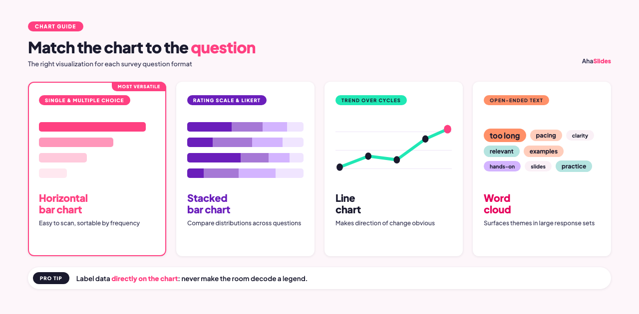
Krok 3: Wybierz typy wykresów odpowiadające danym
Różne formaty pytań wymagają różnych wizualizacji. Użycie niewłaściwego typu wykresu utrudnia zrozumienie dokładnych danych.
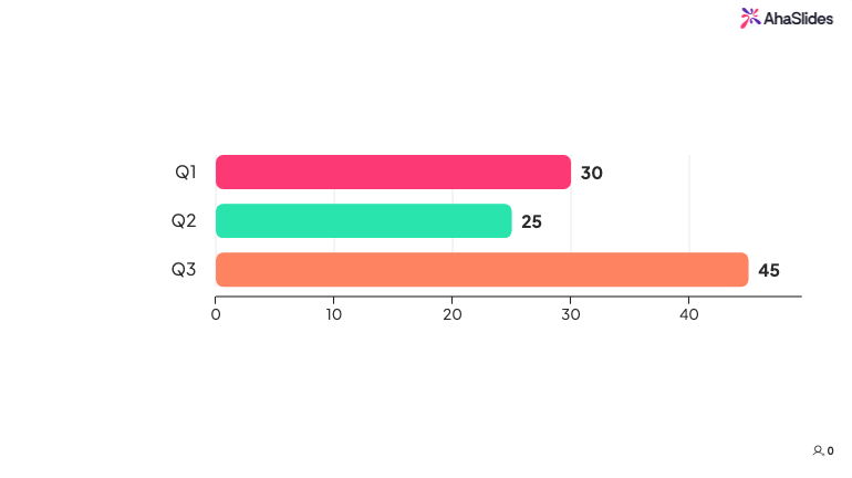
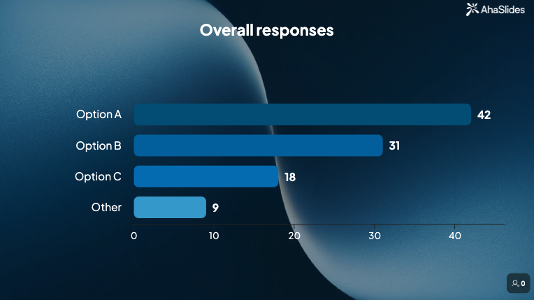
Pytania jednokrotnego i wielokrotnego wyboru Dobrze sprawdzają się jako poziome wykresy słupkowe. Wykresy słupkowe są łatwe do przeglądania, obsługują dowolną liczbę kategorii i pozwalają sortować odpowiedzi według częstotliwości, dzięki czemu wzorce są natychmiast widoczne [1]. Wykresy kołowe sprawdzają się w przypadku pytań jednokrotnego wyboru z czterema lub mniejszą liczbą odpowiedzi, w których głównym punktem jest proporcja do całości, ale stają się trudne do odczytania, gdy zawierają więcej niż pięć wycinków.
Skala ocen i pytania Likerta Najlepiej prezentują się w formie wykresów słupkowych, gdzie każdy słupek reprezentuje jedno pytanie, a segmenty pokazują rozkład odpowiedzi na całej skali [2]. Dzięki temu można porównać wzorce odpowiedzi na wiele pytań na jednym wykresie.
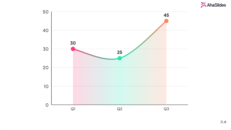
Dane trendowe, gdzie porównujesz wyniki z tego cyklu z poprzednim, najlepiej sprawdza się prosty wykres liniowy lub porównanie słupkowe. Celem jest, aby kierunek zmian był widoczny na pierwszy rzut oka.
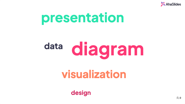
Odpowiedzi tekstowe otwarte Nie muszą być prezentowane jako surowe cytaty (choć kilka dobrze dobranych cytatów może być przekonujących). Chmury słów pozwalają szybko wyłuskać najczęściej używane terminy, co jest przydatne do wyszukiwania tematów w dużych zbiorach odpowiedzi.
Jedna spójna zasada we wszystkich typach wykresów: oznaczaj dane bezpośrednio na wykresie, zamiast polegać na legendach. Odbiorcy nie powinni musieć sprawdzać klucza kolorów, aby zrozumieć, co widzą.
Krok 4: Stwórz narrację, a nie listę
Różnica między przydatną prezentacją a tą, którą łatwo zapomnieć, często sprowadza się do tego, czy prezenter próbował opowiedzieć jakąś historię, czy też po prostu podać liczby [3].
Struktura narracyjna wyników ankiety zazwyczaj wygląda następująco:
Tło: Czego dotyczyło badanie, kto odpowiedział i kiedy zostało przeprowadzone? Ogranicz się do jednego slajdu lub kilku zdań. Odbiorcy potrzebują wystarczających danych, aby zaufać, a nie pełnego raportu metodologicznego.
Kluczowe ustalenie: Zacznij od najważniejszego rezultatu. Sformułuj go jako stwierdzenie, a nie pytanie. „Sześćdziesiąt dwa procent pracowników twierdzi, że nie ma wystarczających informacji na temat decyzji, które wpływają na ich pracę” to wniosek. „Co pracownicy sądzą o komunikacji wewnętrznej?” to pytanie, a nie wniosek.
Szczegóły pomocnicze: Dwa lub trzy punkty danych, które dodają głębi odkryciu z nagłówka. To właśnie tutaj slajdy z dużą ilością wykresów zyskują na znaczeniu.
Porównanie lub kontekst: Jak to się ma do poprzedniego okresu badania, do benchmarku branżowego, czy do innego zespołu lub działu? Liczby są bardziej znaczące w odniesieniu do czegoś.
Implikacja: Co to odkrycie oznacza w praktyce? Chodzi o powiązanie danych z decyzjami, które odbiorcy muszą podjąć.
Zalecenie: Co powinno się wydarzyć dalej? Nawet jeśli prezenter nie ma ostatecznej odpowiedzi, prezentacja powinna zakończyć się jasnymi propozycjami, zamiast pozostawiać publiczności samodzielne wyciąganie wniosków.
Krok 5: Połącz ustalenia z celami biznesowymi
Dane z ankiet, które nie są ściśle powiązane z priorytetami organizacji, rzadko prowadzą do podjęcia działań. Jeśli ankieta dotyczyła efektywności szkoleń, należy powiązać jej wyniki z lukami w umiejętnościach, które wpływają na wydajność lub retencję. Jeśli ankieta dotyczyła zaangażowania pracowników, należy powiązać jej wyniki ze wskaźnikami ryzyka rotacji lub produktywności.
Dopasowanie danych do rezultatów, na których organizacji już zależy, to nie manipulacja. To kontekst. Odkrycie, że „38% pracowników w dziale dystrybucji rzadko wykorzystuje umiejętności zdobyte podczas szkoleń w codziennej pracy”, jest bardziej praktyczne w połączeniu z danymi o rotacji z tego samego działu niż w oderwaniu od innych danych.
Krok 6: Wybierz format i sposób dostarczenia
Sposób udostępniania wyników powinien być dostosowany do odbiorców i pilności ustaleń [4].
Prezentacja na żywo sprawdza się, gdy wnioski są istotne, gdy spodziewasz się pytań lub gdy chcesz omówić implikacje z grupą w czasie rzeczywistym. Prezentacja na żywo pozwala wyczuć atmosferę i dostosować się do sytuacji. Jeśli wykres jest dla kogoś niezrozumiały, możesz to wyjaśnić na miejscu.
Raport pisemny lub wspólny slajd to dobre rozwiązanie dla odbiorców, którzy muszą przyswajać dane we własnym tempie lub podzielić się nimi z osobami, które nie były obecne na pierwotnym spotkaniu. Raporty są również przydatne jako dokument referencyjny po prezentacji na żywo.
W przypadku regularnych ocen szkoleń i ankiet pulsu, pulpit nawigacyjny z wynikami może całkowicie zastąpić okresowy panel. Zespoły mogą monitorować trendy bez czekania na zaplanowany przegląd.
Korzystanie z AhaSlides do prezentacji wyników ankiety na żywo
AhaSlides to kompleksowa platforma do angażowania publiczności, obejmująca ankiety, skale ocen, chmury słów, pytania otwarte oraz sesję pytań i odpowiedzi w ramach jednej sesji. Dla trenerów i facylitatorów prowadzących sesje na żywo, AhaSlajdy umożliwia prezentację wyników ankiety w czasie rzeczywistym, podczas samej sesji. Wyniki ankiety, odpowiedzi w skali ocen i chmury słów aktualizują się w miarę odpowiedzi uczestników, dzięki czemu możesz dzielić się wynikami z uczestnikami, gdy treść jest jeszcze aktualna, zamiast gromadzić wyniki w raporcie, który dociera do nich po kilku dniach.
Jest to szczególnie przydatne w przypadku ewaluacji po szkoleniu, gdzie wspólne, grupowe spojrzenie na skumulowane wyniki pewności siebie często prowadzi do bardziej szczerej dyskusji niż czytanie raportu podsumowującego tydzień po sesji. Kiedy 60% uczestników wskazuje na niski poziom pewności siebie w kluczowej umiejętności, a te dane pojawiają się na ekranie podczas dyskusji końcowej, zmienia to dalszy ciąg wydarzeń: trenerzy mogą natychmiast zająć się luką, a uczestnicy widzą, że nie są sami w tym, co sprawiało im trudność.
AhaSlides eksportuje również odpowiedzi jako dane z arkusza kalkulacyjnego, co umożliwia bardziej szczegółową analizę po zakończeniu sesji. Dzięki temu prezentacje na żywo i raporty po sesji bazują na tych samych danych bez dodatkowych kroków. Pomyśl o tym mniej jak o raporcie podsumowującym, a bardziej jak o tabeli wyników na żywo. Ludzie reagują inaczej, gdy widzą liczby w czasie rzeczywistym.
Typowe błędy, których należy unikać
Zadawanie wszystkich pytań. Publiczność nie jest w stanie przyswoić 25 danych podczas jednego spotkania. Kontroluj bezlitośnie. Przenieś mniej istotne pytania do aneksu, aby dane były dostępne na żądanie, ale skup się na głównej prezentacji na trzech do pięciu wnioskach, które naprawdę zasługują na uwagę publiczności.
Użycie niewłaściwego typu wykresu. Diagram kołowy z ośmioma wycinkami nic nie mówi. Skumulowany wykres słupkowy porównujący rozkłady Likerta dla pięciu pytań mówi im wiele. Zanim sfinalizujesz jakąkolwiek wizualizację, zapytaj, czy kolega niezaznajomiony z ankietą mógłby ją poprawnie zinterpretować w mniej niż dziesięć sekund. Jeśli nie, uprość lub zmień format.
Pomijając „i co z tego”. Dane bez interpretacji zmuszają odbiorców do wyciągania własnych wniosków, co często oznacza, że nie wyciągają żadnych. Po każdym odkryciu powinno znaleźć się jedno zdanie wyjaśniające, dlaczego ma ono praktyczne znaczenie. Jeśli nie potrafisz napisać tego zdania, odkrycie może nie pasować do prezentacji.
Zakopywanie nagłówka. Rozpoczęcie 20-minutowej prezentacji od pięciu minut na omówienie metodologii przed przejściem do głównego wniosku to niezawodny sposób na zmylenie sali. Zacznij od najważniejszego rezultatu na slajdzie drugim lub trzecim, a następnie przedstaw kontekst i szczegóły tym, którzy tego chcą.
Prezentowanie na niewłaściwym poziomie szczegółowości. Zespół kierowniczy potrzebuje innej wersji tych samych danych niż zespół, który zaprojektował ankietę. W razie wątpliwości przygotuj wersję podsumowującą i miej pod ręką bardziej szczegółową kopię zapasową, aby móc z niej skorzystać, jeśli rozmowa się rozwinie.
PYTANIA I ODPOWIEDZI
Jak długa powinna być prezentacja wyników ankiety?
Dla większości liderów lub interesariuszy docelowy czas to 15–20 minut. Zazwyczaj wystarcza to na omówienie trzech do pięciu kluczowych ustaleń, przedstawienie kontekstu dla każdego z nich i zakończenie rekomendacjami. Jeśli ustalenia są złożone lub odbiorcy oczekują szczegółowego omówienia, rozsądnym limitem jest 30 minut. Dłuższe spotkanie powinno zostać zorganizowane w formie warsztatów lub sesji roboczej, a nie prezentacji.
Co powinno znaleźć się w załączniku?
Uwzględnij wszystko, co usunąłeś z głównej prezentacji, ale o co może zapytać ciekawski interesariusz: pełne zestawienie pytań, podział demograficzny, dosłowne odpowiedzi otwarte oraz wszelkie uwagi metodologiczne. Dodatek skraca główną prezentację, ale nie uniemożliwia dostępu do danych źródłowych.
Jak przedstawić wyniki, jeśli wnioski są niepochlebne?
Dokładnie przedstaw dane i dopasuj je do kontekstu. Jeśli wskaźniki zaangażowania znacząco spadły, wyraźnie o tym poinformuj, uwzględnij wszelkie czynniki, które mogły się do tego przyczynić, i przygotuj propozycję odpowiedzi. Odbiorcy zazwyczaj lepiej reagują na rzetelne ustalenia oparte na jasnym planie niż na złagodzone wyniki, które nie określają rzeczywistego problemu.
Źródła
[1] Alchemik. Wykres kołowy czy słupkowy? Prezentacja wyników ankiety. https://www.alchemer.com/resources/blog/pie-chart-or-bar-graph/
[2] Rozkwitać. 5 sposobów na efektywną wizualizację odpowiedzi z ankiety. https://flourish.studio/blog/visualizing-survey-data/
[3] Zemsta. Jak skutecznie prezentować wyniki ankiety. https://venngage.com/blog/survey-results/
[4] Wgląd7. Najlepsze metody prezentacji danych z ankiet interesariuszom. https://insight7.io/top-methods-for-presenting-survey-data-to-stakeholders/
[5] McKinsey Global Institute. Era analityki: Konkurencja w świecie opartym na danych. https://www.mckinsey.com/capabilities/quantumblack/our-insights/the-age-of-analytics-competing-in-a-data-driven-world