

Tänk på den senaste presentationen som verkligen höll din uppmärksamhet från början till slut. Chansen är stor att den var kortare än de flesta, hade färre bilder än du förväntade dig, och texten på skärmen var tillräckligt stor för att läsas utan att kisa. Den kombinationen är inte en slump. Det är resultatet av avsiktlig begränsning.
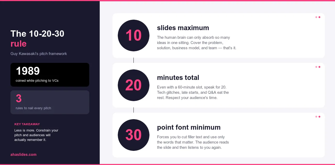
10-20-30-regeln utvecklades för investerarpresentationer av Guy Kawasaki, där risken att förlora sin publik är omedelbar och synlig. Logiken visade sig så överförbar att den blev ett av de mest tillämpade ramverken inom professionell presentation. Tio bilder. Tjugo minuter. Minst trettio punkters teckensnitt. Tre siffror som löser de flesta problem som gör presentationer lättglömda.
Den här guiden förklarar varför varje begränsning fungerar, hur de samverkar och hur du tillämpar ramverket på alla presentationer du skapar, oavsett om du pitchar investerare, utbildar anställda eller argumenterar för något inför en sal med skeptiska beslutsfattare.
Problemet som denna regel utformades för att lösa
De flesta har suttit igenom en presentation som känts som ett straff. Sidor på sextiotalet. Täta stycken i åtta punkters typsnitt. Talaren läser ordagrant från skärmen medan publiken läser snabbare, avslutar före dem och tillbringar resten av tiden med att vänta på nästa bild. Ingenting landar. Ingenting fastnar. Alla går därifrån med att ha absorberat mindre än de skulle ha gjort från ett välskrivet mejl.
Detta är inte ett ovanligt felläge. Det är standardinställningen. De flesta presentationsprogram gör det enkelt att lägga till bilder och enkelt att lägga till text, vilket innebär att de flesta presentationer slutar med för mycket av båda. Mediet glider mot heltäckande eftersom det känns tryggt att vara heltäckande. Att klippa känns som att förlora något. Det är det inte. Det är redigering, och redigering är det som får en presentation att fungera.
10-20-30-regeln är en korrigering för denna avvikelse. Inte en kreativ begränsning som påtvingas utifrån, utan en uppsättning begränsningar som driver varje beslut i samma riktning: mot en presentation där talaren bär argumentet och bilderna stöder det, snarare än tvärtom.
Vad är 10-20-30-regeln?
Regeln har tre delar, som var och en behandlar olika sätt på vilka presentationer vanligtvis går fel.
Max tio bilder. Inte tio bilder som mål utan tio bilder som ett tak. Begränsningen tvingar fram en sorts redaktionell disciplin som de flesta presentationer aldrig utvecklar: man måste bestämma vad som är väsentligt snarare än att inkludera allt som kan vara relevant. När man inte får plats med allt tvingas man prioritera. Det som blir kvar efter den processen är nästan alltid starkare än det man började med.
Max tjugo minuter. Det här är ungefär det tidsfönster där publiken kan bibehålla fokus utan paus. Efter tjugo minuter minskar inte uppmärksamheten gradvis, utan snarare brantare. En tjugominuterspresentation passar också lättare in i scheman och signalerar respekt för publikens tid på ett sätt som en sextiominuterssession helt enkelt inte gör.
Minst trettio punkters teckenstorlek. Liten text är ett symptom, inte ett designval. Presentatörer använder den för att få plats med mer innehåll på bilderna, vilket innebär att mer innehåll läses upp, vilket innebär att publiken tittar på någon som läser snarare än lyssnar på någon som pratar. Ett minimum på trettio punkter förhindrar att bilden blir presentationen. Du får inte plats med stycken i den storleken. Du är tvungen att placera detaljerna där de hör hemma: i din röst.
De tre begränsningarna förstärker varandra. Färre bilder innebär mindre innehåll. Mindre innehåll innebär kortare presentationer. Större teckensnitt innebär mindre text per bild. Tillsammans drar de i samma riktning: mot en presentation där talaren är huvudpersonen och bilderna är stödmaterial.
Varför 10 bilder
De flesta presentationer har för många bilder eftersom presentatören inte har fattat de svåra besluten om vad som faktiskt är viktigt. Att lägga till en bild känns som att ge mervärde. Det är det sällan. Det handlar oftast om att skjuta upp valet mellan två idéer som borde ha varit en.
Tio bilder tvingar fram det valet. När du når gränsen och fortfarande har innehåll kvar måste du bestämma dig: är den här idén tillräckligt viktig för att ersätta något som redan finns där, eller hör den hemma i ett utdelningsblad, ett uppföljande mejl eller en muntlig förklaring? Det beslutet är själva arbetet. Begränsningen är det som får dig att göra det.
Resultatet blir en presentation som bygger på ditt starkaste material snarare än ditt fullständiga material. Varje bild förtjänar sin plats. Ingenting finns kvar för att du fick slut på anledningar att klippa bort den.
En struktur som fungerar för de flesta presentationstyper följer denna logik: börja med problemet, fastställ varför det är viktigt, presentera din lösning, förklara hur den fungerar, ge bevis, visa vem den är till för, ta itu med det konkurrensutsatta eller alternativa landskapet, fastställ förmågan att genomföra, lägg fram de resurser som krävs och avsluta med en specifik fråga. Tio bilder. En idé per bild. En komplett argumentation från problem till handling.
Proportionerna förändras beroende på sammanhang. En utbildningspresentation ersätter det konkurrensutsatta landskapet med en implementeringsplan. En säljpresentation ersätter teambilden med kundbevis. Den underliggande logiken förblir densamma: problem, lösning, bevis, fråga.
Varför 20 minuter
De flesta människor förlorar fokus efter ungefär tjugo minuters kontinuerligt lyssnande. Detta är inte ett personligt misslyckande eller ett modernt problem med uppmärksamhetsspannet. Det är ett konsekvent mönster i hur mänsklig uppmärksamhet fungerar. Bortom det fönstret ber du inte bara om mer tid. Du ber om något som människor inte längre lätt kan ge.
Tjugo minuter är också ett praktiskt antal. Det passar in i ett trettio minuter långt möte med utrymme för frågor. Det är lättare att schemalägga än en timme. Människor är mer benägna att delta, mer benägna att vara närvarande under hela mötet och mer benägna att gå därifrån med ett tydligt minne av vad som sades.
Tiden delas naturligt upp i tre avsnitt. Inledningen, där du fångar uppmärksamheten och fastställer varför detta är viktigt för just den här publiken, tar två till tre minuter. Kärninnehållet över tre till fyra huvudpunkter tar tolv till fjorton minuter, ungefär tre till fyra minuter per punkt. Avslutningen och uppmaningen till handling tar två till tre minuter. Det lämnar en minut eller två buffert, vilket presentationer nästan alltid behöver eftersom de ofta är långa än korta.
Om ditt material verkligen kräver mer tid är rätt svar inte att förlänga presentationen. Det är att flytta detaljerna till stöddokument och använda de tjugo minuterna till argumenten som gör att folk vill läsa dem.

Varför 30-punkters teckensnitt
Liten typsnitt är vad som händer när bilden försöker göra för mycket. Presentatören vill ha en fullständig förklaring på skärmen, så typsnittet krymper för att få plats. Eftersom förklaringen visas på skärmen läser de den högt. Publiken läser snabbare än presentatören talar, avslutar bilden innan presentatören gör det och spenderar resten av tiden med att vänta istället för att lyssna.
Minst trettio punkter bryter det mönstret. Med den storleken rymmer en standardbild tre till fyra korta textrader. En rubrik och två stödjande fraser. En enda statistik med en etikett. Det är allt. Detaljen som brukade finnas på bilden måste vara någon annanstans, och den enda platsen den kan vara i den muntliga framställningen där den hör hemma.
Begränsningen löser också ett tillgänglighetsproblem som presentatörer sällan tänker på. Personer längst bak i rummet kan läsa trettiopunktstext. Personer med synnedsättning kan läsa trettiopunktstext. Liten text exkluderar delar av publiken tyst och utan någon signal om att det händer.
Vissa presentatörer tillämpar ännu strängare begränsningar än detta och reducerar bilderna till en enda bild eller en handfull ord. Principen bakom dessa metoder är densamma som 10-20-30-regeln: ju mindre bilden säger, desto mer måste presentatören göra. Och en presentatör som talar utifrån genuin förståelse är nästan alltid mer engagerande än bilder som läses upp högt.
Hur det ser ut i praktiken
Skillnaden mellan en presentation byggd med detta ramverk och en utan det är lättare att se i ett specifikt exempel än att beskriva abstrakt.
Tänk dig att du presenterar ett utbildningsprogram för nya medarbetare för din ledningsgrupp. Utan några begränsningar vad gäller längd eller struktur förbereder du 35 bilder: programhistorik, marknadsundersökning, konkurrentanalys, detaljerad läroplanfördelning, kostnadsfördelning per avdelning, implementeringstidsplaner för varje plats, bilagor. Presentationen är 75 minuter lång. Cheferna tappar fokus någonstans runt bild 20. Du avslutar, tackar alla och väntar i veckor på ett svar som kanske aldrig kommer. All information fanns där. Argumentet fanns inte där.
Med 10-20-30-ramverket blir samma förslag tio bilder:
- Problemet: nuvarande onboarding tar tre månader och ger inkonsekventa resultat på olika platser.
- Kostnaden: försenad produktivitet, hög tidig personalavgång, inkonsekvent kundupplevelse.
- Lösningen: ett strukturerat åttaveckorsprogram med standardiserat innehåll och chefernas kontrollpunkter.
- Så fungerar det: tre faser som omfattar introduktion, rollspecifik utbildning och handledd praktik med feedback-slingor.
- Pilotresultat: programmet kördes på två platser under sex månader, med mätbara förbättringar i kundlojalitet och tid till produktivitet.
- Implementeringsplan: utrullning på alla platser under tolv månader med en dedikerad projektledare.
- Resursbehov: budget, personalstyrka och teknikbehov uppdelade per fas.
- Tidslinje: viktiga milstolpar från godkännande till fullständig implementering.
- Risk och begränsning: de tre mest sannolika hindren och hur planen hanterar vart och ett av dem.
- Frågan: godkännande av en tolvmånaders pilotbudget och utnämning av en projektledare.
Du presenterar på arton minuter. Argumentet är tydligt: programmet fungerar, planen är realistisk och budgeten är motiverad. Cheferna förstår vad de ombeds godkänna. Du följer upp med fullständig dokumentation, men livepresentationen gjorde sitt jobb.
35-bildersversionen och 10-bildersversionen innehåller mycket av samma information. Skillnaden är att man framför ett argument och man presenterar en fil.
Hur man bygger en 10-20-30-presentation
Börja innan du öppnar en bildsamling. Skriv ditt kärnbudskap som en enda mening: vad är det enda du vill att din publik ska komma ihåg eller göra? Om du inte kan skriva den meningen har du inte ett tillräckligt tydligt argument än. Det är bra att veta innan du har byggt trettio bilder kring den.
Lista sedan allt du tycker hör hemma i presentationen. Redigera inte i det här skedet. Få ut allt och titta sedan på vad du har. Vad är viktigt? Vad är stödjande? Vilken utfyllnad inkluderade du för att det kändes säkrare än att utelämna den?
Organisera det som återstår i en berättelse: problem, lösning, bevis, fråga. Tilldela en idé till var och en av dina tio bilder. Om du har fler än tio idéer som känns viktiga, täcker du antingen ett för brett ämne eller så har du inte gjort de svåra valen än. Gör dem nu snarare än inför din publik.
För varje bild, fråga om du kan visa idén snarare än att beskriva den. Ett diagram som visuellt framhäver poängen gör mer arbete än text som förklarar den verbalt. Flytta allt som inte får plats i 30-punkters teckensnitt till din muntliga presentation, där det hör hemma.
Öva högt och ta tid. Vet var du är för lång och avbryt där istället för att öka tempot. En presentation som får plats i tjugo minuter i normalt tempo är något helt annat än en som får plats i tjugo minuter när det är bråttom. Det förra respekterar din publik. Det senare signalerar att du inte redigerade tillräckligt.

Vanliga bekymmer
Den vanligaste invändningen är att tjugo minuter inte räcker för komplexa ämnen. Det är det oftast. Misstaget är att förväxla omfattande bevakning med effektiv kommunikation. En tjugominuterspresentation som framför tre tydliga poänger och vinner publikens förtroende gör mer än en sextiominuterspresentation som täcker allt och inte blir ihågkommen för något av det. Detaljerna hör hemma i stödjande dokument som folk läser när de är redo att gå djupare, inte i en livesession där uppmärksamheten är begränsad.
Den andra invändningen är om tio verkligen är rätt antal eller om elva eller tolv skulle vara okej. Antalet är poängen. Det är en gräns, inte ett förslag. I det ögonblick du tillåter undantag är du tillbaka på vägen mot uppsvällda presentationer, motiverade en bild i taget. Disciplinen att hålla sig till tio är ofta där de bästa redaktionella besluten fattas. Den där bilden du är ovillig att klippa bort innehåller vanligtvis något som är värt att säga verbalt snarare än att visa på skärmen.
Datatunga presentationer väcker en legitim oro: vad händer med de siffror som inte passar? Svaret är att de siffror som är viktiga hamnar på bilderna, tydligt kommenterade. Stödjande data hamnar i ett utdelningsblad eller en bilaga som du refererar till men inte presenterar. Ditt jobb i rummet är att göra de viktigaste resultaten tydliga och övertygande. Publiken kan granska hela datamängden efteråt.
Invändningen mot teckensnittet löser sig själv. Minst trettio punkter innebär större text, vilket innebär att personer längst bak i rummet kan läsa dina bilder. Om din nuvarande teckenstorlek kräver att publiken kisar eller lutar sig framåt, är det inte en designpreferens. Det är ett problem som regeln åtgärdar.
Tar det vidare med AhaSlides
10-20-30-regeln reglerar vad som ska visas på dina bilder och hur länge du talar. Den reglerar inte vad din publik gör medan du presenterar, vilket för de flesta presentationer inte är någonting.
Interaktiva element ändrar på det. En omröstning som placeras just nu när din publik behöver koppla problemet till sin egen situation gör att problemet känns personligt innan du har lagt fram ditt argument. Ett ordmoln mitt i presentationen visar dig vilka idéer som landar och vilka inte, i realtid, innan du har engagerat dig i resten av ditt argument. En anonym frågestund inbyggd i en naturlig övergång fångar upp de invändningar din publik har men inte kommer att framföra högt.
Dessa moment varken ökar eller ökar komplexiteten. Inbyggda i en 10-20-30-presentation passar de in i tjugominutersfönstret och ersätter passiv bildvisning med aktivt deltagande. AhaSlides är byggt för att göra detta enkelt: omröstningar, frågesporter, ordmoln och frågestunder placeras i ditt presentationsflöde så att övergången från innehåll till interaktion känns avsiktlig snarare än störande.
10-20-30-regeln gör din presentation smidig och fokuserad. Interaktiva element gör den tvåvägs. Båda är värda att ha.
Inslagning upp
10-20-30-regeln fungerar eftersom problemen den löser är verkliga och konsekventa. För många bilder. För mycket text. För lite tid ägnas åt själva argumentet. De tre begränsningarna åtgärdar alla tre samtidigt, och de gör det genom att tvinga fram de beslut som de flesta presentatörer skjuter upp tills de står framför ett rum utan några bra alternativ kvar.
Tio bilder. Tjugo minuter. Trettio punkters typsnitt. Använd alla tre i din nästa presentation och lägg märke till vilka begränsningar du får. De klipp du gör är nästan alltid de rätta. Tiden du sparar uppskattas nästan alltid. Och presentationen som kommer ut på andra sidan är nästan alltid starkare än den du började med.