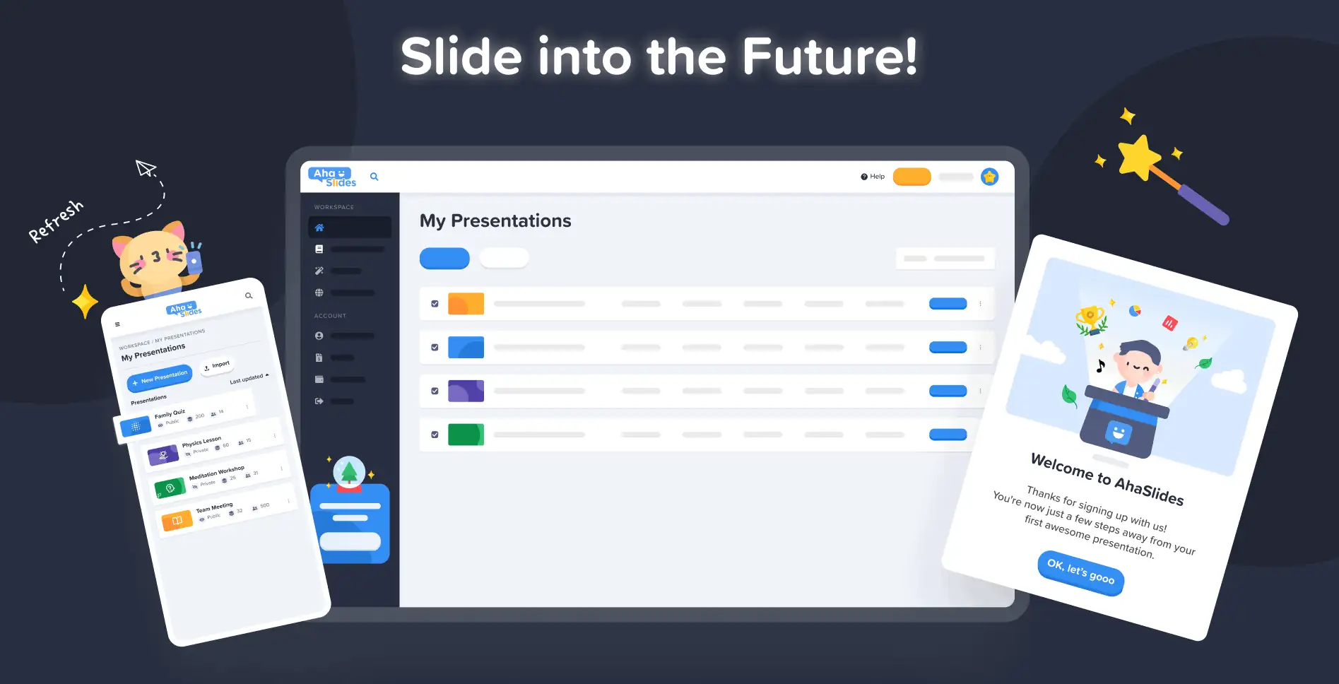
På AhaSlides är vårt mål att göra presentationer roligare, mer engagerande och mer givande för dig och din publik. Idag tar vi ett stort steg mot det med vår helt ny design!
Den nya AhaSlides är ny på så många sätt. Vi har gjort saker mer organiserade, mer flexibla och mer us Än någonsin tidigare.
Hjärnorna och händerna bakom allt var vår designer, trang:
Jag tog AhaSlides samlade vision och lade till mina egna. Vi har kommit fram till något som är bra för nya användare, men också ett passande och innerligt "tack" till dem som har varit med oss sedan dag ett.
Trang Tran - Designer
Låt oss ta en titt på vilka förändringar vi har gjort och exakt hur de kan hjälpa dig att göra presentationer som är smartare och bättre för din publik.
Klåda för att kolla in det? Upptäck nyheterna genom att klicka på knappen nedan:
Vad är nytt?
- Förbättrat utseende och känsla
- Bättre organisation, smidigare navigering
- Redigera var som helst, på vilken enhet som helst
Förbättrat utseende och känsla 🤩
Den här gången bestämde vi oss för något lite mer… oss.
Märkesidentitet var en stor fokuspunkt i den nya designen. Även om vi tidigare kanske var lite reserverade är vi nu redo att vara det nål.
Tillvägagångssättet för vår nya identitet är uppdelat i tre delar:
#1 – Illustration
När vi startade 2019 var inte söta, färgglada bilder särskilt högt upp på "att-göra-listan". Vi valde funktionalitet snarare än utseende.
Nu, med ett gediget utvecklingsteam som arbetar hårt på att skapa och förbättra funktioner, kunde vår huvuddesigner Trang fokusera på att göra AhaSlides mer attraktiv. Det var en enorm uppgift att skapa en ny varumärkesidentitet kring illustrationer och animationer, men en som resulterade i ett fantastiskt bibliotek med söta mönster:

Kolla in dessa andra exempel på nya illustrationer på Min presentationspanel och registrera sida:
Varje illustration har sin egen plats och roll. Vi tycker att det är ett varmare välkomnande till våra nya och nuvarande användare, som kan se den lekfulla andan hos AhaSlides så fort de loggar in.
Efter att ha pratat med Dave [VD för AhaSlides] bestämde vi oss för att göra saker mer levande och lekfulla. Som ni ser är bilderna nu mer rundade, sötare, men vi ville inte göra det för barnsligt. Jag tror att det vi har nu är en bra balans mellan nöje och funktion.
Trang Tran - Designer
#2 – Färg
Livfullhet var verkligen nyckelordet med den nya designen. Vi ville ha något som inte var blygt för sin egen livlighet, och något som återspeglade glädjen i att skapa en spännande presentation att dela med en publik.
Det är därför vi satsade dubbelt så mycket starka, djärva färger.
Vi förgrenade oss från den blå och gula signaturen på vår logotyp och utvidgade vår färgpalett till nyanser av rött, orange, grönt och lila:
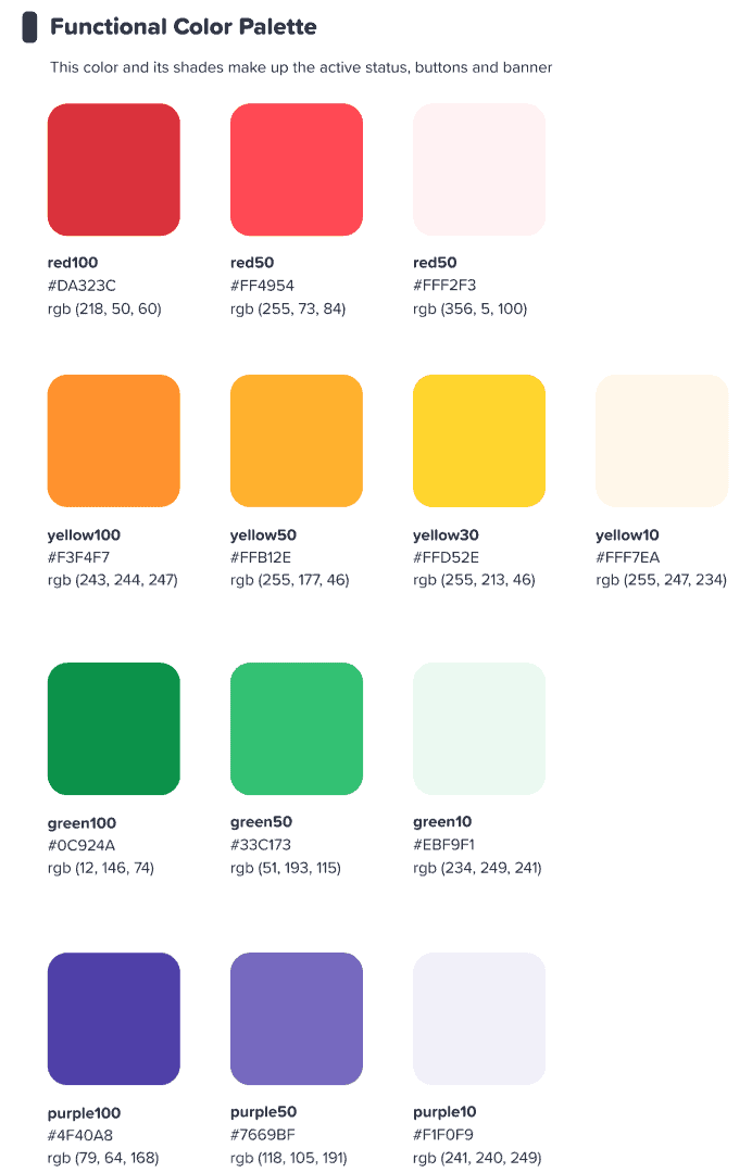
Vi hoppades att detta färgglada gränssnitt skulle inspirera våra användare att starta något färgstarka.
Trang Tran - Designer
⭐ Kommer snart! ⭐ Självklart ville vi även utöka vårt nya fokus på färg till våra användare. Därför kommer presentatörer snart att kunna välja vilken färg som helst. för deras text:

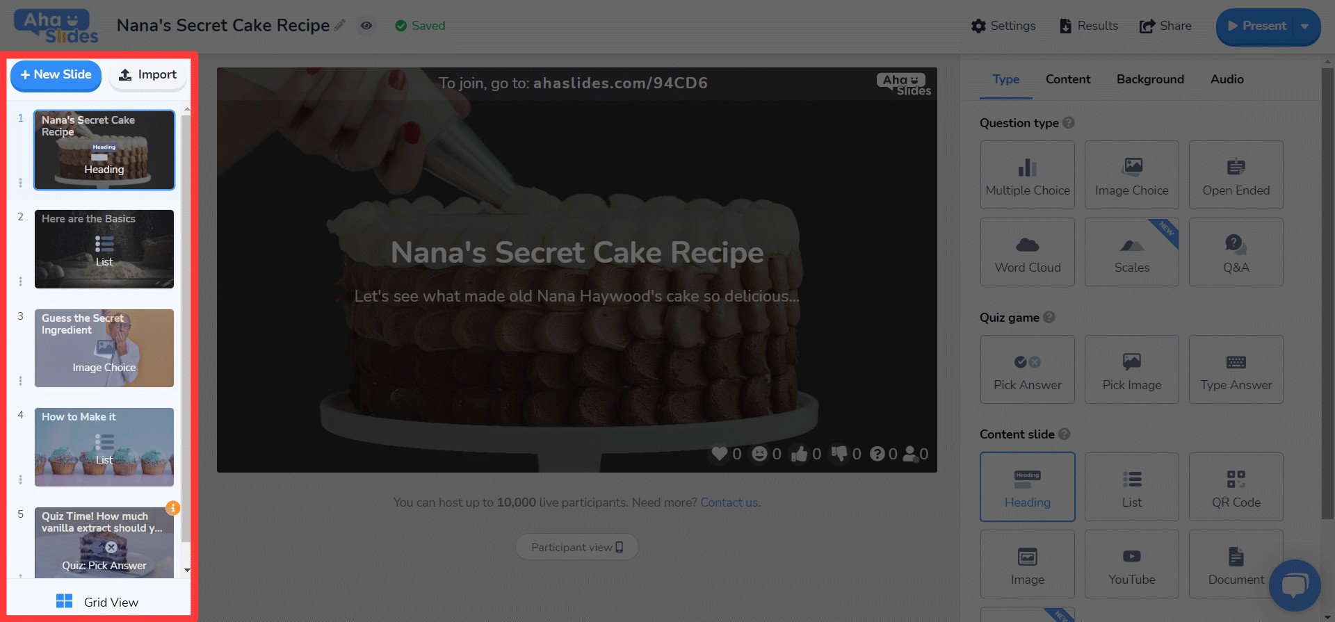
#3 – Informationsarkitektur
Det säger sig självt att ett nytt utseende måste ha en fungera.
Det är därför vi gjorde en stor förändring av IA (Information Architecture) av AhaSlides. Det betyder i grunden att vi har omorganiserat och omdesignat delar av vår programvara för att bättre hjälpa användarna att förstå vad de gör.
Här är ett exempel på vad vi menar – de gamla och nya presentknapparna:

Tycka om Alla Produkter knapparna i den nya designen, ovanstående har vad vi bara kan beskriva som en mer knapp-y känslaVi har lagt till en liknande skugga och glöd till många markeringsalternativ, inte bara för att ge dem en verklighetstrogen känsla, utan också för att förbättra IA, så att användarna bättre förstår vad som är valt och var deras fokus ska ligga.
Vad annars? Du kan se några IA-förändringar i den här bilden:
Förutom knappen har vi gjort fler förbättringar på följande sätt:
- Enskilda lådor för att hjälpa till att separera varje element.
- Fet text skiljer inmatad information från den bleka texten i en tom ruta.
- Ikoner och färger låt informationsrutor sticker ut.
Förändringarna i informationsarkitekturen må vara subtila, men det var min avsikt. Jag ville inte att våra användare skulle behöva flytta till ett nytt hus, jag ville helt enkelt inreda, på ett litet sätt, det hem de redan bor i.
Trang Tran - Designer
Bättre organisation, smidigare navigering 📁
Som vi sa – vad är poängen med att göra saker snyggare om funktionaliteten inte förbättras samtidigt?
Det är där vår andra stora förändring kommer in. Vi har köpt en massa digitala möbler och rensat ut röran.
Låt oss titta på fyra områden där vi har gjort förbättringar:
- Min presentationspanel
- Redaktörens toppfält
- Redaktör vänster kolumn
- Redaktörens högra kolumn (kommer snart!)
#1 – Mina presentationsöversikter
Okej, vi erkänner det – det var inte alltid det lättaste att hitta och arrangera sina presentationer på instrumentpanelens gamla design.
Som tur är har vi ändrat saker och ting rejält på den nya instrumentpanelen…
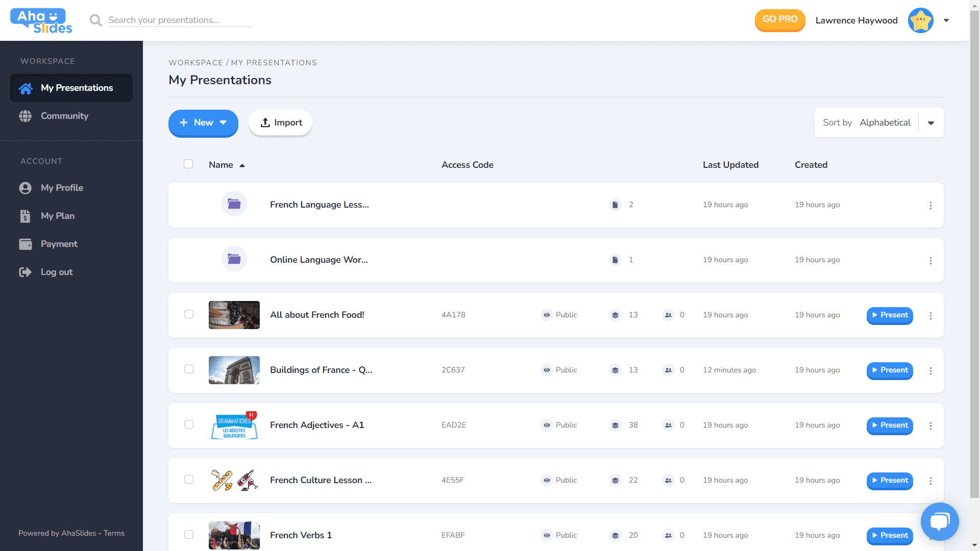
- Varje presentation har sin egen behållare.
- Behållare har nu miniatyrbilder (miniatyren blir den första bilden i din presentation).
- Presentationsalternativ (duplicera, radera data, radera etc.) finns nu i en snygg kebab-meny.
- Det finns fler sätt att sortera och söka efter dina presentationer.
- Din "Arbetsyta" och ditt "Konto" är nu separerade i den vänstra kolumnen.
⭐Kommer snart!⭐ Det kommer att finnas ett helt nytt alternativ för instrumentpanelsvy inom en snar framtid – Grid View! Med den här vyn kan du se dina presentationer i ett bildcentrerat rutnätformat. Du kan när som helst växla mellan Grid View och standard List View.
#2 – Redigerarens översta fält
Vi har omorganiserat några saker i den översta fältet på redigeringsskärmen…

- Antalet alternativ i det övre fältet har minskat från 4 till 3.
- Nedrullningsmenyer för varje alternativ erbjuder bättre organisation.
- Bredden på rullgardinsmenyerna har ändrats för att säkerställa att menyn passar in i den högra kolumnen.
#3 – Redaktörens vänstra kolumn
Enklare, smidigare design i din presentations innehållskolumn. Rutnätsvyn har också ett helt nytt utseende…
- Bildalternativen har nu tagits bort i en kebab-meny.
- En ny knappknapp för rutnät har lagts till längst ner.
- Layouten och driften av Grid View förbättras kraftigt.
⭐ Kommer snart! ⭐ Den högra kolumnen är inte helt klar än, men här är vad du kan förvänta dig att se där inom kort!
#4 – Redigerarens högra kolumn
Små ändringar av ikoner, stora ändringar av textfärg…
- Omdesignade ikoner för varje bildtyp.
- Ett stort utbud av textfärgalternativ.
- Omordnade elementen på fliken "Innehåll".
Redigera var som helst, på vilken enhet som helst 📱
Till de 28 % av våra användare som redigerar sina presentationer på mobilen ber vi om ursäkt för att vi försummat er så länge. 😞
Med den nya designen ville vi ge våra mobil- och surfplatteanvändare en plattform som är lika lyhörd som skrivbordet. Det innebar en omprövning av varje element för att säkerställa att våra användare kunde redigera när de var på språng.
Naturligtvis börjar allt med instrumentpanelenVi har gjort några ändringar här…

Den viktigaste informationen om dina presentationer och mappar visas här. Det finns också kebabmenyn till höger som håller alla presentationsinställningar organiserade.
On d redaktör, möts du av ett annat mer användarvänligt gränssnitt.
Återigen är allt undangömt i kebabmenyer. Att göra detta rensar upp distraktionerna och ger dig så mycket mer utrymme att se din övergripande presentation.

Börjar det bli uppenbart att vi älskar kebab? Vi har ersatt den gamla överfulla bardisken med, japp, en annan kebabmeny! Det blir en... mycket mindre överväldigande gränssnitt och låter dig fokusera på kvaliteten på din presentation.

Jag ville verkligen ta bort några av begränsningarna som hindrar våra mobilanvändare från att skapa de presentationer de vill ha. Vi valde något mer elegant och enkelt än tidigare, men vi har fortfarande stora planer för AhaSlides mobila funktioner i framtiden!
Trang Tran - Designer
