

想想你上一次真正從頭到尾都全神貫注的演講。它很可能比大多數演講都短,幻燈片數量也比你預期的少,而且螢幕上的文字足夠大,不用瞇著眼睛就能看清。這種組合並非偶然,而是刻意控制的結果。
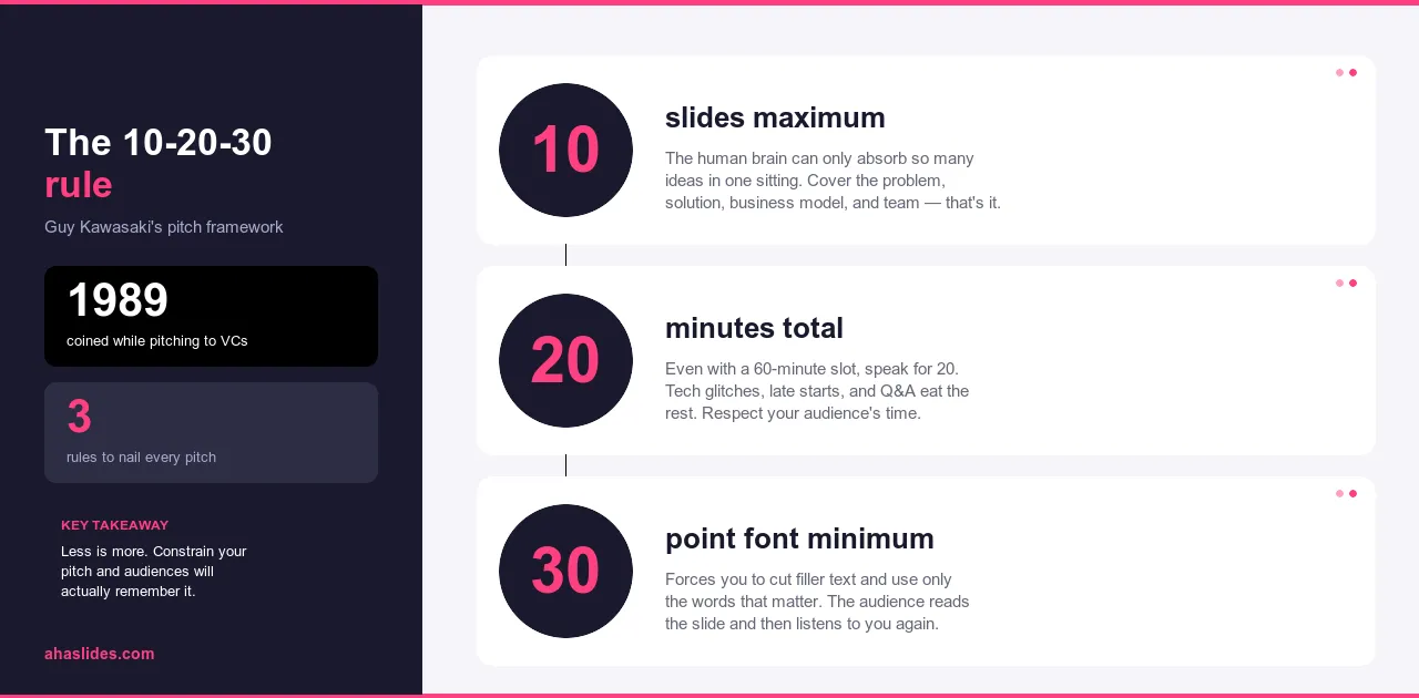
10-20-30 法則最初由 Guy Kawasaki 為投資者路演演示而提出,因為在投資者路演中,失去聽眾的後果顯而易見。這法則的邏輯非常適用,並迅速成為專業演示中最廣泛應用的框架之一。十張投影片,二十分鐘,最小字體30號。這三個數字就能解決大多數導致演示令人過目即忘的問題。
本指南解釋了每個約束條件的作用原理、它們之間的相互作用,以及如何將該框架應用於您正在構建的任何演示文稿,無論您是向投資者推介、培訓員工,還是向一群持懷疑態度的決策者闡述某個觀點。
這條規則旨在解決的問題
大多數人都經歷過那種如同受刑的演講。投影片只有六十多頁,段落密密麻麻,字體只有八號。演講者照著螢幕念,而聽眾讀得更快,搶先一步看完,剩下的時間都用來等待下一張投影片。結果什麼都沒記住,什麼都沒留下。每個人離開時吸收的訊息甚至不如一封精心撰寫的郵件。
這並非罕見的故障模式,而是預設值。大多數簡報軟體都讓添加投影片和文字變得輕而易舉,這意味著大多數簡報最終都會包含過多的幻燈片和文字。這種媒材傾向於追求全面,因為全面讓人感覺安全。刪減內容會讓人覺得像是失去了什麼。但事實並非如此。刪減是編輯,而編輯才是簡報成功的關鍵。
10-20-30 法則正是為了修正這種偏差。它並非外在強加的創作限制,而是一套約束機制,旨在引導所有決策朝著同一方向發展:即演講者主導論點,幻燈片輔助論證,而非反之。
什麼是 10-20-30 法則?
此規則分為三個部分,分別針對簡報中通常出錯的不同方式。
最多十張投影片。不是以十張為目標,而是以十張為上限。這種限制迫使你培養一種大多數簡報都從未培養過的編輯紀律:你必須決定哪些內容是必要的,而不是把所有可能相關的內容塞進去。當無法容納所有內容時,你就必須進行優先排序。經過這個過程之後,剩下的內容幾乎總是比最初的版本更好。
最多二十分鐘。這大致上是聽眾能夠持續集中註意力而不被打斷的時間。超過二十分鐘,注意力不會逐漸下降,反而會急劇下降。二十分鐘的演講也更容易安排時間,並且比六十分鐘的演講更能體現對聽眾時間的尊重。
字體大小至少30號。小字是一種表象,而非設計選擇。演講者使用小字是為了在投影片上塞入更多內容,這意味著更多的內容需要朗讀,最終觀眾看到的是有人在念稿,而不是在聽演講。 30號字體大小限制了投影片本身的重要性,使其無法成為演講的核心。這麼小的字體根本無法容納段落。你只能把細節放在它該在的地方:你的聲音裡。
這三項限制相互強化。投影片數量越少,內容就越少。內容越少,演講時間就越短。字體越大,每張投影片上的文字就越少。它們共同指向同一個方向:使演講者成為焦點,幻燈片成為輔助材料。
為什麼只用10張投影片?
大多數簡報投影片過多,是因為演講者沒有認真思考哪些內容真正重要。增加一張投影片感覺像是增加了價值,但實際上很少如此。這通常只是把原本應該合併成一個想法的兩個想法之間的選擇推遲了。
十張投影片迫使你做出選擇。當達到篇幅限製而仍有剩餘內容時,你必須決定:這個想法是否重要到足以替換現有內容,還是應該放在講義、後續郵件或口頭解釋中?做出這個決定本身就是工作。正是這種限制促使你去做。
最終呈現的簡報圍繞著你最精彩的內容展開,而非全部。每一張幻燈片都恰如其分,沒有絲毫刪減的理由。
適用於大多數演示類型的結構遵循以下邏輯:首先提出問題,闡明其重要性,然後介紹解決方案,解釋其工作原理,提供證據,說明目標受眾,分析競爭格局或替代方案,證明執行能力,列出所需資源,最後提出具體需求。十張投影片,每張投影片一個觀點。從問題到行動,完整論證。
根據具體情況,比例會改變。培訓簡報會以實施計畫取代競爭格局,銷售簡報會以客戶案例取代團隊介紹投影片。但其基本邏輯始終不變:問題、解決方案、證明、提問。
為什麼是20分鐘
大多數人在連續聆聽大約二十分鐘後就會失去專注力。這並非個人缺陷,也不是現代人注意力持續時間短的問題,而是人類注意力運作的普遍規律。超過這個時間窗口,你不僅僅是在請求更多的時間,你是在請求人們難以輕易給予的東西。
二十分鐘也是一個很實際的時間。它正好可以安排在三十分鐘的會議時間內,並且留出提問的空間。比起一個小時,二十分鐘也更容易安排。人們更有可能出席,更有可能全程保持專注,也更有可能帶著對會議內容的清晰記憶離開。
時間自然分為三個部分。開場白,也就是吸引聽眾並闡明演講內容對特定受眾的重要性,大約需要兩到三分鐘。核心內容,涵蓋三到四個要點,大約需要十二到十四分鐘,每個要點大約三到四分鐘。總結和行動號召需要兩到三分鐘。這樣就留了一到兩分鐘的緩衝時間,而演講通常都需要這部分緩衝,因為演講超時的情況比短時演講要多得多。
如果你的資料確實需要更多時間,正確的做法不是延長演講時間,而是將細節內容移到輔助資料中,用剩下的二十分鐘來闡述那些能激發人們閱讀這些資料興趣的論點。

為什麼選擇 30 號字體
幻燈片字體過小通常是因為幻燈片試圖包含過多資訊。演講者想在螢幕上完整地展示解釋,於是字體縮小以適應螢幕。然後,由於解釋內容已經顯示在螢幕上,他們便開始朗讀。觀眾閱讀的速度比演講者說話的速度快,在演講者完成之前就看完了幻燈片,剩下的時間都花在了等待上,而不是認真聆聽。
最小字號30號打破了這個模式。在這個字號下,一張標準投影片只能容納三到四行簡短的文字:一個標題和兩個輔助短語,以及一個標籤的統計資料。僅此而已。原本放在投影片上的細節訊息必須轉移到其他地方,而它們唯一能去的地方就是口頭表達,這才是它們應該去的地方。
這種限制也解決了演講者很少考慮到的一個無障礙問題。坐在房間後排的人可以閱讀30號字體。視力障礙人士也可以閱讀30號字體。小字體會在不知不覺中將部分聽眾排除在外,而且不會讓他們意識到這一點。
有些講者甚至會採用更嚴格的限制,將投影片精簡到只有一張圖片或寥寥數語。這些做法背後的原理與「10-20-30法則」相同:投影片上的資訊越少,演講者就需要講解越多。而且,演講者真正理解內容後再進行講解,幾乎總是比照本宣科地朗讀投影片更具吸引力。

實際應用情況如何
用這個框架建立的簡報與不用這個框架建立的簡報之間的區別,用一個具體的例子來說明比用抽象的方式描述更容易理解。
想像一下,你正在向領導團隊展示一項新的員工培訓計畫。你準備了35張投影片,內容涵蓋:專案歷史、市場調查、競品分析、詳細的課程大綱、各部門的成本明細、各地區的實施時間表以及附錄。演示持續了75分鐘。高層在看到第20張幻燈片左右時開始分心。你結束了演示,感謝了所有人,然後等待數週,但可能永遠不會得到任何反饋。資訊都準備好了,但論證失敗了。
採用 10-20-30 框架,同樣的提案可以縮減到十張投影片:
- 問題:目前的入職流程需要三個月,在不同地區產生的結果也不一致。
- 代價:生產力下降、早期人員流動率高、客戶體驗不一致。
- 解決方案:一個結構化的八週計劃,包含標準化的內容和管理人員檢查點。
- 運作方式:分為三個階段,涵蓋入職培訓、角色特定培訓和帶有回饋循環的監督實踐。
- 試點結果:該計劃在兩個地點運行了六個月,在員工留存率和達到生產力水平所需時間方面取得了可衡量的進步。
- 實施計畫:在十二個月內在所有地點推廣,並配備專門的專案負責人。
- 所需資源:按階段細分的預算、人員配備和技術需求。
- 時間表:從批准到全面部署的關鍵里程碑。
- 風險與緩解:最有可能出現的三大障礙以及計劃如何應對每一項障礙。
- 請求:批准為期十二個月的試點預算並任命專案負責人。
你用了十八分鐘做了報告。論點很明確:這個專案可行,計畫切實可行,預算也合理。高階主管們明白他們需要批准的是什麼。你隨後提交了完整的文檔,但現場報告已經達到了目的。
35頁投影片版本和10頁投影片版本包含的資訊基本上相同。差別在於,前者提出論點,後者展示文件。
如何製作 10-20-30 簡報
在打開投影片之前,先把你的核心訊息用一句話概括:你希望聽眾記住或做的最重要的一件事是什麼?如果你寫不出這句話,表示你的論點還不夠清楚。在你圍繞這個論點製作三十張投影片之前,弄清楚這一點非常重要。
然後列出你認為簡報中應該包含的所有內容。這個階段不要編輯。先把所有內容都列出來,然後再看看你都寫了些什麼。哪些是必不可少的?哪些是輔助性的?哪些是你覺得加進去比刪掉更穩健而增加的冗餘內容?
將剩餘內容整理成一個敘事結構:問題、解答、證據、提問。將每個想法分配到十張投影片中。如果你覺得有超過十個重要的想法,要嘛是你涵蓋的主題太廣泛,要嘛是你還沒做出艱難的抉擇。現在就做出抉擇,而不是在觀眾面前。
對於每一張投影片,都要問自己是否可以用圖表來展示觀點,而不是用文字描述。用視覺方式闡明觀點的圖表比用語言解釋的效果更好。把任何不適合30號字體的內容都移到你的口語表達中,放在它應該出現的位置。
大聲練習併計時。找出自己語速過長的地方,並在那裡刪減,而不是加快速度。以正常語速完成的二十分鐘演講與匆忙完成的二十分鐘演講截然不同。前者是對聽眾的尊重,後者則表示你沒有進行充分的剪輯。

常見問題
最常見的反對意見是,二十分鐘不足以講解複雜的主題。但通常情況下,二十分鐘是足夠的。問題在於將全面涵蓋與有效溝通混淆了。一個二十分鐘的演講,如果能清楚闡述三個要點並贏得聽眾的信任,其效果遠勝於一個六十分鐘的演講,後者雖然面面俱到,卻讓人一無所獲。細節應該放在輔助資料中,讓人們在準備深入了解時閱讀,而不是放在註意力有限的現場會議中。
第二個反對意見是,十張投影片是否真的合適,十一張或十二張是否也可以。關鍵在於幻燈片的數量。它是一個界限,而不是建議。一旦你允許例外,你就會重蹈覆轍,陷入冗長乏味的簡報中,而這些簡報往往需要一張張地來解釋。堅持十張投影片的限制,往往能做出最佳的編輯決策。那些你捨不得刪掉的投影片,通常包含一些更適合口頭解說而非直接展示的內容。
資料量龐大的簡報會引發合理的擔憂:那些不符合預期的資料該如何處理?答案是:關鍵數據應該清楚標示在投影片上,並加以註釋。而輔助資料則可放在講義或附錄中,以供參考,但無需在簡報中展示。你在簡報中的任務是清晰有力地闡述關鍵發現。聽眾可以在簡報結束後自行查閱完整的資料集。
關於字體大小的異議不言而喻。 30號字的最小字號意味著更大的文本,這樣即使坐在教室後排的人也能看清幻燈片。如果目前的字體大小讓觀眾不得不瞇著眼睛或向前傾身才能看清,那並非設計上的偏好,而是這條規定旨在解決的問題。
使用 AhaSlides 進一步拓展
10-20-30 法則針對的是幻燈片上的內容以及你的演講時間。它並沒有涉及聽眾在你演講期間的活動,而對於大多數演講來說,聽眾什麼都不做。
互動元素改變了這一切。在聽眾需要將問題與自身情況連結起來的時候插入一個投票,就能在你闡述觀點之前,讓聽眾感受到問題的切身性。在演講過程中插入一個詞雲,可以即時顯示哪些觀點受歡迎,哪些不受歡迎,在你繼續闡述論點之前就能看出。在自然過渡環節中加入匿名問答,可以捕捉聽眾心中有數但不會公開提出的異議。
這些環節不會增加演示時間長度或複雜度。它們巧妙地融入 10-20-30 分鐘的簡報流程中,恰好控制在 20 分鐘之內,並將被動的幻燈片瀏覽轉變為積極的互動。 AhaSlides 的設計理念就是讓這一切變得簡單:投票、測驗、詞雲和問答環節都融入到演示流程中,因此從內容到互動的轉換自然流暢,而非突兀。
10-20-30 法則能讓你的簡報簡潔明了、重點突出。互動元素則能增強簡報的雙向互動性。兩者都值得擁有。
總結
10-20-30 法則之所以有效,是因為它解決的問題真實存在且反覆出現:幻燈片過多、文字過多、以及論證本身的時間過少。這三個限制條件同時解決了這三個問題,其作用在於迫使演講者做出那些他們通常會拖延的決定——直到站在講台前,別無選擇時才會做出決定。
十張投影片,二十分鐘,三十號字體。將這三點運用到你的下一次示範中,看看這些限制會迫使你做出哪些改變。你所做的刪減幾乎總是正確的。你節省的時間幾乎總是會受到讚賞。而最終呈現的演示幾乎總是比你最初的版本更精彩。