在 AhaSlides,我們的目標是讓簡報對您和您的觀眾更有趣、更有吸引力、更有價值。今天,我們朝著這個目標邁出了一大步, 全新設計!
新的 AhaSlides 是 新 在很多方面。我們讓事情變得更有條理、更靈活、更 us 比以往任何時候都。
背後的大腦和雙手都是我們的設計師, 莊:
我借鑒了 AhaSlides 累積的願景,並添加了自己的一些想法。我們最終為新用戶提供了非常棒的產品,同時也向那些從第一天起就與我們在一起的用戶表達了恰當而衷心的「感謝」。
莊陳 - 設計師
讓我們看看我們做了哪些改變,以及它們如何幫助您為觀眾製作更聰明、更好的簡報。
很想檢查一下? 點擊下面的按鈕發現新內容:
最新動向
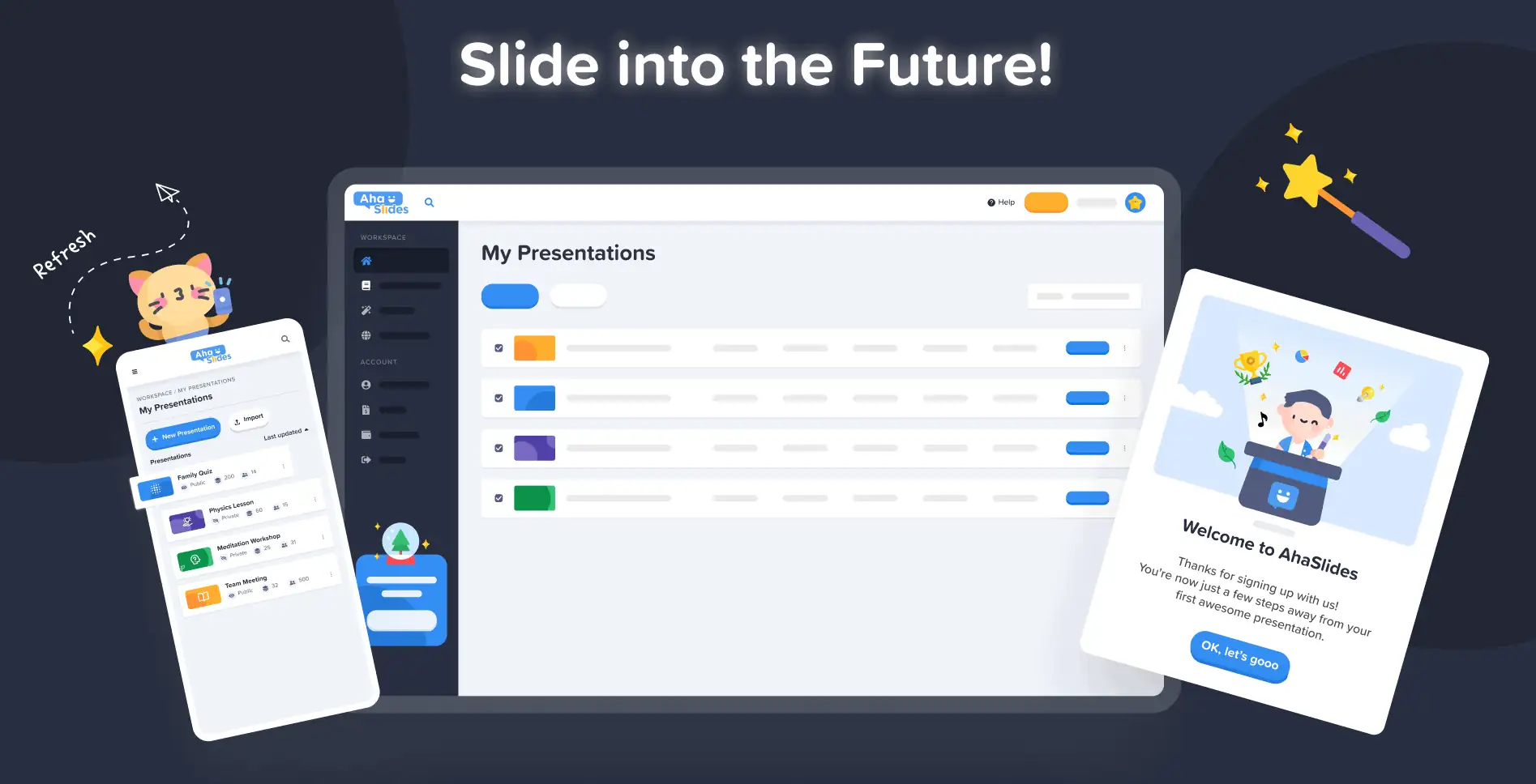
改進的外觀和感覺🤩
這一次,我們決定做一些更符合自己的事情。
品牌標識 是新設計的一大焦點。雖然過去我們可能有點保守,但現在我們已經準備好了 無所畏懼.
我們新身份的方法分為 3 個部分:
1. 插圖
2019年我們剛開始做的時候,可愛又色彩鮮豔的圖像在我們「待辦事項」中並不靠前。我們更重視的是功能性,而不是外觀。
現在,憑藉強大的開發團隊致力於創建和改進功能,我們的首席設計師 Trang 可以專注於製作 AhaSlides 更加有吸引力. 圍繞插圖和動畫形成新的品牌標識是一項艱鉅的任務,但最終產生了一個很棒的可愛設計庫:

在網站上查看這些新插圖的其他示例 我的演示文稿儀表板 和 註冊頁面:
每個插圖都有其自己的位置和作用。我們認為,這對我們的新舊用戶來說是一種更熱烈的歡迎,他們一登入就能感受到AhaSlides的俏皮精神。
在與 Dave(AhaSlides 執行長)溝通後,我們決定讓內容更生動、更有趣。如你所見,現在的圖像更加圓潤、更可愛,但我們不想讓它顯得太幼稚。我認為我們現在擁有的是 樂趣和功能的良好平衡.
莊陳 - 設計師
#2 – 顏色
充滿活力 這確實是新設計的關鍵字。我們想要一種不掩飾自身活力的東西,並能體現出創作精彩簡報與現場觀眾分享的樂趣。
這就是為什麼我們加倍努力 強烈、大膽的色彩.
我們從標誌的標誌性藍色和黃色擴展出來,並將我們的調色板擴展到紅色、橙色、綠色和紫色的陰影:
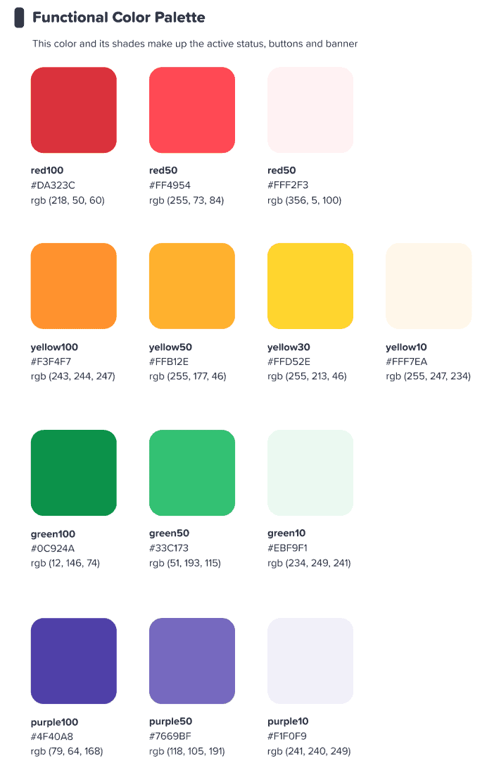
我們希望這個多彩的界面能激發我們的用戶 開始某事 豐富多彩.
莊陳 - 設計師
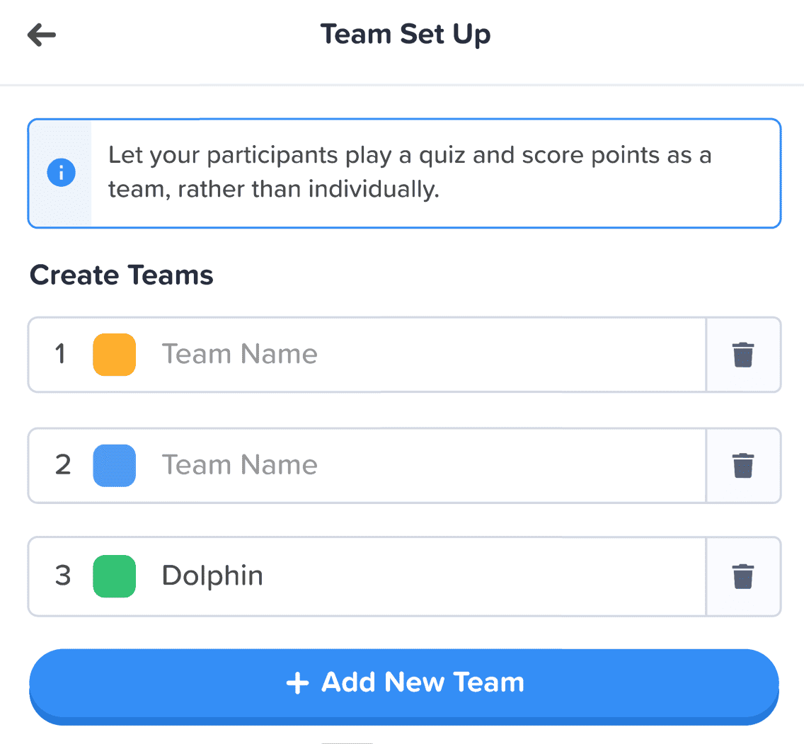
⭐ 快來了! ⭐ 當然,我們也希望將我們對色彩的全新關注延伸至用戶。因此,演示者很快就能選擇任何顏色了。 為他們的文字:

3.資訊架構
毋庸置疑,新的外觀和感覺必須具有 功能.
這就是為什麼我們對 IA (信息架構) 的 AhaSlides。這基本上意味著我們重新安排和重新構想了軟體的各個部分,以便更好地幫助用戶理解他們正在做的事情。
以下是我們所謂的新舊呈現按鈕的一個例子:

Like 全部 新設計中的按鈕,上面的按鈕具有我們只能描述為 更多 鈕扣感。我們為許多選擇選項添加了類似的陰影和光暈,不僅是為了給它們真實的感覺,也是為了提高 IA,以便用戶更好地了解選擇了什麼以及他們的焦點應該放在哪裡。
還有什麼? 好吧,您可以在此圖像中看到一些 IA 更改:
除了按鈕之外,我們還在以下方面做出了更多改進:
- 單獨的箱子 以幫助隔離每個元素。
- 粗體 將輸入的信息與空框褪色的文本區分開來。
- 圖標 和顏色 讓信息框脫穎而出。
資訊架構的變化可能很細微,但這確實是我的本意。我並不想讓用戶搬進新家,只是想用一些小細節來裝飾他們現有的家。
莊陳 - 設計師
更好的組織,更流暢的導航 📁
就像我們所說的——如果功能沒有隨之改進,那麼讓事物變得更漂亮又有什麼意義呢?
這就是我們的第二個重大改變。我們買了一大堆數位家具,並整理了雜亂的東西。
讓我們來看看我們做出改進的 4 個方面:
#1 – 我的簡報儀表板
好吧,我們承認這一點——在儀表板的舊設計上尋找和安排簡報並不總是最容易的事情。
幸運的是,我們在新儀表板上做了重大改變…
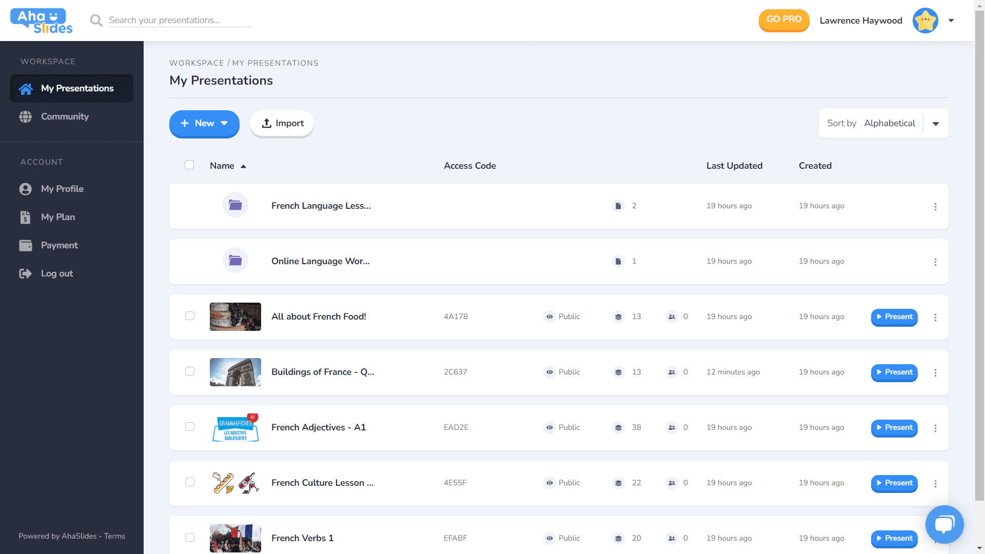
- 每個演示文稿都有自己的容器。
- 容器現在有縮略圖(縮略圖將是您的演示文稿的第一張圖片)。
- 演示選項(複製、擦除數據、刪除等)現在位於整潔的烤肉串菜單中。
- 有更多方法可以對您的演示文稿進行排序和搜索。
- 您的“工作區”和“帳戶”現在在左側欄中分開。
⭐快來了!⭐ 不久的將來將會有一個全新的儀表板視圖選項—— 網格視圖! 此視圖可讓您以以圖像為中心的網格格式查看演示文稿。 您可以隨時在網格視圖和默認列表視圖之間切換。
#2 – 編輯器頂部欄
我們對編輯器螢幕頂部欄中的一些內容進行了重新調整…

- 頂部欄中的選項數量已從 4 個縮減為 3 個。
- 每個選項的下拉菜單提供更好的組織。
- 下拉菜單的寬度已更改,以確保菜單適合右列。
#3 – 編輯左欄
簡報內容欄的設計更簡潔、更流暢。網格視圖也煥然一新…
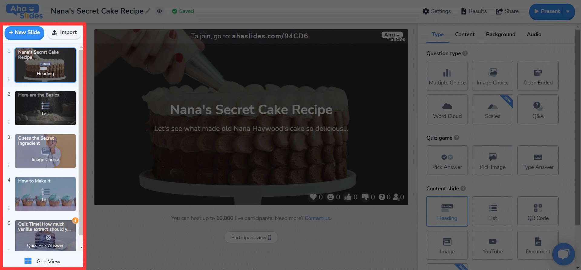
- 幻燈片選項現在在烤肉串菜單中變得雜亂無章。
- 底部添加了一個新的網格視圖按鈕按鈕。
- Grid View 的佈局和操作有了很大的改進。
⭐ 快來了! ⭐ 右側的欄位尚未完全完成,但您很快就能看到以下內容!
#4 – 編輯右欄
圖示有小變化,文字顏色有大變化…
- 為每種幻燈片類型重新設計了圖標。
- 大量的文本顏色選項。
- 重新排序「內容」標籤中的元素。
隨時隨地在任何設備上編輯 📱
對於我們 28% 在行動裝置上編輯簡報的用戶,我們很抱歉這麼長時間忽略了你們 😞
透過新的設計,我們希望為我們的手機和平板電腦用戶提供一個 與桌面一樣響應. 這意味著重新考慮每個元素,以確保我們的用戶可以隨時隨地進行編輯。
當然,這一切都始於 儀表板。我們在這裡做了一些更改…

您的簡報和資料夾最重要的資訊都顯示在這裡。右側還有烤肉串選單,方便您整理所有簡報設定。
On 編輯,您將看到另一個更友善的介面。
同樣,一切都隱藏在烤肉串菜單中。 這樣做可以消除乾擾,讓您有更多空間來查看整體演示。

是不是越來越明顯了,我們都愛烤肉串?我們把以前擁擠的頂欄換成了,沒錯,又一份烤肉菜單!這樣就 不那麼壓倒性的界面 並讓您專注於演示的質量。

我真的很想刪除一些限制 阻止我們的行動用戶創建他們想要的簡報。我們採用了比以前更簡潔、更流暢的介面,但我們仍然 大計劃 未來 AhaSlides 的行動功能!
莊陳 - 設計師