Hos AhaSlides er vores mål at gøre præsentationer sjovere, mere engagerende og mere givende for dig og dit publikum. I dag tager vi et kæmpe skridt mod det med vores helt nyt design!
Den nye AhaSlides er ny på så mange måder. Vi har gjort tingene mere organiserede, mere fleksible og mere us end nogensinde før.
Hjernen og hænderne bag det hele var vores designer, Trang:
Jeg tog AhaSlides' samlede vision og tilføjede mine egne dele. Vi er endt med noget, der er fantastisk for nye brugere, men også en passende og dybfølt 'tak' til dem, der har været med os siden dag ét.
Trang Tran – Designer
Lad os se på, hvilke ændringer vi har foretaget, og præcis hvordan de kan hjælpe dig med at lave præsentationer, der er smartere og bedre for dit publikum.
Kløe for at tjekke det ud? Gå og se, hvad der er nyt, ved at klikke på knappen nedenfor:
Hvad er nyt?
- Forbedret udseende og fornemmelse
- Bedre organisation, jævnere navigation
- Rediger hvor som helst på enhver enhed
Forbedret udseende og følelse 🤩
Denne gang besluttede vi at gå med noget lidt mere ... os.
Brandidentitet var et stort fokuspunkt i det nye design. Selvom vi tidligere måske har været lidt reserverede, er vi nu klar til at være det pin.
Tilgangen til vores nye identitet er opdelt i 3 dele:
#1 – Illustration
Da vi startede i 2019, var søde, farverige billeder ikke ligefrem højt på vores 'to-do-liste'. Vi valgte funktionalitet frem for udseende.
Nu, med et solidt udviklingsteam, der arbejder hårdt på at skabe og forbedre funktioner, kunne vores chefdesigner Trang fokusere på at lave AhaSlides mere attraktivt. Det var en enorm opgave at danne en ny brandidentitet omkring illustrationer og animationer, men en der resulterede i et stort bibliotek med søde designs:

Tjek disse andre eksempler på nye illustrationer på Mit præsentations dashboard og Tilmeld siden:
Hver illustration har sin egen plads og rolle. Vi synes, det er en varmere velkomst til vores nye og nuværende brugere, som kan se den legende ånd i AhaSlides, så snart de logger ind.
Efter at have talt med Dave [CEO for AhaSlides] besluttede vi, at vi ville gøre tingene mere levende og mere legende. Som I kan se, er billederne nu mere afrundede, mere søde, men vi ville ikke gøre det for barnligt. Jeg tror, det, vi har nu, er en god balance mellem sjov og funktion.
Trang Tran – Designer
#2 – Farve
Livskraft var virkelig nøgleordet med det nye design. Vi ønskede noget, der ikke var bleg for sin egen livlighed, og noget, der afspejlede glæden ved at skabe en spændende præsentation at dele med et live publikum.
Derfor har vi fordoblet indsatsen stærke, dristige farver.
Vi forgrenede os fra det signaturblå og gule af vores logo og udvidede vores farvepalet til nuancer af rød, orange, grøn og lilla:
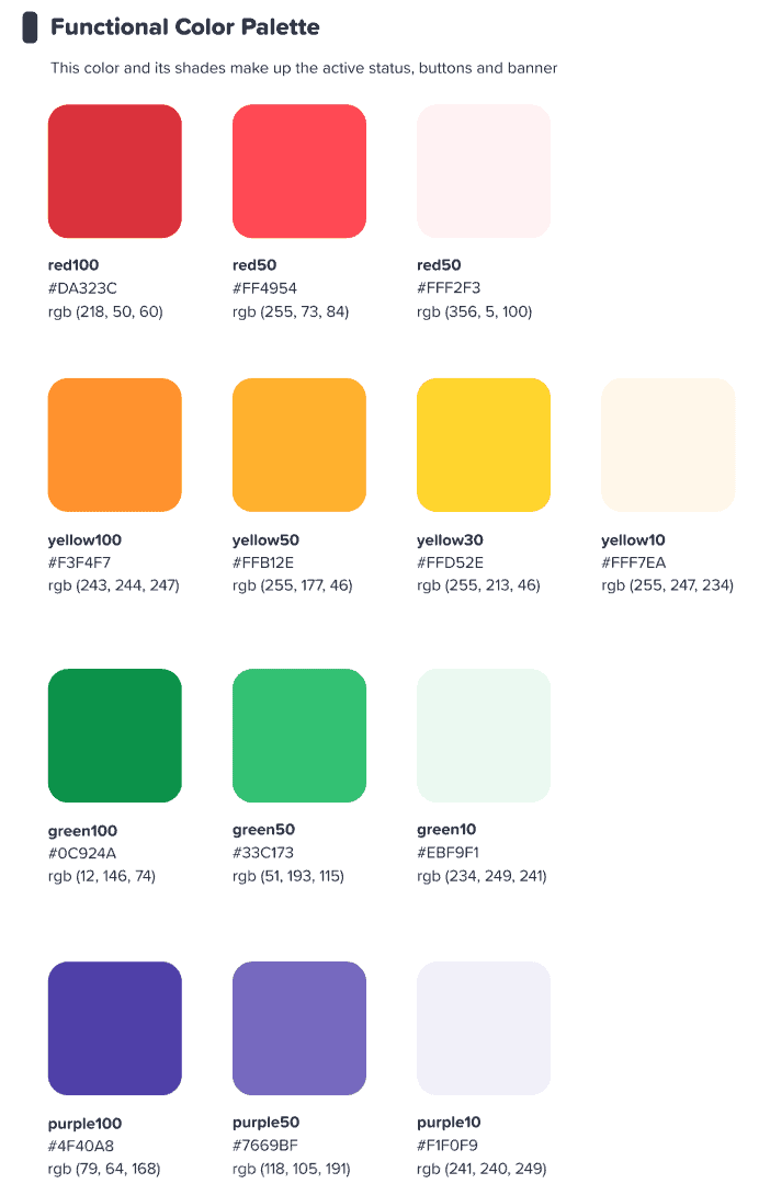
Vi håbede, at denne farverige grænseflade ville inspirere vores brugere til start noget farverig.
Trang Tran – Designer
⭐ Kommer snart! ⭐ Selvfølgelig ville vi også udvide vores nye fokus på farver til vores brugere. Derfor vil præsentanter snart have mulighed for at vælge en hvilken som helst farve under solen. for deres tekst:

#3 – Informationsarkitektur
Det siger sig selv, at et nyt udseende skal have en funktion.
Derfor har vi lavet en stor ændring i IA (Information Architecture) af AhaSlides. Det betyder dybest set, at vi har omarrangeret og gentænkt dele af vores software for bedre at hjælpe brugerne med at forstå, hvad de laver.
Her er et eksempel på, hvad vi mener – de gamle og nye gaveknapper:

lignende alle knapper i det nye design, ovenstående har det, vi kun kan beskrive som en mere knap-y-følelseVi har tilføjet en lignende skygge og glød til mange valgmuligheder, ikke kun for at give dem en mere reel fornemmelse, men også for at forbedre IA'en, så brugerne bedre forstår, hvad der er valgt, og hvor deres fokus skal være.
Hvad ellers? Nå, du kan se et par IA-ændringer i dette billede:
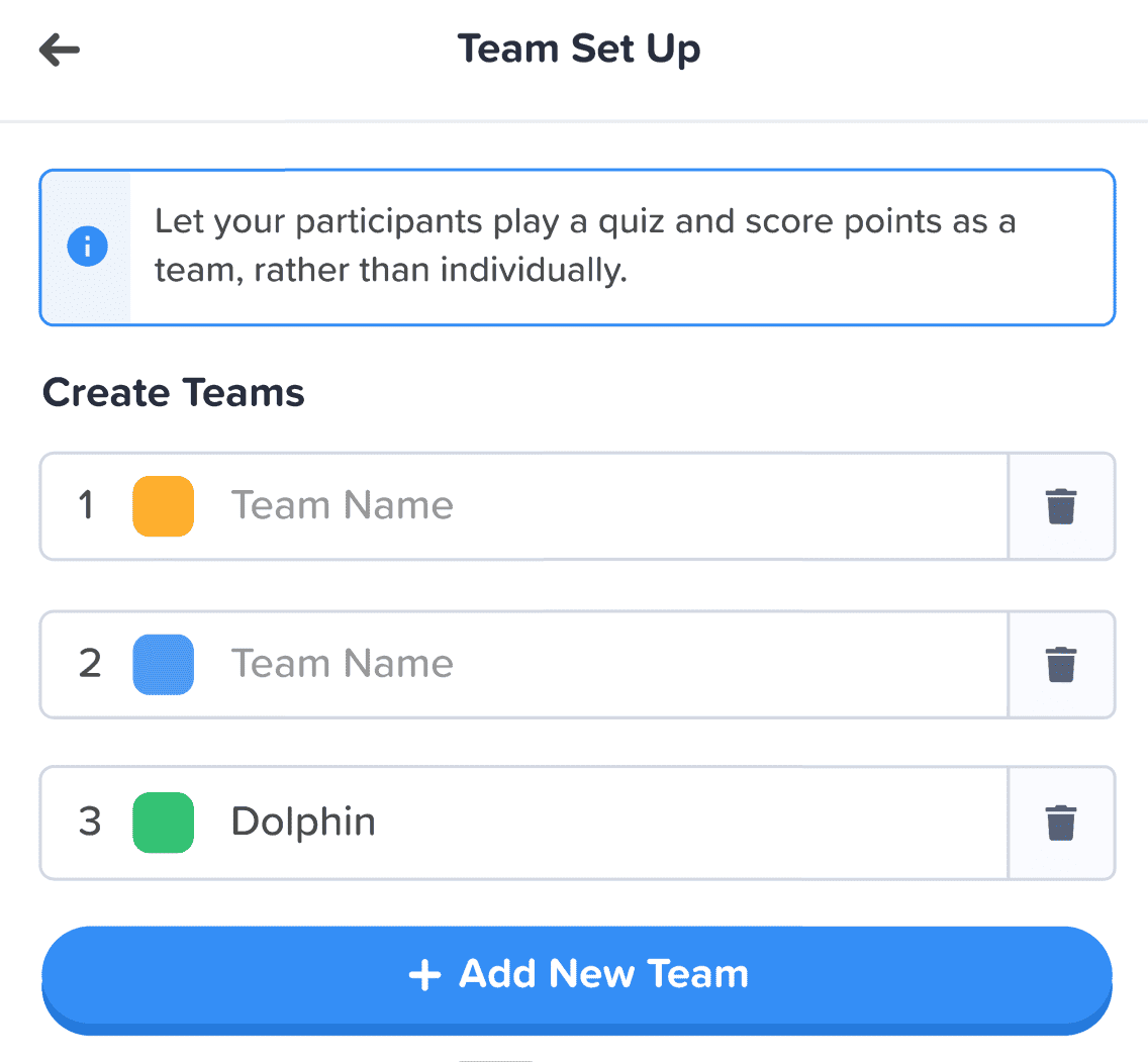
Udover knappen har vi foretaget flere forbedringer på følgende måder:
- Individuelle kasser for at hjælpe med at adskille hvert element.
- Fed tekst adskiller indtastet information fra den falmede tekst i en tom boks.
- Ikoner og farver lad informationsbokse skille sig ud.
Ændringerne i informationsarkitekturen er måske subtile, men det var min intention. Jeg ønskede ikke, at vores brugere skulle flytte til et nyt hus, jeg ville blot på små måder dekorere det hjem, de allerede bor i.
Trang Tran – Designer
Bedre organisation, jævnere navigation 📁
Som sagt – hvad er pointen med at gøre tingene pænere, hvis funktionaliteten ikke forbedres samtidig?
Det er her, vores anden store forandring kommer ind i billedet. Vi har købt en masse digitale møbler og ryddet op i rodet.
Lad os se på 4 områder, hvor vi har forbedret os:
- Min præsentations dashboard
- Editorens øverste bjælke
- Editor venstre kolonne
- Editor Højre kolonne (kommer snart!)
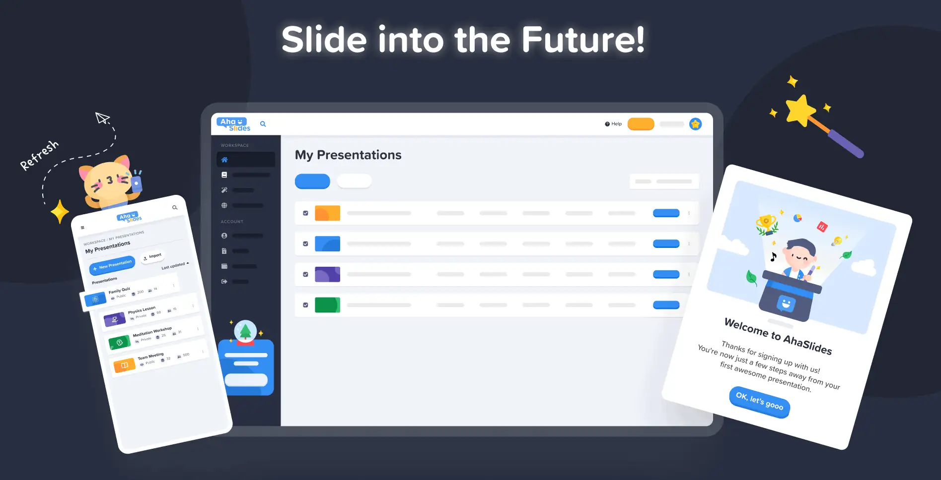
#1 – Mit præsentationsdashboard
Okay, vi indrømmer det – det var ikke altid lige nemt at finde og arrangere sine præsentationer i dashboardets gamle design.
Heldigvis har vi ændret tingene markant på det nye dashboard…
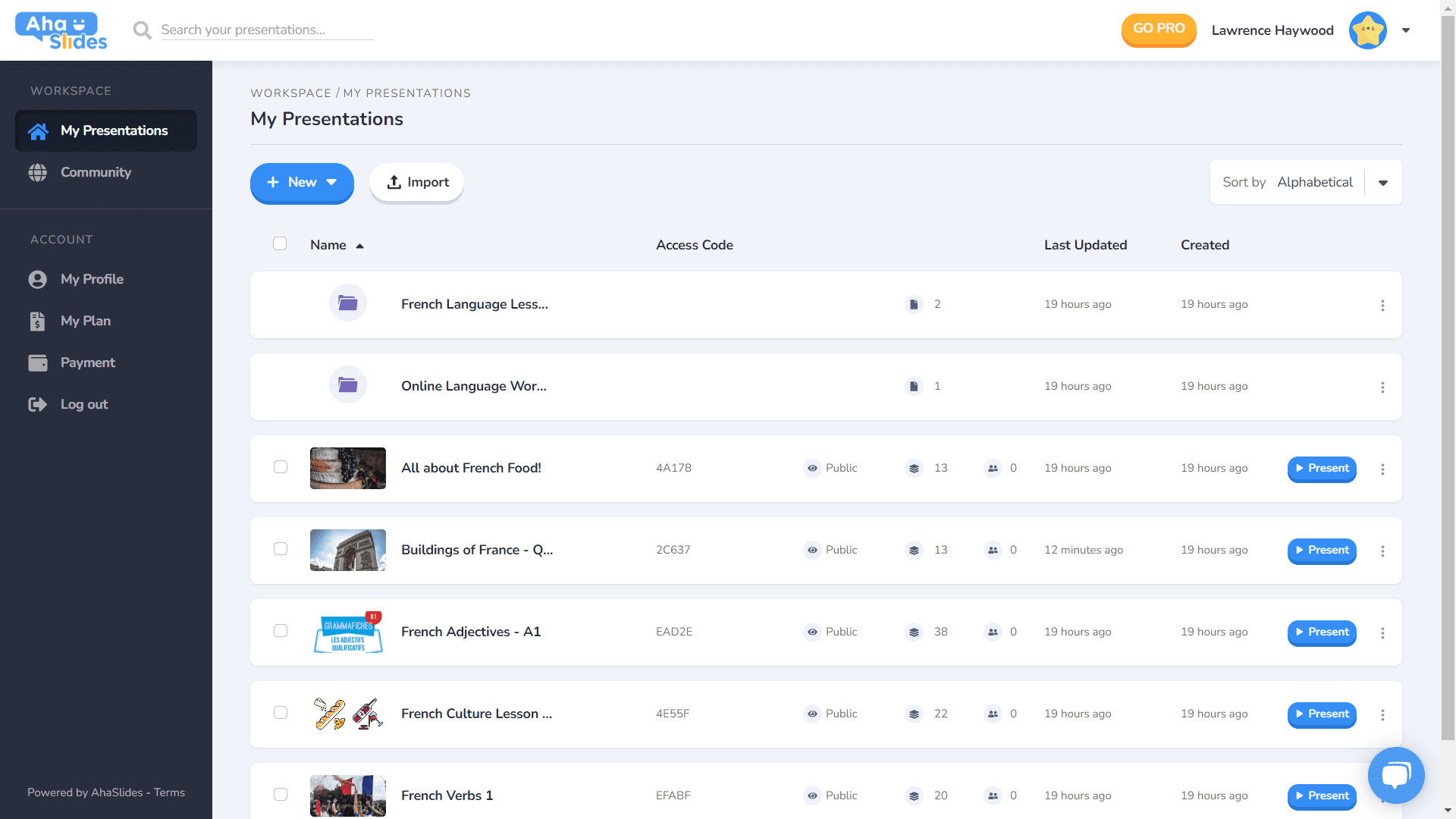
- Hver præsentation har sin egen container.
- Beholdere har nu miniaturebilleder (miniaturebilledet er det første billede af din præsentation).
- Præsentationsmuligheder (duplikat, sletning af data, sletning osv.) Er nu i en pæn kebab-menu.
- Der er flere måder at sortere og søge efter dine præsentationer på.
- Dit 'Arbejdsområde' og din 'Konto' er nu adskilt i venstre kolonne.
⭐Kommer snart!⭐ Der kommer en helt ny visningsmulighed for dashboardet i den nærmeste fremtid – Grid View! Denne visning giver dig mulighed for at se dine præsentationer i et billedcentreret gitterformat. Du kan til enhver tid skifte mellem gittervisning og standard listevisning.
#2 – Redigeringsbjælke øverst
Vi har omrokeret et par ting i den øverste bjælke på redigeringsskærmen…

- Antallet af indstillinger i den øverste bjælke er nedskaleret fra 4 til 3.
- Dropdown-menuer for hver mulighed giver bedre organisering.
- Bredden på rullelisterne er ændret for at sikre, at menuen passer ind i højre kolonne.
#3 – Redaktørens venstre spalte
Enklere og mere elegant design i din præsentations indholdskolonne. Gittervisningen har også fået et helt nyt udseende…
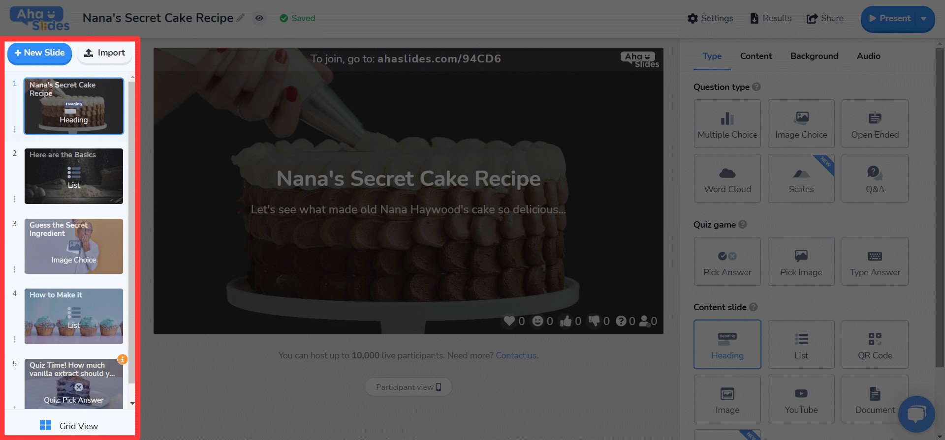
- Diasindstillinger er nu ophævet i en kebab-menu.
- En ny knapvisnings knap knap er blevet tilføjet i bunden.
- Layoutet og driften af Grid View forbedres meget.
⭐ Kommer snart! ⭐ Højre kolonne er ikke helt færdig endnu, men her er hvad du kan forvente at se der snart!
#4 – Redaktørens højre kolonne
Små ændringer af ikoner, store ændringer af tekstfarve…
- Re-designet ikoner til hver diasetype.
- Et stort udvalg af tekstfarveindstillinger.
- Omarrangerede elementer i fanen 'Indhold'.
Rediger hvor som helst, på enhver enhed 📱
Til de 28% af vores brugere, der redigerer deres præsentationer på mobilen, beklager vi, at vi har forsømt jer så længe. 😞
Med det nye design ønskede vi at give vores mobil- og tabletbrugere en platform, der er lige så lydhør som desktop. Det betød at genoverveje hvert element for at sikre, at vores brugere kunne redigere på farten.
Selvfølgelig starter det hele med instrumentbrættetVi har foretaget et par ændringer her…

De vigtigste oplysninger om dine præsentationer og mapper vises her. Der er også kebab-menuen til højre, der holder alle præsentationsindstillinger organiseret.
On og editor, bliver du mødt af endnu en mere brugervenlig brugerflade.
Igen er alt gemt væk i kebab-menuer. At gøre dette rydder distraktionerne og giver dig så meget mere plads til at se din samlede præsentation.

Er det ved at blive tydeligt, at vi elsker kebab? Vi har erstattet den gamle overfyldte bar med, ja, endnu en kebabmenu! Det giver en... meget mindre overvældende interface og lader dig fokusere på kvaliteten af din præsentation.

Jeg ville virkelig fjerne nogle af begrænsningerne der forhindrer vores mobilbrugere i at lave de præsentationer, de ønsker. Vi valgte noget mere elegant og enkelt end før, men vi har stadig store planer for AhaSlides' mobile muligheder i fremtiden!
Trang Tran – Designer