Unser Ziel bei AhaSlides ist es, Präsentationen für Sie und Ihr Publikum unterhaltsamer, ansprechender und lohnender zu gestalten. Heute machen wir einen großen Schritt in diese Richtung mit unserem brandneues Design!
Das neue AhaSlides ist neu in vielerlei Hinsicht. Wir haben alles organisierter, flexibler und us als jemals zuvor.
Das Gehirn und die Hände dahinter waren unser Designer, Trang:
Ich habe die gesammelten Visionen der AhaSlides aufgegriffen und meine eigenen Ideen hinzugefügt. Das Ergebnis ist etwas, das sich hervorragend für neue Nutzer eignet und gleichzeitig ein herzliches Dankeschön an alle ist, die uns seit dem ersten Tag begleiten.
Trang Tran - Designer
Sehen wir uns an, welche Änderungen wir vorgenommen haben und wie diese Ihnen dabei helfen können, Präsentationen zu erstellen, die für Ihr Publikum intelligenter und besser sind.
Juckt es, es auszuprobieren? Entdecken Sie die Neuigkeiten, indem Sie auf die Schaltfläche unten klicken:
Was gibt's Neues?
- Verbessertes Erscheinungsbild
- Bessere Organisation, reibungslosere Navigation
- Überall auf jedem Gerät bearbeiten
Verbessertes Erscheinungsbild 🤩
Dieses Mal haben wir uns für etwas entschieden, das mehr … wir selbst ist.
Markenidentität war ein großer Schwerpunkt des neuen Designs. Während wir in der Vergangenheit vielleicht etwas zurückhaltend waren, sind wir jetzt bereit, fett.
Die Herangehensweise an unsere neue Identität gliedert sich in drei Teile:
#1 – Illustration
Als wir 2019 anfingen, standen niedliche, farbenfrohe Bilder nicht ganz oben auf unserer To-do-Liste. Wir entschieden uns für Funktionalität statt für das Aussehen.
Jetzt, da ein solides Entwicklungsteam hart an der Erstellung und Verbesserung von Funktionen arbeitet, konnte sich unser Chefdesigner Trang auf die Erstellung von AhaSlides konzentrieren attraktiver. Es war eine Mammutaufgabe, eine neue Markenidentität um Illustrationen und Animationen herum zu bilden, aber eine, die zu einer großartigen Bibliothek niedlicher Designs führte:

Schauen Sie sich diese anderen Beispiele für neue Abbildungen auf der Mein Präsentations-Dashboard und der Seite anmelden:
Jede Illustration hat ihren eigenen Platz und ihre eigene Rolle. Wir denken, es ist ein herzlicher Willkommensgruß für unsere neuen und bestehenden Benutzer, die den spielerischen Geist von AhaSlides sofort nach dem Einloggen erkennen können.
Nach einem Gespräch mit Dave [CEO von AhaSlides] beschlossen wir, die Dinge lebendiger und verspielter zu gestalten. Wie Sie sehen, sind die Bilder jetzt runder und niedlicher, aber wir wollten sie nicht zu kindisch wirken lassen. Ich denke, was wir jetzt haben, ist ein gute Balance zwischen Spaß und Funktion.
Trang Tran - Designer
#2 – Farbe
Lebendigkeit „Ich bin begeistert“ war das Schlüsselwort für das neue Design. Wir wollten etwas, das seine eigene Lebhaftigkeit nicht scheut und die Freude an der Gestaltung einer spannenden Präsentation für ein Live-Publikum widerspiegelt.
Deshalb haben wir uns verstärkt kräftige, kräftige Farben.
Wir haben uns vom typischen Blau und Gelb unseres Logos entfernt und unsere Farbpalette auf Rot-, Orange-, Grün- und Lila-Töne erweitert:
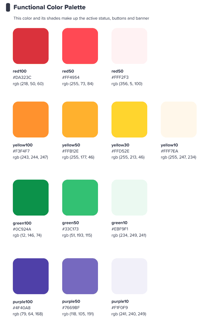
Wir hatten gehofft, dass diese farbenfrohe Oberfläche unsere Benutzer dazu inspirieren würde Etwas anfangen bunt.
Trang Tran - Designer
⭐ Demnächst! ⭐ Natürlich wollten wir unseren neuen Fokus auf Farbe auch auf unsere Nutzer ausweiten. Deshalb werden Moderatoren bald die Möglichkeit haben, jede beliebige Farbe unter der Sonne auszuwählen für ihren Text:

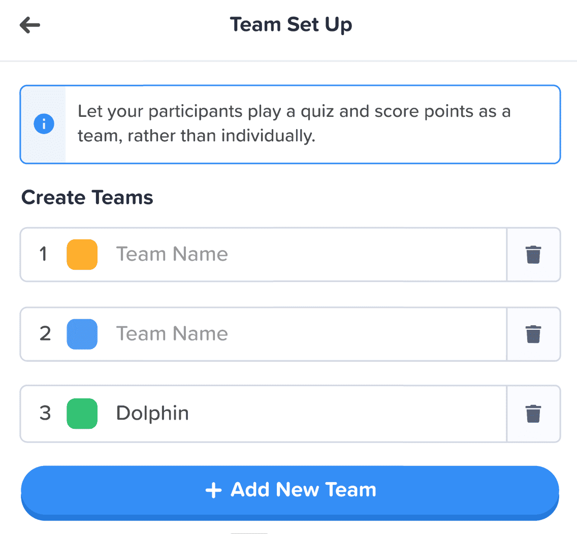
#3 – Informationsarchitektur
Es versteht sich von selbst, dass ein neues Erscheinungsbild eine haben muss Funktion.
Deshalb haben wir eine große Änderung vorgenommen an der IA (Information Architecture) von AhaSlides. Das bedeutet im Wesentlichen, dass wir Teile unserer Software neu angeordnet und überarbeitet haben, damit die Benutzer besser verstehen, was sie tun.
Hier ist ein Beispiel dafür, was wir meinen – die alten und neuen Geschenk-Buttons:

Like alle Schaltflächen im neuen Design, die oben genannten haben das, was wir nur als beschreiben können Mehr Knopf-y fühlen. Wir haben vielen Auswahloptionen einen ähnlichen Schatten und Schein hinzugefügt, nicht nur um ihnen ein realistischeres Gefühl zu verleihen, sondern auch um die KI zu verbessern, sodass Benutzer besser verstehen, was ausgewählt ist und worauf sie sich konzentrieren sollten.
Was noch? Nun, Sie können ein paar IA-Änderungen in diesem Bild sehen:
Abgesehen von der Schaltfläche haben wir in den folgenden Bereichen weitere Verbesserungen vorgenommen:
- Einzelne Boxen um zu helfen, jedes Element zu trennen.
- Fetter Text Unterscheidet eingegebene Informationen vom ausgeblendeten Text eines leeren Felds.
- Icons und Farben Lassen Sie Informationsfelder hervorstechen.
Die Änderungen in der Informationsarchitektur mögen subtil sein, aber genau das war meine Absicht. Ich wollte nicht, dass unsere Nutzer in ein neues Haus umziehen müssen. Ich wollte lediglich ihr Zuhause, in dem sie sich bereits befinden, ein wenig verschönern.
Trang Tran - Designer
Bessere Organisation, reibungslosere Navigation 📁
Wie gesagt: Was bringt es, Dinge schöner zu machen, wenn sich die Funktionalität nicht gleichzeitig verbessert?
Und hier kommt unsere zweite große Veränderung ins Spiel. Wir haben jede Menge digitale Möbel gekauft und das Durcheinander beseitigt.
Werfen wir einen Blick auf 4 Bereiche, in denen wir Verbesserungen vorgenommen haben:
- Mein Präsentations-Dashboard
- Editor Obere Leiste
- Linke Spalte des Editors
- Rechte Spalte des Editors (kommt bald!)
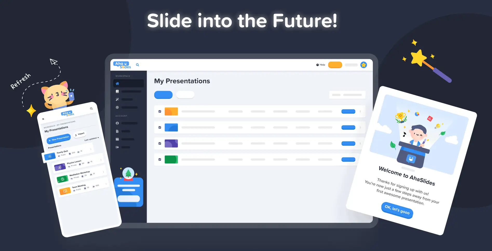
#1 – Mein Präsentations-Dashboard
Okay, wir geben es zu – es war nicht immer ganz einfach, Ihre Präsentationen im alten Design des Dashboards zu finden und anzuordnen.
Glücklicherweise haben wir auf dem neuen Dashboard einiges geändert …
- Jede Präsentation hat einen eigenen Container.
- Container haben jetzt Miniaturbilder (das Miniaturbild ist das erste Bild Ihrer Präsentation).
- Präsentationsoptionen (Duplizieren, Löschen von Daten, Löschen usw.) befinden sich jetzt in einem übersichtlichen Kebab-Menü.
- Es gibt weitere Möglichkeiten, Ihre Präsentationen zu sortieren und zu suchen.
- Ihr „Arbeitsbereich“ und Ihr „Konto“ werden jetzt in der linken Spalte getrennt.
⭐Demnächst!⭐ In naher Zukunft wird es eine brandneue Dashboard-Ansichtsoption geben – Grid-Ansicht! In dieser Ansicht können Sie Ihre Präsentationen in einem bildzentrierten Rasterformat anzeigen. Sie können jederzeit zwischen der Rasteransicht und der Standardlistenansicht wechseln.
#2 – Editor-Oberleiste
Wir haben ein paar Dinge in der oberen Leiste auf dem Editor-Bildschirm neu angeordnet …

- Die Anzahl der Optionen in der oberen Leiste wurde von 4 auf 3 verringert.
- Dropdown-Menüs für jede Option bieten eine bessere Organisation.
- Die Breite der Dropdowns hat sich geändert, um sicherzustellen, dass das Menü in die rechte Spalte passt.
#3 – Linke Spalte des Editors
Einfacheres, eleganteres Design in der Inhaltsspalte Ihrer Präsentation. Auch die Rasteransicht hat ein völlig neues Aussehen …
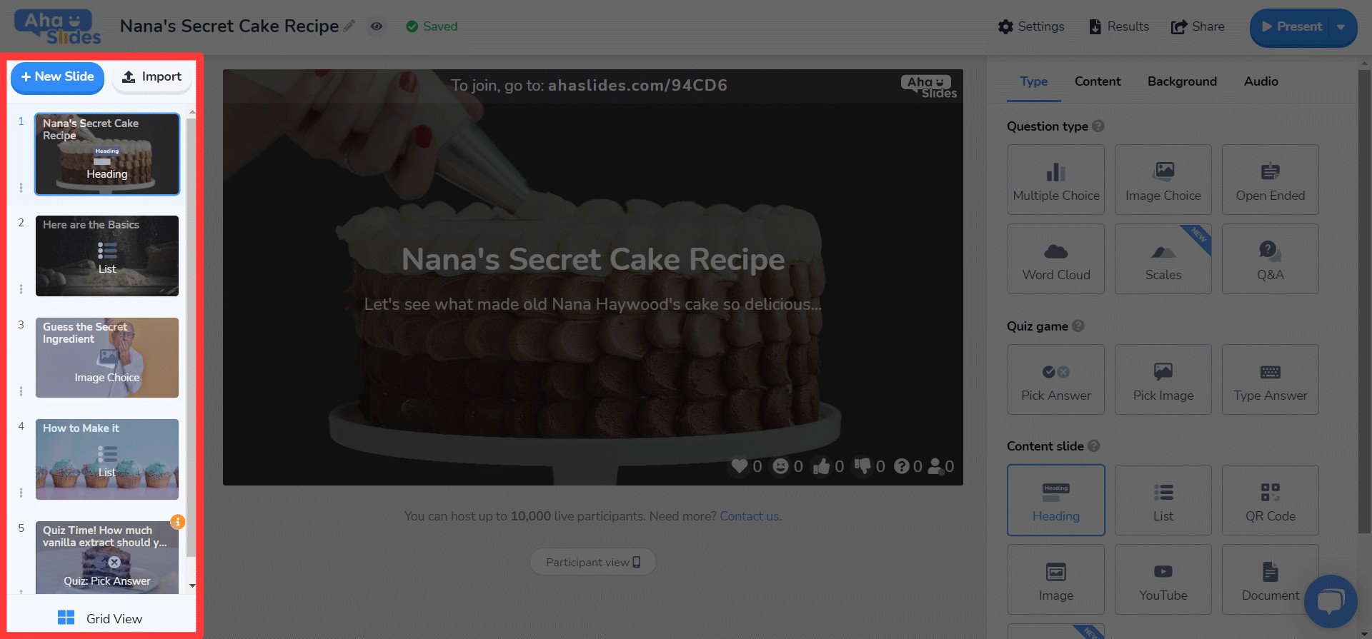
- Folienoptionen werden jetzt in einem Kebab-Menü angezeigt.
- Unten wurde eine neue Schaltfläche mit der Schaltfläche "Rasteransicht" hinzugefügt.
- Das Layout und der Betrieb von Grid View wurden erheblich verbessert.
⭐ Demnächst! ⭐ Die rechte Spalte ist noch nicht ganz fertig, aber hier ist, was Sie dort in Kürze erwarten können!
#4 – Rechte Spalte des Editors
Kleine Änderungen an Symbolen, große Änderungen an der Textfarbe …
- Neu gestaltete Symbole für jeden Folientyp.
- Eine Vielzahl von Textfarboptionen.
- Elemente auf der Registerkarte „Inhalt“ neu angeordnet.
Überall und auf jedem Gerät bearbeiten 📱
An die 28 % unserer Nutzer, die ihre Präsentationen auf dem Handy bearbeiten: Es tut uns leid, dass wir Sie so lange vernachlässigt haben. ????
Mit dem neuen Design wollten wir unseren Handy- und Tablet-Nutzern eine Plattform bieten, die genauso reaktionsschnell wie Desktop. Das bedeutete, jedes Element zu überdenken, um sicherzustellen, dass unsere Benutzer es auch unterwegs bearbeiten konnten.
Natürlich beginnt alles mit das Dashboard. Wir haben hier ein paar Änderungen vorgenommen…

Hier werden die wichtigsten Informationen zu Ihren Präsentationen und Ordnern angezeigt. Außerdem finden Sie rechts das Kebab-Menü, in dem Sie alle Präsentationseinstellungen übersichtlich verwalten können.
On die Herausgeber, werden Sie mit einer anderen, benutzerfreundlicheren Benutzeroberfläche begrüßt.
Auch hier ist alles in Kebab-Menüs versteckt. Auf diese Weise werden die Ablenkungen beseitigt und Sie haben viel mehr Platz, um Ihre Gesamtpräsentation anzuzeigen.

Wird es offensichtlich, dass wir Kebabs lieben? Wir haben die überfüllte obere Leiste von früher durch, ja, eine andere Kebab-Karte ersetzt! Das sorgt für eine viel weniger überwältigende Schnittstelle und lässt Sie sich auf die Qualität Ihrer Präsentation konzentrieren.

Ich wollte wirklich einige der Einschränkungen beseitigen die unsere mobilen Nutzer daran hindern, die gewünschten Präsentationen zu erstellen. Wir haben uns für etwas Schlankeres und Einfacheres als zuvor entschieden, aber wir haben immer noch große Pläne für die mobilen Funktionen von AhaSlides in der Zukunft!
Trang Tran - Designer

Schon versucht?
Klicken Sie einfach auf die Schaltfläche unten, um zu sehen
Das überarbeitete Design von AhaSlides!