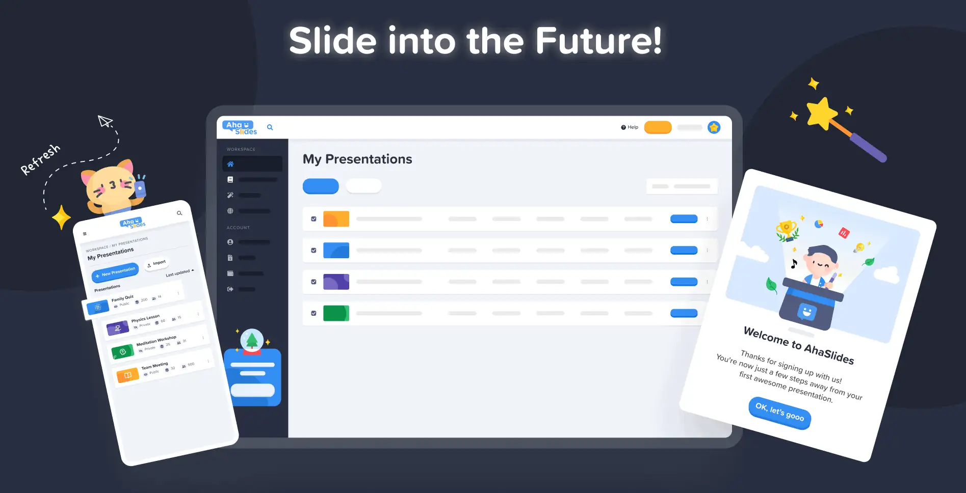
Στο AhaSlides, στόχος μας είναι να κάνουμε τις παρουσιάσεις πιο διασκεδαστικές, πιο ελκυστικές και πιο ανταποδοτικές για εσάς και το κοινό σας. Σήμερα, κάνουμε ένα τεράστιο βήμα προς αυτό με το δικό μας ολοκαίνουργιο σχέδιο!
Το νέο AhaSlides είναι νέος με τόσους πολλούς τρόπους. Έχουμε κάνει τα πράγματα πιο οργανωμένα, πιο ευέλικτα και πιο us από ποτέ.
Οι εγκέφαλοι και τα χέρια πίσω από όλα αυτά ήταν ο σχεδιαστής μας, Trang:
Πήρα το συσσωρευμένο όραμα των AhaSlides και πρόσθεσα δικά μου κομμάτια. Καταλήξαμε σε κάτι που είναι εξαιρετικό για τους νέους χρήστες, αλλά και ένα ταιριαστό και εγκάρδιο «ευχαριστώ» σε όσους είναι μαζί μας από την πρώτη μέρα.
Τρανγκ Τραν - σχεδιαστής
Ας ρίξουμε μια ματιά στις αλλαγές που έχουμε κάνει και πώς ακριβώς μπορούν να σας βοηθήσουν να δημιουργείτε παρουσιάσεις που είναι πιο έξυπνες και καλύτερες για το κοινό σας.
Κνησμός για να το ελέγξετε; Ανακαλύψτε τι νέο υπάρχει κάνοντας κλικ στο παρακάτω κουμπί:
Τι νέα?
- Βελτιωμένη εμφάνιση και αίσθηση
- Καλύτερη οργάνωση, ομαλότερη πλοήγηση
- Επεξεργασία οπουδήποτε, σε οποιαδήποτε συσκευή
Βελτιωμένη εμφάνιση και αίσθηση 🤩
Αυτή τη φορά, αποφασίσαμε να επιλέξουμε κάτι λίγο πιο... δικό μας.
Ταυτότητα μάρκας ήταν ένα μεγάλο σημείο εστίασης του νέου σχεδιασμού. Ενώ στο παρελθόν μπορεί να ήμασταν λίγο επιφυλακτικοί, τώρα είμαστε έτοιμοι να είμαστε .
Η προσέγγιση της νέας μας ταυτότητας χωρίζεται σε 3 μέρη:
#1 – Εικονογράφηση
Όταν ξεκινήσαμε το 2019, οι χαριτωμένες, πολύχρωμες εικόνες δεν ήταν και πολύ ψηλά στη «λίστα υποχρεώσεων». Επιλέξαμε τη λειτουργικότητα και όχι την εμφάνιση.
Τώρα, με μια σταθερή ομάδα ανάπτυξης που εργάζεται σκληρά για τη δημιουργία και τη βελτίωση χαρακτηριστικών, ο επικεφαλής σχεδιαστής μας Trang θα μπορούσε να επικεντρωθεί στη δημιουργία AhaSlides πιο ελκυστικό. Ήταν ένα τεράστιο καθήκον να δημιουργήσει μια νέα ταυτότητα μάρκας γύρω από εικονογραφήσεις και κινούμενα σχέδια, αλλά αυτό είχε ως αποτέλεσμα μια μεγάλη βιβλιοθήκη χαριτωμένων σχεδίων:

Δείτε αυτά τα άλλα παραδείγματα νέων εικονογραφήσεων στο Πίνακας ελέγχου των παρουσιάσεων μου και την εγγραφείτε:
Κάθε εικόνα έχει τη δική της θέση και ρόλο. Πιστεύουμε ότι είναι ένα θερμότερο καλωσόρισμα στους νέους και τους υπάρχοντες χρήστες μας, οι οποίοι μπορούν να δουν το παιχνιδιάρικο πνεύμα του AhaSlides μόλις συνδεθούν.
Αφού μιλήσαμε με τον Ντέιβ [Διευθύνων Σύμβουλος της AhaSlides], αποφασίσαμε ότι θέλαμε να κάνουμε τα πράγματα πιο ζωντανά και πιο παιχνιδιάρικα. Όπως μπορείτε να δείτε, οι εικόνες τώρα είναι πιο στρογγυλεμένες, πιο χαριτωμένες, αλλά δεν θέλαμε να τις κάνουμε πολύ παιδικές. Νομίζω ότι αυτό που έχουμε τώρα είναι ένα καλή ισορροπία διασκέδασης και λειτουργίας.
Τρανγκ Τραν - σχεδιαστής
#2 – Χρώμα
Δόνηση ήταν πραγματικά η λέξη-κλειδί με το νέο σχέδιο. Θέλαμε κάτι που να μην ντρέπεται για τη ζωντάνια του και κάτι που να αντανακλά τη χαρά της δημιουργίας μιας συναρπαστικής παρουσίασης για να μοιραστούμε με ένα ζωντανό κοινό.
Γι' αυτό διπλασιάσαμε δυνατά, έντονα χρώματα.
Έχουμε διακλαδώσει από την υπογραφή μπλε και κίτρινο του λογότυπου μας και επεκτείναμε την παλέτα χρωμάτων μας σε αποχρώσεις του κόκκινου, πορτοκαλί, πράσινου και μοβ:
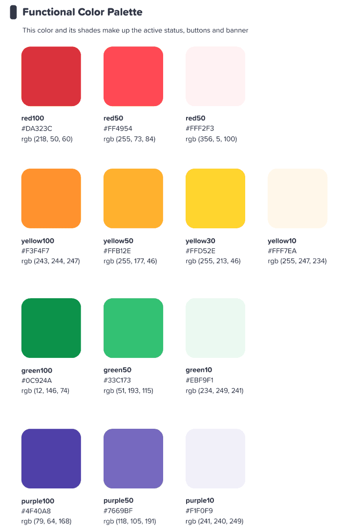
Ελπίζαμε ότι αυτή η πολύχρωμη διεπαφή θα εμπνεύσει τους χρήστες μας ξεκινήστε κάτι πολύχρωμα.
Τρανγκ Τραν - σχεδιαστής
⭐ Ερχονται συντομα! ⭐ Φυσικά, θέλαμε να επεκτείνουμε τη νέα μας εστίαση στο χρώμα και στους χρήστες μας. Γι' αυτό οι παρουσιαστές σύντομα θα έχουν την επιλογή να επιλέξουν οποιοδήποτε χρώμα υπάρχει. για το κείμενό τους:

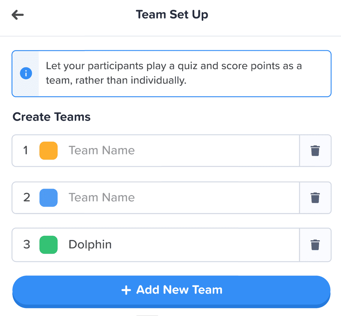
#3 – Αρχιτεκτονική Πληροφοριών
Είναι αυτονόητο ότι μια νέα εμφάνιση και αίσθηση πρέπει να έχει λειτουργία.
Γι' αυτό κάναμε μια μεγάλη αλλαγή στο IA (Αρχιτεκτονική Πληροφορίας) του AhaSlides. Αυτό ουσιαστικά σημαίνει ότι αναδιατάξαμε και επαναπροσδιορίσαμε μέρη του λογισμικού μας για να βοηθήσουμε καλύτερα τους χρήστες να κατανοήσουν τι κάνουν.
Ακολουθεί ένα παράδειγμα του τι εννοούμε – τα παλιά και τα νέα κουμπιά δώρου:

Αρέσει όλοι κουμπιά στη νέα σχεδίαση, τα παραπάνω έχουν αυτό που μπορούμε να περιγράψουμε μόνο ως περισσότερο κουμπί-y αίσθησηΈχουμε προσθέσει μια παρόμοια σκιά και λάμψη σε πολλές επιλογές, όχι μόνο για να τους δώσουμε μια πραγματική αίσθηση, αλλά και για να βελτιώσουμε την IA, ώστε οι χρήστες να κατανοούν καλύτερα τι έχει επιλεγεί και πού πρέπει να επικεντρωθούν.
Τι άλλο? Λοιπόν, μπορείτε να δείτε μερικές αλλαγές IA σε αυτήν την εικόνα:
Εκτός από το κουμπί, έχουμε κάνει περισσότερες βελτιώσεις με τους εξής τρόπους:
- Μεμονωμένα κουτιά για να διαχωρίσετε κάθε στοιχείο.
- Έντονο κείμενο διαφοροποιεί τις εισαγόμενες πληροφορίες από το ξεθωριασμένο κείμενο ενός κενού πλαισίου.
- Εικόνες και χρώματα επιτρέψτε στα κουτιά πληροφοριών να ξεχωρίζουν.
Οι αλλαγές στην αρχιτεκτονική πληροφοριών μπορεί να είναι ανεπαίσθητες, αλλά αυτή ήταν η πρόθεσή μου. Δεν ήθελα οι χρήστες μας να μετακομίσουν σε νέο σπίτι, απλώς ήθελα να διακοσμήσω, με μικρούς τρόπους, το σπίτι στο οποίο βρίσκονται ήδη.
Τρανγκ Τραν - σχεδιαστής
Καλύτερη οργάνωση, ομαλότερη πλοήγηση 📁
Όπως είπαμε – ποιο το νόημα να κάνουμε τα πράγματα πιο όμορφα αν η λειτουργικότητα δεν βελτιώνεται παράλληλα με αυτό;
Εκεί έρχεται η δεύτερη μεγάλη αλλαγή μας. Αγοράσαμε ένα σωρό ψηφιακά έπιπλα και τακτοποιήσαμε την ακαταστασία.
Ας ρίξουμε μια ματιά σε 4 τομείς στους οποίους έχουμε κάνει βελτιώσεις:
- Πίνακας ελέγχου των παρουσιάσεων μου
- Πάνω γραμμή επεξεργαστή
- Αριστερή στήλη επεξεργαστή
- Δεξιά στήλη επεξεργαστή (Ερχομαι συντομα!)
#1 – Πίνακας Ελέγχου Παρουσιάσεών μου
Εντάξει, το παραδεχόμαστε – δεν ήταν πάντα το πιο εύκολο πράγμα να βρείτε και να τακτοποιήσετε τις παρουσιάσεις σας στον παλιό σχεδιασμό του πίνακα ελέγχου.
Ευτυχώς, έχουμε αλλάξει ριζικά τα πράγματα στον νέο πίνακα ελέγχου...
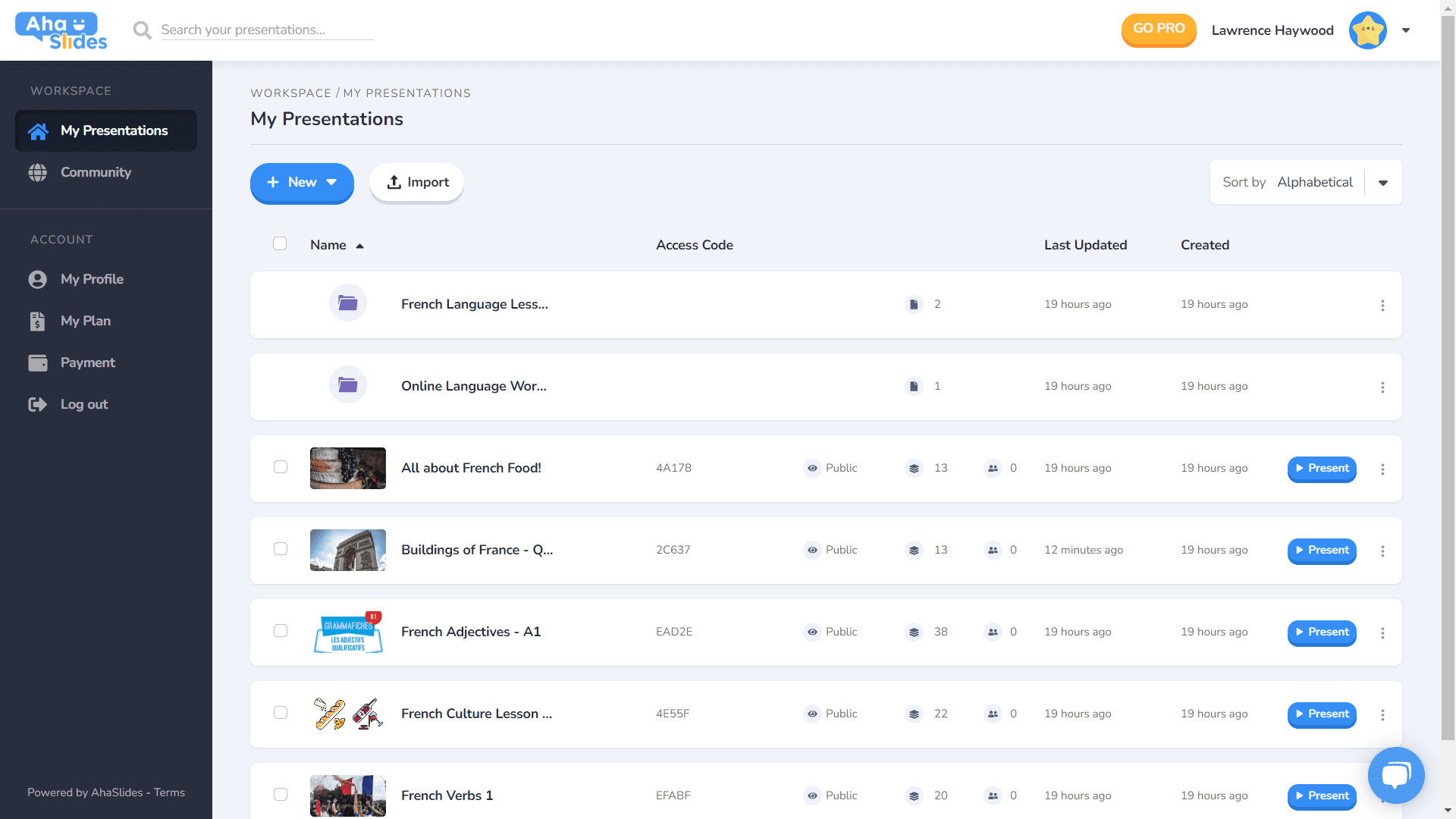
- Κάθε παρουσίαση έχει το δικό της κοντέινερ.
- Τα κοντέινερ έχουν τώρα εικόνες μικρογραφίας (η μικρογραφία θα είναι η πρώτη εικόνα της παρουσίασής σας).
- Οι επιλογές παρουσίασης (διπλότυπο, διαγραφή δεδομένων, διαγραφή κ.λπ.) βρίσκονται τώρα σε ένα τακτοποιημένο μενού kebab.
- Υπάρχουν περισσότεροι τρόποι ταξινόμησης και αναζήτησης για τις παρουσιάσεις σας.
- Ο «Χώρος εργασίας» και ο «Λογαριασμός» σας διαχωρίζονται πλέον στην αριστερή στήλη.
⭐Ερχονται συντομα!⭐ Στο εγγύς μέλλον θα υπάρχει μια ολοκαίνουργια επιλογή προβολής πίνακα ελέγχου – Προβολή Πλέγμα! Αυτή η προβολή σάς επιτρέπει να βλέπετε τις παρουσιάσεις σας σε μορφή πλέγματος με επίκεντρο την εικόνα. Μπορείτε να κάνετε εναλλαγή μεταξύ της προβολής πλέγματος και της προεπιλεγμένης προβολής λίστας ανά πάσα στιγμή.
#2 – Επάνω γραμμή επεξεργασίας
Έχουμε αναδιαμορφώσει μερικά πράγματα με την επάνω γραμμή στην οθόνη του προγράμματος επεξεργασίας…

- Ο αριθμός των επιλογών στην επάνω γραμμή μειώθηκε από 4 σε 3.
- Τα αναπτυσσόμενα μενού για κάθε επιλογή προσφέρουν καλύτερη οργάνωση.
- Το πλάτος των αναπτυσσόμενων μενού έχει αλλάξει για να διασφαλιστεί ότι το μενού θα χωρέσει στη δεξιά στήλη.
#3 – Αριστερή στήλη του επεξεργαστή
Απλούστερος, πιο κομψός σχεδιασμός στη στήλη περιεχομένων της παρουσίασής σας. Η προβολή πλέγματος έχει επίσης μια εντελώς νέα εμφάνιση...
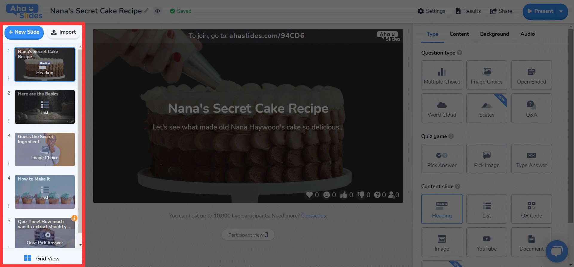
- Οι επιλογές διαφανειών είναι πλέον αφαιρετικές σε ένα μενού κεμπάπ.
- Στο κάτω μέρος προστέθηκε ένα νέο κουμπί κουμπιού προβολής πλέγματος.
- Η διάταξη και η λειτουργία του Grid View βελτιώνεται σημαντικά.
⭐ Ερχονται συντομα! ⭐ Η δεξιά στήλη δεν έχει ολοκληρωθεί ακόμη, αλλά δείτε τι μπορείτε να περιμένετε να δείτε σύντομα εκεί!
#4 – Δεξιά στήλη του επεξεργαστή
Μικρές αλλαγές στα εικονίδια, μεγάλες αλλαγές στο χρώμα του κειμένου…
- Επανασχεδιασμένα εικονίδια για κάθε τύπο διαφάνειας.
- Μια τεράστια ποικιλία επιλογών χρώματος κειμένου.
- Αναδιάταξη στοιχείων στην καρτέλα «Περιεχόμενο».
Επεξεργασία οπουδήποτε, σε οποιαδήποτε συσκευή 📱
Για το 28% των χρηστών μας που επεξεργάζονται τις παρουσιάσεις τους σε κινητά, ζητούμε συγγνώμη που σας παραμελήσαμε για τόσο καιρό. ????
Με τον νέο σχεδιασμό, θέλαμε να παρέχουμε στους χρήστες κινητών και tablet μια πλατφόρμα που είναι εξίσου ανταποκρίνεται με τον υπολογιστή. Αυτό σήμαινε την επανεξέταση κάθε στοιχείου για να βεβαιωθούμε ότι οι χρήστες μας θα μπορούσαν να επεξεργαστούν εν κινήσει.
Φυσικά, όλα ξεκινούν με το ταμπλό. Έχουμε κάνει μερικές αλλαγές εδώ…

Οι πιο σημαντικές πληροφορίες σχετικά με τις παρουσιάσεις και τους φακέλους σας εμφανίζονται εδώ. Υπάρχει επίσης το μενού με τα κεμπάπ στα δεξιά που διατηρεί όλες τις ρυθμίσεις της παρουσίασης οργανωμένες.
On ο συντάκτης, σας υποδέχεται μια άλλη, πιο φιλική διεπαφή.
Και πάλι, όλα είναι κρυμμένα στα μενού κεμπάπ. Κάνοντας αυτό καθαρίζει τις περισπασμούς και σας αφήνει πολύ περισσότερο χώρο για να δείτε τη συνολική παρουσίασή σας.

Γίνεται ολοφάνερο ότι αγαπάμε τα κεμπάπ; Αντικαταστήσαμε το παλιό, υπερπλήρες μπαρ με, ναι, ένα άλλο μενού με κεμπάπ! Αυτό μας κάνει να νιώθουμε... πολύ λιγότερο συντριπτική διεπαφή και σας επιτρέπει να επικεντρωθείτε στην ποιότητα της παρουσίασής σας.

Ήθελα πραγματικά να καταργήσω μερικούς από τους περιορισμούς που εμποδίζουν τους χρήστες κινητών μας να δημιουργούν τις παρουσιάσεις που θέλουν. Επιλέξαμε κάτι πιο κομψό και απλό από πριν, αλλά έχουμε ακόμα μεγάλα σχέδια για τις δυνατότητες της AhaSlides για κινητά στο μέλλον!
Τρανγκ Τραν - σχεδιαστής

Το δοκίμασα ακόμα;
Απλώς κάντε κλικ στο παρακάτω κουμπί για να δείτε
Ανανεωμένος σχεδιασμός της AhaSlides!