Event designing 101: how to create a memorable attendee experience
Most events fail not because the content was bad, but because the experience around it was forgettable. People arrived to a confusing entrance, sat in chairs facing away from the screen, and left without speaking to anyone. The program itself was fine. The design was an afterthought.
Event designing is the discipline that fixes this. It covers every deliberate choice that shapes how attendees move through, feel about, and remember an event — from the moment they walk in to the moment they leave. Done well, it transforms a gathering into an experience people talk about afterward.
This guide covers what event designing actually involves, how it differs from event planning and styling, and how to apply its principles across a real event.
What is event designing?
Event designing is the process of creating the overall look, feel, and flow of an event to achieve a specific outcome — whether that's a product launch that builds brand excitement, a conference that generates genuine networking, or a company all-hands that actually lands.
It works across five dimensions simultaneously: the visual environment, the physical layout, the sensory atmosphere, the attendee journey, and the programming that sits inside all of it. A good event designer thinks about all five before a single vendor gets booked.
That broad scope is what distinguishes event designing from its two close neighbors.
Event designing vs. event planning
Event planning handles the logistics: budget management, vendor contracts, catering headcounts, run-of-show timelines, and risk mitigation. Event designing handles the experience: what it feels like to be at the event, what story it tells, and what attendees walk away with.
The two are interdependent, but the design decisions need to come first. A venue can't be contracted until you know how many different spatial zones the design requires. A catering package can't be finalized until you know whether the event design calls for seated dinner or standing cocktail format.
Event designing vs. event styling
Styling is a subset of design. An event stylist focuses on the visual and decorative layer: florals, linens, tableware, signage, and the aesthetic details that make photos look good. Event designing encompasses styling but also covers flow, pacing, interaction, layout, and the overall attendee journey. You can have beautiful styling inside a badly designed event, and the result is still disappointing.
The 5 core elements of event design
1. Theme and concept
The theme is the organizing principle that makes every other decision easier. It answers the question: what is this event actually about, and what should it feel like?
A strong theme is specific enough to generate clear creative decisions. "Innovation" is not a theme. "The next 10 years of renewable energy, told through the voices of people living through it" is a theme. Every visual, spatial, and programming choice then serves that concept rather than competing with it.
The theme also connects to the event's business objective. A sales kickoff designed to build team momentum needs a different concept — and different design choices — than a customer summit designed to build trust and deepen relationships.
2. Venue and spatial layout
The venue is both a constraint and a canvas. Before committing to a space, designers need to answer:
- How many distinct zones does the event require? (Main stage, breakout rooms, networking area, exhibition space, quiet work area, catering zones)
- How will attendees move between zones without bottlenecks?
- Where are the natural focal points, and do they support the event's programming structure?
- What does the space restrict, and what does it enable?
Traffic flow is consistently underestimated. In a poorly laid out venue, 30% of attendees at a conference never make it to the secondary sessions because they can't find them or the route is unintuitive [1]. The entrance, wayfinding, and transition paths are as much a part of the design as the stage.
Seating configuration also drives outcomes. Theater-style rows maximize capacity but limit interaction. Cabaret-style tables encourage discussion but reduce sightlines. Standing cocktail format creates circulation but tires attendees at a long event. Each configuration sends a signal about what the event expects from attendees.
3. Lighting and atmosphere
Lighting does more than illuminate — it directs attention, signals transitions, and sets emotional tone. A room with flat, even overhead lighting reads as a workplace. The same room with warm, directional lighting and defined focal points reads as an experience.
實際應用:
- Use brighter, cooler light during content-heavy sessions when attention and comprehension matter.
- Shift to warmer, softer light during breaks and networking periods to encourage conversation.
- Use gobos, coloured washes, or spotlights to distinguish different event zones visually.
- Program lighting transitions to signal the shift between session segments without a verbal announcement.
Sound follows the same logic. Background music at around 65–70 decibels (roughly the volume of a conversation) has been shown to enhance creative thinking compared to silence or very loud environments [2]. Managing ambient sound levels across different event phases — arrival, sessions, breaks, dinner — is part of the design brief, not an afterthought for the AV team.
4. Branding and visual environment
Every surface an attendee sees is a design opportunity: entrance signage, stage backdrop, printed materials, digital screens, table arrangements, and the branded touches on catering and merchandise. Consistency across these elements reinforces the event's concept and makes the whole experience feel intentional rather than assembled from separate parts.
A few principles that hold regardless of budget:
Color does most of the work. Three to four well-chosen colors, applied consistently, create more visual impact than a complex palette applied inconsistently.
Scale matters more than quantity. One large, well-executed centerpiece creates more impression than ten small decorative items scattered around a space.
Typography at event scale is different from print. Signage needs to be readable from at least 5 meters. Digital screens need high contrast. What looks good on a design mockup often fails in a real venue with ambient light competing.
5. Attendee journey and engagement
The attendee journey maps the experience from arrival to departure: how people enter, how they find their way, when they're guided versus free to explore, where energy peaks, and how the event closes.
Designing this journey means thinking about pacing. Most events front-load information and underinvest in transition moments. The 10 minutes before a session starts, the 15-minute break, and the exit are all design moments. They're also the moments most likely to be left to chance.
Active engagement is the element that separates events people attend from events people experience. According to a 2025 Bizzabo survey, 68% of attendees said live interaction and interactive formats were among the best ways to engage with event content [3]. Passive formats — long keynotes, panel discussions with no audience involvement — consistently underperform on post-event recall and satisfaction scores.
The event design process: 5 stages
Stage 1: Define objectives and audience
Before anything creative happens, pin down what success looks like. What should attendees know, feel, or do differently after this event? Who are they, what do they already know, and what do they need from the experience?
These questions aren't just strategy — they're design inputs. An audience of senior executives at a leadership summit has different attention spans, status sensitivities, and networking behaviors than a group of frontline employees at a company all-hands. The design responds to both.
Stage 2: Develop the concept and theme
With objectives defined, build the creative concept. This is where theme, aesthetic direction, color palette, and the event's overall tone get established. The concept should be specific enough to make decisions from: if a vendor proposes something that doesn't fit the concept, you have a clear reason to redirect rather than just a vague preference.
Get the concept documented early. A one-page brief with mood board, color references, and 3–5 guiding principles is enough to align your team and brief vendors without spending weeks on it.
Stage 3: Select and configure the venue
Apply the concept to venue selection. Look for spaces where the existing architecture works with the design rather than against it. A converted industrial warehouse can look extraordinary for a tech event without heavy transformation. A ballroom that fights your contemporary concept will cost twice as much to dress and still not quite work.
Once the venue is confirmed, map the layout in detail. Place every zone, every traffic path, every AV position, and every catering station before you brief suppliers. Changes made on a floor plan cost nothing. Changes made on the day of setup are expensive and stressful.
Stage 4: Design the details
This is where the concept becomes tangible: briefing the AV and lighting team, finalizing decor and signage, confirming the run-of-show timing and its relationship to lighting and music cues, and designing the programming elements that will fill the space.
Programming is part of event design, not separate from it. A 90-minute general session with no interaction built in will lose the room by minute 45. The design brief should specify where audience interaction happens, what format it takes, and how it connects to the event's theme.
Interactive moments work best when they serve the content rather than interrupting it. A live poll that asks attendees to vote on the most important challenge facing their industry, then displays the results on stage, creates a shared data point the presenter can respond to in real time. That's design, not gimmick.
Stage 5: Execute and adapt
On the day, the designer's job shifts from creation to oversight and adaptation. Run a full walkthrough before doors open. Walk every traffic path. Sit in every section. Test the AV from the back row. Check sightlines from the worst seat in the room.
Then stay available for the adaptations that always come: the sponsor who wants to move their logo, the session that runs long, the breakout that fills too fast. A well-designed event has contingencies built in. The design holds because it was built with flexibility in mind, not despite the problems that arise.
Common event design mistakes
Treating layout as a logistical decision, not a design one. Where chairs face, how far seats are from the screen, whether there's enough space for catering without creating bottlenecks — these are experience decisions, not just operational ones.
Designing for photos rather than for people. A backdrop that photographs beautifully but distracts from the presentation, or florals that block sightlines, serves the Instagram post rather than the attendee.
Ignoring the transitions. The experience between sessions — the break, the networking window, the meal — is where relationships form and decisions get made. These moments deserve as much design attention as the main stage.
Starting the design process after the venue is booked. The venue shapes almost every other design decision. Choosing the space before the concept is defined forces the concept to serve the venue rather than the other way around.
Underestimating setup time. Setup almost always takes longer than planned. Build in at least 25% contingency beyond your initial estimate, and schedule the full-team walkthrough before you need it, not right at doors-open.
Adding interaction to the design
Audience engagement isn't a feature you bolt onto an event — it's a design choice that affects pacing, seating, AV needs, and session structure.
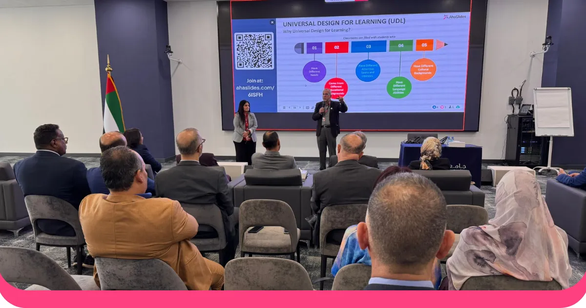
Live polling, Q&A tools, and real-time word clouds change the dynamic of a session. Instead of a presenter delivering to a passive room, the content becomes a conversation. The presenter can see what the audience actually thinks, respond to it, and adjust. Attendees see their own input reflected back as shared data, which increases investment in the discussion.
For event organizers, platforms like AhaSlides make this straightforward to set up: polls and Q&A run on attendees' phones through a join link, results display live on the main screen, and the data is available after the event for follow-up. The interaction doesn't require a separate app install or a complicated integration — it works within the existing presentation flow.
The design implication: build interaction points into your run-of-show from the start. A live poll placed five minutes into a session rather than bolted on at the end becomes a genuine data moment the presenter can use, not just a warm-up exercise.
來源
[1] Planning Pod. Event layouts 101 — complete guide for amazing event design. https://planningpod.com/blog/event-layouts-101-complete-guide-for-amazing-event-design
[2] Ravi Mehta, Rui (Juliet) Zhu, and Amar Cheema. "Is Noise Always Bad? Exploring the Effects of Ambient Noise on Creative Cognition." 消費者研究雜誌, Vol. 39, No. 4 (December 2012), pp. 784–799. https://doi.org/10.1086/665048
[3] Bizzabo. The events industry's top marketing statistics, trends, and benchmarks for 2026. https://www.bizzabo.com/blog/event-marketing-statistics