大多數簡報的失敗,首先體現在視覺效果上,其次才是其他方面。投影片內容過於密集,第三排的圖表難以辨認,配圖與主題毫無關聯。在演講者說出任何令人質疑的內容之前,觀眾就已經對簡報失去了信任。
令人沮喪的是,這些問題其實都不難解決。好的視覺呈現並不需要設計學位或昂貴的軟體。它只需要一個清晰的原則,並且始終如一地貫徹執行:每個視覺元素都應該透過清晰地傳達訊息來贏得存在的意義,而不是為了填充空間或炫耀努力。
本指南涵蓋了有效的視覺格式、區分優秀視覺演示和普通演示的技巧,以及將所有內容聯繫在一起的設計原則。
如何才能使視覺演示有效
圖表能否起到幫助作用,關鍵在於其設計意圖。一張能夠突顯重點、令人一目了然的圖表,就達到了目的。而一張塞滿十二個資料系列卻沒有任何註解的圖表,只不過是一堆噪音加上一個圖例而已。
同樣的道理也適用於其他所有視覺形式。一張能將觀眾置於你所描述情境中的照片,才能真正打動人心。一張團隊成員指著白板的普通照片則毫無價值。一段展現真情實感的30秒客戶視頻,其效果遠勝於一句「客戶愛我們」。
以意圖為導向的設計才是標準。它並非追求美觀,也並非追求複雜。設計必須服務訊息,並尊重受眾的注意力。其他一切都由此而來。
有效的視覺輔助工具類型
不同的內容需要不同的視覺形式。知道該選擇哪一種形式以及為什麼,才是實際操作中最重要的部分。
信息圖表 和圖表
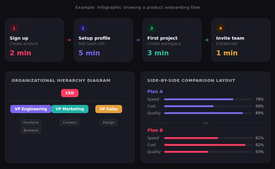
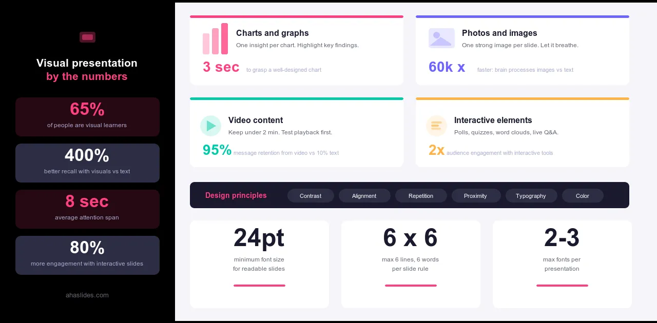
當你的內容結構清晰,文字難以表達時,資訊圖表就顯得特別重要:例如多步驟流程、選項對比、層級結構、時間線,或包含值得展示的模式的資料集。優秀的資訊圖表會運用圖示、色彩和極簡的文字,讓結構一目了然。最常見的錯誤是試圖將所有內容塞進一張圖表中。需要仔細閱讀的資訊圖表已經失敗了。如果你的受眾需要研究它,那就簡化它。
圖表和圖表
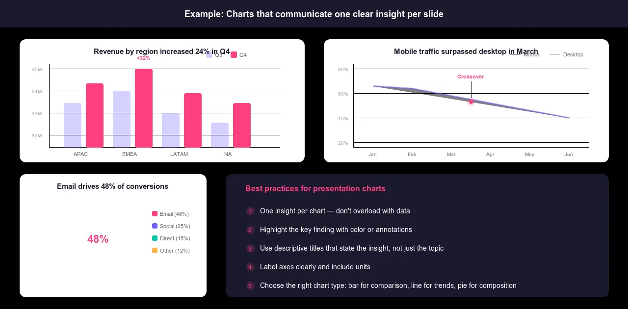
一張需要花費數小時分析的圖表,應該能在幾秒鐘內清晰傳達其見解。而這只有在圖表類型與洞見相符時才能實現。長條圖適用於比較不同類別的數值。折線圖適用於展示隨時間的變化。圓餅圖用途有限,且僅適用於展示整體中五個或更少扇形的部分。散點圖適用於展示兩個變數之間的關係。表格則適用於需要精確數值而非視覺模式的情況。
最常見的錯誤是無論顯示什麼內容都預設使用長條圖,並將過多的資料系列塞進同一個圖表中。每個圖表只展示一個資訊。標註坐標軸。包含單位。使用顏色或註釋來突出重要的發現。沒有上下文的圖表只是帶有圖例的雜訊。
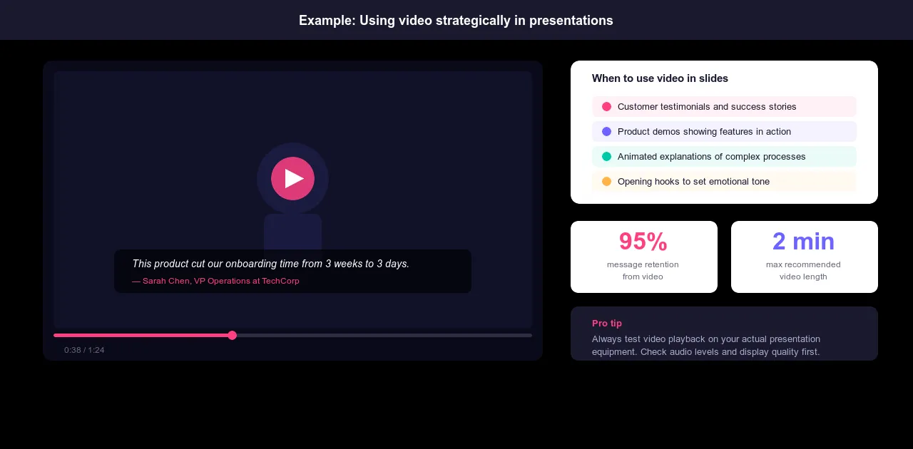
視頻內容
當展示比描述更具說服力時,影片便能脫穎而出。例如,客戶證言如果以文字形式呈現,效果會大打折扣;產品演示中,實物比截圖更具說服力;專家訪談能夠提升你無法透過其他方式獲得的公信力;以及靜態圖像無法傳達的情感背景。
影片時長請控制在兩分鐘以內。超過兩分鐘,就相當於要求觀眾從觀看演示文稿切換到觀看視頻,這會打斷演示的節奏。演示前,務必在實際演示設備上測試影片播放。影片無法播放或播放品質差,幾乎比任何其他因素都更能破壞演示效果。
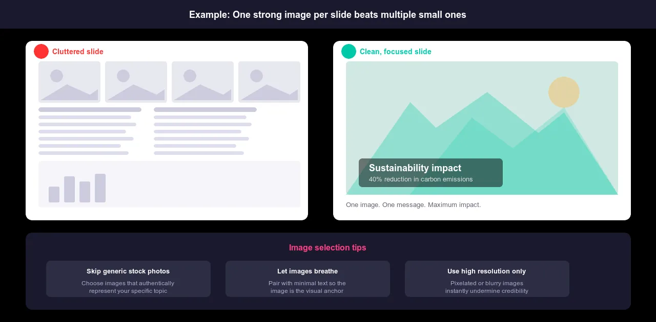
攝影和影像
每張幻燈片配上一張醒目的圖片,並盡量減少文字,比塞滿小圖的幻燈片效果更好。讓圖片佔據空間,而不是與其他圖片分享空間。圖片應該是視覺焦點,而不是與實際內容並列的裝飾。
錯誤的圖片會嚴重削弱你的訊息傳達效果。使用千篇一律的素材圖片會讓人覺得你沒有認真考慮受眾應該看到什麼。如果你要向科技受眾講解創新,那麼一張穿著西裝的商務人士在會議室裡擊掌的照片會適得其反。選擇能夠真實反映你主題的圖片。如果條件允許,原始照片幾乎總是比素材圖片更好。
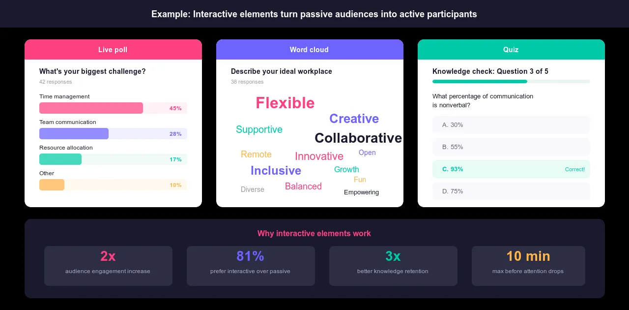
互動元素
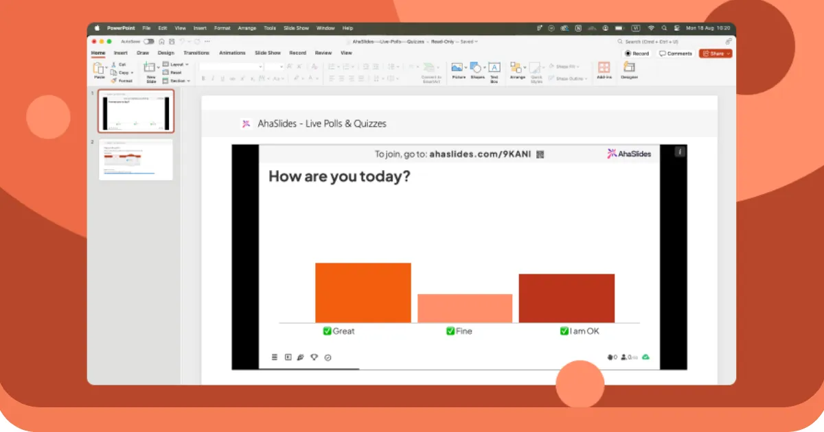
靜態滑梯只能朝一個方向滑動。 包含與學員互動的問答環節 元素則反其道而行:它們能讓聽眾有所回應,從而將被動聆聽轉變為積極參與。
即時投票功能讓您在試圖改變聽眾想法之前,就能了解他們已有的觀點。詞雲功能即時顯示哪些內容引起了共鳴。匿名問答功能可以捕捉到人們真正想知道的問題,而不是他們不好意思公開問的問題。測驗功能可以在演示過程中檢查聽眾的理解程度,這樣您就可以在需要時放慢速度,而不是在演示結束時才發現聽眾的困惑。 AhaSlides 正是基於這些理念而設計的。
五種製作有效視覺簡報的技巧
了解視覺格式是基礎。這些技巧是區分熟練運用視覺元素的簡報和運用得當的簡報的關鍵。
1. 關注受眾的需求
同一個主題,針對不同的受眾,需要採用完全不同的視覺呈現方式。例如,關於同一主題的簡報… 數據分析 對研究人員來說,這和對初次創業者來說,主題截然不同。內容可能會重疊,但視覺呈現方式不應該重疊。
在設計任何一張投影片之前,先問自己三個問題:這個特定的受眾需要理解什麼?什麼樣的細節程度既能滿足他們的需求,又不會讓他們感到不知所措?什麼樣的視覺效果會讓他們覺得可信,而不是讓他們感到困惑?
資料科學家需要詳盡的圖表和精確的方法論。高階主管需要展現業務影響的概覽式視覺化圖表。新創業者則希望圖表易於理解,並能將概念與自身實際情況連結起來。同樣的圖表,可能給一部分受眾留下深刻印象,卻可能讓另一部分受眾感到疏離。設計時要考慮在場人員的需求,而不是你腦中已有的內容版本。
2. 有目的地使用動畫和轉場效果
動畫名聲不好,是因為大多數動畫確實名副其實。從側面飛入的文字、旋轉到位的幻燈片、彈跳的要點:這些都只是增加了動感,卻沒有增加任何意義,反而讓觀眾覺得你把時間浪費在了錯誤的地方。
精心設計的動畫有所不同。它能控制觀眾看到的內容和時間。在分析過程中,逐一展示圖表元素,讓觀眾在看到全貌之前專注於每個要點。逐步建立流程圖,而不是同時展示所有階段。在擴展視圖之前,引導觀眾專注於複雜視覺效果中的特定部分。以一種自然流暢而非突兀的方式,提示主要章節之間的過渡。
測試方法很簡單:如果移除動畫不會改變任何事情,那就移除它。所有動畫都應該讓內容更清晰或節奏更流暢。除此之外,沒有其他理由可以證明動畫存在的意義。
3. 寫出有意義的投影片標題
橋樑 投影片標題 標題要不是含糊不清,就是完全缺失。 「概述」、「分析」、「第三季結果」等標題無法告訴觀眾他們即將看到的內容。投影片標題應該要夠具體,讓人們僅憑標題就能理解投影片的要點。
以「行動流量年增 35%」取代「數據」。用「實施三步驟法」取代「流程」。以「除東北地區外,所有地區的顧客滿意度均有所下降」取代「調查結果」。標題已經揭示了關鍵訊息,幻燈片內容也印證了這一點。
標題也起到導航作用。當讀者短暫地迷失方向時,一個清晰的標題就能幫助他們重新找到方向,而無需你重複解釋。標題在視覺上要與正文內容區分開來:更大、更粗,並採用醒目的格式,使其成為讀者目光首先落下的部分。
4. 使用道具和創意視覺輔助工具
幻燈片是預設選項,但並非總是最佳工具。實體演示能讓人握在手中,與之互動,帶來截圖無法複製的觸感。能將抽象概念具象化的道具,能讓觀眾找到切入點。不尋常的視覺格式,例如等距插圖、手繪圖表或垂直版佈局,都表明這並非前一天晚上匆忙趕制的普通企業簡報。
道具和創意視覺效果只有在與內容相關而非僅僅吸引眼球時才有效。一個能讓你親手觸摸實體物品的產品簡報比五張投影片的文字描述更具說服力。用個人照片講述個人故事比用素材圖片說同樣的故事更有說服力。創意選擇應該服務於訊息本身,而不是取代訊息。
5. 使用視覺素材進行排練並收集回饋
在你的筆記型電腦上看起來不錯的演示文稿,在正式演示時可能效果不佳。在演示前,請務必在實際使用的設備上進行全面測試。影片播放是否流暢不卡頓?後排觀眾是否能清楚看見文字?在房間的燈光下,顏色是否合適?這些問題需要在彩排時解決,而不是在演示過程中解決。
在正式演示之前,先進行一次測試演示。與其問“你覺得怎麼樣?”,不如問一些具體的問題。圖表清晰易懂嗎?有沒有視覺元素讓人困惑或分散注意力?影片是起到了增值作用,還是浪費了時間?模糊的回饋只會帶來模糊的改進。要具體指出哪裡出了問題,才能得到真正可以改進的地方。
刪除與訊息傳遞無關的視覺元素。用更清晰的圖表取代不清晰的圖表。剪掉效果不佳的影片。保留的每一個視覺元素都應該是因為它能增強你的簡報效果,而不是因為你花了時間製作它。
視覺衝擊力設計原則
優秀的視覺設計並非裝飾,而是一套系統,它能確保你的內容從第一張投影片到最後一張都清晰易讀、易於瀏覽且前後一致。這六項原則適用於所有形式的視覺演示,無論其主題、格式或受眾為何。
對比 這就是建立層級結構的方法。如果投影片上的所有內容看起來都一樣,那就沒有任何內容能夠脫穎而出。在圖表中,要用粗體標出重要的數字。用顏色突顯你的論點所依賴的數據點。讓每張投影片上最重要的內容在視覺上與周圍其他內容區分開來,這樣你的觀眾無需被告知就能知道該看哪裡。
校準 這就是精心設計與隨性設計的差別。文字與統一的頁邊距對齊,圖表位置經過精心安排,元素之間相互協調:這些選擇表明有人對幻燈片進行了仔細思考。反之,則表示設計有缺陷。元素錯位不僅看起來不夠專業,還會造成低層次的認知障礙,這種障礙會在長時間的演示中不斷累積。
重複 正是這些因素,讓簡報看起來像是連貫的整體,而不是一系列來自不同來源的幻燈片拼湊而成。貫穿始終的統一配色方案、一致的字體選擇、重複出現的版面模式。重複能夠建構一種視覺語言,讓觀眾在前幾張投影片中就能掌握,並在接下來的簡報中流暢地理解。除非你刻意想要打破這種模式,否則不要輕易打破。
接近 圖表應清楚展現彼此之間的關係。相關的元素應該放在一起。圖表及其說明文字應緊密相連,以便清晰地展現它們之間的關係。邏輯上相互關聯的要點應該分組。如果相關元素分散在投影片的不同位置,觀眾就需要花費額外的精力去理解它們之間的連結。這會分散他們的注意力,影響他們認真聆聽你的講解。
活版印刷 即使在視覺演示中,字體大小也至關重要。使用足夠大的字體,讓後排觀眾也能看清:最小 20 號,盡可能 24 號或更大。正文避免全部使用大寫字母,因為與大小寫混合使用相比,大寫字母的閱讀難度要大得多。每個簡報最多使用兩種字體樣式。超過兩種,字體樣式就會喧賓奪主,與內容爭奪注意力,而不是起到輔助作用。
顏色 它同時做到兩件事:傳達情緒和引導注意力。通篇使用一致的色調會讓人感覺專業且用心。用顏色突顯特定數據點或關鍵發現,可以引導觀眾的視線聚焦在重要內容。顏色過多、分佈過廣會分散注意力,而不是集中註意力。選擇一個色調,並始終如一地使用,點綴色要適量,確保它們出現時仍然具有意義。
視覺演示避免哪些面向?
大多數視覺呈現錯誤可分為兩類:添加不該添加的內容和遺漏應該添加的內容。以下是需要注意的事項。
此外,還有一些需要注意的地方:剪貼畫和低解析度圖片會讓投影片顯得過時,即使內容本身很好。裝飾性的動畫只是為了增加動感而沒有增加意義。超過兩三種字體樣式會分散注意力。配色方案對比度不足,導致在光線充足的房間裡文字難以辨認。投影片中同時混雜了太多視覺元素,圖表、圖片、文字和圖示都擠在同一空間,結果卻都顯得雜亂無章。
缺點在於:圖表沒有標註座標軸或單位,讓觀眾摸不著頭腦;投影片沒有標題,或標題過於模糊,無法提供任何方向;圖片與論點缺乏明確關聯;原本計畫好的互動環節卻未能實現,導致觀眾在整個過程中都處於被動狀態。
兩種情況下的基本原則相同:每個元素的存在都應服務於訊息傳達。如果你無法用一句話解釋為什麼某個圖片會出現在投影片上,那麼它可能就不應該出現。
使用 AhaSlides 進一步拓展
優秀的視覺演示與卓越的視覺演示之間的一個區別在於,觀眾是在觀看還是在參與。靜態的視覺效果,無論設計多麼精良,其傳播方向仍然是單向的。觀眾只是接收訊息,而不會做出回應。
互動元素改變了這一切。演講過程中穿插的即時投票可以讓你了解聽眾的真實想法,而不是在你告訴他們應該怎麼想之前就讓他們自己去想。詞雲可以即時顯示哪些想法引起了共鳴。匿名問答環節可以收集人們心中有疑問但又不好意思開口問的問題。這些互動元素並非對演講的干擾,而是視覺內容與聽眾回饋交會的時刻。
AhaSlides 讓建構這些互動環節變得輕而易舉。投票、測驗、詞雲和問答環節都融入您的簡報流程中,而不是獨立於簡報之外。最終呈現的效果是:視覺元素發揮其應有的作用,而觀眾則全程保持專注。
總結
人們記得的簡報並非那些擁有最炫目畫面的,而是那些每一個視覺設計都服務於特定目的的,觀眾無需費力就能理解畫面內容的,設計恰到好處地襯托出內容本身的作用。
這是一個可以達到的標準。它不需要專業的設計知識或昂貴的工具。它需要的正是本指南一直強調的原則:意圖。要清楚每個視覺元素存在的意義。要知道它想引導受眾做什麼。刪除所有無法回答這些問題的元素。
剩下的就是執行了。而且每次執行都會變得更容易。